SNES mini theme
-
@ohmycommodore said in SNES mini theme:
Hi folks. Has this theme been updated recently, so that all these little additions have been incorporated if you "update theme"?
No. Theme hasn't been updated since 2018...
-
@ohmycommodore no it hasn't been updated and the author, before going silent, has expressed their intent to remain the sole content creator for the theme so we are not allowed to share an updated version; this is why instead we are discussing options to manually update our own local forks.
@gomisensei it looks like it's all controlled there in the resolution layout config which defines the "gamelist" field where the titles are displayed. The "pos" and "size" parameters each have two values, a horizontal component (X-position or width) and a vertical component (Y-position or height). The "height" component of the "size" parameter determines how many titles are displayed.
Oddly, after I got the position dialed in correctly, sometimes adjusting the size parameter would then shift them back out of place and I had to fine-tune the pos again.
nes-mini was still showing a row of dark pixels either above or below the selector bar when it was in some positions near the top or bottom of the list; this was solved by ever-so-slightly increasing the "selectorHeight" parameter.
I'm using 1280x720 so your numbers may be slightly different but it's the same aspect ratio so it should still be real close (at 1080, you might conceivably need four decimal places to get pixel-perfect accuracy. One pixel is .0009259259[259...] or just under .001 of the vertical height so there may be a time when you adjust a value by .001 and it moves the asset by two pixels.) Here's what I've ended up with:
File:
~/.emulationstation/themes/{theme}/layouts/1280x720.cfgsnes-mini:
<pos>${listx} 0.196</pos>
<size>${listWidth} 0.629</size>nes-mini or famicom-mini:
<pos>{x value unchanged} 0.189</pos>
<size>{width value unchanged} 0.629</size>nes-mini only:
<selectorHeight>0.06</selectorHeight>...and the results:
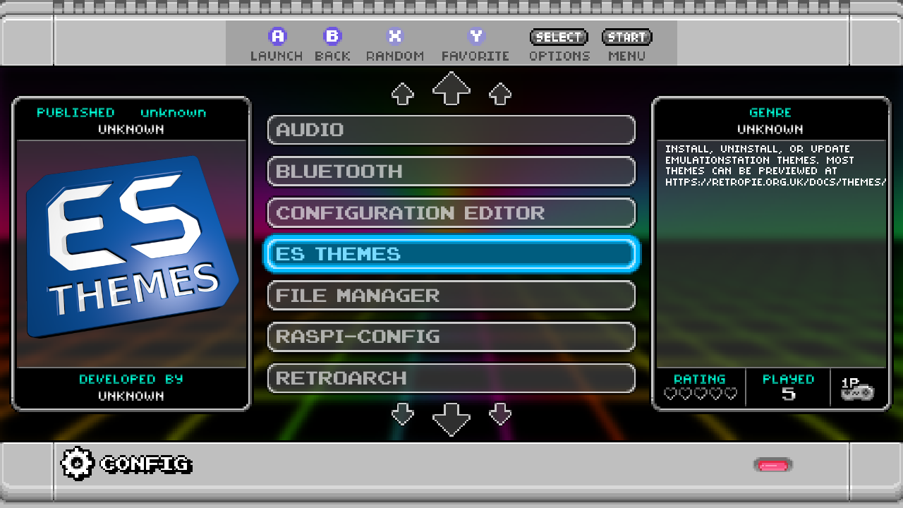
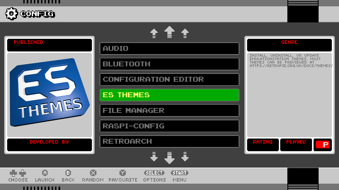
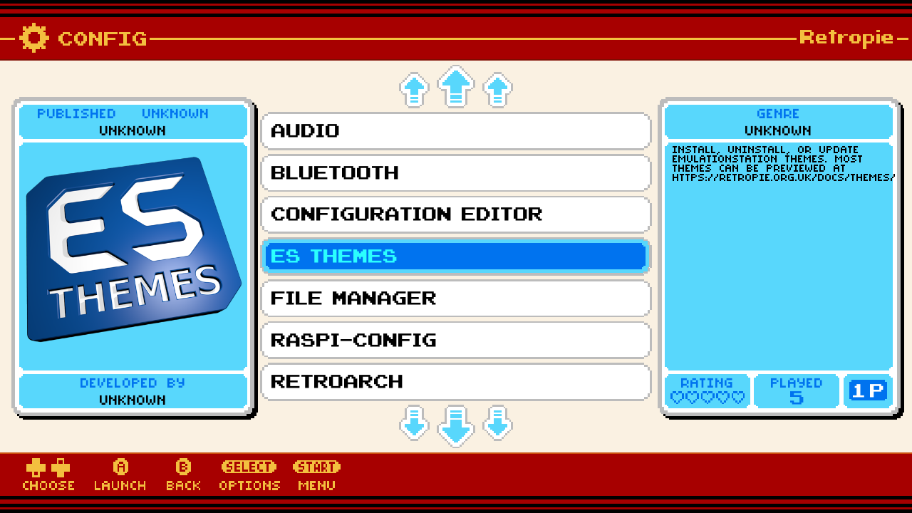
Next up: find out why
missing.png("Our box art is in another castle") is still displayed behind existing art in famicom-mini: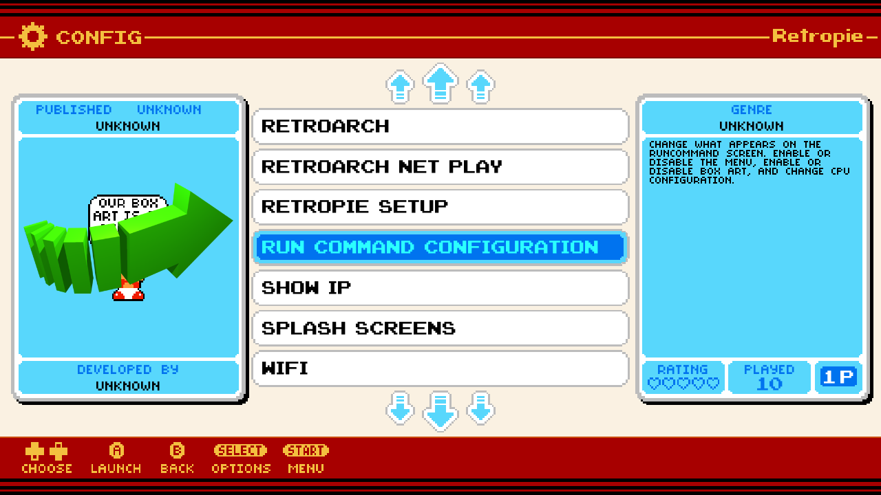
-
@sleve_mcdichael said in SNES mini theme:
Next up: find out why missing.png ("Our box art is in another castle") is still displayed behind existing art in famicom-mini:
This happens in nes_mini/nes_rich_usa as well...it briefly displays for 1s or less, just before the boxart pops into place.
-
@cdaters I'm not seeing it in either of those. It's not behind the transparent icons in retropiemenu:
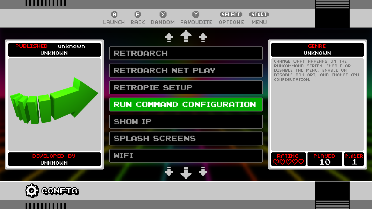
...and even when I remove both the image and the video for a game, either removing the gamelist tags or the files they point to, it still just shows an empty box:
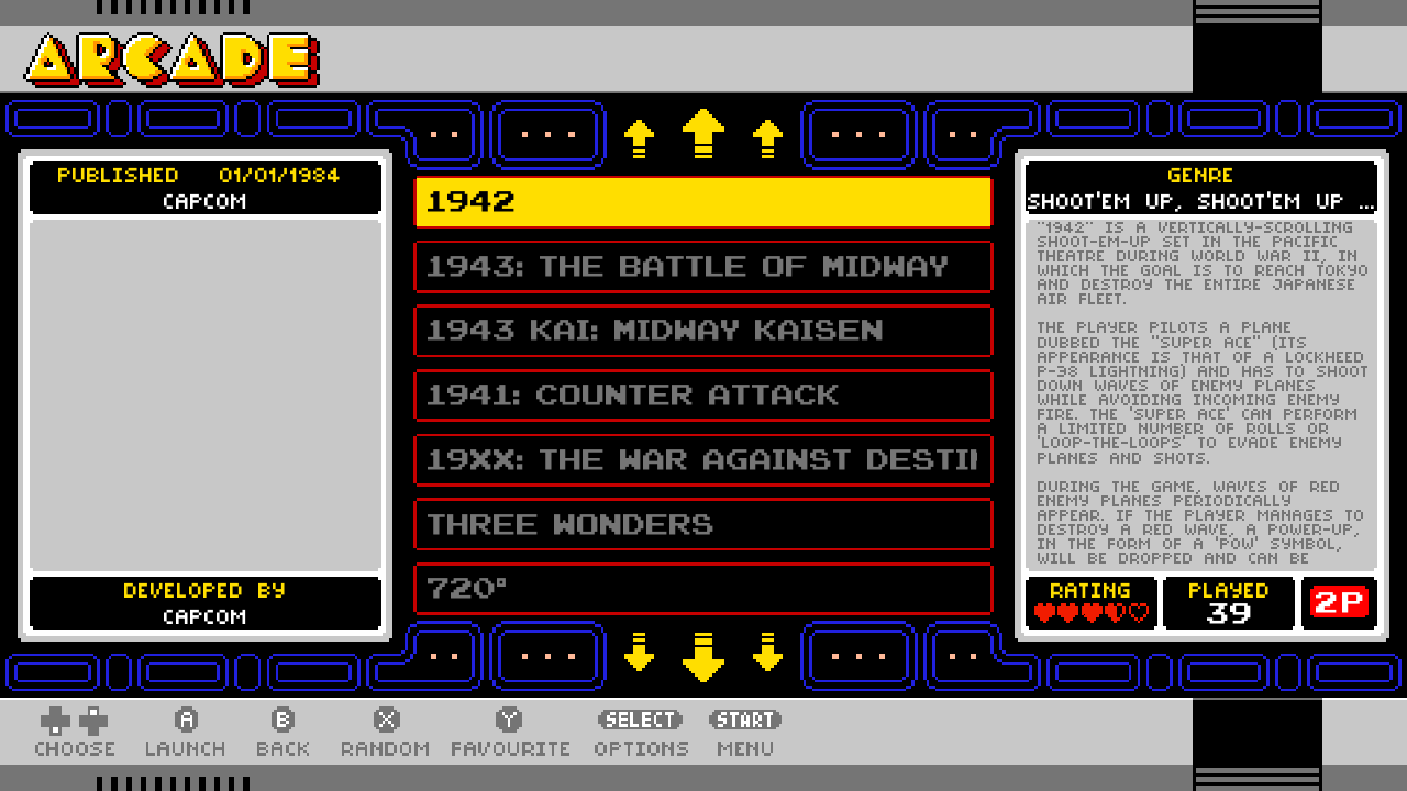
-
@sleve_mcdichael very interesting... I'll have to keep an eye peeled. It is very quick and seems to be intermittent. I don't see it all the time and I only saw it after adding a newly scraped system to this new mix I am working on...
I have to ask though, are you using the theme cloned from @ruckage's github, or the one installed from RPi's ES Themes script? I only ask because your theme looks different than mine, and I believe I installed it from RPi's ES Themes script... My logos and help
.PNG's are flopped compared to yours... -
Hmmm well after 3-4 years perhaps it's time to consider an alternative route. Seems like a popular theme and worthy of some stewardship. Thanks for the update.
-
@cdaters snes-mini doesn't even use the image.
In snes-mini there are several references to
<image name="missing_art" extra="true">and themissing.pngfile exists inlayouts/but unlike the other two, this is never defined inlayouts/setup.xmlto use the file for that asset, so it remains undefined.The removal of this is mentioned in
readme.txtline 93. Are you sure you're using the "latest" (old as it may be) version? -
@cdaters it looks like that in nes-mini, the
missing.pngimage is never shown in "video" view, even when a title has no art or video. In "detailed" view it is shown "behind" the image so if the gamelist art is small or transparent, or doesn't exist, it can be seen in the background. In "basic" view the art is never shown so themissing.pngcan be seen all the time. Except......in the "RetroPie" system menu, the
missing.pngimage is never shown, not even in "basic" or "detailed" view. And it's just not an issue in the actual game lists because the art won't be small or transparent, it will either obscure the "missing" image entirely or will in fact be missing.I suspect that if we can track down whatever logic is used to hide it only in the "RetroPie" menu in nes-mini, it might could be ported to the famicom-mini theme as well.
The other option would just be to remove or comment the line that defines the image path in
layouts/setup.xml, as in snes-mini (just the<path>line needs to be removed, the rest of the entry and all the references to it can remain without causing any harm, apparently.) -
@cdaters said in SNES mini theme:
I have to ask though, are you using the theme cloned from @ruckage's github, or the one installed from RPi's ES Themes script?
The script installs it from ruckage's github:
I only ask because your theme looks different than mine, and I believe I installed it from RPi's ES Themes script... My logos and help
.PNG's are flopped compared to yours...nes-mini and famicom-mini have logos on the top and help text on the bottom. snes-mini is the other way around, even in "nes_rich_usa" style which is otherwise very similar to nes-mini (see my two NES screenshots in #932 -- the top one is actually snes-mini in "nes_rich_usa" style.)
I have also customized my
snes_Europexml to use the purple US system- and gamelist-help images instead of the multicolored European ones (top image in #930.) -
@sleve_mcdichael Hmmm... Now you have me scratching my head, lol! So at home last night, I was working on two Pis. One is a pre-built image on a 4GB Pi4 where I was playing with the snes @ruckage theme vs the nes-mini that had come before that was already on it, and the other is one I am building from scratch on my Pi400. On the one on my Pi400, I cannot find that
missing.pngshowing at all!I am going to pour though his
XMLand see what I can find. With just a cursory looksie, I do see inboxart_pos_2.xmlthe following:<image name="missing_art" extra="true"> <pos>2 2</pos> </image>...and that
boxart_pos_2.xmlfile is being called bya.xmlfromconfig.xml...whew! -
@sleve_mcdichael i just changed the width a little, and it fixed the empty bottom tab... wierd.
-
@sleve_mcdichael said in SNES mini theme:
I suspect that if we can track down whatever logic is used to hide it only in the "RetroPie" menu in nes-mini, it might could be ported to the famicom-mini theme as well.
Indeed. In
nes-mini/retropie/theme.xmlthere is a tag for this image that doesn't exist in the other system themes:<image name="missing_art" extra="true"> <pos>2 2</pos> </image>If I understand correctly, what this does is the
<pos>2 2</pos>tag just positions it off-screen so we can't see it. Coordinates are in units of "one screen" so (0 0) is top left and (1 1) is bottom right. ( 0.abc 0.xyz) is anywhere in the middle. And so (2 2) is a full screen past and below the visible area, where unless it's very large (at least a full screen, depending on how the image is <origin>ed), it will never reach that visible area.)I copied this code block into
famicom-mini/retropie/theme.xmlbefore the final</view>tag (so inside the<view name="basic, detailed, video">section), and it looks like it worked: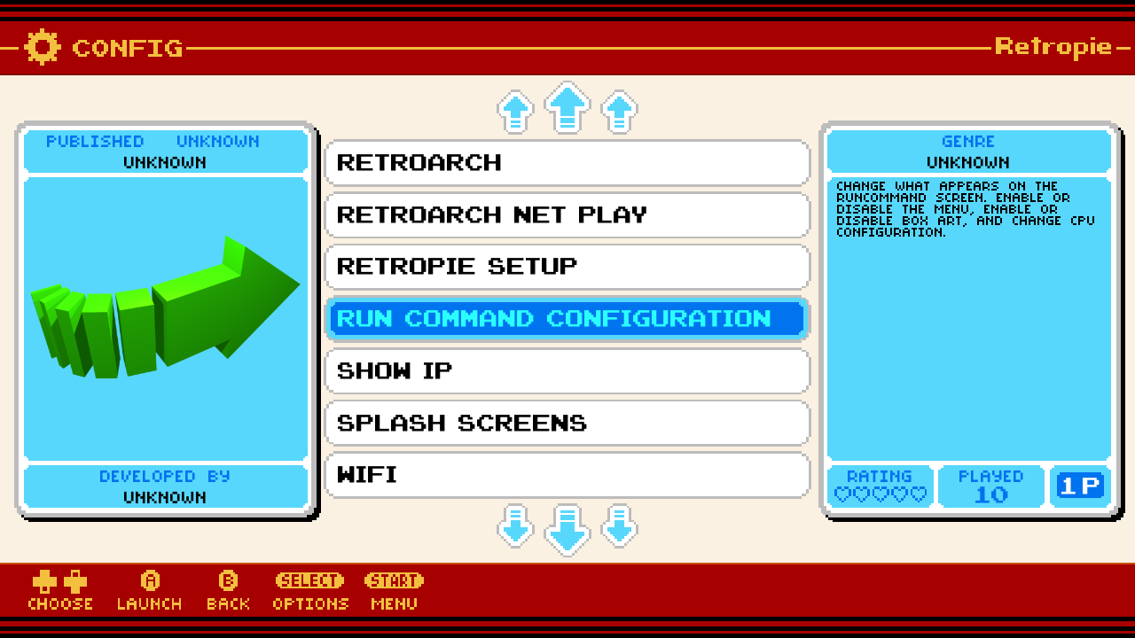
-
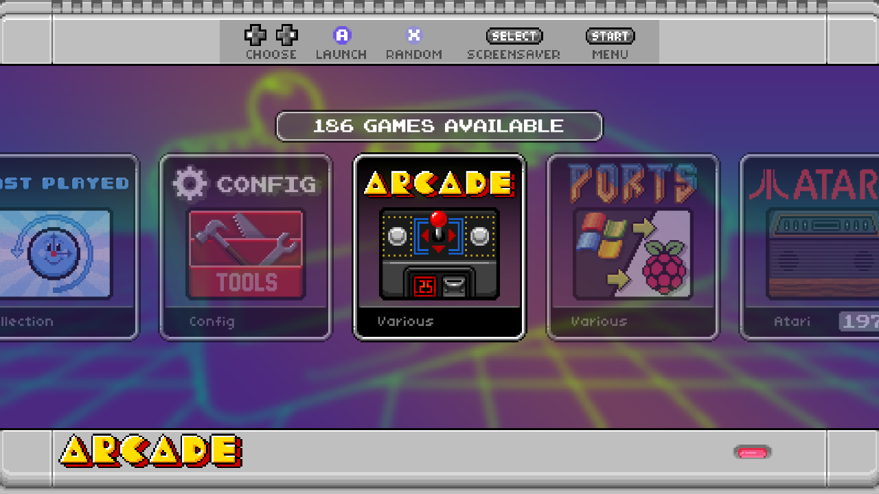
Without sharing any of ruckage's original art, here is a small ".25" patch that can be pasted over the "10p" on your
arcade.pngormame.pngto make a US icon. Use paint.net or similar to retain the background transparency on your icon.
-
@sleve_mcdichael said in SNES mini theme:
And it's just not an issue in the actual game lists because the art won't be small or transparent, it will either obscure the "missing" image entirely or will in fact be missing.
I guess sometimes they are small and/or transparent (Skyscraper composite image of vertical arcade game):
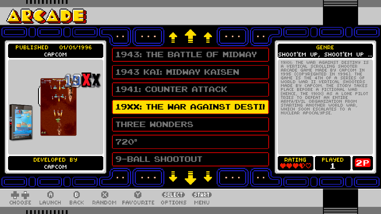
You can just barely see the edge of Toad's speech bubble peeking out behind the screenshot.
This appears on both nes-mini and famicom-mini, in "detailed" view. It is not present in "video" view; if you wish to use detailed view:
The other option would just be to remove or comment the line that defines the image path in
layouts/setup.xml, as in snes-mini (just the<path>line needs to be removed, the rest of the entry and all the references to it can remain without causing any harm, apparently.) -
@sleve_mcdichael said in SNES mini theme:
In "detailed" view it is shown "behind" the image so if the gamelist art is small or transparent, or doesn't exist, it can be seen in the background.
@cdaters I imagine this is what you are seeing on nes-mini, just the "missing" image in the background before your gamelist art loads on top of it. I wasn't seeing it because I was in "video" (actually "automatic") view.
If you're seeing it in snes-mini, I suspect your pirate image has an outdated version of the theme on it.
-
@sleve_mcdichael said in SNES mini theme:
If you're seeing it in snes-mini, I suspect your pirate image has an outdated version of the theme on it.
I agree... Looking at some of the other content on that build, there are emulators and such that are known not to work on Pi4 just yet, so I imagine the developer took an old image and just copied large swaths of content (including configs, etc.) over to their Pi4 build. Additionally, I discovered that he is using the older "stand-alone" version of @ruckage's original
es-theme-nes-miniWhile I am putting together a build from scratch using what is currently available for the Pi4--with the most current themes, programs, emulators, etc. available. So much so that I donated to an emulator developer in an attempt to encourage him to update his (one my of my favorite) emulators that was not yet available on the Pi4.
This theme by Ruckage is definitely one of my favorites, so I would like to work through all the nuances to keep it relevant and able to survive RetroPie updates/upgrades and possibly port it over to batocera's version of ES where the configs, stylings, locale (US vs EU vs JP, etc.) can be incorporated into the UI itself! I wish that RetroPie's ES would pick up some of that same functionality.
In the meantime, it looks like I'll be diging deep to resurrect my pixel art skills (harkening back to my ASCII art days of BBS's) lol to create clean/crisp carousel icons for missing systems in the same style as @ruckage...
-
@sleve_mcdichael how are you doing your screen captures of the various ES screens?
-
@cdaters said in SNES mini theme:
@sleve_mcdichael how are you doing your screen captures of the various ES screens?
-
-
The default
snes-europestyle: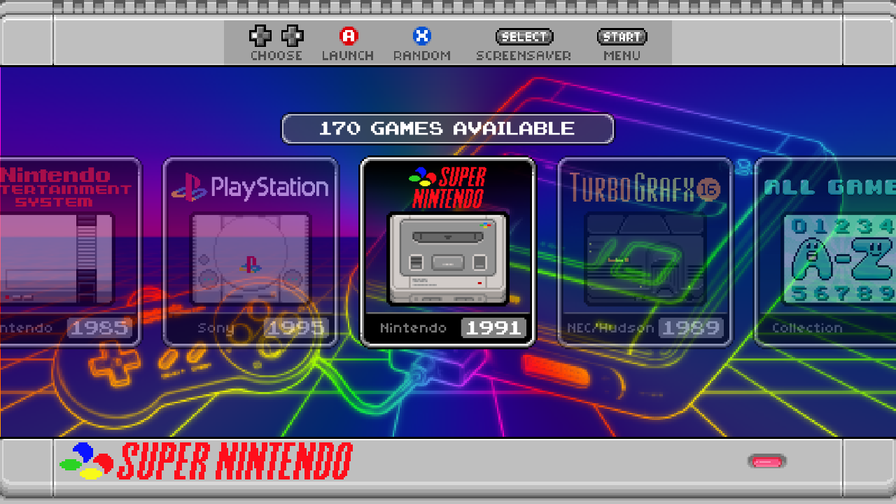
If you change the
<include>tag inconfig.xmlyou can switch thestyletosnes-usa. The borders and icons have changed, but notice that the background image hasn't; it's still showing the European SNES: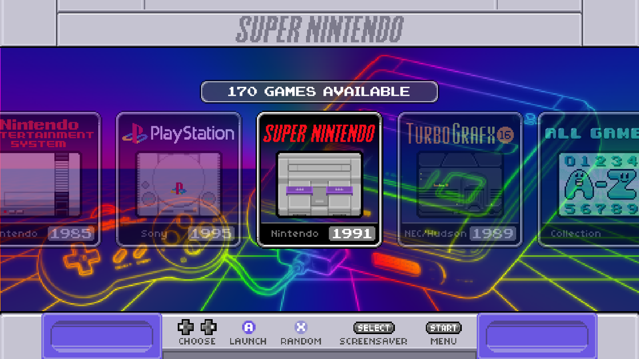
This is explained by a PR shared to the repo:
Fixed include order in config.
The backgrounds sometimes depend on the region setting defined in the style.
https://github.com/ruckage/es-theme-snes-mini/pull/17
This just swaps the order of these two tags in the
config.xml. Now the backgrounds will change with the region setting: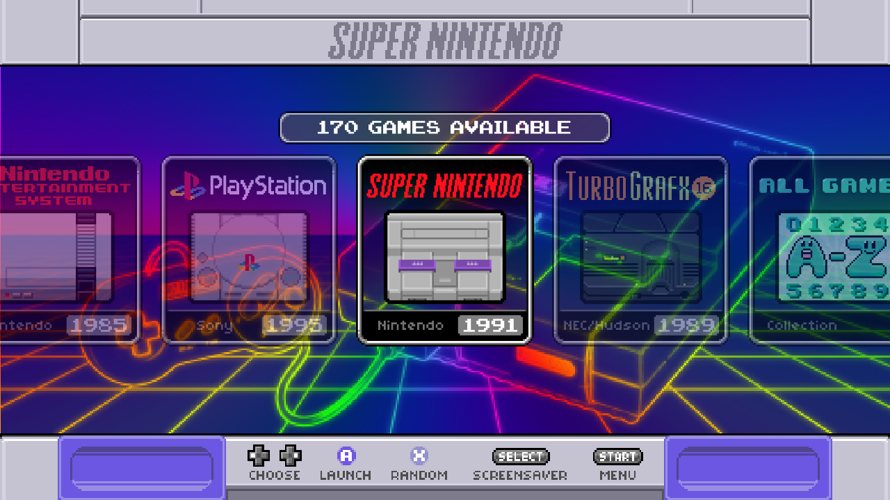
However, this has introduced a new problem. When I change the style to
nes_simple_usa, I noticed the gamelist was sort of low-contrast and hard to read: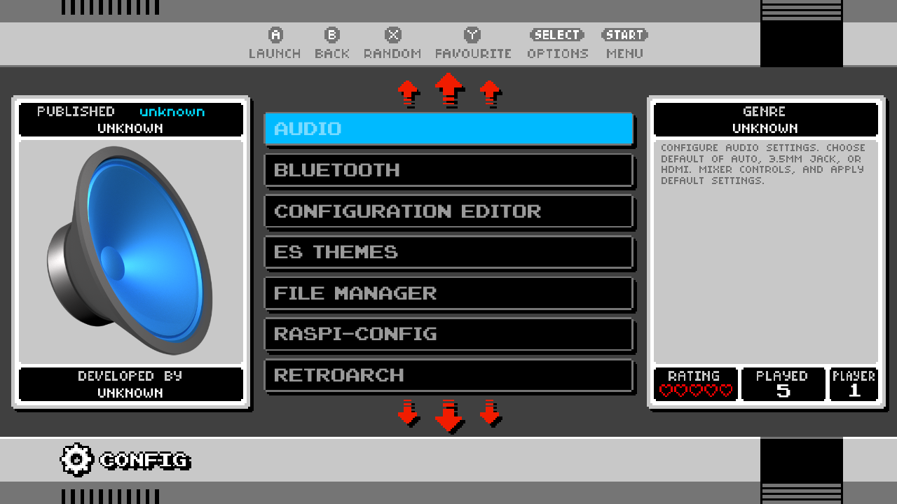
Here's what it looked like before:

What's going on? Clearly it's to do with the order of the
styleandbackgroundtags so I had a look at the files they point to.nes_simple_usaandnes_simple_Europeboth just handle the region-specific differences in borders and icons, then point tones_simple.xmlfor the rest.nes_simple.xmlin the gamelist section, sets the tag<selectedColor>(text color of the selected item) toffffff(white.) The various backgrounds also set this to a custom color.When the
styletag came second (default), then the white color innes_simple.xmlwould overwrite whatever had been set in the background XML. After I switched the order, the custom color set in the background would overwrite the white and actually be used.Sometimes it's even worse. In
neon_purple.xmlfor example, selector and selected are literally the same color!:<selectorColor>00dbff</selectorColor> <selectedColor>00dbff</selectedColor>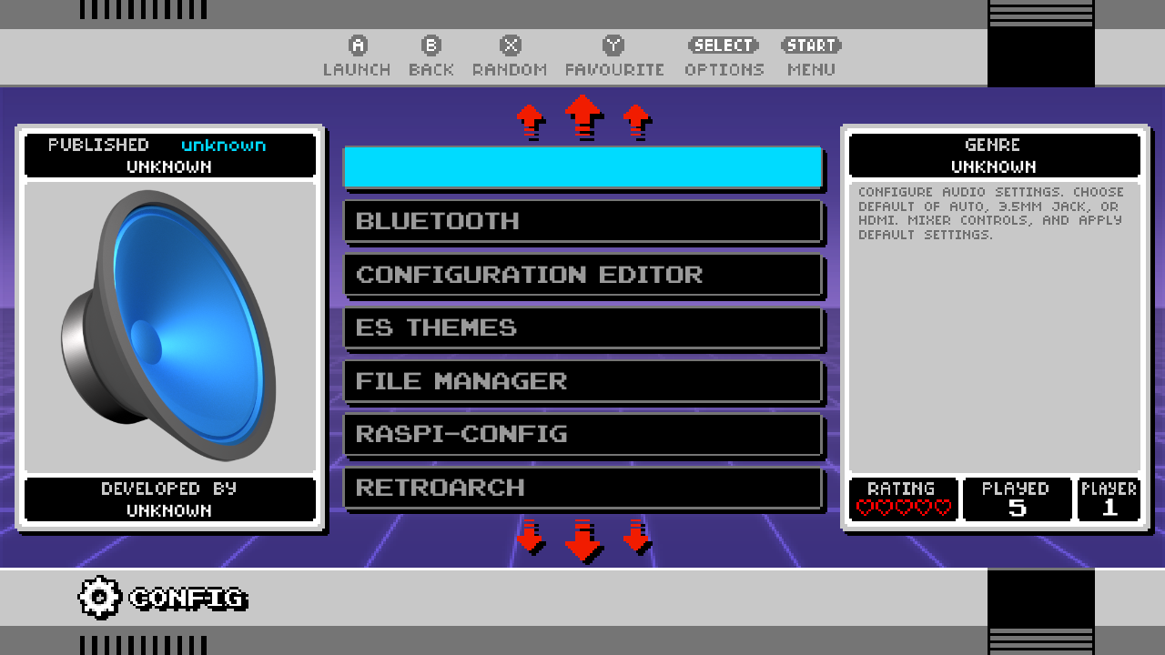
I don't know yet what the "solution" to this problem should be; the other styles still handle this correctly so
nes_simpleshould be able to, too, if we can track down the difference. As a hacky fix for now, you can manually edit the<selectedColor>value in your chosen background XML(s) to white or something else that contrasts with the selector color (background color of the selected item), but this does also change the text color when using the othernes_richandsnesstyles, instead of being dynamic as they are right now.
Contributions to the project are always appreciated, so if you would like to support us with a donation you can do so here.
Hosting provided by Mythic-Beasts. See the Hosting Information page for more information.