Chicuelo Theme
-
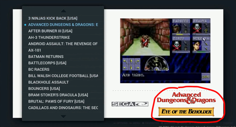
Wow, those look incredible! Really, really great work. So clean. Very much looking forward to seeing a Cadillacs and Dinosaurs image!
So regarding your question about Arcade/MAME, etc.
Arcade is a special folder, which people can use to avoid having several menus for different arcade emulators - essentially all arcade-based ROMs can be placed in the arcade ROM folder and ran from there, which is what I currently do.
I would suggest the following image requirement for each ROM folder/menu/theme.xml for arcade games:
arcade = arcade logo and arcade character image
mame-libretro, mame-mame4all, mame, mame-advmame = mame logo and mame character image
fba = fba logo and fba character image
neogeo = neogeo logo and neogeo character imageDoes that make any sense? Not sure if I have explained too well.
Cheers
P.S. Thanks for merging my changes, will update my copy when I get home and check it out.
-
@chicuelo wow. So awesome <3 The Ghouls & Ghosts image is incredibly gorgeous. Seriously. I love it.
-
@movisman said in Chicuelo Theme:
mame-libretro, mame-mame4all, mame = mame logo and mame character image
mame-advmame = advmame logo (needs creating), and maybe a new advmame image - or just the mame character image if notYou would split mame-advmame and the other mame-s? Why is that?
-
Yeah, I see your point there. I think I thought this originally, because AdvanceMAME has a different logo and is a bit different to the others, and also looking at other themes like the default one (carbon) there was a different logo for it. I put a caveat at the end to perhaps still use a MAME character image, so I wasn't swaying either way really. But I think another logo needs creating for it, which I can take a look at if I can find an SVG.
If you have roms in the mame-libretro, mame-mame4all, mame, and mame-advmame they all appear as separate systems in the GUI. Thinking about it, I think a logo needs creating for it but the image should be the same for all MAME 'related' emulators. However FBA and Neo Geo to be different.
I will edit my post accordingly.
Cheers!
-
@movisman Yeah I think that's right. Different logos allow to differentiate between different MAME versions while scrolling, but the character image can stay the same.
-
-
Done and PR raised for that logo also:
https://github.com/chicueloarcade/es-theme-Chicuelo/pull/5 -
-
Great work so far.
Looks like I could use Odyssey2/Videopac and Frotz/Infocom.
Finally... are you sure ColecoVision is a "1 Bit Console"? :)
-
@ohmycommodore
Sorry the Colecovision XML wasn't made by me, maybe its an input issue -
Hi @chicuelo !
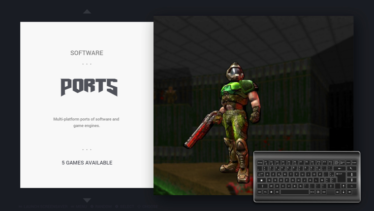
I have made a pull request so that the "ports" logo uses the DOOM font. I think it's much better :)
I also have reduced the controller size, it was pretty huge.
-
@cosmo0
You read my mind.
I updated ports image and I was thinking about that logo, I will make a pull now -
@movisman since your update to the video game list, the logo is displayed on top of the game image, which is nice, except that I already have the logo in the image :D (I'm using "mix" images a bit like this).
Plus it doesn't go away when the video starts, and it's pretty weird to see the edges of the logo below the video.Do you think you can check it out ? Or maybe I just need to re-scrape my games and not download the logos...
Other than that, I must say the image-then-video is a huge improvement to my games list feel :)
Thanks :)
-
@cosmo0 @movisman
I also want to add that the game logo must display over the video, not where the text of the console is. That changes all the theme aspect and I think it looks bad. I saw a video on youtube and I think the best way to display the game logo is over the video on the top right or bottom right corner.
Can we make this correction on the xml?
-
Hey both,
Sorry, I have been away for a couple of days :)
So I think you must be talking about the 'md_marquee' attribute? If so, I didn't make any adjustments to this one for my video 'fix', but looking at the theme.xml it looks like it's only active in the 'video' view (i think). But because I adjusted the image/video position a bit, I think I need to adjust the marquee one too.
I do not use marquees because I use a 'mix' for my image scrape (game screen, boxart, and game logo) which fades into video, and for MAME I use a 'title screenshot' for the image scrape which then fades to a video, because I found a mix scrape generally didn't find everything on screenscraper so I used title screen instead. Hope that makes sense.
However, just to check with you both - if there IS a marquee scraped, did you want me to try and have this moved to the bottom right corner of the image / video area, and have it placed on top?
If so I can have a go with it later this evening if I get chance, but wanted to check the requirement first - as maybe I am misunderstanding something. The only issue with this approach I can see, is if you have an image, logo AND a video scraped, the logo will get in the way of the image somewhat and look weird when you have a mixed image.
This will only cause issues if you have a 'mixed' image scraped I guess, but would look ok with a regular screenshot image.
Let me know :)
-
Hi,
Ok so had a very quick look (still checking this out) anyway..... it actually appears for me (on x86) above the image AND above the video, which I think is what @chicuelo was after?
However - it doesn't really appear in the best place as I suspected, because I never altered the marquee position. I will work on the positioning and come back to you shortly. I think bottom right of the image/video is best but will post a screen for you.
I wonder, are you guys using Raspberry Pi units? I am guessing so. If you are, I have a feeling something to do with the OMX player / hardware acceleration causes some of these issues with video / image overlays and what appears on top of where. Let me find a post which refers to it and i'll paste it here. On x86 I don't think OMX is used so there is no problem.
@cosmo0 - I see what you are saying about the logo being in the way when it's over the image, but i'm not too sure I can see another way around it, as people may just have a regular image (not a mix), and the logo would look ok then. I would be tempted to do what i've done if you are using mixed images and not use the marquee tag at all.
Cheers
-
Ok, check this post out and the one directly below it:
https://retropie.org.uk/forum/topic/768/pixel-theme/643It explains that when using OMX player, it has to be rendered on top of everything else. You can turn this off, then the logo will appear correctly (on top). However not sure on a Pi, the video performance may suffer. I think this is a limitation of the OMX player. For me, on x86 the marquee logo appears on top of both the image and video.
Thanks!
-
@movisman
I think the best will be to remove the md_marquee from the video mode (and other modes too). Have you any Idea of how can I achieve this?
So you only have displayed the game image or video even if you have scrapped box art or logos they will not be showed up.
It will be the best resolution to make the theme look always the same -
Yeah, we can simply remove that tag from the main theme.xml.
It means then if you have a marquee scraped it won't show up at all.
So this means, only a single media image and video will show up in the video view. Basically image which fades to video.
If you are in detailed (non-video) view, just the image will show up.Personally, this is how I use the theme anyway (I don't use marquees/logos), especially since screenscraper.fr has the ability to combine logo, boxart, and screenshot into a single image.
I would agree it is best to remove marquee entirely - this way it doesn't matter whether you use OMX or not on a Pi.
If you do not use OMX, I can reposition the marquee so it is placed nicely to the bottom right of the image/video - however if you use OMX it'll always appear underneath, sadly.
Does that make sense?
Thanks!
-
I would be OK with removing the marquee from the theme.
This way, it doesn't show in a "random" place, and I can still download it during my scrape, if I ever want to use another theme that uses the marquee.
Thanks :)
Contributions to the project are always appreciated, so if you would like to support us with a donation you can do so here.
Hosting provided by Mythic-Beasts. See the Hosting Information page for more information.