Chicuelo Theme
-
Hey, I can reposition the marquee from it's current position to be laid over the main image/video in a more appropriate location. For example (white background used to give an idea of size - you can use a transparent PNG too which may look better):
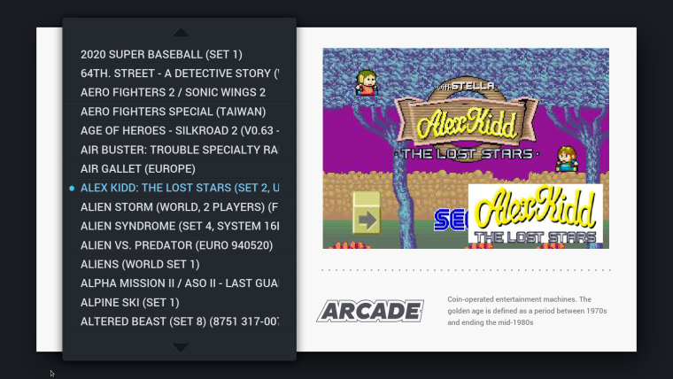
Only thing is, if you use OMX player on your Pi, the video will always appear on top of that marquee image if it overlaps. You have to disable OMX player (I believe) to have the marquee image laid over the video.
We could keep it, and I can sort out the position so it's like my image above. This way, it should always appear in the same place, no bigger - if you have the marquee image scraped. The only time it'll appear below the video (so basically invisible) is if you are using OMX player, which I think is default on the Pi (not sure). And obviously nothing will appear if you don't have the marquee scraped.
What is the preference? Personally I don't use marquees as I think the clean look of image > video, and system name and description looks nicer to me. But that is my personal view.
For a global look on all configurations which just works (regardless of video player etc), dropping the marquee or moving it entirely is the only fool-proof solution I believe.
However - on the other hand, if the marquee/logo stays within the video boundary (which I think I can make it do), and if the user isn't using OMX and has a marquee scraped, it will appear like the above, which might be desired. And if the user is using OMX, the logo will appear above the image, but unfortunately when the video when it starts to play it will be underneath and not seen.
Happy to work in whatever :) personally, I do not use logos/marquees because I have mixed image scrapes for all systems bar MAME, so I get the logo within the main image anyway. So my vote is to not use the tag - other people may disagree though.
Just let me know - I can then raise a PR for my theme.xml edit to reposition the marquee so it's in a better position and you can test.....or I can just remove that tag entirely from the theme.
Thanks!
-
-
-
It doesn't appear to break anything if the md_marquee code is simply removed - whether you have a marquee image scraped or not, it simply doesn't display it now. So I removed the code and raised a PR.
Thanks!
-
@movisman said in Chicuelo Theme:
esn't appear to break anything if the md_marquee code is simply removed - whether you have a marquee image scraped or not, it simply doesn't display it now. So I removed the code and raised a PR.
Gorgeous!
-
@chicuelo Hi!
I have created a bunch of custom "game types" collections :)
I have made a pull request : https://github.com/chicueloarcade/es-theme-Chicuelo/pull/8
I haven't added backgrounds to the characters because it never looks as good as you, so I just kept a simple white background (that I can do :D)
I have matched the logo with the game illustration, so it limits the choices to both a recognizable character and a somewhat-recognizable logo, when possible.You can find my sources here: https://we.tl/vkhI1RqO4u (including original images, fonts and full vector logos).
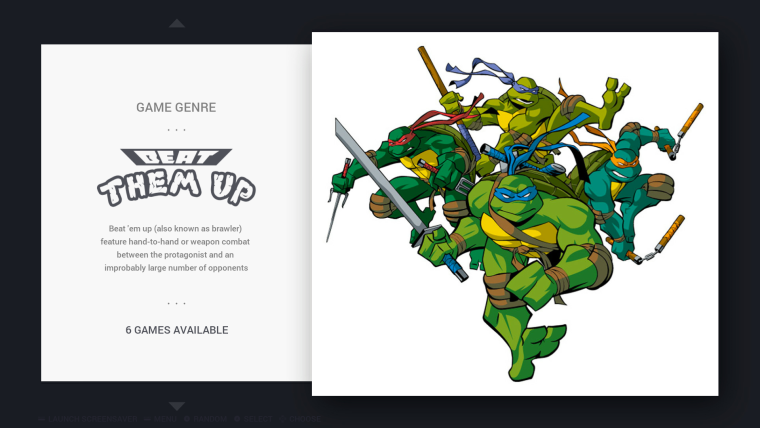
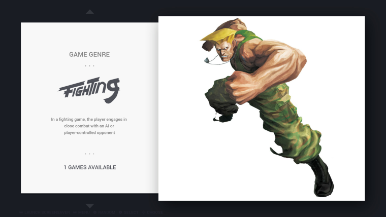
I'm not satisfied with the "Fighting" logo but I have reached the limits of my graphics skills...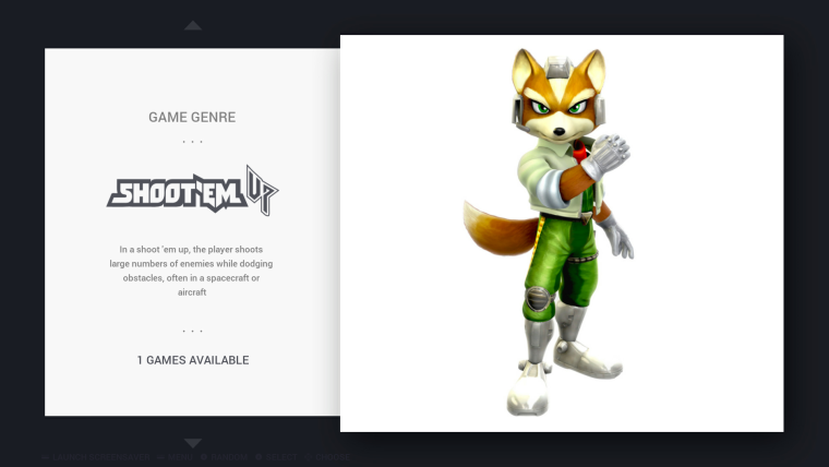
It seems there simply is not a single other shmup with a recognizable character. There are many ships, but we never know who pilots them. That's a shame because there is a "gradius" font that makes an easy and recognizable logo.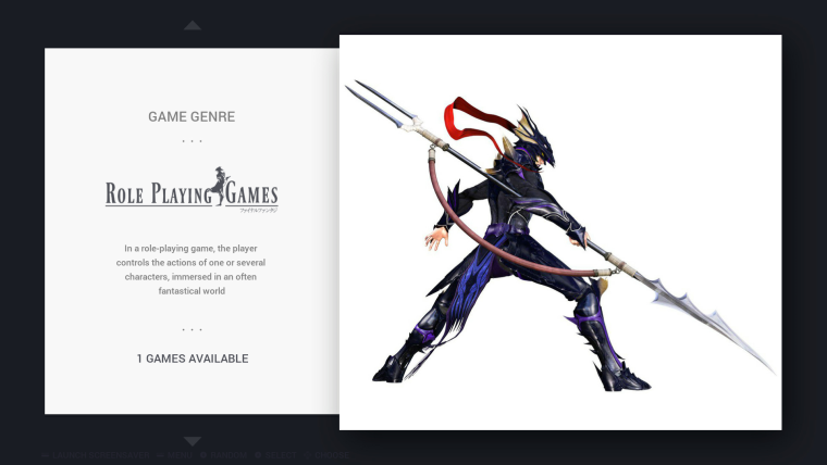
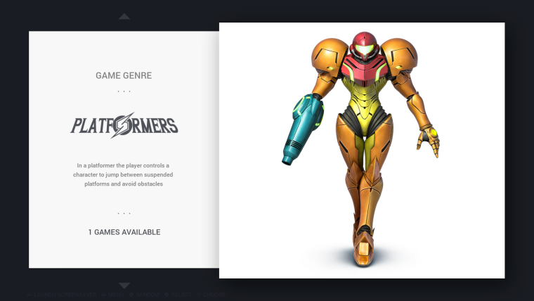
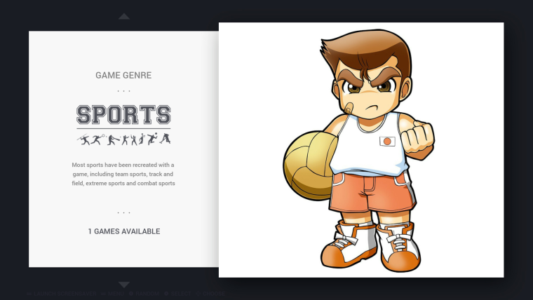
Not many sports game have recognizable characters either.
I tried really hard to find a "full" (including feet) Speedball 2 or Windjammers characters, but just could not find either.
The logo is very "generic sports", I think the Super Dodgeball logo is pretty ugly.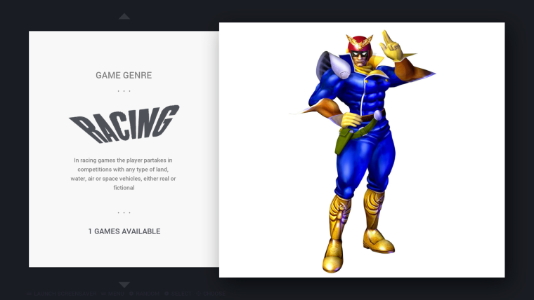
Like the shmups, I couldn't find a single other racing game with characters, it always focuses on the vehicles.
Well, there is Mario Kart, but I think the theme has enough Marios already :D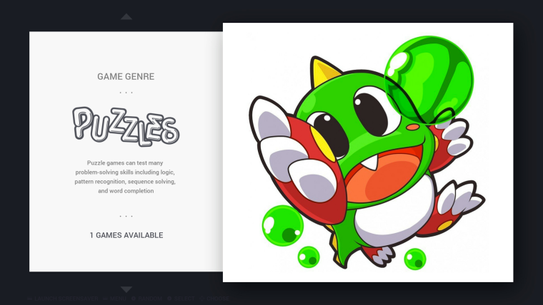
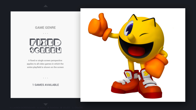
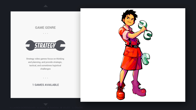
Strategy is yet another genre without many recognizable characters... at least on console.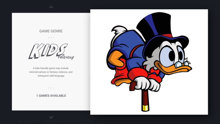
If you don't know custom collections:
- open the EmulationStation menu, go to "Game collections Settings"
- "Create custom collection from theme"
- select a custom collection
- browse you games lists and use the "add favorite" button (Y) -> it will add the game to the collection
- open the ES menu again, go to "Game collections settings", and at the bottom, "Finish editing collection"
- restart ES
-
@cosmo0
Wow thats a great improvement! I personally don't use custom collections but it will be a great option for those who do.
I love the logos. Im only thinking about reducing the size of the characters and maybe adding the same background to all of them so the user understands its not a system.
Great work! -
-
@chicuelo said in Chicuelo Theme:
@cosmo0
Wow thats a great improvement! I personally don't use custom collections but it will be a great option for those who do.
I love the logos. Im only thinking about reducing the size of the characters and maybe adding the same background to all of them so the user understands its not a system.
Great work!Yeah good idea :)
I thought you would want to touch up the characters, so I have included the source images (and a few others I think) in the source zip.
Thanks :)
I have missed a few types (action and adventure), I'm planning on doing them... sometime :D
I also want to do "game series" (like "all Mario") in the same style. -
@cosmo0 Just a thought, might wanna change the 'Beat them up' into 'Beat 'em up'. Rolls off the tongue better.
-
@cosmo0
I am thinking on using a blister mockup and set the images inside, so its easy to create more genres with that method. I will prepare one and share to yo so we both be able to create the rest. What do you think? -
Action and Adventure are done : https://github.com/chicueloarcade/es-theme-Chicuelo/pull/9
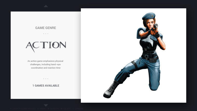
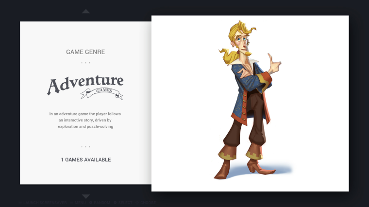
@lilbud : yeah I tried to, but it's weird if I just leave "'em up" below "beat". Or I type the whole "beat 'em up" in "turtle-style", but then what do I type above?
@chicuelo sounds good to me :)
-
@cosmo0 Whole 'Beat 'em up' in turtle style
-
@cosmo0
What do you think about something like this? The same background where we only have to change the character, logo and add some items according to that genre, for example in racing we could add a nitro and white flag, for sports a ball and a pair of referee cards, for action games a whip, and a key... Using that criteria we can make all the genres matching fine.
I have a psd where you only have to replace the logo and the character + items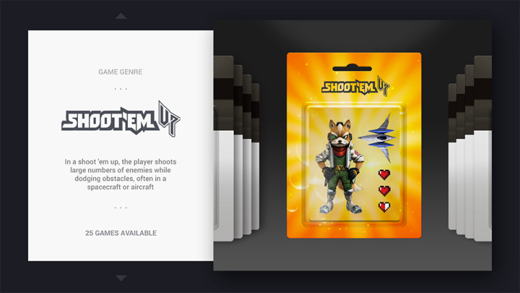
-
@chicuelo
Wow, looks great!
Not sure about the logo on the blister, though, because then it appears twice, it's a bit weird.
Do you think it will match with all the characters? It reduces the position possibilities, the characters have to stand upright to look good, no ?@lilbud yeah but then the logo is missing something :(
-
@cosmo0 said in Chicuelo Theme:
@lilbud yeah but then the logo is missing something :(
Maybe pick a different logo to
completely rip offuse as inspiration. Maybe use Streets of Rage... -
@cosmo0
You are right about the logo, its not a good choice to use it twice.
I think you can play with the character using all the space you have. If you choose a character with a pose, you could arrange the representative elements of the genre arround it. Its a matter of try and error.
The only condition I see is that the character and the object must seem 3D or realistic to fit fine the blister.
I let you to take those decisions in order to complete the others :)
You can download the psd from here and you only have to modify the Green layer and put the art by genre inside a folder https://www.dropbox.com/s/2pt3fs2aks1f2w5/Genre.psd?dl=0For example for racing games, I don't use a character, but yes a F1 from a game so its ok while the genre is understood by the user.
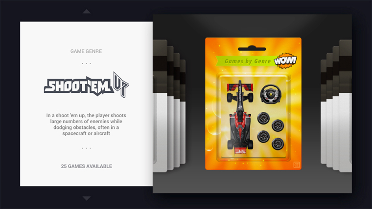
-
@lilbud said in Chicuelo Theme:
Maybe pick a different logo to
completely rip offuse as inspiration. Maybe use Streets of Rage...The problem is that I must find a game for which:
- the logo should be from the same game as the character (I tried matching logos and characters from different games but it felt super weird)
- the main character is well-known (even though that's quite subjective)
- high-resolution and high-quality artworks of the main character are available (I just can't draw)
- the logo is recognizable (just "slanted Arial" like Captain Commando is not pretty)
- a font that matches the logo can be found (I'm not good enough to create it from scratch, maybe Chicuelo can do it, but not me).
It reduces the possibilities drastically.
I tried many BTU, but only TMNT checks all these criterias. -
@chicuelo said in Chicuelo Theme:
@cosmo0
You are right about the logo, its not a good choice to use it twice.
I think you can play with the character using all the space you have. If you choose a character with a pose, you could arrange the representative elements of the genre arround it. Its a matter of try and error.
The only condition I see is that the character and the object must seem 3D or realistic to fit fine the blister.
I let you to take those decisions in order to complete the others :)
You can download the psd from here and you only have to modify the Green layer and put the art by genre inside a folder https://www.dropbox.com/s/2pt3fs2aks1f2w5/Genre.psd?dl=0For example for racing games, I don't use a character, but yes a F1 from a game so its ok while the genre is understood by the user.

Great, thanks! I'll see what I can do with that :)
For the racing games, I found a bunch of 3D renders of Captain Falcon, if I can put the Blue Falcon (its ship) in there, it would be perfect :P
-
@cosmo0
I think in that case its going to be better if you use the f zero ship, because racing or any Genre is about an activity and not so about a character so in that case the element that represent racing games is an object instead a character. For fighting games yes, you can use a fighter and some gloves and a boxing bag
Contributions to the project are always appreciated, so if you would like to support us with a donation you can do so here.
Hosting provided by Mythic-Beasts. See the Hosting Information page for more information.