Chicuelo Theme
-
Perfect, sounds good! Have a great weekend! The theme is looking so awesome now, and getting to a much more completed state.
Cheers
-
Have a nice weekend :)
I'm not sure which one is the worst... :( I think I'll switch to another game... :(
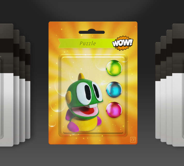
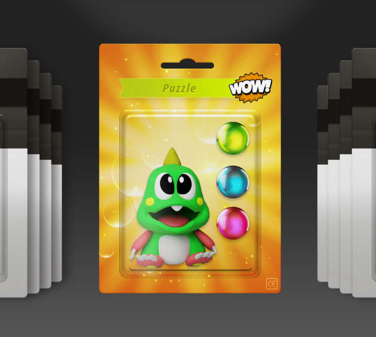
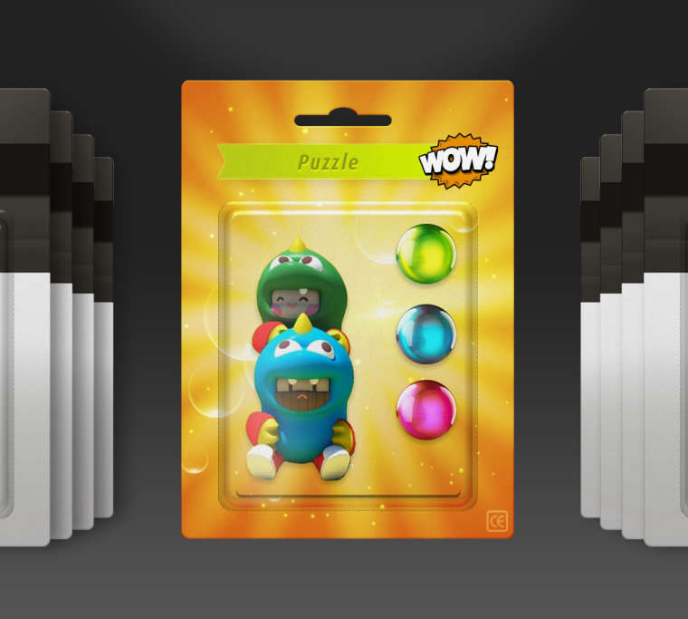
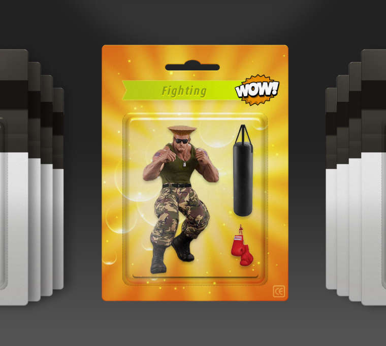
I have the opposite problem with fighting genre, I don't know which I prefer... :D
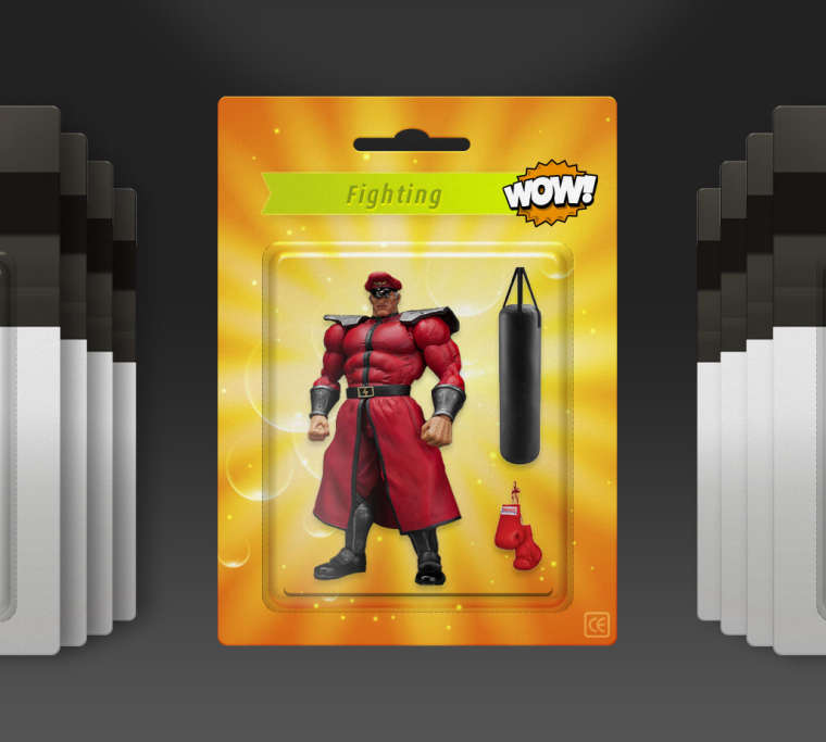
-
Hey,
I think they are all great - but I don't know which I prefer!
Possibly the Bison one for Fighting, and maybe the one with both players for Puzzle if I had to pick?!
Cheers
-
@movisman Thanks :)
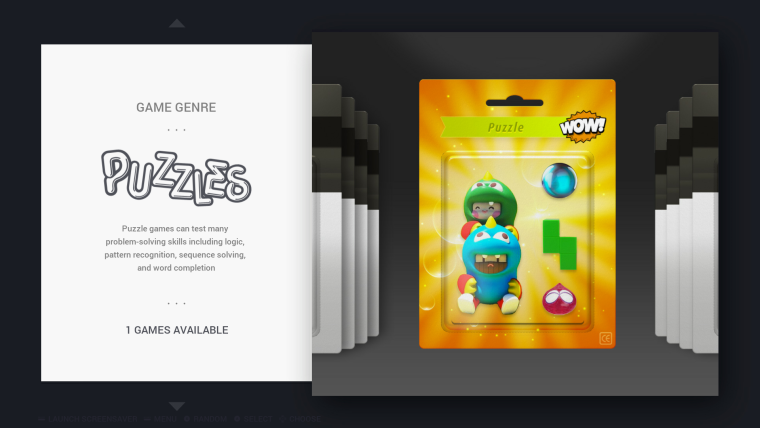
I also prefer Bison for fighting.For Bubble Bobble, I really like the two costumes, I think they're SUPER CUTE <3 but they don't really match the "blister", they look much too "deep" and it makes them look out of place.
The second one is a bit off-color, but looking at it again I think it's not so bad after all. I think I can work with it to make it match the "real" colors.
-
@cosmo0 i honestly think it should be Ryu, if picking a fighter from the SF franchise. My .02¢
-
@celly I like the idea of picking a less-obvious character :)
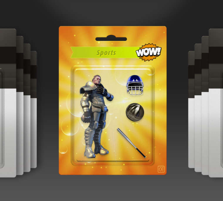
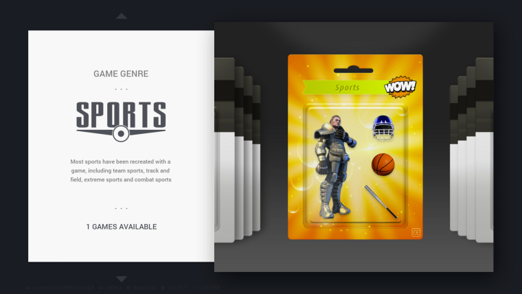
I'm also having trouble deciding between characters in sports... I have finally found 3D models for Speedball, I will remake the logo :)
The first is front-facing, but it's a robot :(
The second is better-looking, but is not front-facing like in the other genres.
There is no other front-facing Speedball 3D model :/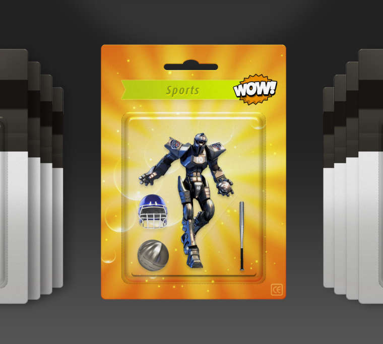
-
Maybe @chicuelo or somebody else, should make another repo with alternative versions, so if a user wants something different, it can be replaced.
I mean all the different versions could be included in the theme repo, but personally I don't like it when stuff gets bloated with unnecessary files.
If someone makes such a repo, it would also be good if the templates are provided as well. -
-
Yeah, I also liked the second puzzle one too. They are all good but I see what you mean on the costume one. If you decide on the second one and change the colours about a bit, dunno if it is worth reducing the size of the creature slightly as it looks a tiny bit large atm inside the blister?
Regarding the sports one, both of those are really nice. And very pleased you chose Speedball! :) obviously a human is more suitable than the robot, but of course the robot is face on. I wonder, does it matter too much that the human character is half side-on? Some of the others are not totally front facing, some are slightly turned (albeit not as much)?
Cheers
-
@cosmo0 @movisman @EctoOne
Hi Guys! Im back, great work! here are my thoughts. For the puzzle series I would use the last without a doubt, but adding another ball, they are very big, I think reducing 40/50% the size and adding another will result much better!
For fighting I do prefer bison, but the gloves a bit bigger and maybe replacing the bag with a speedball? if there is too much blank space you could add a mouthguard (I have some png objects from an old work I´ve done so if you need I can provide them). My suggestion for sports: Maybe because I am from South America, but I don't get too much sports, I love the helmet, but the iron ball, the bat and the character I don't know if they represents the activity, I though about something more like this. Tell me what do you think, its just an idea to communicate sports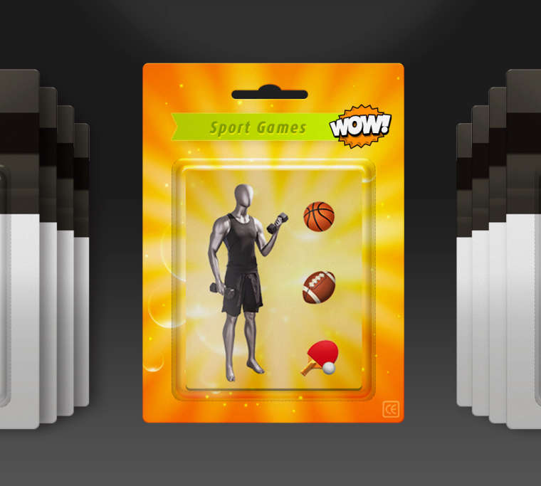
About making alternative versions. I prefer having only an oficial version, so the quality of the theme remains, otherwise I think it will start changing. I made a theme for Hyperspin and I saw a lot of bad handled variants.
-
@movisman @cosmo0 @EctoOne
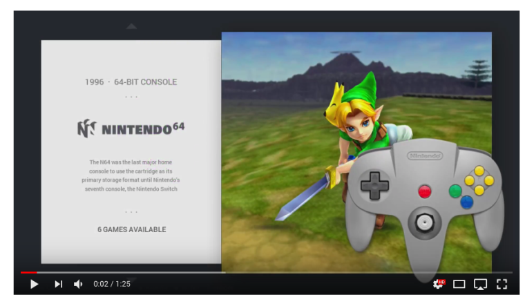
Guys, I was watching some user with the theme and I note they have some issues with the artwork, for example a N64 theme were the controller was VERY big, do you see all of your systems properly? I can't test all of them because I have only a Pi and not a pc.
Thanks!Youtube capture, Controller is huge
-
@chicuelo
I have a few things to fix still but I think I'm almost done. I have noted what you said and will edit the images accordingly.About the huge controllers : I also found that a few controllers were a bit too large. The controllers height is not always the same : most controllers are about 250 to 300px high, but for instance N64 is almost 400px high.
It's not a problem for "vertical" controllers (GB, GBC, Atari 5200...) but for others (N64, PSX...) it can look weird.I suspect the problem is amplified if you use a small resolution (720p or below) but I haven't tested.
In the theme the controller size is not set, so I imagine it's as large as possible
<image name="controller" extra="true"> <path>./_assets/controllers/${system.theme}.png</path> <tile>false</tile> <origin>1 1</origin> <pos>0.98 0.98</pos> </image> -
@cosmo0
yes, at first there was a max height, but the gameboy controllers look very tiny so I removed. I test the theme on a 7" pi screen and it looks fine, also on a 1440x900 px screen and with an RCA cable on a small crt tv and it looks fine too. I dont know that the issue could be -
Hi,
When I made some tweaks previously to the sizes and positioning in the gamelist view, plus the video fix - the controller wasn't an area which I touched, as on my system it looked fine so didn't see any need for adjustment.
However, looking at it, I would say there needs to be a "max" size configured, because then in smaller resolutions it should scale according to the maximum percentage value which has been set and not go beyond it. If the image is bigger than the max size set, it should scale both axis until one of the maximum values has been met. However if the image is smaller than the max size set, it will scale up which might look a bit rubbish. I think that's how it works but am not certain.
I am out this evening, but I can try to take a look when I get back later or tomorrow. However if you had a maxSize set before, it would seem strange that the gameboy controllers looked so small. You should be able to set a max size on both axes and in theory the image should not scale beyond those whilst keeping it's aspect ratio. I can have a play around with it.
At the moment, with no maximum size set, I guess the theme will always try to show the image 1:1 irrespective of resolution, which in the N64's case, ends up being a pretty big image on a 720p screen. I think this is the problem.
-
@movisman
I think that's the problem, but what happens in smaller resolutions? I test the theme on smaller screens and always seems fine -
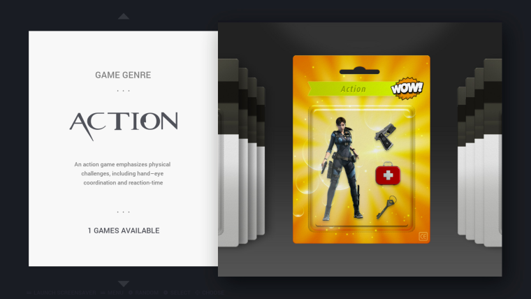
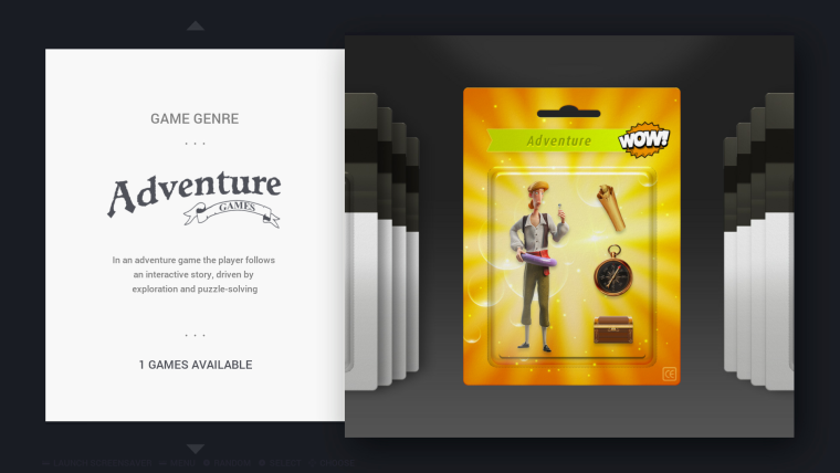
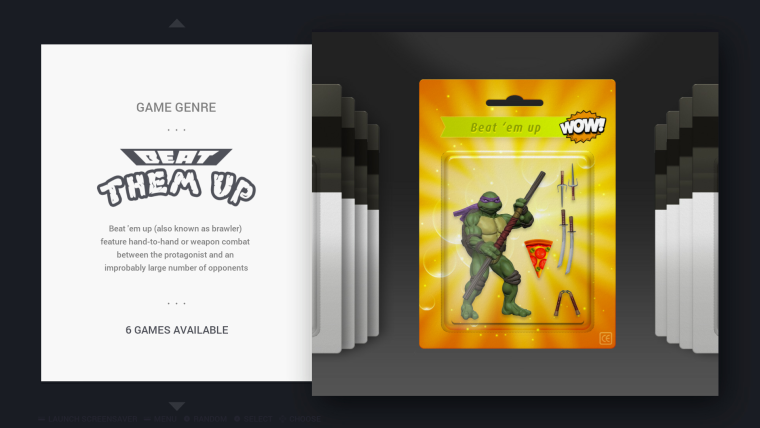
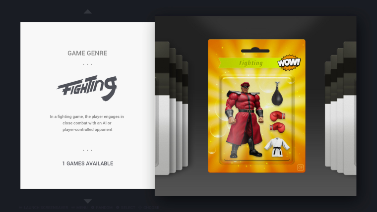
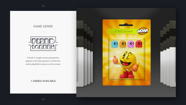
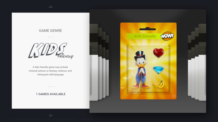
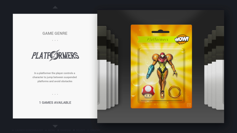
I am finally done!
It took way more time than I anticipated, so I will leave it at that, and provide the sources for anyone wanting to make modifications : https://we.tl/heSmZbuZ6oI have created a pull request: https://github.com/chicueloarcade/es-theme-Chicuelo/pull/12
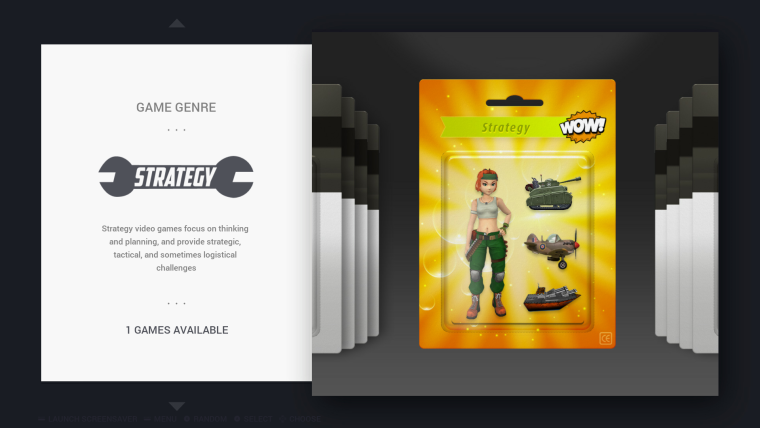
What can be "easily" improved:
- Beat'em up: write the whole "beat'em up" in "turtle" font (but what do you write above ?)
- fighting: switch the "N" to uppercase
- fixed screen: not sure about the lines around, I wanted a throwback to Pac-Man mazes, but I think it could look better
- kids: not sure about the bananas (it's for Donkey Kong Country). There was a money bag, but coin + diamond + money bag was very capitalistic :D I tried an apple (for Mickey Castle of Illusion) but with the red heart it didn't work.
- platformers: the ring (for Sonic) looks a little bit weird, some rings look better but they're not up-front
- puzzle: the costumed couple do look better. Not sure about the puzzle pieces; finding a 3D Tetris piece is surprisingly hard! I may not be hard to create but I don't have 3D software.
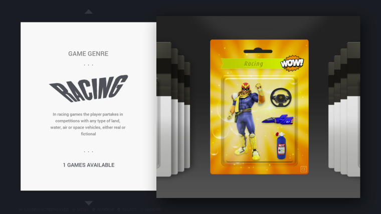
- racing: the NOS tank is a little weird-looking (it's a pillow...), but it's either that or a very-realistic-looking one
I think the rest is fine, they can be improved but I quite like them.
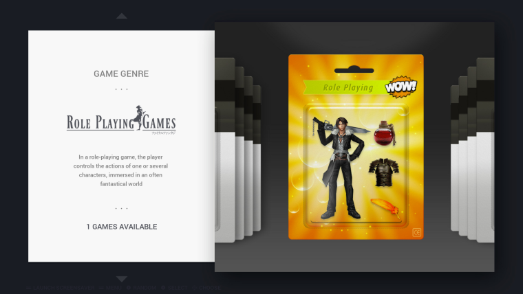
-
@cosmo0
I love them!
The bananas are the only item that is bothering me because I notice they are a photograph, everything else is great!
If you want we can merge the PR and then I can help to adjust some little items if you want.
Great work! -
@chicuelo Well it's your theme :) I won't mind even if you change most things, you have a better eye than me anyway. I'm just glad I could help :)
I provided the sources (including the PSD, fonts, source images, etc) at the top of the post.I wanted to do "game series" (Mario, Sonic, Megaman, Batman, Star Wars, Disney, Castlevania, Zelda, Final Fantasy and Dragon Quest) but I don't have the courage anymore :D
-
@cosmo0
I really love what you do so I dont want to change too much, so I only suggest some minor adjustments, Ill take a look to those files and I send the updates back! -
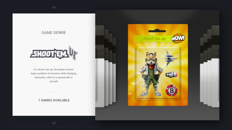
Wow! These are really fantastic. Great work. I'm very impressed with the work you've put in to create these. I do think the 'beat them up' should perhaps be 'beat 'em up' to match the blister packaging, like 'shoot 'em up' is already. But that is personal preference.
I am having a quick look at the max size now for the controller images, and it is a bit of a pain. Just thinking of the best solution, but certainly when I reduce my PC monitor to 720p the controllers are huge, so a max size of some description definitely needs to be implemented, or possibly reducing the size of the images themselves - need to have a think.
@chicuelo - when you have some time to make more character images, I found a ZX Spectrum system which is a good image - perhaps you could work your magic to use this when you get round to making a character background for the system. I think as @cosmo0 mentioned, Dizzy is an iconic character for the Spectrum so a good choice - or my personal favourite game Head Over Heels (which was one of the highly regarded Speccy games).
Also there is that 'correct' Amiga system image I posted a few days ago which could do with being updated.
Contributions to the project are always appreciated, so if you would like to support us with a donation you can do so here.
Hosting provided by Mythic-Beasts. See the Hosting Information page for more information.