Chicuelo Theme
-
-
@chicuelo Thanks!
-
@cosmo0 So far just the platforms I use. I do have more than what is pictured. I could take request for systems not covered already.
-
Thank you for this theme! so simple, super clean and I've had loads of fun modding it :D
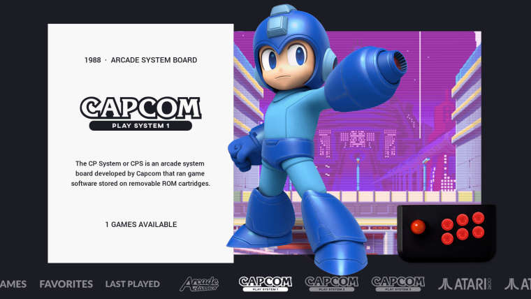
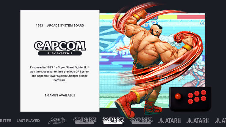
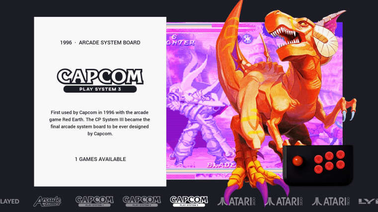
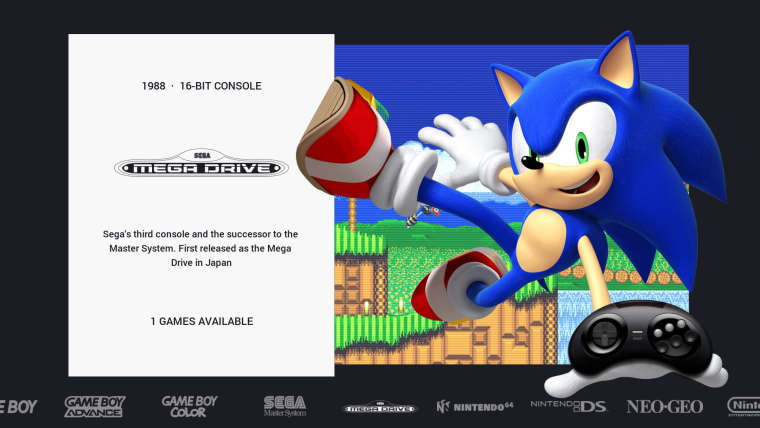
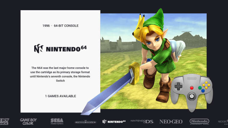
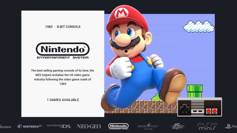
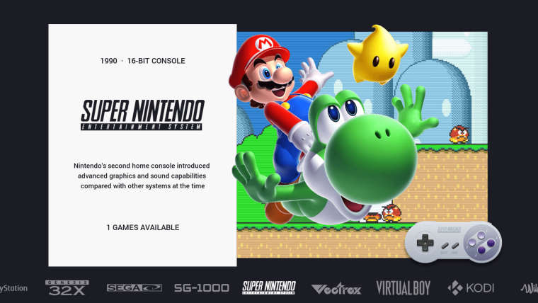
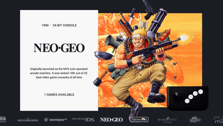
I've also included custom collections for hacked rom's and arcade games with realistic overlays.
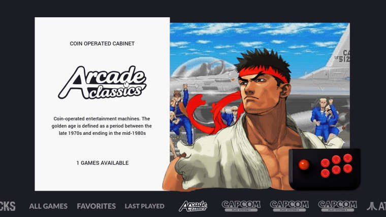
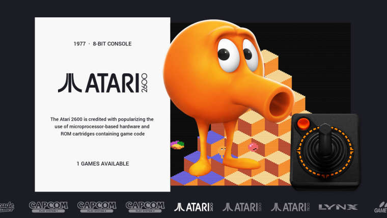
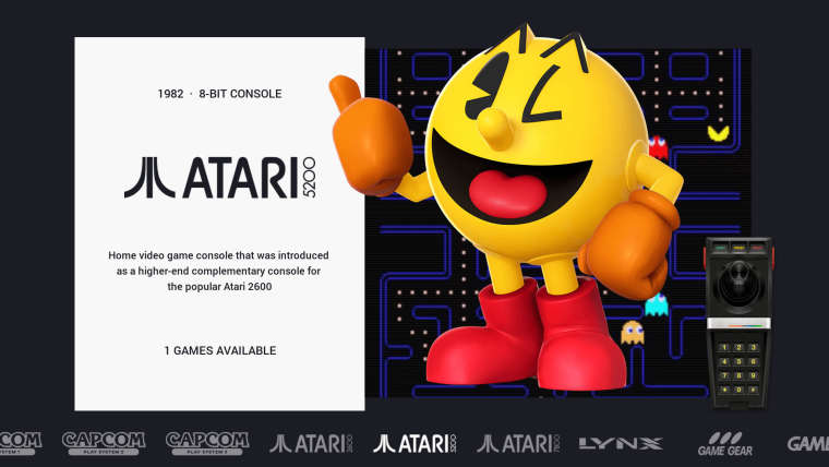
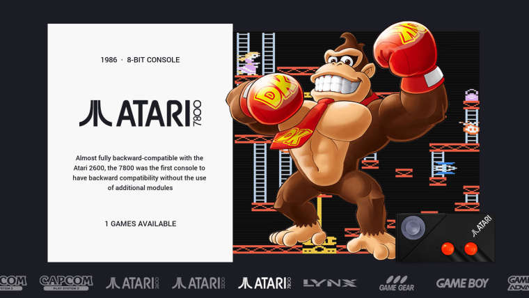
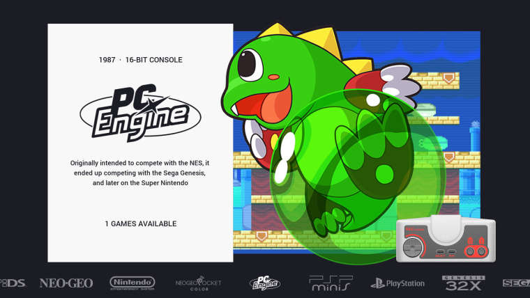
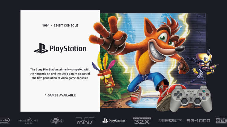
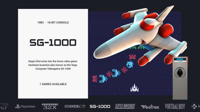
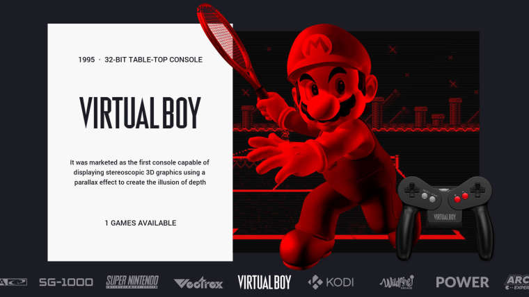
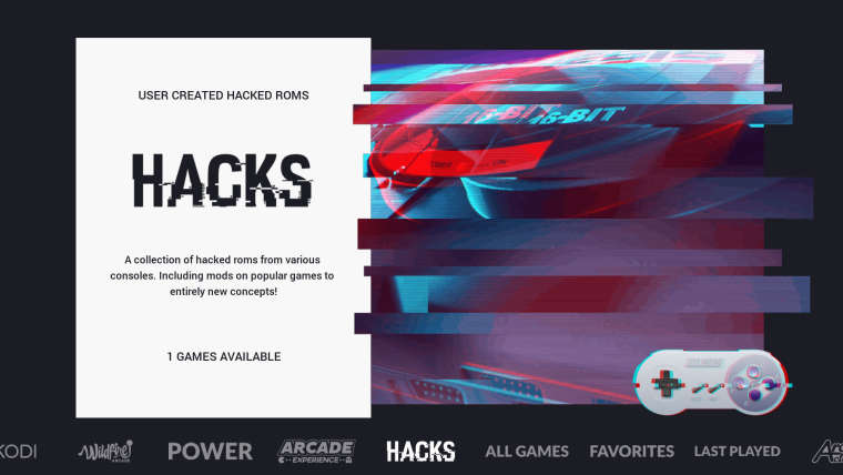
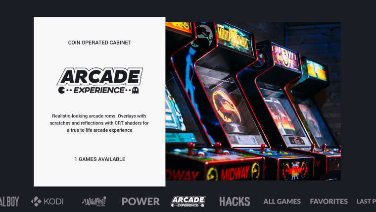
-
@wildfire wow these are fantastic, great work!
-
@wildfire could you share with us?
-
@Wildfire Love it!
I love how this theme is moddable thanks to its clean look and simplicity :)
-
Well done guys! its good to see your versions too!
-
Great job Wildfire, any chance to share your mod? I'm working too with Chicuelo theme, is great, but cannot set horizontal systems.
-
That. Is. One. Awesome. Theme.
So, I only have one question: can I edit it for my personal RetroPie? I would only use it on my own Pi
-
@retroduck
Yes you can, as long as you don't make any profit of it and give the credits go ahead! -
@wildfire And, man, I'm sure that just like me, several colleagues have been dreaming about adding these images since you posted them :)
-
@chicuelo said in Chicuelo Theme:
@sheyk90
Hey! Im going to see if I could take the theme to the recalbox platformI'm actually not sure if it could be recreated for recallbox. The easy but tedious stuff would be to edit all system/theme.xml files and add the path for all three images (thus would get rid of the variables used by the emulationstation version that retropie uses.
But then there is the carousel, I don't know if recallbox allows it to be themed. If not you will always have that big white carousel across the whole screen, covering the character images. The active system would be always be in the middle, not on the left side etc. -
@wildfire Awesome, can you Upload your modified Theme?
-
What are the legalities of using the OpenEmu controller art assets in this theme? I see a couple of controllers that I created in this theme and I know for a fact that I did not give consent for them to be used in other applications without my knowledge.
-
@qrayg Congratulations! Congratulations! You did a great job!
A great artist. -
@chicuelo: Are you planning to add a "detailed view" for this awesome theme?
Something like this quick mockup:
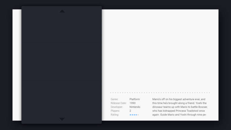
-
@jesseblue said in Chicuelo Theme:
@chicuelo: Are you planning to add a "detailed view" for this awesome theme?
Something like this quick mockup:

JesseBlue I was able to change the setting to display the long description, but not being practical to xml and linux edit I can not set as the example you showed, so with the date/platform/etc. I can share the xml file if the author agrees, but it would actually be better if he provided the detailed viewer himself!
-
@jesseblue I just made some adjustments. Paste the following code before the last
</theme>tag in the theme.xml in the theme folder (not in one of the subfolder files).<view name="detailed"> <image name="logo2" extra="true"> <origin>0 0</origin> <pos>1 1</pos> </image> <text name="longdescription" extra="true"> <origin>0 0</origin> <pos>1 1</pos> </text> <text name="md_lbl_genre, md_genre, md_lbl_releasedate, md_lbl_developer, md_developer, md_lbl_players, md_players, md_lbl_rating"> <fontPath>./_assets/Roboto-Medium.ttf</fontPath> <forceUppercase>0</forceUppercase> <fontSize>0.02</fontSize> <color>818181</color> <alignment>left</alignment> </text> <text name="md_lbl_genre"> <origin>0.5 0.5</origin> <pos>0.56 0.761</pos> <size>0.16 0.16</size> </text> <text name="md_genre"> <origin>0.5 0.5</origin> <pos>0.62 0.761</pos> <size>0.16 0.16</size> </text> <text name="md_lbl_releasedate"> <origin>0.5 0.5</origin> <pos>0.56 0.791</pos> <size>0.16 0.16</size> </text> <datetime name="md_releasedate"> <fontPath>./_assets/Roboto-Medium.ttf</fontPath> <fontSize>0.02</fontSize> <color>818181</color> <pos>0.54 0.711</pos> <size>0.16 0.16</size> </datetime> <text name="md_lbl_developer"> <origin>0.5 0.5</origin> <pos>0.56 0.821</pos> <size>0.16 0.16</size> </text> <text name="md_developer"> <origin>0.5 0.5</origin> <pos>0.62 0.821</pos> <size>0.16 0.16</size> </text> <text name="md_lbl_players"> <origin>0.5 0.5</origin> <pos>0.56 0.851</pos> <size>0.16 0.16</size> </text> <text name="md_players"> <origin>0.5 0.5</origin> <pos>0.62 0.851</pos> <size>0.16 0.16</size> </text> <text name="md_lbl_rating"> <origin>0.5 0.5</origin> <pos>0.56 0.881</pos> <size>0.16 0.16</size> </text> <rating name="md_rating"> <origin>0.5 0.5</origin> <pos>0.62 0.881</pos> <size>0.16 0.02</size> <color>818181</color> </rating> <text name="md_description"> <fontPath>./_assets/Roboto-Medium.ttf</fontPath> <forceUppercase>0</forceUppercase> <fontSize>0.02</fontSize> <color>818181</color> <origin>0.5 0.5</origin> <pos>0.789 0.821</pos> <size>0.25 0.16</size> </text> </view>If you want to use the same for video view, change
<view name="detailed">to<view name="detailed, video">Only thing i noticed while coding is that long genres/developers might overlap with the description text. But I only tested it with a small resolution so it might be fine.
Edit: See fixed code here
-
@jesseblue Sorry but no :(
I think that info it's not so relevant. The game preview will define your interest on the game so I give more space to that area!
Contributions to the project are always appreciated, so if you would like to support us with a donation you can do so here.
Hosting provided by Mythic-Beasts. See the Hosting Information page for more information.
