Chicuelo Theme
-
@mikeydoom said in Chicuelo Theme:
I tried to instal lthis theme a few weeks ago but it was broken.
The theme was pulled off from Github and it's not installable from the RetroPie themes module.
-
Sooooo how do I install it?
-
@mikeydoom You don't - as I said, the theme is not available, as the author wished.
-
It is really beyond disgusting what these greedy a******s did by taking Chicuelo's theme and trying to sell it off as their own creation.
I followed the thread from the beginning and one thing that truly amazed me was the hard work and dedication both by @chicuelo as well as all the other community members who contributed to the theme. Such work shows off the best aspects of open sourcing, but it only takes a few bad ones to spoil the whole deal for everyone.
Having said that, I had an earlier version of Chicuelo's theme which I decided to rework to match the original Commodore 64 OS colours, as well as changing the system artwork etc. Would it be ok with Chicuelo to provide a link to the theme / or open a new thread for it?
I also made another remix, this time keeping the original colours but adding new system screens as well as some other minor enhancements, but if Chicuelo wants to keep it offline I totally understand and respect the decision.
Cheers,
Nick -
@nil06 Thanks for your kind words Nick, Im still working on the theme, refining graphics and updating some artwork but I would not share It again. Its a pity as a designer it's harmful when you work on a project, share for free and then you get some "pro builders" selling it.
-
@chicuelo Only checked your reply today. That's a shame. I was really looking forward to use your theme in my new arcade.
-
-
@chicuelo Can't wait to try out that dark theme. And thanks for changing your mind on releasing it.
-
@chicuelo Any one who wants the theme must send a carrier pigeon with a USB drive attached, the theme will be put on the drive and the pigeon will be sent back.
Or some kind of watermark on the theme backgrounds. like "Chicuelo - 2020" at the bottom. Noticeable, but not obtrusive.
-
@lilbud I live in Argentina, if you send here an usb drive you will never see it again. Neither I :D
Watermarks are easy to remove. I will find a way, maybe a template theme where you have to place or create your artwork in order to use it -
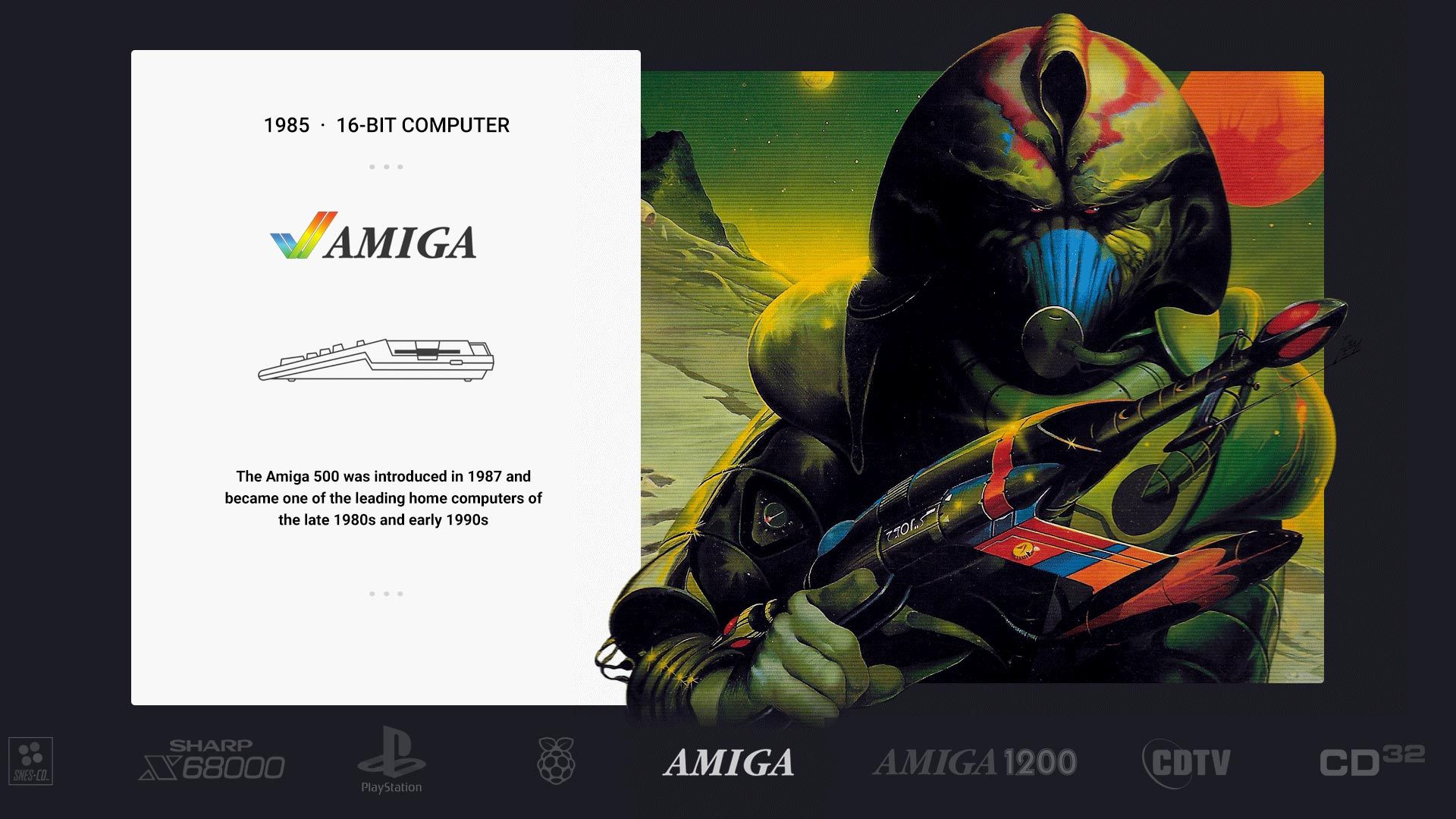
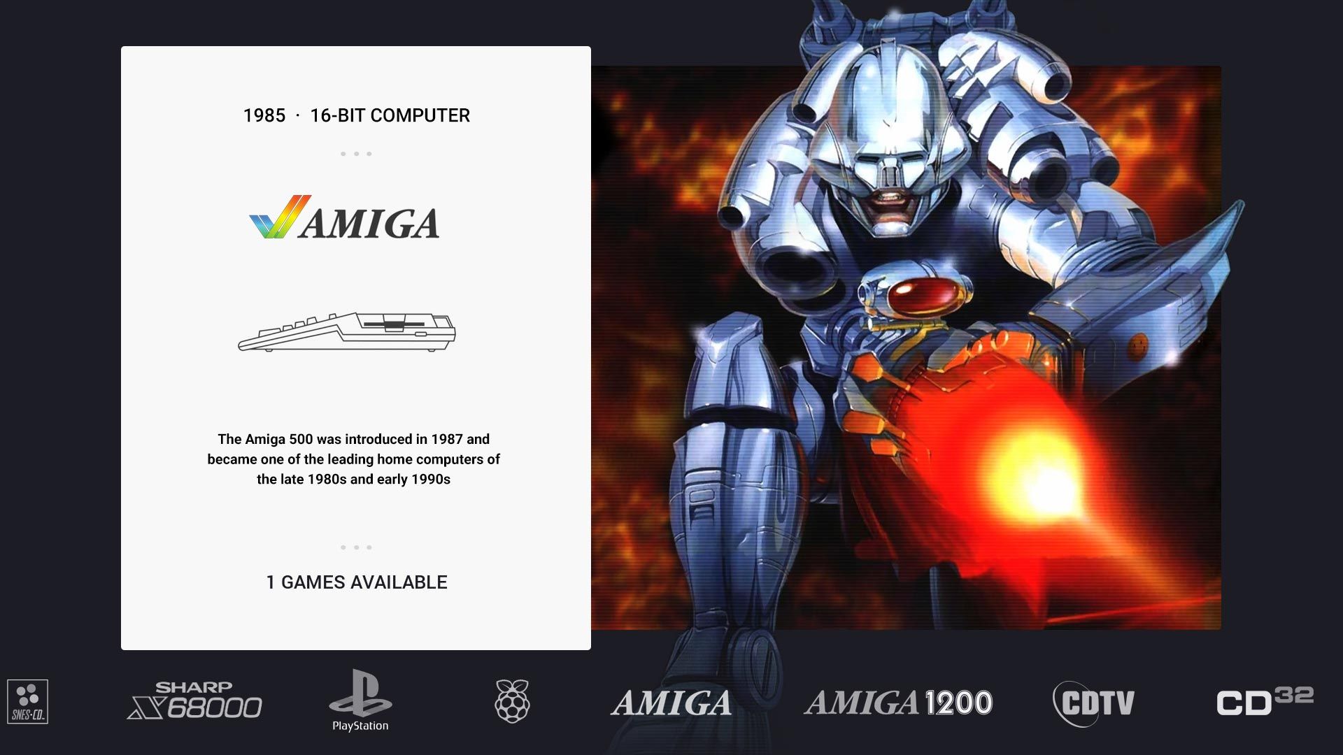
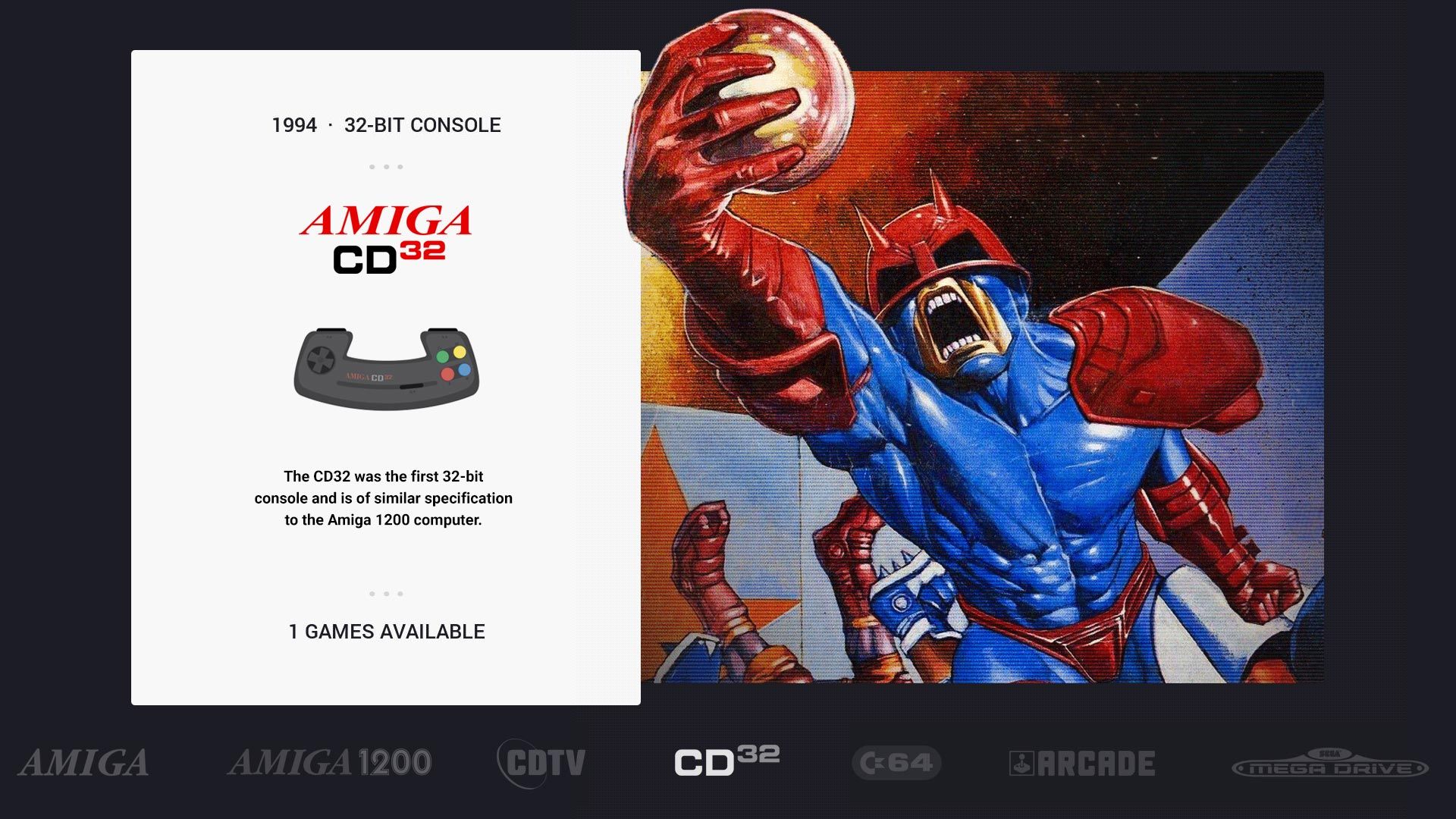
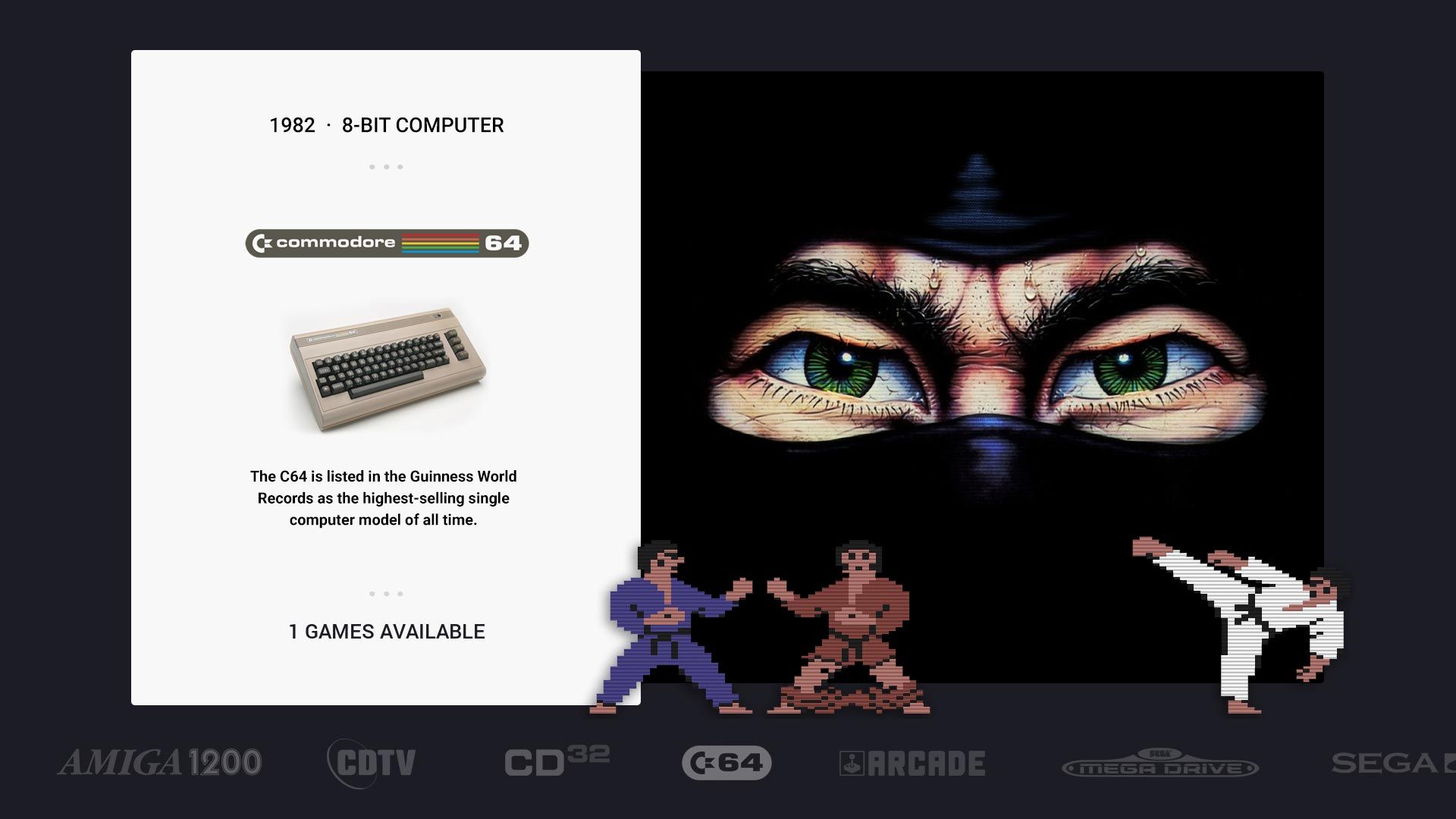
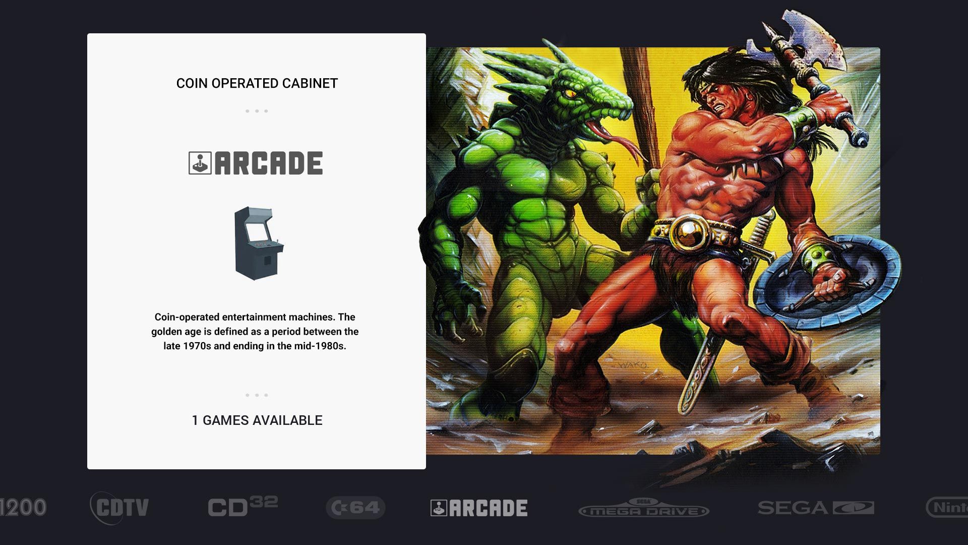
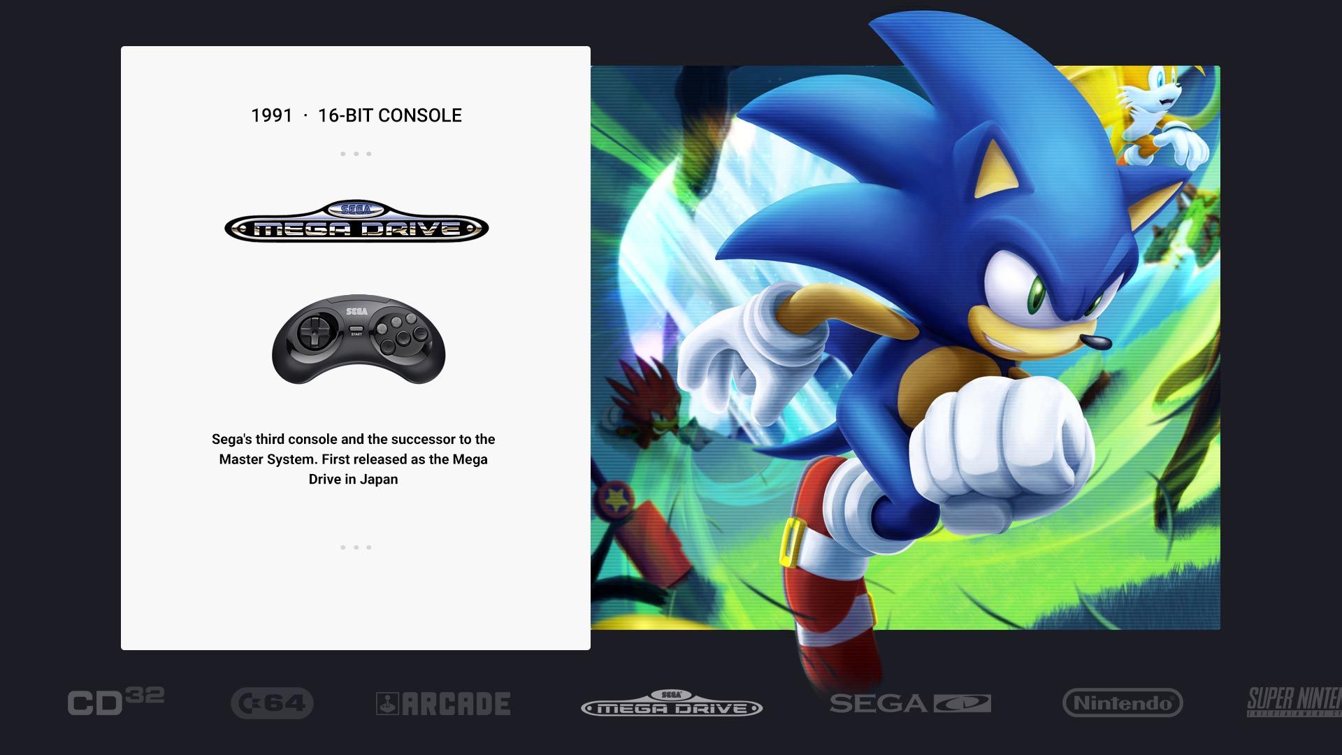
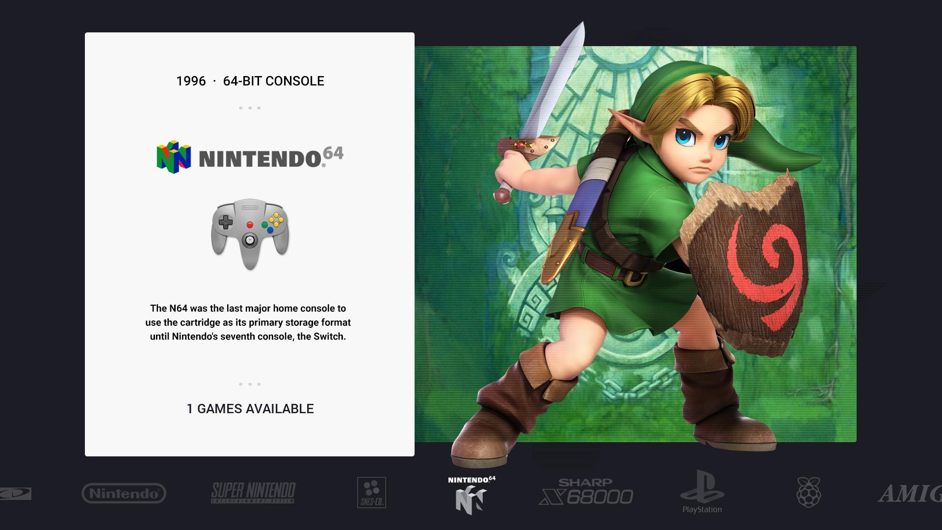
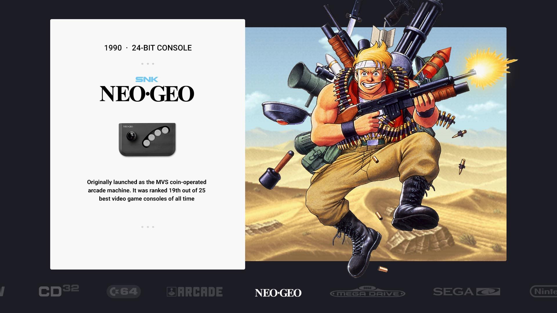
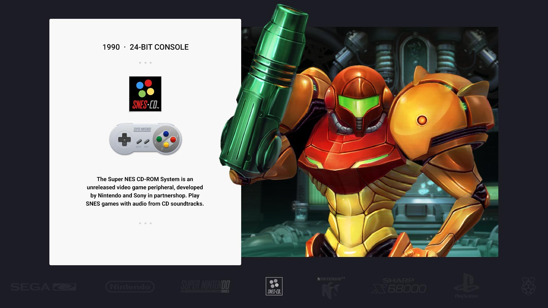
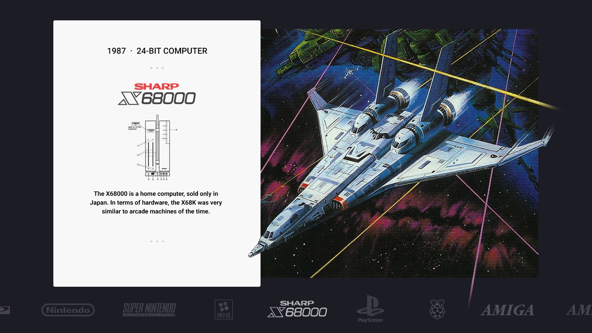
Hi all! I know this theme is now archived / historic, but I wanted to share my experiments! @chicuelo , is it still okay to be playful with this theme and share personal mods here like this? If you'd prefer not, I'll pull it! This has always been a long running project modding one of my favourite ES Themes, taking inspiration from @Wildfire and @PittStone forks with their modifications to create a version with a system menu carousel at the bottom and large image popping out of the frame on the right.
DISCLAIMERS!
I read about what happened with this theme and was very saddened to hear that. I started this work on an installed version I had a long time ago. If it's preferred that the code remains unshared, I totally respect that decision and post only mockup art here for inspiration / ideas. I see that @Frakatchoo shared his great looking mod here (thanks!) recently and hope I too can post a link to the WIP? Funnily enough I'm using a very similar modified Gameslist too!
-
Art is used from many online sources; fan art, forums etc. Some box art is scanned hi-res from my own games library where it was hard to find.
-
These are mockups in photoshop, but I do have it working.
-
Work in progress test. Works well with around 12-15 systems.
-
I've tried many combos of PNGs, JPEGS, transparency on/off on overlays, full page bgs, VRAM settings and have hit a wall re. performance if loading more that 15 systems + collections. I'd love to share and work with others to complete a stable version that works well with 20-30 themes and collections, but as said I won't share the WIP version if this theme is now, sadly, retired.
-
The systems here are those I play the most, many are missing but I got this far.
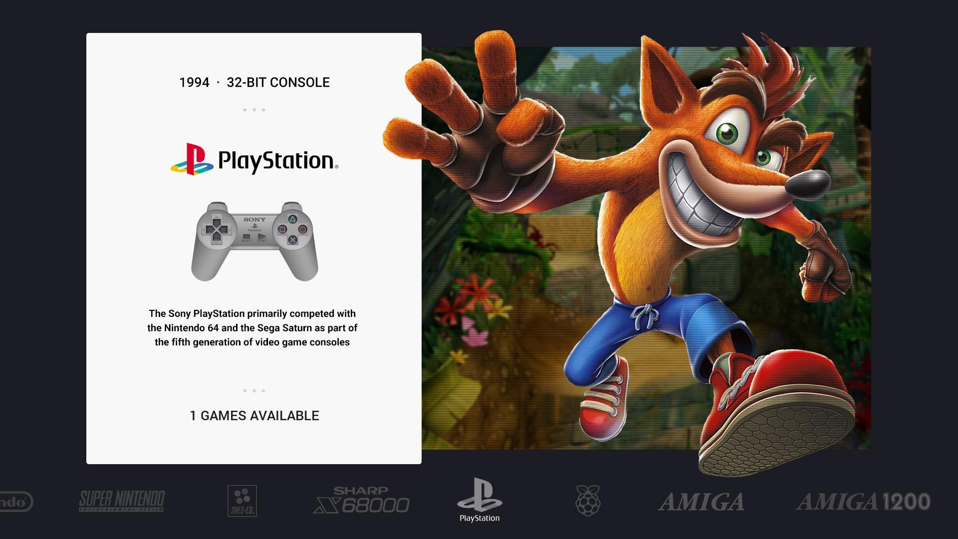
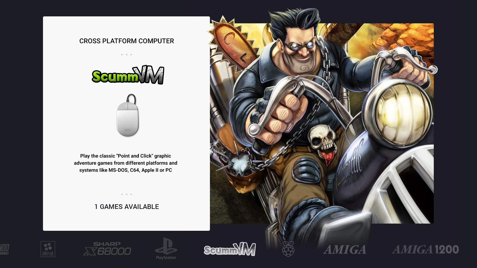
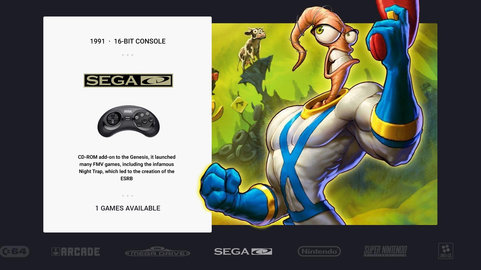
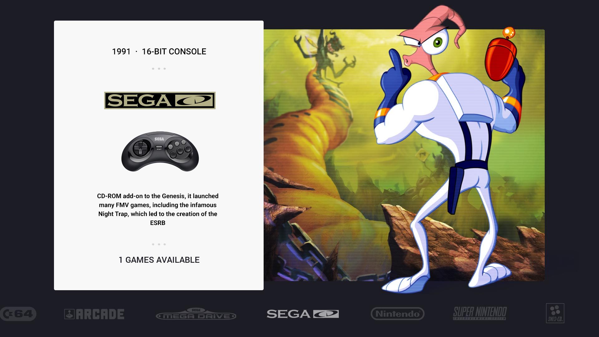
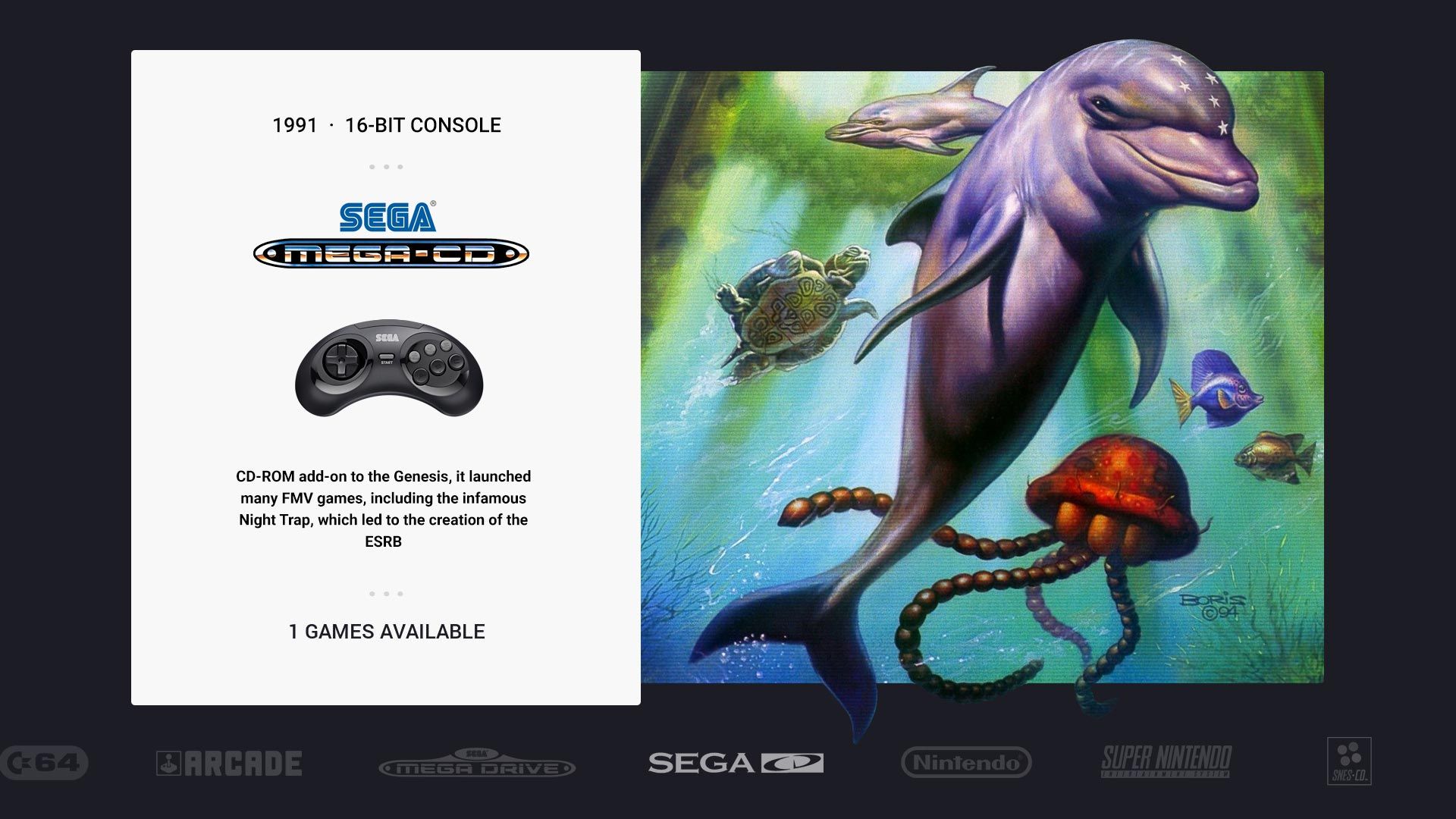
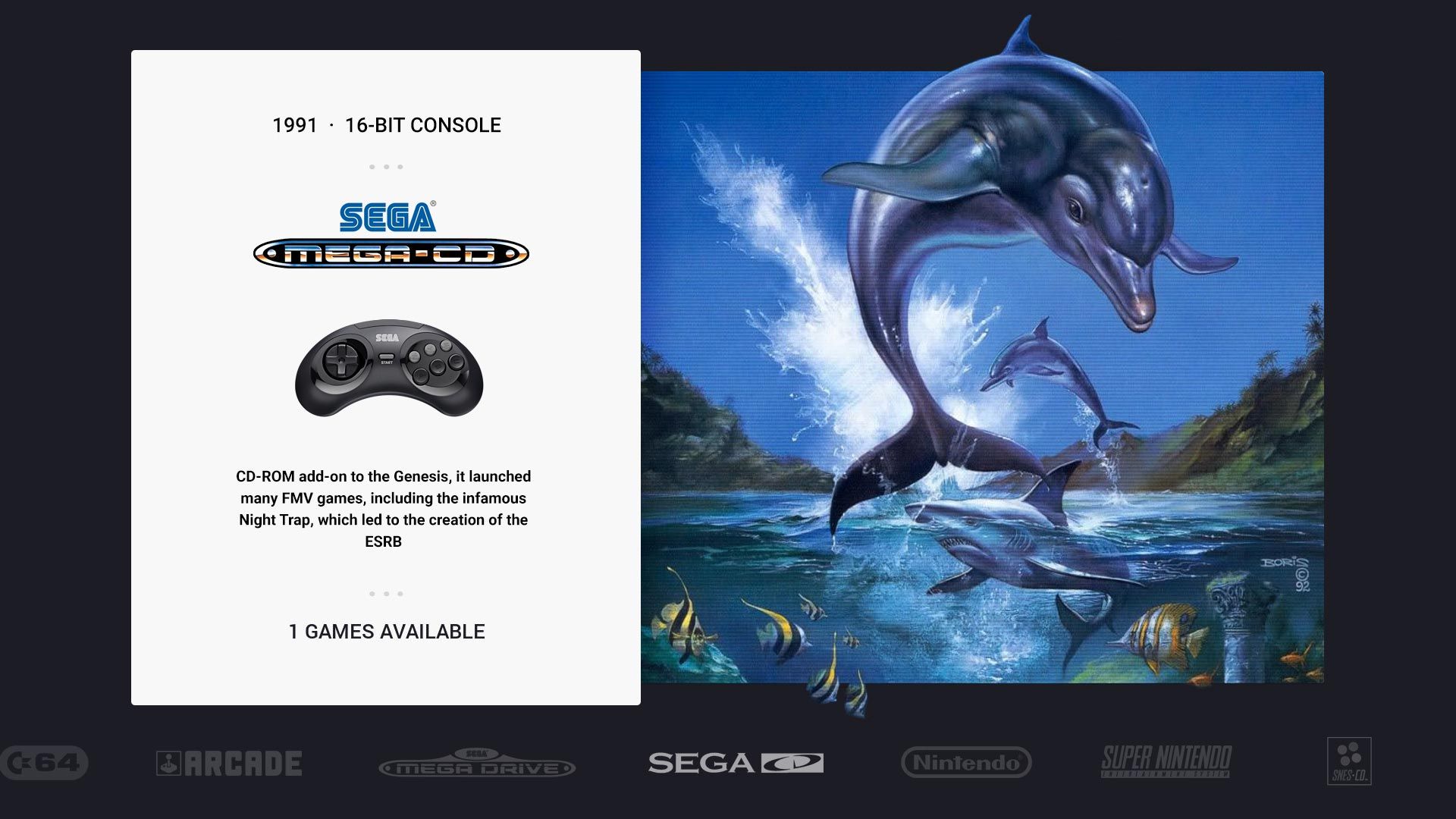
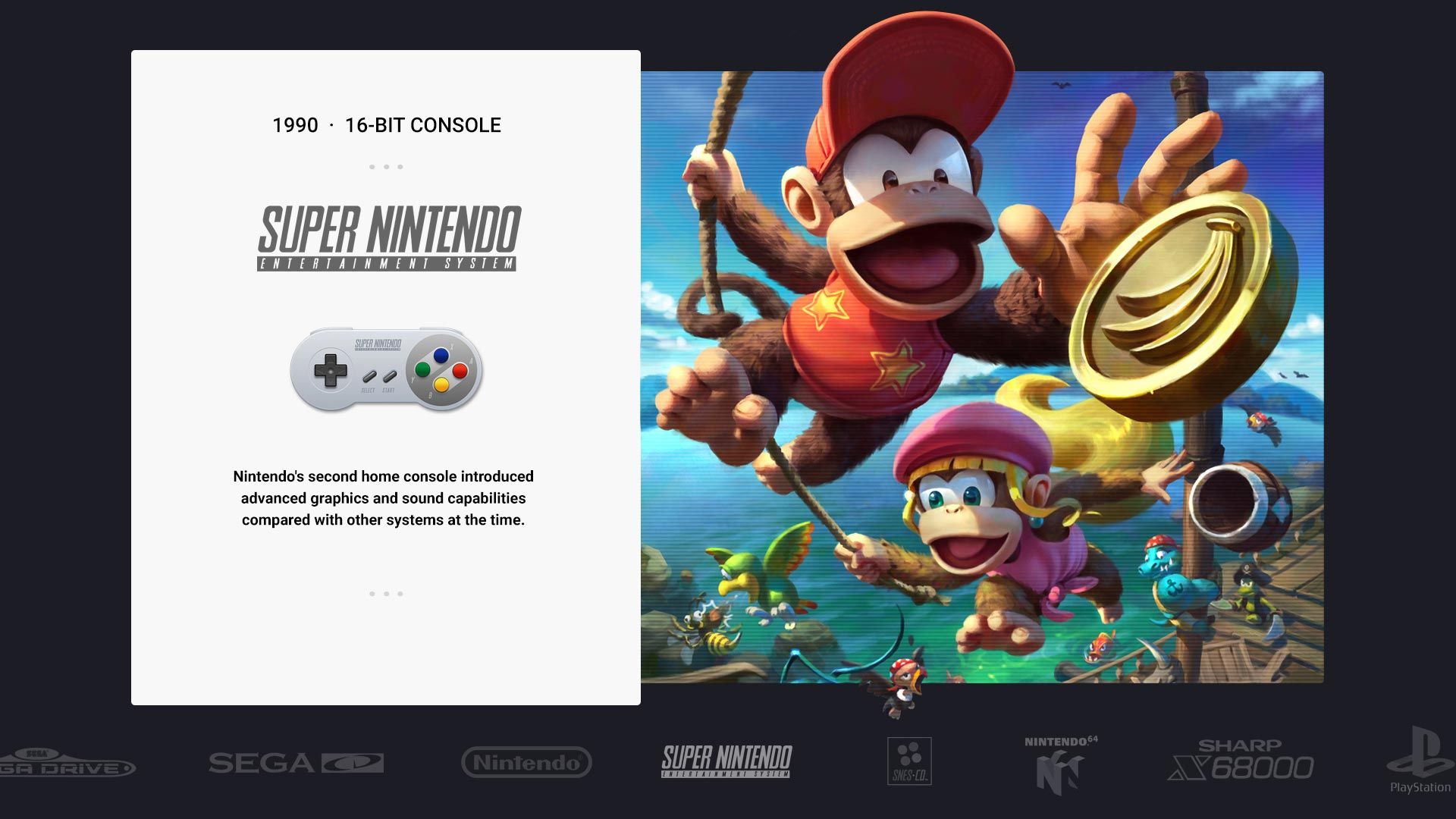
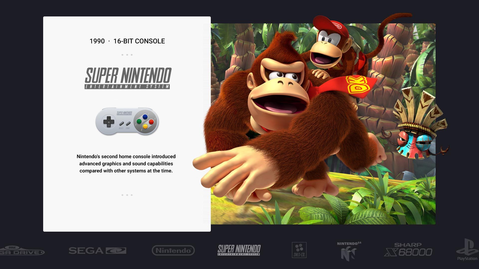
-
-
@Jimiga Nice approach, I think you will struggle with the performance of Es with those big png files, but the overal looks great
-
@chicuelo Thanks! Yes I've definitely found that the combination of the large images and the scrolling carousel menu causes issues with >15 systems. I don't think any optimization really gets around this, as far as I know! I'm curious to learn the best approach though!
I know the original theme had PNG backcground art, PNG overlays with the controllers and the SVGs from the menus showing in the info section on the left panel.
I'm using a similar approach currently with PNG's for the main art (no transparency, they include a crop section from the left panel), then PNGs for the system title / controller.
I'm thinking if I ditch that in favour of a simple SVG shared with the menu, this might help, though I might just be finding the limits of the little Pi3B+ and have to postpone using this fully until Pi4 is more fully supported.
Thanks for all the original work! Love this theme, and your latest work on the dark theme!
-
@Jimiga Love the art selection, you can try using tinypng (an online png compressor) for cutting down on png size and for faster processing. I had good results with it in attract-mode.
-
@rand0m I think the problem is not the size of the file (kb) but the file size (px)
-
@chicuelo I think you might be right as I tried using TinyPNG to cut down the sizes for short test I did @rand0m , and it didn't appear to make any difference.
I've found it can be a little counter-intuitive in that respect, like larger PNGs load better than much smaller jpeg files - I'm not sure quite why as I'm no back end expert, just experimenting through trial and error. I assume that's something to do with file loading / handling being easier on the system with PNGs.Thanks for your input! I'll continue to play with the theme and share my files shortly now that I know it's okay to do so!
-
-
If I'm correct, there was never an official fork, just artwork posted here for inspiration you can find here in this thread. I loved the carousel menu idea and the art popping out of the frame, so I build on those influences and ideas.
-
Hey @Jimiga, those screenshots look awesome! really like the Donkey Kong & Earthworm Jim system views. I encountered the same problem mentioned above regarding PNG size, even when passed through tinyPNG the file sizes were hard to manage on the rpi3 and I'd often get white boxes where the PNG should be.
To get mine working well I had to create a "fast" version of the theme where I would combine the background, text box and artwork into a fullscreen 1920 x 1080 image. Not the best option for flexibility but its much faster in emulation station.
To make things a little easier I created smart objects in photoshop of the textbox and background, then set up each system view as an artboard, this allows you to export all system backgrounds using the "Export As" feature.
Unfortunately, this does remove the sharp vector edges you'd get on the text box but I'd rather have a fuzzy edge on a theme that runs smooth.
-
@Wildfire Thanks for your reply - the screenshots you shared here got me going with all this!
Yes it's definitely a tricky one to balance, I have some friends in the community working on Pi4 builds now and as I understand it, the new Pi should be able to cope with this just fine :)
I tried playing with the VRAM - too much ends up with white boxes (from what I've read it's something to do with the buffer not unloading well), and too little results in no image loading or the images flashing on/off.
Full PNG backgrounds I've never tried! I was going to attempt that route though. Thanks for your input, it's helpful to learn and understand how ES works best with files in themes.
@chicuelo I've seen Epic Noir in action, looks amazing! Great work on that theme.
Contributions to the project are always appreciated, so if you would like to support us with a donation you can do so here.
Hosting provided by Mythic-Beasts. See the Hosting Information page for more information.