mame2003-plus: hundreds of new games, improved input, features, new bugs - now with runahead support
-
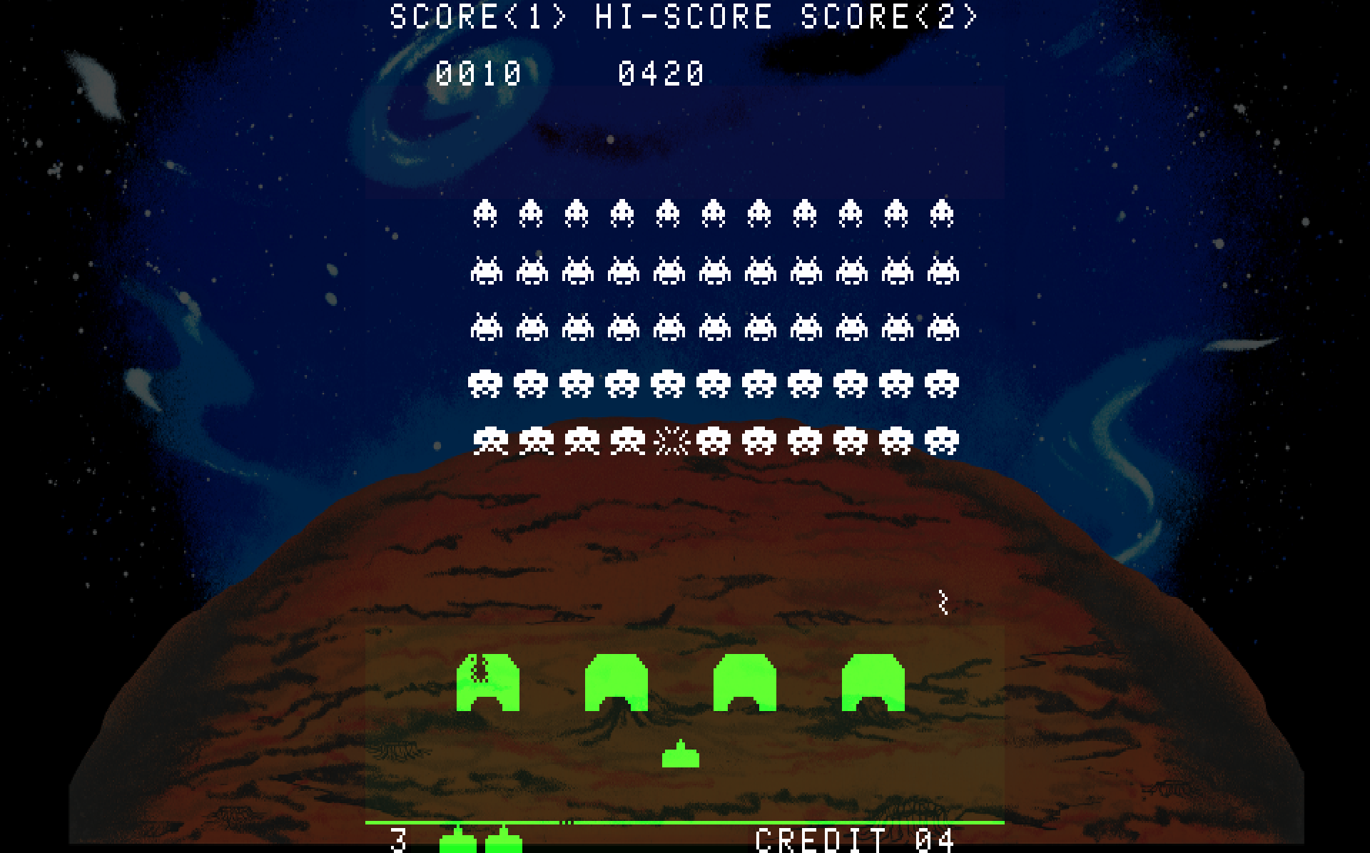
I did update from source and added alpha=0.3 and it did make the shields and ship solid but it has a side effect. If you look at the pic closely it has a light green box around the shields and ship.
@UDb23 - I think once a position has been calculated for a specific backdrop size and game size it will be reusable. So
Backdrop:1920x1080Game:896x1080Position:0,-0.57142,1,1.57142 is done. I think several will be identical once 3:4 and 4:3 games are calculated. Space Invaders is a "weird" resolution 0.83:1.
-
thats not a side effect its the film that on the arcade screen if you look at the video posted above in a the real you will notice this shows kinda like this as well it kinda authentic
-
that green box is visible with no artwork added check for yourself
-
Ok, sounds good, if it's in the original then I guess it's good.
-
@grant2258 Sorry to say but I don’t think that the polyester stripe should be visible. Screen had tinted stripes but you would not notice them. I played that game a lot as a kid and remember well. Also I never noticed that stripe in any previous mame implementation. If you check the screenshot of the video I posted previously you can see green but no stripe.
Here’s another video of the cab and I can’t see the stripes.
-
there is more than one video of the game if go in really close you can se ethe contrast and shafing in green of the film. You can make it back and white if you want or change the games artwork code. The green film mirrored on the monitor will show something. you can leave it the way it was without alpha blending or work the gfx to blend better either way its up to yourself
-
the original mr do invaders uses a tint mask
-
@grant2258 yes and the newer .lay format uses tinted boxes generated in the layout settings in the .lay itself (no more need for images).
SI colors implementation was discussed long time ago:
https://retropie.org.uk/forum/topic/2042/space-invaders-colors/18My coding capabilities do not include C unfortunately so while I can read code I don’t think I I’d be able to write new or change current.
IMHO would suggest we make it like the current mame as much as possible (colors but no visible stripe).
You and @markwkidd are already doing so much for this project in coding that I don’t want to give you additional stuff to do. So up to you and what you like best about the colors implementation in SI. -
@Riverstorm
Could you kindly share your latest Space Invaders .art file content (for 1080p) ? -
I agree I do like it better without the visible strip if it's easy to code but if not then I can live with it too.
-
@UDb23 - Here's what I've been running for SI on 1080p.
backdrop: file = moonR.png layer = backdrop alpha = 0.3 priority = -2 visible = 1 position = 0,-0.57142,1,1.57142 -
no code changes using invaders original art from mr do

-
@grant2258 ...but somewhat transparent in the green... again :-(
-
well you dont want the free tinge or the alpha. We could just make the game b & w. if this is doing the same thing in advance mame is not a code fault on out end ill get it and test it on there at some point and do some experimentation the geen and red added are treated as overlays
-
I guess I don't doubt the validity of whether it was there or not but since we are kind of breaking all the rules so to speak for backdrops why not remove it, if it's easy. It's so pronounced when you see it on a TV and doesn't look right to me at all.
-

-
I meant with green! =/ I am fine with how it was with the green rectangle.
-
@UDb23 - Here's a crude and not fancy spreadsheet in Excel that will calculate the position. All you need to do is enter
backdrop xandbackdrop yas backdrop dimensions andgame xandgame yas the game screen dimensions and the final number should be calculated afterPosition:near the bottom. Ignore all the other numbers (quite a few) or they could be moved off screen and just leave pertinent information. I left Space Invaders numbers in the spreadsheet as an example.The formulas in backdrop x/y one and game x/y one are long and funky with trim, substituting, rounding, etc. that's all to get the final
Position:string to match what it should look like in the .art file with just a cut-and-paste.It's not been fully tested such as half/pixels or screen edges which I left after some quick and dirty testing due the final number calculations are carried out to the 100 thousands (5 decimal places) anyway and just don't seem affected to much.
Also I used some raw values for and made the assumption such as 0,0 is the top left corner (of the backdrop, not the game area). If they are negative x/y values I didn't know what to formulate them against or I would have created a formula such as
game xbeing larger thanbackdrop xand make it zero unless it's a negative number, etc.There's a lot of room for improvement, field naming etc. and just calculating the numbers directly vs. all the extras but I needed to do it long hand to get a grasp of how to do it first. I believe the formula should work for a majority of quick calculations on new backdrops.
If you do find ways to improve it just let me know or shoot me back a copy if you would. I am heading out and will be with family over the next 4 days (in and out but around home) so have a great holiday and Merry Christmas, if it applies.
-
@UDb23 - One last thing, just to clarify game x/y in the spreadsheet are Core Provided values so your viewports should work perfectly.
-
@Riverstorm Great work and really useful, thanks.
Will use it for my testing.
Merry Christmas to you and family.

Contributions to the project are always appreciated, so if you would like to support us with a donation you can do so here.
Hosting provided by Mythic-Beasts. See the Hosting Information page for more information.