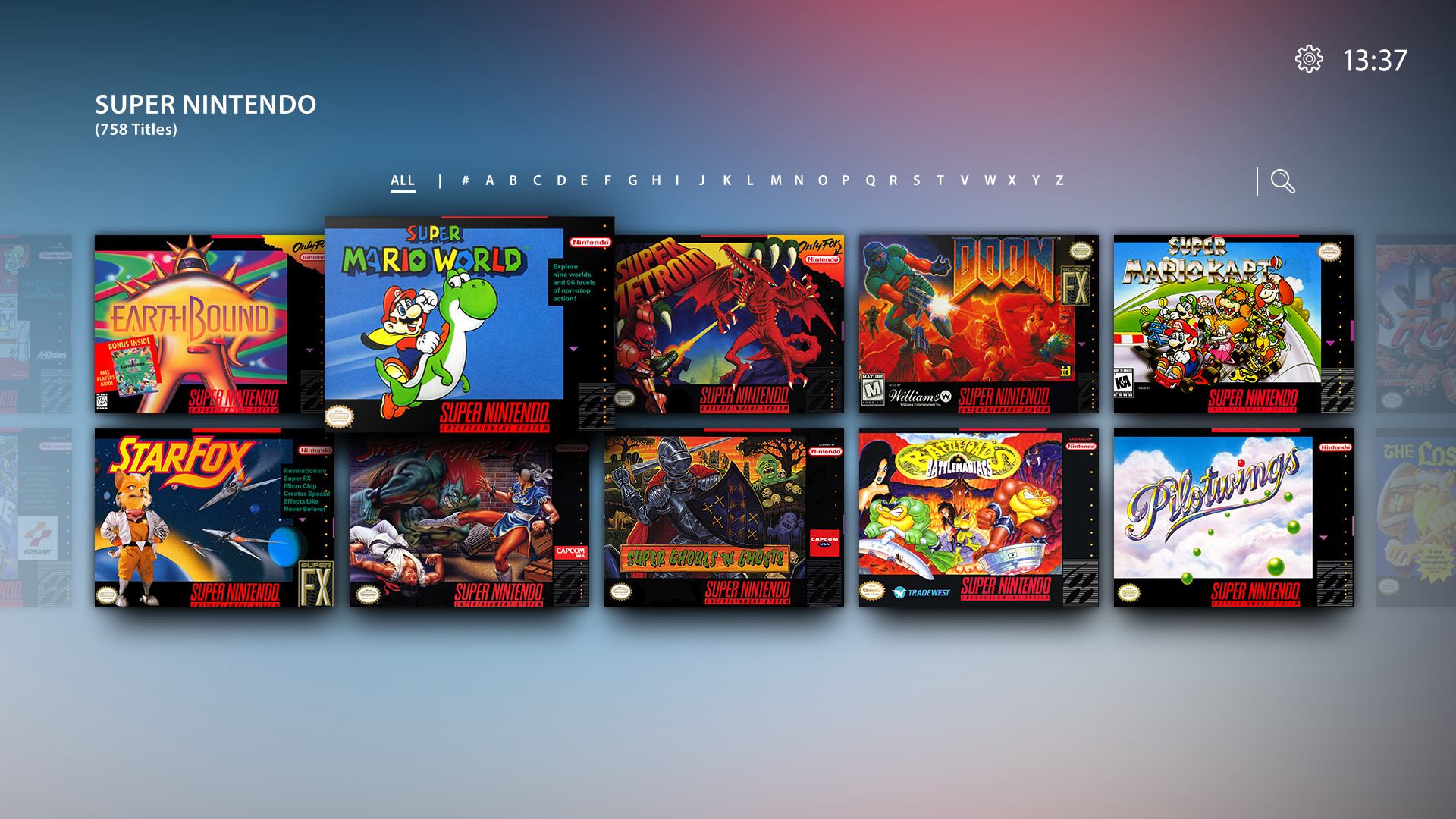
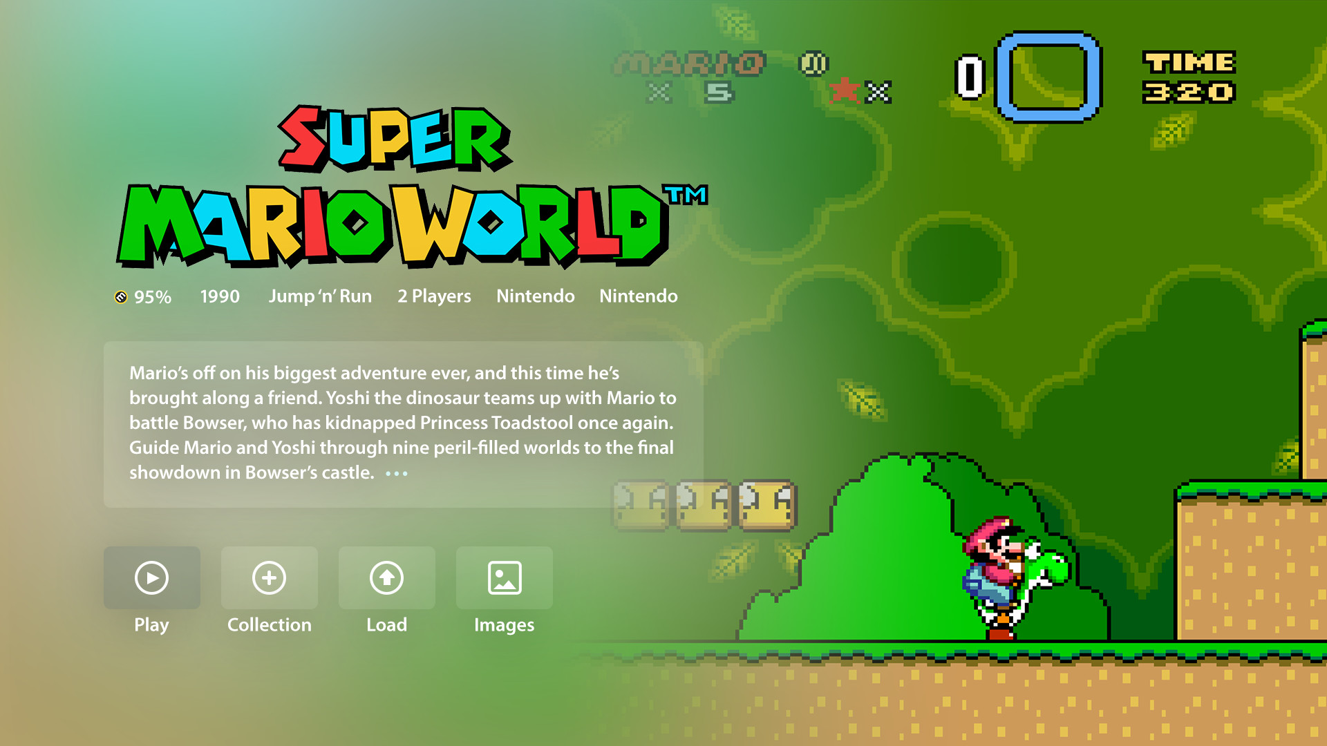
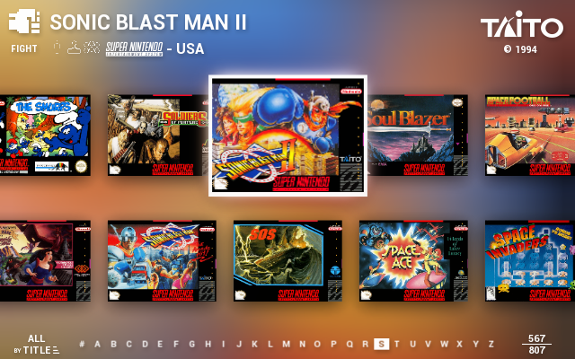
My Idea for a theme :)
-
Hi everyone,
i have been working on a theme for a quite while now. And i would love to hear some thoughts of you.


high5
-
@lomax2k surely these are mock-ups yes? Or have you coded a whole new frontend?
Looks great though. Especially the grid launch
-
Yeah, it would be wonderful to have a front-end with grid launching and full screen wallpapers. It's a shame Emulation Station can't handle this. It's possible to make something similar with Attract Mode. But you'd have to learn how to code. Attract Mode themes get complicated, fast.
-
Those are awesome. I would apply that theme in a heartbeat.
-
@herb_fargus hi! no these are just mockups :) i am not a coder. but i just wanted to show them. maybe there's someone here that can help :)
-
@lomax2k This is amazing!
Someone has to help you with this! (not me, im not a great coder!) -
I know this thread is a bit old now, but I've been working on a theme trying to implement some of these ideas in Attract Mode... basically there are two "versions" of this theme: one is more traditional with a vertically scrolling grid and inline "coin op" preview.
The other one has an horizontally scrolling list with a separate history/preview screen before launching the game. It's still in development and not released yet.
I can't upload images right now but some screenshots are in this album:
-
Maybe a bit older, but it would be very cool if anyone could do this ;)
-
Hi, seen a pr on git by havocbcn - https://github.com/RetroPie/EmulationStation/pull/623
Does this mean it would be separate individual elements (image,marquee,video) tags within the grid view?
Example:
<view name="grid">

<image name="md_image">
...
</image>

<video name="md_video">
...
</video>

<image name="md_marquee">
...
</image>

<text name="md_name">
...
</text>

<imagegrid name="gamegrid">
...
</imagegrid>

<gridtile name="default">
...
</gridtile>

<gridtile name="selected">
...
</gridtile>

</view>
...or is it actually going to be inside the grid like <imageSource> ...like @jdrassa has already incorporated but with the video tag as an option?
I'm curious...
Sorry, I did not know where to post this as the user havocbcn referenced this post.
-
@lomax2k How were you able to get that faded blur effect? Does anyone know? It is truly a thing of beauty
-
@juju6725 said in My Idea for a theme :):
Maybe a bit older, but it would be very cool if anyone could do this ;)
Well a lot of time has passed, and in all these years my Arcadeflow theme for Attract Mode, which was also inspired by this mockups, has grown a lot. You can see how it looks in these screenshots and an history page is here:
and the main thread on Attract Mode forum is here
http://forum.attractmode.org/index.php?topic=2068.0

Contributions to the project are always appreciated, so if you would like to support us with a donation you can do so here.
Hosting provided by Mythic-Beasts. See the Hosting Information page for more information.