[Theme] gameOS for Pegasus
-
@fastpop72 Yep that's what I had planned for the fast browsing.
Could you share a screenshot of what you mean for the arcade flyer?
-
@fastpop72 said in [Theme] gameOS for Pegasus:
Could be great if the theme recognize the aspect ratio of the PNG and move all the text a little to the right...
Just pushed an update to fix this:

-
Lovely work as always.
-
@PlayingKarrde said in [Theme] gameOS for Pegasus:
@fastpop72 said in [Theme] gameOS for Pegasus:
Could be great if the theme recognize the aspect ratio of the PNG and move all the text a little to the right...
Just pushed an update to fix this:

Exactly what i intended! The theme check if width is more than height then move the text a little to the right. Later i will check with my horizontal flyers with this new commit. The US/PAL snes boxes will benefit for this.
-
I made a little tuning with the boxart size, i use a 4:3 monitor with 1280x1024 resolution and i noticed that the best visual solution for me is this:
width: (boxart.width > boxart.height) ? vpx(500) : vpx(375)
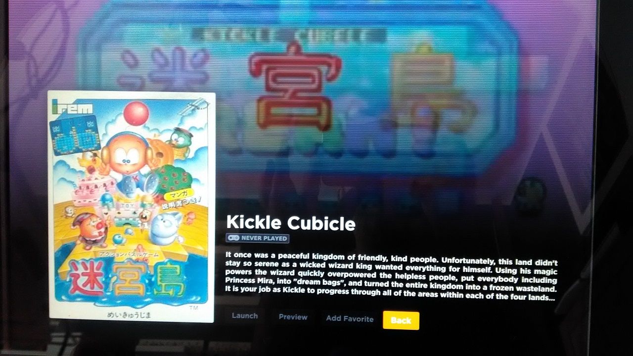
Arcade flyers are awesome and i think deserves more visibility, here's how it looks:
I have only a little issue, the text in the left column is not aligned vertically but i think it's related to my 4:3 resolution:

-
@fastpop72 oh interesting... I'll take a look into that. What's also interesting (and annoying as this is not the first time I've experienced this) your font in your platform menu is not the same as mine. Yours actually looks closer to how I intended though. I'm not sure why I can't get mine to look correct on my machine.
Regardless, I'll look into fixing that vertical alignment.
-
@PlayingKarrde Another hint for you is:
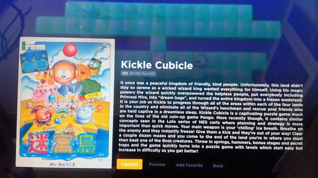
Line 287 of the GameGrid2.qml change Layout.maximumHeight: vpx(100) to Layout.maximumHeight: vpx(300) in order to have more room for long game description like this:
Before

After

-
@fastpop72 That was actually intentional on my part. I want the main screen's focus to be on the art with some brief important information/summary. The plan is to have expanded details with a longer/scrollable description available behind a button but I haven't gotten to it yet.
-
@PlayingKarrde For the video preview i have some vertical aligned videos (240x320) and i'd like to have a vertical scanline overlay during video preview in the theme for these videos.
It's possible to retrieve the height/width of the current mp4 and select a horizontal or vertical overlay png?
Something like this:
Image { id: overlay anchors.top: parent.top anchors.left: parent.left source: if (???????.videos.heigth > ????????.videos.width) {"./assets/images/scanlines-vert.png" } else {"./assets/images/scanlines.png" } sourceSize { width: 1920; height: 1080 } opacity: 0.3 smooth: true } -
Yep that would be possible. The code would actually look a bit more like this though:
Image
  {
    id: overlay
    anchors.fill: parent
    source: (gameData.assets.videos[0].height > gameData.assets.videos[0].width) ? "../assets/images/scanlines-vert.png" : "../assets/images/scanlines.png"
    sourceSize { width: 1920; height: 1080 }
    opacity: 0.3
    smooth: true
  }
If you are ok to wait though I could probably just add this as a feature to the next release.
-
@PlayingKarrde I surely will wait for your next release! I love this theme! Meanwhile i'd like to tamper just in order to learn something...
I won't add any Pull Request to the original code!
I tried your suggestion for selecting vertical scanlines (scanlines-vert.png) when current video preview is vertical but doesn't work... it show me always the horizontal scanlines (scanlines.png). Any hint?
-
@fastpop72 Yep I found the same thing when I tried to implement it just now. I will have to do some further digging to figure out why. It's possible it isn't reading gameData.assets.videos[0].height but I couldn't say for sure without some debugging.
-
@PlayingKarrde said in [Theme] gameOS for Pegasus:
@fastpop72 Yep I found the same thing when I tried to implement it just now. I will have to do some further digging to figure out why. It's possible it isn't reading gameData.assets.videos[0].height but I couldn't say for sure without some debugging.
Ok thank you, i will wait further testing.
-
-edit- Am going to have to hold off on the update I just posted for now.
-
Nice update. But in my opinion the new details page for games does not suit the theme as good as the old one.
-
@ryuuji Sorry to hear that. On the plus side, with the next major release you should be able to choose which one you like from within the theme itself.
-
OK phew, finally got this stupid video thumbnail issue sorted out properly now. Performance should be a lot better in the current release and there should be much less visual issues. I think there could still be some general performance enhancements due to it being fairly messy code wise still, but in general I'm pretty happy with it.
Here's the full and proper updates for this incremental release:
v0.6.5
- Greatly improved video thumbnail performance by rebuilding the entire system (thanks @waldnercharles for the tip on where to look)
- Re-added video thumbnails by default
- Cleaned up buttons for video preview on game details screen
- Added better support for landscape boxart
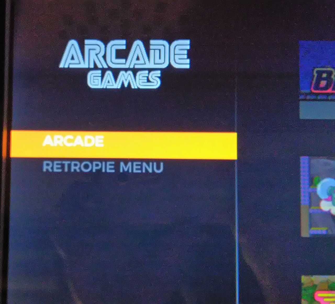
- Fix for misaligned platform selection text
- Fix for platform selection not defaulting to selected view
-
Thank You Thank You Thank You!!! Your theme is going better every day!!
I think the new details screen is much better than previous, usually i don't like videosnaps at full screen but using the scanlines has been a touch of class!! The scanlines gives a retro CRT look even with low quality videosnaps (320x240) in full screen!!! The only little thing i miss is the vertical ones when videosnap is vertical.
The other thing i think would be great is reintroduce a white text in the main grid with the game title you are selecting...
Often happens on grids with hundred games that you can't spot the game you are searching because every rectangle is different (due to game art) and the game title under the box is very tiny.
I think an overlay with the game title (like the one used in the top section of the grid in the previous version) placed now at the bottom of the grid would be great and together with title you could restore the little gray boxes with "developer", "year", "number of players" that i can't say why but you removed it from the game details screen....Keep on your great work @PlayingKarrde !!!
-
Oh my god! I can't believe I missed on that, it's perfect! That is everything I've been looking for, very well done!
Is it possible to have an animated loading screen when launching a game? -
@Malixx do you mean a screen that displays as the game is loading in the background? I don't think that's possible (unless this is a retropie feature but I don't use the pi so couldn't say). Or do you mean just something that shows when it's launching a game?
Contributions to the project are always appreciated, so if you would like to support us with a donation you can do so here.
Hosting provided by Mythic-Beasts. See the Hosting Information page for more information.