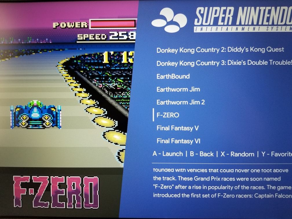
[Theme] Angular Theme
-
Also, made a brand new post to seperate it from the testing post.
And I didn't think I'd have the whole thing ready to go today.
-
If you download the theme again, I added the option to switch between 16:9 and 4:3 aspect ratios.
-
Awesome. I've always liked your themes, lilbud.
I do have a slight nitpick. There is no space between the colon symbol and the developer name. Also I think the color purple would fit the snes section better.
-
@SP I'll try and fix the spacing. But I don't have much room to move it over because it will run into the marquee.
I'll add the purple color later
-
@lilbud Hey, don't worry about it. Like I said, slight nitpick.
I still love the theme. Thanks.
-
@lilbud said in New Theme Testing:
@LiveFastCyYoung I used skyscraper to get the screenshots and marquees. I don't have any videos, but I wanted the marquees to show, so I just set it to Video view as a default.
The bust a move was scraped, the aerofighters one was from the es-toolkit
This is from the previous thread and I think I misunderstood. If I have the screenshots and marquees saved separately, the theme will place the marquees there in video mode? I was trying to scrape the screenshot and marquee together and it wasn't working well as the translucent bar on the bottom covered the marquee up too much.
-
Love it, Great work as always @lilbud keep it up! Thanks.
-
@LiveFastCyYoung Make sure you modified the artwork.xml file so it only calls the screenshot and marquee. The marquee should be on top of the black bar at the bottom
-
@SP Added an optional purple color to the snes.xml file in the /assets/systems folder. Just comment out the include line and uncomment the variable line.
-
@lilbud said in [Theme] Angular Theme:
@LiveFastCyYoung Make sure you modified the artwork.xml file so it only calls the screenshot and marquee. The marquee should be on top of the black bar at the bottom
Will try tonight. Thanks!
-
@lilbud said in [Theme] Angular Theme:
@SP Added an optional purple color to the snes.xml file in the /assets/systems folder. Just comment out the include line and uncomment the variable line.
Awesome! Looks great. Thank you!

-
This theme looks Great! Modern, clean, and I really like the cursor and layout!
-
This is a great theme.
The only problem I have with the theme, is that the boxart it stays always on top of the video.
Can you please help me with this little problem?Thank you for your awesome work.
-
@hargon Try switching the ui to video view, that might work.
I have no experience with videos, so I might be wrong.
-
@lilbud I already tried that with no luck, funny is that the files on this post https://retropie.org.uk/forum/topic/22434/new-theme-testing works well, it shows the boxart and then the video. not the two at the same time.
-
@hargon Yeah, maybe someone else can help me out here? I'm not home now, so I'm kinda at a loss as to what I can do.
-
@hargon I have noticed this too.
I found a fix adding
<zIndex>70</zIndex>after this line in thetheme.xml. My video view section now looks as below:<view name="video"> <video name="md_video"> <origin>0 0</origin> <delay>1</delay> <showSnapshotNoVideo>true</showSnapshotNoVideo> <showSnapshotDelay>true</showSnapshotDelay> <zIndex>70</zIndex> </video> </view>This will layer the video when it starts above the screenshot which has a zIndex of 67 but below the marquee which has a zIndex of 71.
-
@dudleydes @hargon I just pushed this change to the repository, the theme is now in the downloader, so you can easily update it.
-
@dudleydes @lilbud Thank you both
-
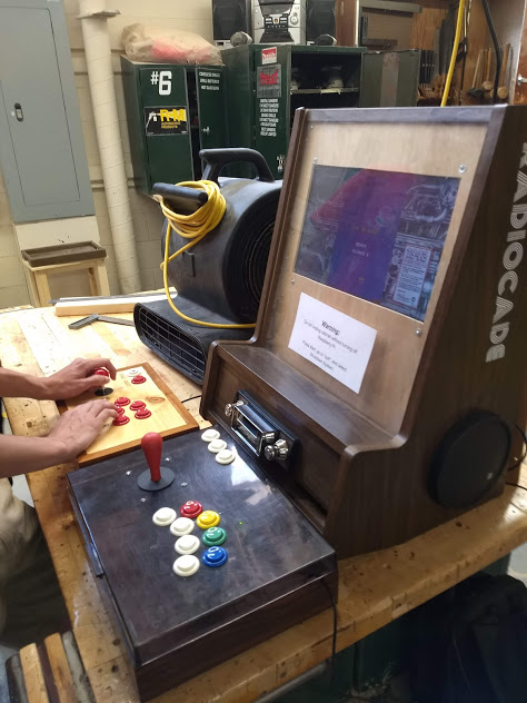
Finally got to bring my cabinet in today. People were getting hooked on Pac-Man and Donkey Kong. I got to smoke some people in Windjammers and Pac Man.
Also got to play The Simpsons with my math teacher

Contributions to the project are always appreciated, so if you would like to support us with a donation you can do so here.
Hosting provided by Mythic-Beasts. See the Hosting Information page for more information.