[ES Theme] VectorPie (16:9)
-
@Zachariel X68000 has been in Carbon for a couple years now, but yeah, you don't often see these categories in a lot of themes, I agree.
-
@SeraphisCain Really? Well, I may have to add that one at least.
-
This is a really nice looking theme. I particularly like the way the different "strands" filter down from the console view to the detailed view. It's really really clever.
-
@mattrixk Thank you, sir. I'm a big fan of MetaPixel and Spare as well. I have both.
-
@mattrixk said in [ES Theme] VectorPie (16:9):
I particularly like the way the different "strands" filter down from the console view to the detailed view. It's really really clever.
Absolutely!
-
I will also gladly take suggestions, or requests! I want to add another category already, so might as well do multiple things at once.
-
@Zachariel Aside from the categories I added, another change I made was swapping out the PlayStation logo for one where the PlayStation text is white with a black outline. Makes it far easier to read, as the text the logo uses now is almost the same shade of grey as the background. Maybe you could do something like that? Or at least darken the logo text a few shades?
Also, would it be possible to make the game description text use the entire space allotted for it? As it is now, the entire top 1/3 of the box isn't used.
-
@SeraphisCain Ah, good call. I haven't seen all of the categories in action so I've missed little things like that.
As far as the game description, that's by design because the top third is to display the logo title of the game, or "marquees". If you have those assets scraped, they should show up.
-
@Zachariel Ahh, okay. Yeah I've never used marquees so I never knew that. Good to know!
-
@SeraphisCain I have updated the theme and it should now cover those categories. The PSX logo should be fixed as well. Let me know if you notice any problems!
-
@Zachariel Wow, thank you for adding those systems! There are a few problems though:
- The logo SVGs for Naomi and X68000 are completely black, so they completely blend into the background when scrolling (the Naomi one also likely blends into the all-black background of the gamelist as well).
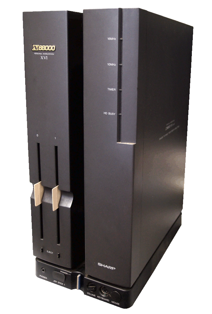
- The console picture used for the X68000 is not an X68000, but a custom Raspberry Pi case made to resemble one. It still looks noticeably different from a real X68000, however. (I could provide the one I used in my custom if you'd like)
- The "logo" part of the Atomiswave logo (not the text, just the symbol) is completely blue.
- The Cave theme.xml is looking for a console.svg, however the file included is console.png, which is resulting in errors. I manually edited the xml to fix the issue, but you'll probably want to update it yourself.
Also had some problems with text not appearing on a couple of the new gamelist screens, but a reboot fixed that, not sure what happened there.
-
@SeraphisCain Well, the image included with cave actually is svg, so that's correct and I'm not sure what's going on there. I might suggest you completely remove the theme and reinstall it. I'll check on everything else when I get home. I tried some new software, it's possible that screwed the files up. Update me after you reinstall, if you could. Also, if you could link me the image you used for the x68000, that would be great, I might end up using that.
-
@Zachariel I completely removed the theme before I installed the updated version, so I don't think any changes I had made to the original install caused any issues (I even went in with WinSCP and checked to make sure the folder was 100% gone before I installed the new version). For the Cave thing, I may have gotten things mixed up when I was making that post and it was that the xml was looking for a png while the file was svg, but there was definitely an issue there that required editing the xml to fix.
Here's the X68000 image I use:

-
@SeraphisCain But thats what doesn't make sense. I checked the folder on github, the xml calls an svg and the image in the folder is an svg. I didn't change anything, it seems right the way it is... unless I was still half asleep. Lol
Thanks for the image!
-
@Zachariel It's been updated with reworked backgrounds, and I tried to fix the glitches with the images. Let's see how it goes!
-
Hi! I really love your theme! It's really clean and thought out. I have a pi4 and about 40 systems and everything works great!
I was trying to generate matching launching images with the autogenerator script, but it failed to do so (something about missing fonts, iirc).
So right now I use the carbon theme for launching image generation, but I'd really like to have some better matching ones...
Do you have any idea how to do so?
-
@ecto Thank you! I'm really glad to hear it.
As for the launch images, I'm sorry but no. I can't think of a reason why the generator would be looking for a font that isn't there. But I think if there's someone that can help, it would likely be mitu. Or you could try posing it as a general question to the community.
-
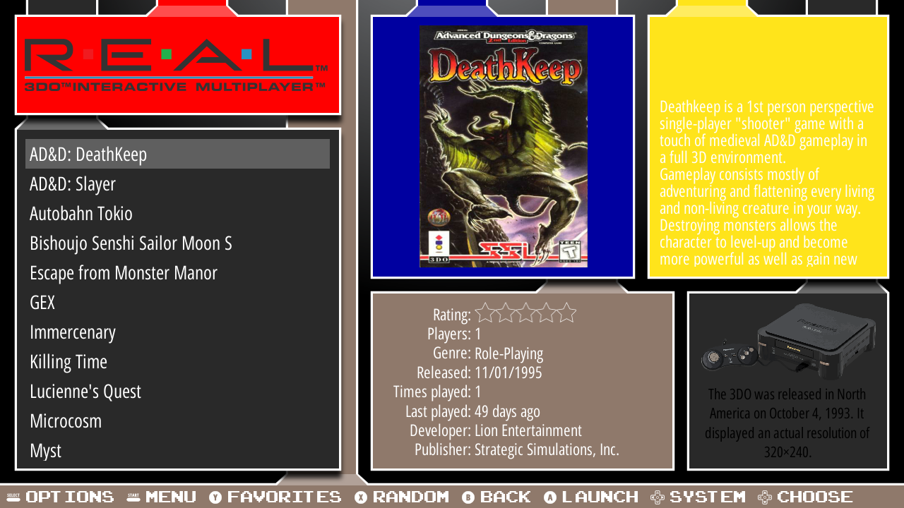
One more small suggestion: the "white text on bright yellow" of the 3DO game description box can be a bit hard to read. Making the yellow a bit darker would make the text much easier on the eyes.
(Don't mind the different logo, that's just something I changed myself since I prefer the REAL logo to the standard 3DO logo.)

-
@SeraphisCain Yup, thanks for finding and pointing that out. Definitely need to fix it.
-
@Zachariel Not sure how I didn't notice before, but the Capcom category has the same issue (and probably the CPS1/2/3 categories as well, but I can't say for sure there since I don't use them).
EDIT: Went through all the categories I use, and aside from the previously mentioned Capcom categories, Amiga, GBC, Intellivision, MSX, NGPC, and SNES all have game description boxes with white text on a light/bright background that would be improved by changing the text to black.
Contributions to the project are always appreciated, so if you would like to support us with a donation you can do so here.
Hosting provided by Mythic-Beasts. See the Hosting Information page for more information.