Background images, coming back!!!
-
@tronkyfran OH YEAH! Showing Joust a little love! Yay!
-
@tronkyfran Thanx!!
-
This is my favorite theme. Simple and sexy. I just wish there were 32x and Sega CD images. :)
-
I've had those two under muy radar a long time, because they are a bit more complicated , but maybe its the moment to leave lazyness behind, I cant promise anything, but Ill try!!!
-
Arcade "Joust", 2 versions:
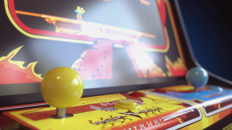
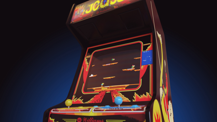
Second one is really bland, I know :(
-
@tronkyfran I've updated the theme with your latest arcade assets. It will be nice once we can get a frontend that will handle all your awesome pictures
-
@tronkyfran OH WOW! It's better than I expected. This is very cool. Thanks for working with Joust. Such a good game. And thanks, @herb_fargus for the updates. Ok, now I gotta go load this thing! Fantastic!
-
@tronkyfran said in Background images, coming back!!!:
Second one is really bland, I know :(
Actually, I just updated and I think the second one is perfect. . . The controls below the center scrolling band clearly represent a simple, arcade control panel without being too busy, and the marquee above represents the nostalgic appeal of spotting your favorite game (well, my favorite, anyway). I think it frames the menu really well, and has just enough of the screen peeking out from underneath that I can see the mount ready to play!
Well done!
-
I always forget the carousel and its white bar when doing this images, cant wait to get the possibility of changing its opacity, lets see what can we get of thE last developments in emulation station, it would be awesome to make a theme with just the logos and the backgrounds!!! Next one VIC20, glad you liked it @caver01 !! And thx for ALL your work, @herb_fargus !!
-
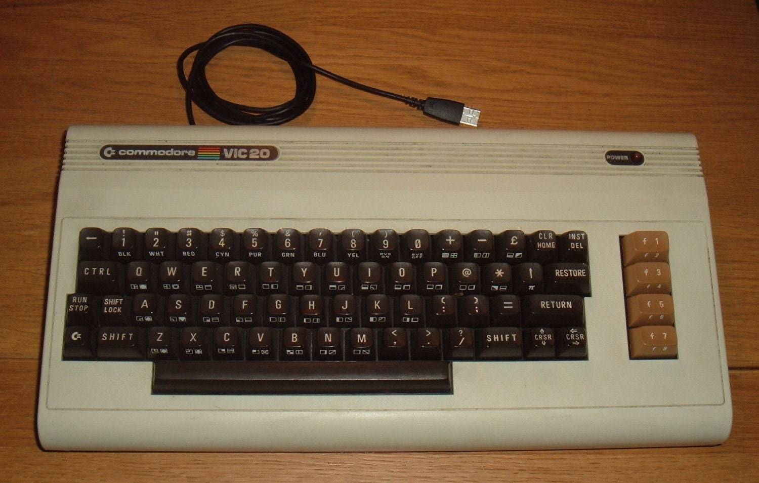
I'm a bit confused about vic 20. There are a many different models????????


-
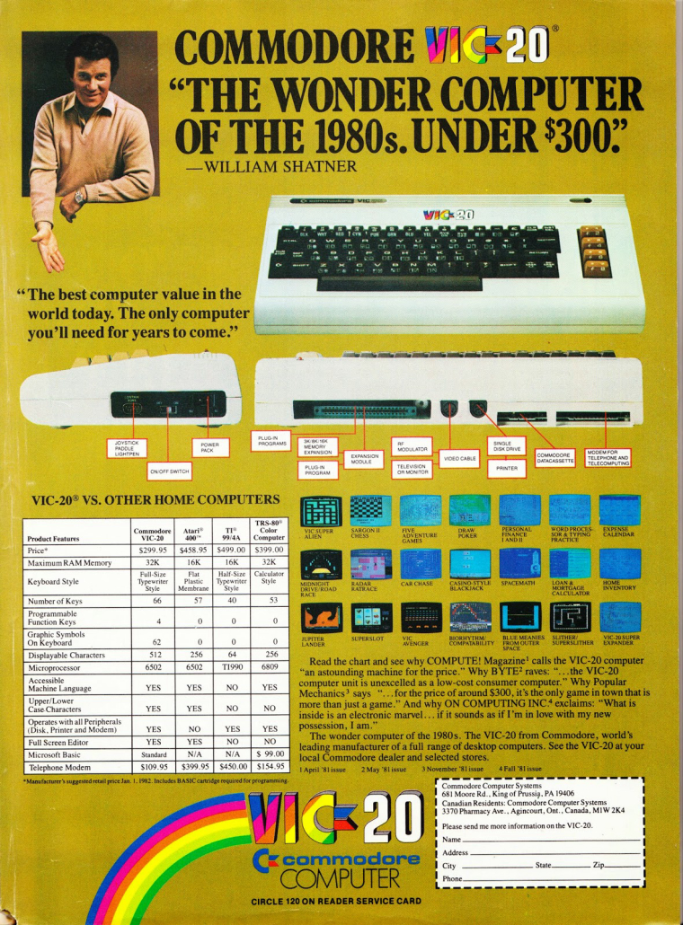
@tronkyfran That's the original VIC20 with correct colors and logo:
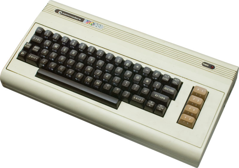
I had one so I can confirm ;-)This old ad shows also side and back views ; with not so common logo top left and correct logo as a sticker in the middle over the keyboard (sticker didn't exist on actual machines afaik..)
High-res details of they keyboard in this image.
If you need an svg Vic20 logo I can provide it.
-
Thanks a lot, this is just what I needed, I think Ill get it done soon! ;)
-
@tronkyfran thank you for creating the image !
What software do you use for making the 3D models and rendering ? -
Mainly 3dsmax, and rendered with Corona Render. It could be perfectly done in Blender, but Im more comfortable with my old friend max. And a heavy touch of photoshop after the render, of course!
-
Vic-20, dont know if I will modify this to make it better yet, but here it is anyway ;)
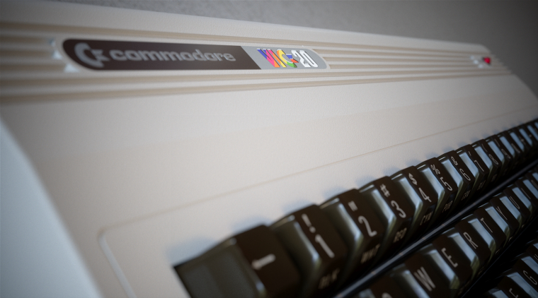
In progress...
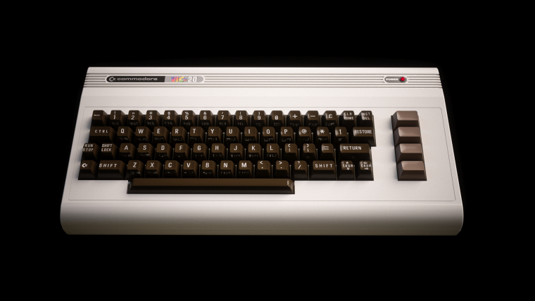
I'm not sure if I got the logo right, I made the "Commodore" part like silver, and maybe its white paper.... ¿? -
@tronkyfran Impressive model; looks great, thanks!!
Yes, Commodore logo was white.
If I may suggest some fine tuning (and if you have time for it): vic20 logo perspective in the first image looks a bit strange but maybe it's just an impression; original function buttons' color was slightly lighter (almost sort of orange). -
Still working on the vic20, but I had this done long time ago. Didnt posted because emulation is far far away for this console, but hey, you never know....
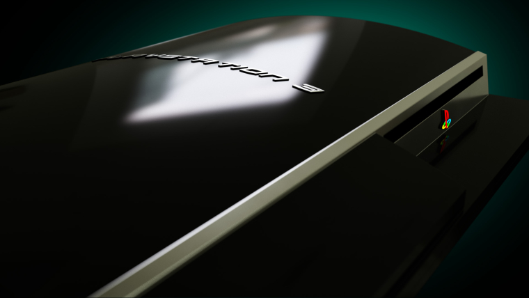
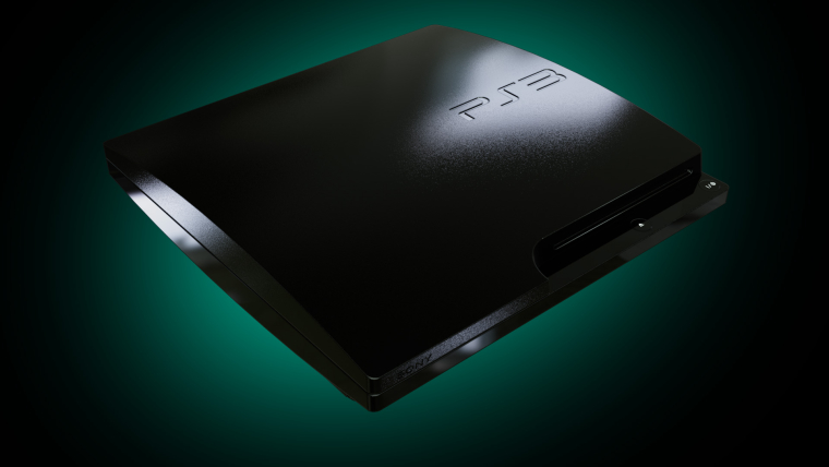
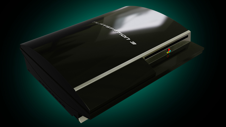
-
Delaying some other images, I just wanted to make some controllers!!
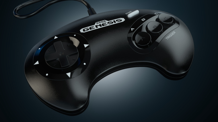
-
snes controller
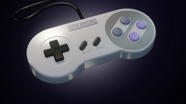
-
@tronkyfran you know that now you started rendering the controllers you'll have to do all of those too ;) they look great!
Contributions to the project are always appreciated, so if you would like to support us with a donation you can do so here.
Hosting provided by Mythic-Beasts. See the Hosting Information page for more information.