Pixel Theme
-
@Rookervik said in Pixel Theme:
I'm working on a fairly decent update to pixel. Working my way through the logo graphics right now. I'll get video previews incorporated when I release the update.
Are you saying my video update is not decent?... XD I released video update time ago...
-
@Nismo Thank you for your work. Now that video has been incorporated into the RetroPie ES fork I will edit my theme and Carbon... and Luminous and the others, to have video as well. I didn't want to mess with it unless it was actually added to RetroPie.
It also looks like Zigurana's carousel changes might be added to the RetroPie branch as well. I will keep my eye on that and see if it is added.
-

-
i like the new look, thanks, and merry christmas.
-
@Rookervik Your new console logos look fantastic! You mentioned changing the license; what were you planning on changing it to?
-
@mattrixk I'm planning on changing it so you can use the old logos and I use the new ones. :P
-
I've been toying around with the theme just to see if I can teach myself it. I'm having a hell of a time getting the videos to appear in the upper right hand box and the game box art to show up in the lower right hand side. I figured doing it would be much easier, I was wrong.
-
@ebtalk I believe when a video is found, the box art is ignored. But I can't be sure until I play around with it more, myself.
-
@Rookervik said in Pixel Theme:
I'm planning on changing it so you can use the old logos and I use the new ones. :P
That's what I was thinking of. You've put so much effort into the new logos, it doesn't feel right to update MetaPixel to use them too.
-
Game & Watch had quite a small logo. Fixed that up...

-
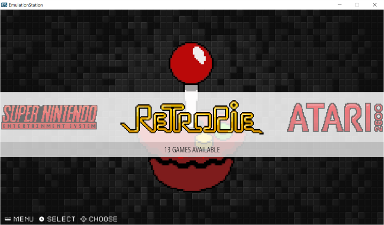
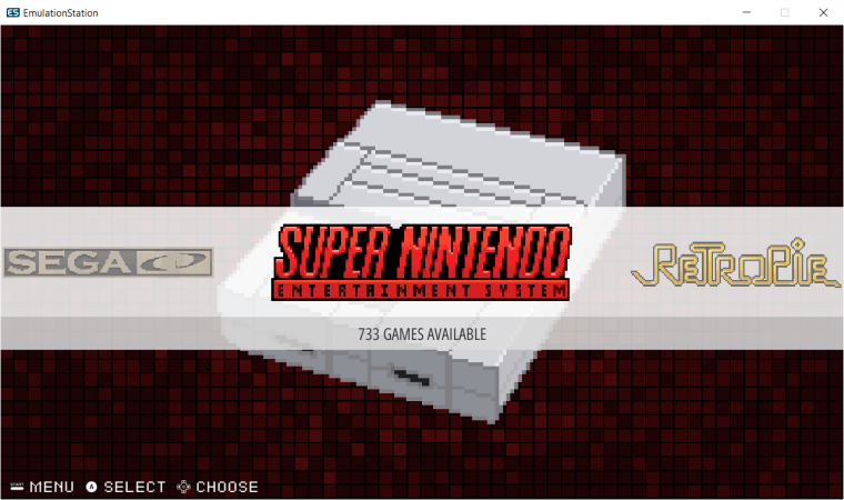
Finally finished the logos. Took days. Some were completely re-drawn.
Added Mac Plus system. Now just checking to see if I can do something with those tetris blocks that won't make CrazySpence cry like a 2 year old.
Oh, and add video previews.
-
@Rookervik awesome. Can't wait to see the finished product!
-
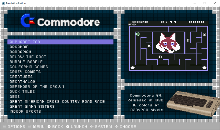
Got video previews working. I don't think I want to add marquees. Trying to decide if I want to combine the metadata version and the regular version, or keep them separate. They shouldn't be hard to just keep as they are. Adding video previews makes the XML a heck of a lot larger... but it still seems to run just as fast. So that's good.
Toying with removing the oldschool "3d" effect of the backgrounds. Might make it look a little better. I don't know. Cast your vote.

-
@Rookervik Do you have an example of what it'd look like without it?
-
@ebtalk That screenshot shows the background without the highlight effect "old school 3d". Instead of the 3D effect, it just has black lines between each square.
-
@Rookervik i think i prefer the 3d effect. one thing that might be cool is making those background colour/shade variations as tetris blocks :)
-
@dankcushions Hahaha, tetris is what I was trying to avoid. The entire theme is a big tetris game :D
-
@Rookervik I kind of agree. It's very tetris-y
-
@Rookervik I like the 2D backgrounds. It makes the new 3Dish logos really stand out. I'm curious what the Detailed View background would look like though.
-
Turns out that ES's scaling kind of makes single-pixel lines look like poop. So I wont' be changing the background to this:

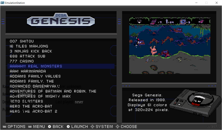
I do have this for a replacement for the tetris crap. Don't mind the metadata... it's not set up in this hacked version of Pixel. But it does show the background, and the colored lines in the background that are different per system.

Contributions to the project are always appreciated, so if you would like to support us with a donation you can do so here.
Hosting provided by Mythic-Beasts. See the Hosting Information page for more information.