New comic theme and SVG problems
-
Well would you look at that, i learned something today. What the tool you posted does is output an 8bit png with full alpha transparency, 8 bit is way smaller than 24bit. Given i work on photoshop every day i had to look into this further, and i was quite surprised that photoshop can't output png8 with alpha, it defaults to using indexed color when saving anything under 24bit and you lose alpha trans. That tool is pretty awesome, really useful for web design!
-
@screech - Thanks for the advice. Turns out that i was using the artboard resolution, wich gives me a lot of space with transparency.
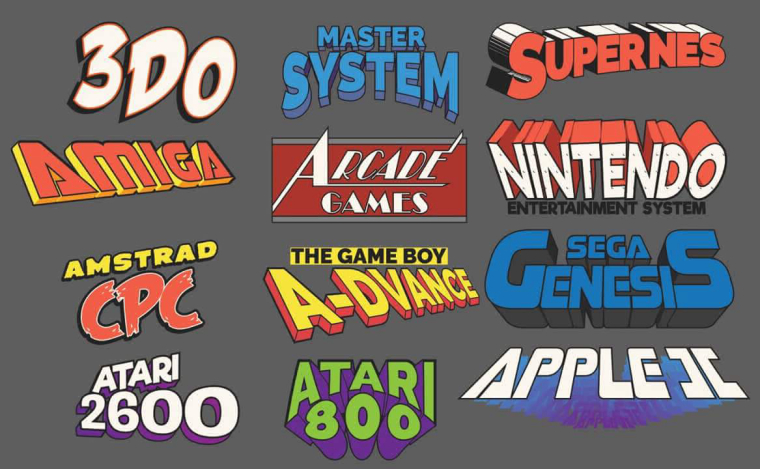
Now i have around 20KB per logo.I have made new logos to used on system and menus. Trying to made it look like the super heroes logos.
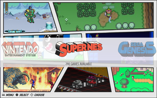
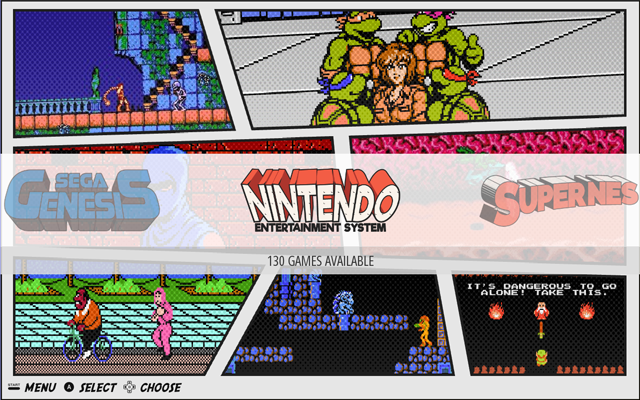
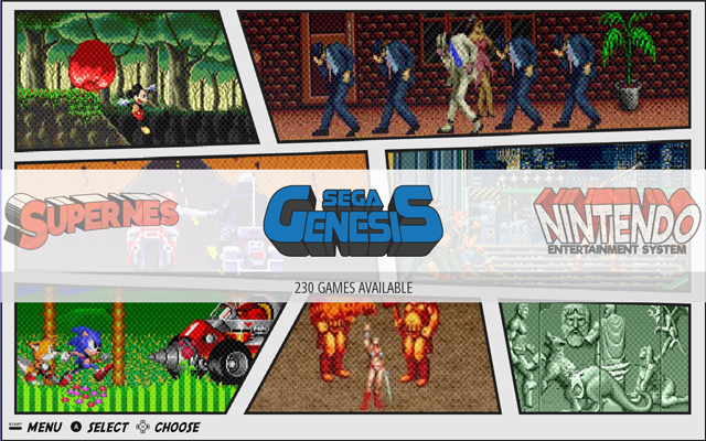
-
@lipebello I really hope the font "shaka pow" will be in the final release??! :)
-
@lipebello I really need this! :)
-
Nice work, thats a really cool looking theme
-
Will this theme have Video previews?
-
@HurricaneFan no, i will adjust the size of the images that comes from scrapper.
-
@Kischa i'm making new logos to fit all menus.
-
@lipebello I second the request of the Shaka pow logos. Hoping there is a version using those instead of the redone superhero style. The superhero also looks nice, just think the Shaka pow makes it looks amazing.
Great work!
-
@lipebello I have to say I'm with @Kischa and @zoop on this one. While the "superhero" logos look good, and you've obviously put a lot of work into them, I much prefer the "shaka pow" logos you had in the original images (either with the dithering or without, both look great).
-
@mattrixk It would be cool to include both in the theme, then users could use the ones they liked the most. I liked the original ones he posted in the first screenshot too. But the 2nd batch looks neat also.
-
@HurricaneFan That is true, but it's also twice as much work for @lipebello. With potentially 80+ systems to cover, making a theme takes a lot of time as it is.
-
Thanks for the feedback.
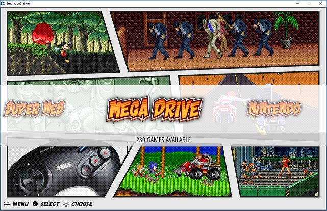
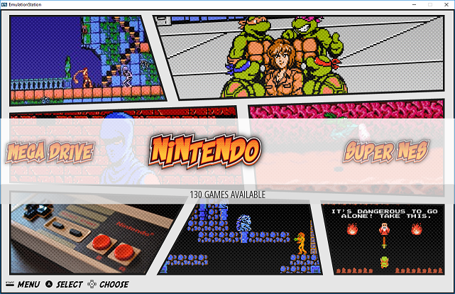
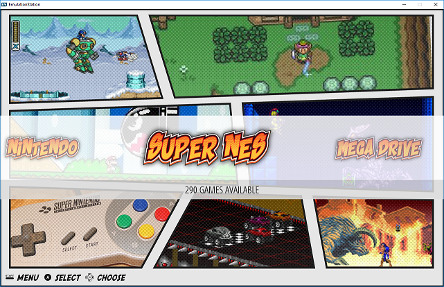
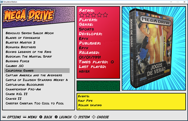
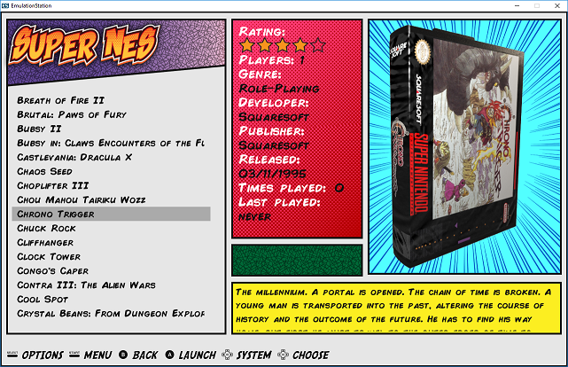
I'm thinking in going back to the original logos (shaka pow font) for all systems. Then i can finish and release the theme.
Edit: Going back for initial logos.
-
@lipebello Ah thats super! One more request, I really liked the diffrent color between the systems logos as in your first picture post. Could you make them like that?
Thanks!
-
@lipebello I really like the system controllers down the bottom left. It looks really good.
-
@lipebello this is hot fire! Will be rocking this theme the second it becomes available. Very impressive!
-
Really love your theme...
I love the "shaka pow font" but I prefere it in different color too ^^
I love the controler in the bottom left corner (why not a picture of the plateform in the bottom right corner?)
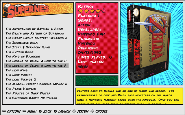
What the "green" area in the detail view for ? (do you plan to put something in ?)
Are you interested in an UXS MIX profile for your detail view ?
Exemple :
One comics "box" with your blue "speed" background and the 3D Case
One comics "box" with a screenshot + a "comics" overlay
One comics "box" with a "POW" comics Bubble and the Wheels in it ? -
@lipebello would you be so kind as to update this thread once the theme becomesong available? I will also volunteer if you need any beta testers ;p.
Just want to make sure I don't miss it!
-
@lipebello i see you bro lol i still await your awesomeness with your theme. Keep it up and keep us updated with it.
-
Personally i prefer the comic logos. Gives it a nice variety.
Contributions to the project are always appreciated, so if you would like to support us with a donation you can do so here.
Hosting provided by Mythic-Beasts. See the Hosting Information page for more information.