Flat Theme
-

-
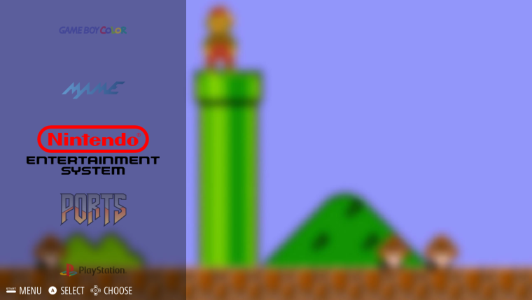
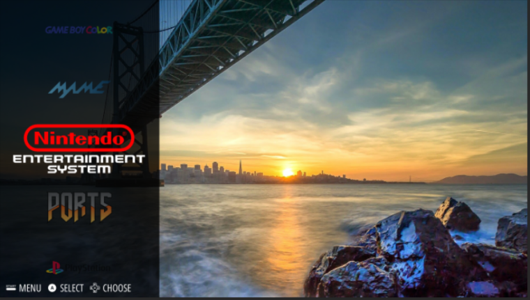
What does everyone think the system select background should be? When trying the new carousel, the colors don't end up looking that good.
That SMB one looks good but are you going to use a different background for each system?
-
@backstander yeah, i'm planning on using the backgrounds from the simple theme. Unless someone has an idea that could work for every single system
-

-
Personal opinion for the flat look, limit your colours, no photos.
Keep it clean and minimalistic, even on the select screen.
Tone the vibrance down on some of the colours (i.e Super Nintendo red on the select screen, even all 4 colours from the logo).
I would likely change the font size to a bit smaller, but it's clean so that's just me being picky.
-
@Keigan got some ideas for the system select? Cause I'm running on empty.
The photo idea came from the need to have 1 color/image for all systems
-
I like different background for each system with a blurr effect. The feeling it gives is really nice.
I see there are different opinions about this. There could be two theme versions, one with specific background ofr each system and another one with the same background.
-
@kbronctjr There will only ever be 2 versions of the theme, Flat and Flat-Dark. Only 2 versions makes updates faster and prevents me from having to maintain 50 different versions.
-
The Flat theme has been updated with a custom carousel

-
I love it
-
@lilbud How can I activate carousel feature?
-
@kbronctjr download the newest emulation station from the retropie setup menu
-
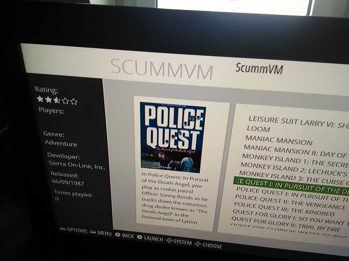
Hey there. I'm using your theme and it works just fine, though I set up ScummVm recently and I guess it somehow needs to update...something?

-
@bobbycopter All fixed, try updating the theme from the theme installer.
-
@lilbud for me personally, flat style, I would honestly not mind just a black background, with white system logos. Clean and simple.
Ideally if the transitions could be altered to not fade to black first, or not fade at all, I'd suggest any to jus made it any colour you like, or soft colours that resemble the system. NES (red), SNES (purple), etc.
-
@Keigan Well, that's the beauty of themes, you can change whatever you want. I do have a set of white logos that I used for the Material theme. The transitions can be changed through ES itself.
Since not everyone updates ES, I would have to have another version of the theme to monitor without carousel changes.
-
Alright, I've been having some trouble.
I'm using the ES Toolkie v1.1 and the theme just shows up as the default theme. Any help? -
@lilbud I realise you can change whatever you please, you asked for an idea about system selects. I gave my suggestion to fit a flat theme.
You have 2 options for transitions
Slide / Fade
Slide is fine if you build a select screen that flows into the next, so it looks smooth, but a carousel doesn't look right since it scrolls vertically, while the background would scroll horizontal.
Fade is good too, though it always fades to black before the next screen. It would be much cleaner to have it just fade into the next screen, and not fade to black first
These all need to be changed inside the program, I am not a C# guy, so I've been trying to pin point it, but having no luck. Also would be nice to add no transitions, so there is no transition between scrolling.
-
-
@itsnitro Shows up fine for me, make sure you change the theme on there. And remember to add it to the theme folder.
Contributions to the project are always appreciated, so if you would like to support us with a donation you can do so here.
Hosting provided by Mythic-Beasts. See the Hosting Information page for more information.