Cardboard Mini NES + Nes mini and Famicom mini themes
-
The layout for new version hasn't really changed that much and offers lots more options for resolution, aspect ratio, and the layout. Plus it supports collections. It's really just the carousel that is different (for the better in my opinion). Why did you update EmulationStation if you were happy with the old version of the theme?
You can fix the gamelist by going to the nesmini.xml and replacing the <textlist name="gamelist"> section with:
<textlist name="gamelist">
	<forceUppercase>0</forceUppercase>
	<scrollSound>./sounds/se_sys_cursor.wav</scrollSound>
	<fontPath>./art/NESCyrillic_gamelist.ttf</fontPath>
	<pos>0.2958333333333333 0.2185185185185185</pos>
	<size>0.4083333333333333 0.5481481481481481</size>
	<alignment>left</alignment>
	<horizontalMargin>0.0083333333333333</horizontalMargin>
	<fontSize>0.0592592592592593</fontSize>
	<lineSpacing>1.375</lineSpacing>
	<selectorHeight>0.0592592592592593</selectorHeight>
	<selectorOffsetY>0.0074074074074074</selectorOffsetY>
</textlist>
You'll probably find other things don't work correctly as well though so it's better to use the new version.
-
Thanks @ruckage thats exactly what I needed to fix the problem I had, the only reason I prefer the older theme is because the boxart section is much bigger, I accidentally updated the rp es then noticed that the gamelist was misaligned, I remember seeing you post something about this before, but that was for the more recent versions of you theme and I wasn't sure if it would work on the older 1.2 version but it did and thank you so much for you help.
-
@skj
Yeah, box art was handled differently originally but you'll find the box art is only bigger for portrait style boxes anyway - for square and landscape style boxes the images size is exactly the same and on the old version that resulted in a lot of wasted space. I originally only made the theme for NES which has portrait box art so it looked ideal for that but as I added more and more systems it wasn't a good option any more. -
hi @ruckage think you add some missing systems to your minines theme like "amstrad, atari st, amiga, msx, gw, pcenginecd, scummvm"?
Thank you for your answer -
Hi!
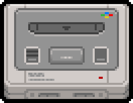
I noticed the SNES icon was quite flat compared with the other console icons, so i changed some stuff and added additional details. Here is the result next to the original one:
Old SNES:
 New SNES:
New SFC:

-
@hi-ban
You're right the original is a bit flat, probably as it was one of the first I did and hadn't settled into a style at that point.I really want to keep this all my own work though but I may go back to the icon (and a few others) and update them myself.
-
I've updated the snes icon myself so that it has more depth, It will be in the next update (I'll probably update pc engine at some point as that is also a bit flat.)
@hi-ban your modifications to my icon look just as good as mine but as I said I'd just like to have all the art on this be my own work, I hope you understand.

-
@ruckage No probs, man.
-
This post is deleted! -
I've migrated over to this theme and hit a few systems that aren't included that seem semi-popular. (Or, at least, I have :)). Wondering if there's any chance to get them added? (I know you want to do all art yourself, otherwise I would try myself! :) )
- Game & Watch
- TurboGrafx-CD
- SuprGrafx
-
Hi. Yes those are on my to do list. Now my Snes theme is released and more or less parallel with this theme I will get back to adding the missing systems. I'll also be adding a default theme so that at least then it will still work correctly if a system is missing.
-
@ruckage Great - I was thinking about that 'default' system idea as well. Also, semi-related (was coming back to edit my comment - damn you're fast) - is there a US SNES icon floating around to switch to? I thought I saw one in the thread but...not being able to search the thread is making things difficult.
-
@necro
Yeah, if you check in the theme folder and go to the snes folder there is an alternate in there, you have to change it manually - just rename it to carousel_logo.png.
I've automated it via the config file on the Snes-mini theme and I'll see about doing the same on the Nes-mini theme in a future update. -
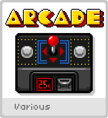
For the Arcade image, it has 10p. Is there a chance to get one that has 25 cents(cent symbol) for US users?
Thanks as always! :)
-
@ruckage it has been a long time hence asking, any eta on DOSBOX and PAL suppot?
-
@livefastcyyoung said in Cardboard Mini NES + Nes mini and Famicom mini themes:
For the Arcade image, it has 10p. Is there a chance to get one that has 25 cents(cent symbol) for US users?
Thanks as always! :)
Here you go :)

-
@ruckage Yr the best! :)
-
@hex said in Cardboard Mini NES + Nes mini and Famicom mini themes:
@ruckage it has been a long time hence asking, any eta on DOSBOX and PAL suppot?
I plan on getting the resolution support working for the SNES theme next and will get the Pal resolution added to the Nes theme around the same time. After that I'll get back to work on the missing systems, it will be Amiga, MSX, MSX2, and PCengine cd first as I've already made icons for those and I will the do DOS and ScummVm shortly after as I know both of those are popular.
-
Everyone's not clamoring for Game and Watch? I'm freaking shocked. :)
Is there an official (or unofficial) set of loading screens or a 'boot' screen for this theme as of yet? I tried to scan the thread but am having some problems. If so, having it posted in the first post would be GREAT.
(And keep up the good work Ruckage!)
-
@necro If you are looking for launching images, those were done here...
https://retropie.org.uk/forum/topic/11481/nes-mini-theme-launching-images
Contributions to the project are always appreciated, so if you would like to support us with a donation you can do so here.
Hosting provided by Mythic-Beasts. See the Hosting Information page for more information.