New Comic Book Theme!
-
I followed your video. After what felt like an art class (and a good one) using your image to go by, I came up with this.

-
I then wanted to attempt a system that I haven't seen yet. (forgive me if I missed it somewhere) Using the colors from an Astrocade catalog that I have, this was my end product.

Do you have any artistic advice you may offer?
If I wanted to attempt a multi colored image like that amazing VIC 20 above, would it basically be the same process but with a group of layers for each color? A two color image having 14 layers and so on? Thanks for any input. -
I followed your video. After what felt like an art class (and a good one)
I too mostly taught myself everything to get the images created. I am not an artist by trade, I would be classified as an IT Expert, and even then I feel like I don't know nearly enough to be in that category.
Using the colors from an Astrocade catalog that I have, this was my end product.
I'm lazy so I mostly get the color schemes from the logos or the systems/series I am trying to get, as well. I think it is the best way to go as well for getting your start. The more you make the the more ideas and experiments you will try which will yield cool results. Perfect example is the .Hack// system image I created up above.
Do you have any artistic advice you may offer?
Experiment, try different things, and have fun doing it. Anything you create I do not mind adding to the repo if you want.
If I wanted to attempt a multi colored image like that amazing VIC 20 above, would it basically be the same process but with a group of layers for each color? ...
Even easier than that. Just color each letter as you type it. Avoid doing anything to the Text Layer as if you try to say use the "Fill/Bucket Tool" it will "Rasterize" the text making the text un-editable. So you want to use the Text Tool's color change options. As for the Dotmatrix I am again lazy and I find that the Black Dotmatrix is my go to, and I just simply change the opacity to match what I want.
However feel free to experiment and add multiple dotmatrix layers, different gradients and others.
-
@zenjiro said in New Comic Book Theme!:
Experiment, try different things, and have fun doing it. Anything you create I do not mind adding to the repo if you want.
If you think that anything I post is worthy, please do. I have been experimenting a lot with different things now that I have the basics down. The UNDO button is my friend!
Even easier than that. Just color each letter as you type it. Avoid doing anything to the Text Layer as if you try to say use the "Fill/Bucket Tool" it will "Rasterize" the text making the text un-editable. So you want to use the Text Tool's color change options. As for the Dotmatrix I am again lazy and I find that the Black Dotmatrix is my go to, and I just simply change the opacity to match what I want.
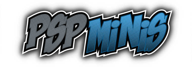
I didn't think that one through before I asked. My thought was on how to add multiple colored gradients and then it hit me to just select by color of the text and so I did this:
However feel free to experiment and add multiple dotmatrix layers, different gradients and others.
I would like to complete all the graphics for the Astrocade. I followed your post on the newsprint filter and mine looks like this:
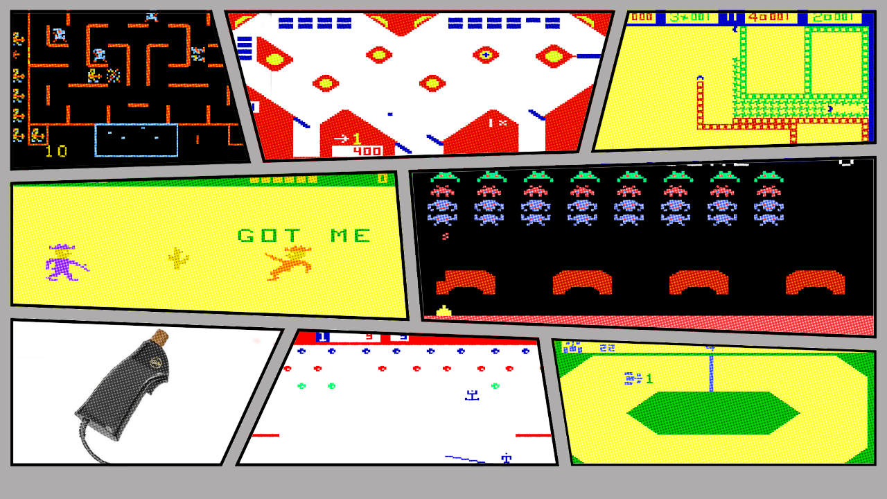
It seems off to me. Is it because there is too much black and bright yellow or did I miss something?
Thanks again! -
@mrseven Nope that is just the nature of having all Black, White, and Yellow backgrounds. I ran into the same problem. It just happens to the really old systems like the Atari800, some NES games, and other very old archaic systems.
-
Is there any artwork for "Solarus"? There was artwork in the default Carbon theme, but I didn't see any in the new Comic Book theme. If there isn't any artwork, would it be difficult to create?
Thanks.
Here is the project: https://www.solarus-games.org
-
@zenjiro said in New Comic Book Theme!:
@mrseven Nope that is just the nature of having all Black, White, and Yellow backgrounds. I ran into the same problem. It just happens to the really old systems like the Atari800, some NES games, and other very old archaic systems.
Glad to hear and know that I'm on the right track then. I was looking for an overlay to try but can't seem to find one for free. Have you tried that at all?
-
@mrseven Not sure what you mean by the "Overlay." Are you talking about something for GIMP or something for EmulationStation.
Or are you talking about the Overlays that are used in projects like Retroarch? I typically use what is available on the BezelProject or on Screenscraper using the Skraper program or just manually pulling off the site.
@kcoconnor76 If I get around to it I can try and whip something together. No ETA on it. I will post it here when I get around to it.
-
@kcoconnor76 said in New Comic Book Theme!:
Is there any artwork for "Solarus"? There was artwork in the default Carbon theme, but I didn't see any in the new Comic Book theme. If there isn't any artwork, would it be difficult to create?
Thanks.
Here is the project: https://www.solarus-games.org
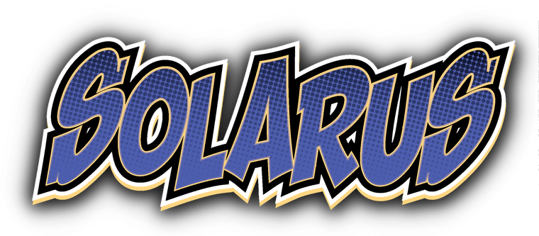
Because of Zenjiro's video, these things are becoming addicting. I tried a few different variations. Perhaps one of these will work?


-
@zenjiro said in New Comic Book Theme!:
@mrseven Not sure what you mean by the "Overlay." Are you talking about something for GIMP or something for EmulationStation.
Or are you talking about the Overlays that are used in projects like Retroarch? I typically use what is available on the BezelProject or on Screenscraper using the Skraper program or just manually pulling off the site.
@kcoconnor76 If I get around to it I can try and whip something together. No ETA on it. I will post it here when I get around to it.
I was thinking of a newsprint overlay for the comic instead of a newsprint filter. Like the dot matrix used for the logos. I was curious to see how one would work over all the screenshots and then the comic border as the top layer. It still would change anything on the black areas though.
-
@mrseven Very nice! Thank you very much! The first one looks very good to me.
-
@kcoconnor76 said in New Comic Book Theme!:
@mrseven Very nice! Thank you very much! The first one looks very good to me.
You're very welcome. Glad you liked.
-
I have been playing around with some variations. Keeping the comic book feel along with the original logo style like this:
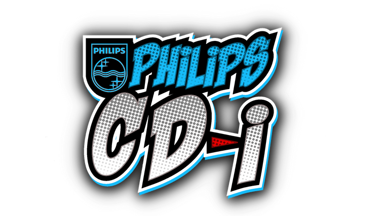
Let me know if you would like me to post them here. -
@mrseven Looking really good.
-
@zenjiro Thanks. Here's a few more:


I'll post more later. -
@mrseven dang dude, looking super sharp. For the Jaguar one I think it would look better with the "64-bit" on top of the dot-matrix layer
-
@zenjiro appreciate it. I had thought about that as well. I wanted to put the eyes in there as well but they don't look good unless they are are on a black background

-
@mrseven Yeah I see that now.
-
a few more:


-


Contributions to the project are always appreciated, so if you would like to support us with a donation you can do so here.
Hosting provided by Mythic-Beasts. See the Hosting Information page for more information.