New Comic Book Theme!
-
@tmntturtlguy said in New Comic Book Theme!:
create a dot matrix overlay of custom color of your liking
Any tips or sources on this step? Sounds like its more involved than just that. ;)
-
@alturis Nope, but hold on a minute and i am going to share something i think many people might like!
-
If anyone else is better at making these logos than I end up being, I am interested in getting some done for the following two custom category names:
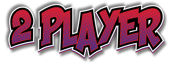
2 PLAYER
CLASSICS -
I apologize to everyone out there for my very long absence. I have had a lot of exciting changes in life over the last 6-8 months and unfortunately retropie and my arcade building has taken a back seat for a while. It has become evident through my lack of updates and responses that I am not doing a good job of keeping up and servicing my theme, so i want to share some files with everyone that might help in creating your own updates. There are instructions on how to do most all of the art throughout this thread, so please look back if you have question. if you go to this new github link i have a few different photoshop and illustrator files for the logos, you should be able to use those to come up with some of your own logos. I have also included one 16:9 art background, and a single photoshop file called dot matrix which is what @Alturis has requested regarding the logos. Github link to templates
Lastly, hey guys, how are you? @pjft @meleu @cyperghost @ruckage @lilbud @Syhles
-
@tmntturtlguy Hi, I just want to use this opportunity to thank you for your great theme. I'm using its 4:3 version in my upright cabinet.
-
@tmntturtlguy Doing fine, swamped in schoolwork but otherwise okay. How about yourself?
-
@lilbud Busy with work and the kids, but things are good. I need to find more time to get back into this community though. Glad to hear you are doing well.
-
@tmntturtlguy Hi! Glad to have you back, and glad to hear all is ok :) I believe you've seen that last week's MAME ROW was Bubble Bobble!
I'm also busy with work and the kids for the most part, but trying to find some time every now and then to do some things here. I'd been a bit less present over the end of 2017/beginning of 2018 but I think I'm back to a good cadence here.
Hope to see you more often around here!
-
@tmntturtlguy said in New Comic Book Theme!:
I have had a lot of exciting changes in life over the last 6-8 months
You didn't come to live in Brazil, did you?!
I'm also a bit away from here. Involved with RetroAchievements stuff. Specially the Documentation Project and helping with the development of RALibretro (mainly with testing).
RALibretro is an "emulator" that uses libretro cores for emulation and this is allowing us to add support for new systems at RetroAchievements very fast. Recently added Neo Geo Pocket, Atari 2600, and Virtual Boy. There are some guys working to add support for Neo Geo (yeah! cheevos for Metal Slug!!), and there are more systems to come!
I wish good vibes for you and your family, bro! ;)
-
@meleu said in New Comic Book Theme!:
There some guys working to add support for Neo Geo
PUZZLE BOBBLE HERE I COME
-
@alturis said in New Comic Book Theme!:
If anyone else is better at making these logos than I end up being, I am interested in getting some done for the following two custom category names:
2 PLAYER
CLASSICSHere is my attempt. Thanks for the instructions @TMNTturtlguy !
I was confused about what order the 4 layers were supposed to be in within illustrator so had to play around with it for a while. But my end result looks like these.
 !
! -
@tmntturtlguy Very kind of you for the templates, considering others have bowed out. Kudos man !
-
Ok take 2 on the "2 PLAYER" and "CLASSICS" logos. I think I have the technique down better now.


Edit: Updated based on a few more things I noticed about color schemes in the original set
-
@alturis said in New Comic Book Theme!:
Ok take 2 on the "2 PLAYER" and "CLASSICS" logos. I think I have the technique down better now.
Very nice, though I like the colours of the former ones better, but it's always good to have several to choose from. And if you hone your skills by doing more of them, all the better. :)
-
@tmntturtlguy Still alive and fine ;) Thank you
We older we get the more we don't loose track -
@clyde said in New Comic Book Theme!:
though I like the colours of the former ones better
Well I was trying to hit on the Red vs Blue standard for 2 player. And the classics matches better with the marquee image I used which also has yellow text.
-
@alturis these are really good. Just one comment: I think the ones in the actual theme are in italics, maybe @TMNTturtlguy can confirm that.
-
I also found a "simpler" technique that only requires the use of PhotoShop. (which I have a license for) and not having to use Adobe Illustrator (which I only have another 5 days of use in the free trial)
And honestly, I think it comes out looking more like the originals than my attempts at @TMNTturtlguy's Illustrator technique.
-
Install Shaka_Pow.TTF as found in
etc/emulationstation/themes/ComicBook/art.
(Right click and select install in windows) -
Open photoshop and Create a new image 8 inches by 3 inches, 72 pixels per inch (the default)
-
Use eraser tool to make the background layer transparent
-
Use Text tool set to Shaka Pow Upright, 150pt, Strong, in a color of your choosing. Open the Character settings (looks like a folder button) and set the VA to -22 to squeeze the letters closer together) Center the text in the image with the move tool. Right click the layer and select Rasterize Type (or Rasterize Layer depending on your Photoshop version)
-
Ctrl-Click on the text layer's thumbnail to select all of the pixels in that layer and create a new blank layer. Edit -> Stroke... Width: 7.8, color: black, Location: Outside
-
Create another new blank layer. Edit -> Stroke... Width: 11.5, color: white, Location: Outside
-
Ctrl-Click that white layer, Ctrl-C, Ctrl-V to copy paste (or you can just duplicate it and then Ctrl-Click the new duplicate of the white layer).
-
Use Eyedropper to pick the same color you used for the original text and paint over that white selection with that color. Then select the entireity of that layer and Free Transform move it down a bit until that last layer sticks some color out from under the white.
-
Copy the desired color from @TMNTGuy 's dot matrix psd (you also need to first resize this to 25% to match the resolution. Paste that as a new layer on top of all the others
-
Use magic select and set focus to the original text layer selecting the colored letters. Invert this selection, Select->Modify->Expand 2 pixels (with "at canvas bounds" disabled). Set focus to the dot matrix layer and erase everything in the selection.
-
Set the opacity of the dot matrix layer to something like 50% to better blend its color with the background primary letter color.
-
Select the lowest layer (should the be colored layer that was shifted down) and Click the "Fx" button to create a double drop shadow. (or double click the layer in newer versions of Photoshop) One at like 130 degrees, 10 px, 10%, 10px, 50% opacity. The other a copy of that but flipped 180 degrees.
-
Save As... PNG. Done!
I typed those steps while creating this in the exact same way as an example:

You can get the Dot Matrix PSD in @TMNTturtleguys git hub.
https://github.com/TMNTturtleguy/ComicBook-Templates.gitEdit: Added step 11 and updated the example image
-
-
I know this is a old post but how do i disable metadata? i just want videos enabled and no metadata as it is for my arcade cabinet.
-
@alturis those are awesome! I couldn't have done them any better! nice work
Contributions to the project are always appreciated, so if you would like to support us with a donation you can do so here.
Hosting provided by Mythic-Beasts. See the Hosting Information page for more information.