[RELEASE] PSX-MINI Theme
-
I think it looks very good. I like the graphics with the gamepad (1P), the menu below with the metadata is not bad either. Can not judge now whether the area for the cover is too small? It is already a requirement that looks different to the NES-MINI theme. But you're on a good way, very nice work.
-
Wow looks great. Very nice work. How about changing the Megadrive lettering on the upper left against a logo?
-
After several times I think the cover format is not bad. Since it is more in the width. Since I use these covers is not so bad :-)
-
That looks really good, you've done a good job of differing it from my layout and I really like it. My only suggestion would be to change the fonts to ones that more closely match the Playstation (particularly the gamelist).
I get the impression you're not so keen on doing the coding side of theme creation so I would like to make you an offer.
I will write all the xml needed to create the theme based on your mockup, you would just need to provide all of the graphics for it. My only conditions would be that I get a credit for writing the theme code and that the code will be available for other theme creators to use as well, that way it can help other potential theme creators.Let me know if this sounds good to you, I will need a little time to code everything but it shouldn't take me too long.
-
@Cybermen thanks!
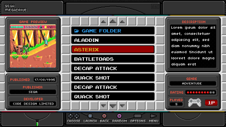
and yes, I also use screenshots of games in my metadata, so I decided to change the aspect ratio of md_image.
but keep in mind! in different systems - a different aspect ratio. in the NES 256x224, in megadrive 320x224 and so on. so that the previews look the same for all systems, the screenshot of the game (md_image) will be one layer below the background. but in the background layer, in the place where there should be a preview of the game, there will be a transparent rectangle. Thus, all screenshots will be in the same proportions. and this means that the prefixes to your screenshot (how to properly call them?) with the name of the game, and the image of the box with the game, will hide from sight. in the visible area will be only the screenshot of the game itself.
to be honest, I do not know yet what can be done with this. maybe I'll think of something. -
thanks!
about the fonts - I somehow tried to find a font similar to the one used in the bios menu PSX. the searches were unsuccessful, and I decided to create this font myself. cut out letters from the screenshots of the BIOS. from raster graphics made a vector, from the vector is already the font itself. but the result did not suit me. if interested, here's the link to this font. he, of course, is the same as in the PSX menu, but turned out to be more pixelated. and besides, it seemed to me that he did not fit into the general view of the theme.
on the contrary, writing code for me is not a problem. I was able to understand your confusing topic and make significant changes there. :)
with the rules for coding those with a sign, this is not my first project, so the code is easy.
the only thing I did not understand - why are you setting values in positioning and sizes in this form 0.724333133331333? as it seemed to me, 4 characters after 0 is enough to position anything with an accuracy of 1 pixel. and the second, which I did not understand, if it is really so necessary - how is this calculated? I would have exploded my brain.my only problem is to come up with something simple and original. when I saw your topic, I understood, here it is! since you released the theme, I tried to make a change. so the result you see was created very long. and even now I'm not sure that this is a complete thing. I'm a bad designer, but it does not stop me from being a perfectionist. I want to do something really cool. and I'm now looking at this layout, and I understand that he still needs some rethinking. and it's only gamelist menu.
with a carousel, I generally have no idea what to do.I am very willing to accept help, but if it's creating graphics or some valuable ideas.
Thank you for not being left out. -
@thunderbolt
thanks!
what can be changed there? my idea was to make these inscriptions not flat. I looked through the graphics and menu items from pixel games a lot, and came to the decision that I can make the same font for all systems. I applied a light gradient (volumetric, imitation of lighting and highlights) to the text, and I pictured it as if it had been "pressed" into the body of the console. as if it's a design element. if you like, you can call this pixel sceumorphism. :)if there are any specific wishes and recommendations - then I'm all attention
-
two more layouts
-
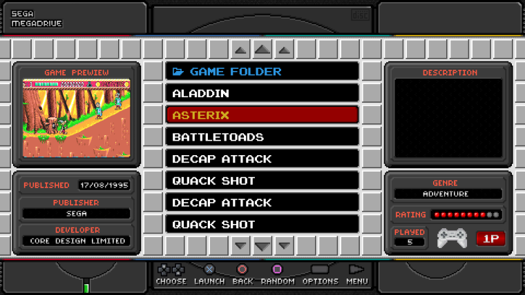
ah okay, I do not even notice that the systems have different cober sizes. If, of course, too much is hidden, I do not find it so good.
From your two new suggestions I find the top better. It also has more lines to choose the Games. Only there will be the problem with our covers? Very nice again the suggestions.
-
The new proposals look great. As a small note are the PSX buttons not wrong? According to the Retropy Guide, circle = A, X = B, triangle = X, square = Y. So circle = lunch, X = back, triangle = random, square = Favorite. Because it would be so with my attitude. Should I change this then? Then I would come together with other gamepads.
Is the Favorite Button? Looks pretty tight down ;-)
But everything was very nicely done.
Here the button assignment:

-
@frgn now where you explain it is also logical. It also looks as if the lettering is grafted into the console :-) I thought instead of the lettering a logo like this:

From the new layouts, I find the first better. Because the whole symetric works. -
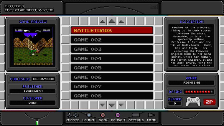
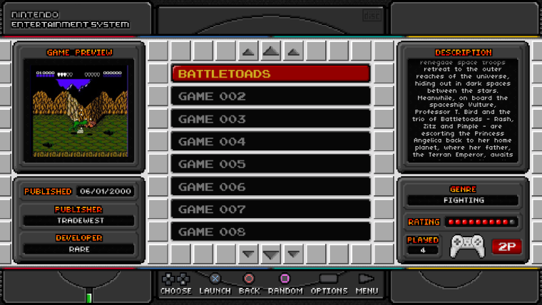
You've got "Game Preview" in the top left corner as "Game Prewiew".
-
@thore
I saw this scheme, but when I created help_systems, I relied on the layout of the buttons. visually:
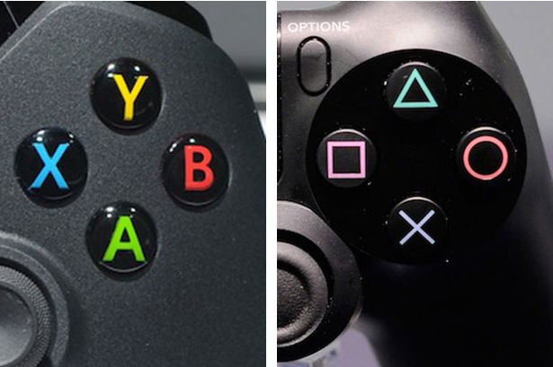
besides, if you've ever played in PS3, you might have noticed that there's the same layout on the menu as mine.
the cross always takes the action, the circle (in earlier games on ps1 it was a triangle) is responsible for returning to the previous menu or exit.
but if it is important for someone to have a different layout, I can lay out the links to the changed version.@Thunderbolt
the first layout in development. now I completely encoded the menu with the choice of games, but while it is displayed correctly only in the resolution of 1920x1080 and 1280x720. Soon I will create layouts at different screen resolutions.
about the logos in the menu with the lists of games: maybe in time I'll come up with something better. but so far everything remains as it is.
I like these logos, but they measure different sizes. and besides painted by another person. I'm trying to do as much as I can myself.@LiveFastCyYoung
Thanks, i fix it :) -
work on the theme continues, but not as quickly as we would like. To all who are waiting for the release of the theme, I advise you to be patient. I have no problems with the code, but I have some difficulties in "creating" the concept. to come up with something new is much more difficult than copying and changing, especially in the pixel art technique.
In addition, I have a lot of work a little free time to develop. but when I do, I put my soul into it.at the moment I completely encoded the menu with a list of games. now it is well displayed in the resolution of 1920x1080 and 1280x720. For other screen resolutions, I will create additional layouts. it's easy and does not take long.
screen with a carousel, I have not yet invented, but I try to find suitable icons and try many options.here are some sketches:
-
Guys. I decided to create a small survey. It is necessary to assess objectively how many people are interested in what I do.
Please leave your answer here. -
This is great, I look forward to the finished theme and do not let you stress ;-)
-
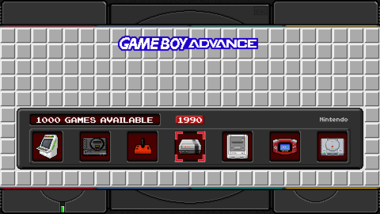
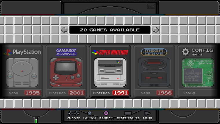
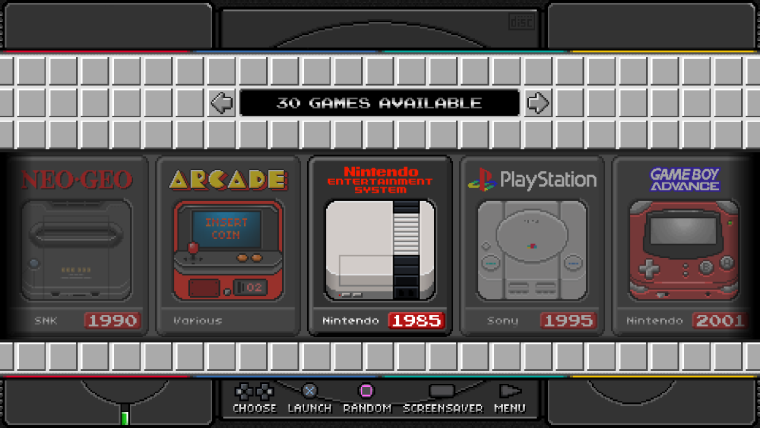
Rom selection looks great, with the system selection, I find the icons somewhat small with the current version. Looking forward to more suggestions.
-
So I would find it already good, if the button occupancy is as it is described with github and the retropie guide. As described in the photo above. As you said, it might not be bad if there were different button layouts. Many thanks for your work.
-
Now I seriously want this. It's good you've changed some code and it looks very awesome. Can't wait to get it on my PiStation.
-
Hello everybody. Long time no see.
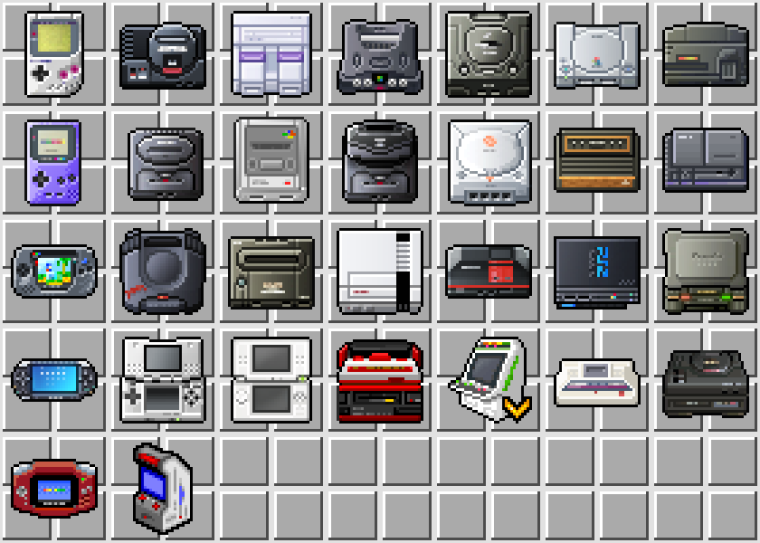
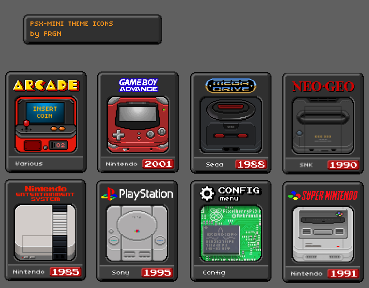
for the last two weeks I finally managed to decide on the concept of new icons. this is what slowed down the whole process of creating a theme.and so, I have been surfing the web for a long time and a lot, and at some point I found a pretty good package of icons for different gaming systems.
and just like @ruckage , I decided not to be content with the ready decision. I just repainted them in a pixel art style. The work was very long and there were a lot of changes. at the moment I have draw 7 icons:- arcade
- gba
- megadrive
- neo geo
- nes
- psx
- retropie menu
- snes
example:
I was satisfied with the result, and started writing code for the carousel. at the present time it looks like this:
Besides, I thought that not everyone has a console body painted black, like mine.
most likely your PiStation has the original color of the case - gray.
so the composition of the theme will include a layout in gray tones. something like that (this is not the final option. I think it's worthwhile to play with shadows and lighting.):
also: the theme will include models with different layout buttons (help system), as well as layouts with simple values (A B X Y buttons).
at the moment this is all the news I have.
Now that I have an idea of what I'm doing, it's easier to work. but drawing icons is still quite difficult for me, so it takes time to draw the next batch of icons (for example, 10 pieces).
write what icons you need first. personally I use 7 gaming systems, which I have already introduced.P.S. - do you think I should add a link for donations? I have quite a small of free time, which I dedicated entirely to this project.
Aloha from Russia, and sorry for my bad English. ¯\(ツ)/¯
My RetroPie themes repo - https://github.com/free-gen/
Blast16 to MDMINI mod
DONATE HERE
Contributions to the project are always appreciated, so if you would like to support us with a donation you can do so here.
Hosting provided by Mythic-Beasts. See the Hosting Information page for more information.