NES RessurctionXtras 2.0 Project (thread previously titled: Does anybody work on Emulators to fix broken games here?)
-
Sweet. The new way is great. Puts all of the Title shots in the Titles folder and the Action shots in the Action folder with the file names of the roms. No renaming necessary. :)
Now I just have to figure out how to change palettes so I can get some better colors. I just think something is off about the MednafenX standard palette. I want to try out this guy's palettes here: http://www.firebrandx.com/nespalette.html
He claims to have put up to 30 hours constructing a single palette and really seems to know his stuff. I really appreciate that type of dedication and eye for detail.
-
@used2berx They got title too: http://thumbnails.libretro.com/Nintendo - Nintendo Entertainment System/Named_Titles/
They also have box art
-
@used2berx said in NES RessurctionXtras 2.0 Project (thread previously titled: Does anybody work on Emulators to fix broken games here?):
I want to try out this guy's palettes here: http://www.firebrandx.com/nespalette.html
That guy does a lot of crap for retro game resolution and scaling. As well as custom palettes.
-
@lilbud Hey man. If I sent you some screenshots of the games you had listed, would you be able to compare them to your actual NES games on a CRT and tell me which one is the best? You'd have to be pretty confident that the monitor you're seeing the screenshots on was accurate too.
My TV and PC show them differently. I have no way of knowing if anything is accurate, so I can't really decide what is the "best" palette to go with. I don't want to make a few thousand images and end up regretting my choice after the fact.
-
@used2berx Sure, but it'd probably tomorrow or Friday until I have some time. I'll probably take some pics of my screen as well.
Games I have:
Gyromite
Double Dribble
Dr Mario
Q Bert
Millipede
Pinball
Ninja Kid
SMB1/Duck Hunt -
@lilbud I'm itching to get this done and I've had a couple other people tell me that Smooth (FBX) is the way to go. I think it's really probably just a matter of opinion and I'm way overthinking this. I'm still going to send some shots your way now in hopes that you might get to it before I just break down and start doing them. Maybe some other people will chime in and tell me what they think as well, even if that's just to say that I'm being an OCD idiot about all of this. :)
Here we go!
DOUBLE DRIBBLE:
MednafenX Default:
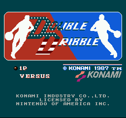
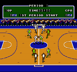
Smooth (FBX):
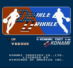
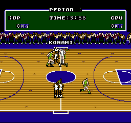
PVM Style D93 (FBX):
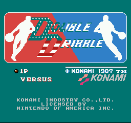
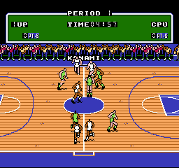
Composite Direct (FBX):
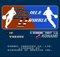
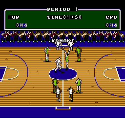
DR. MARIO:
MednafenX Default:

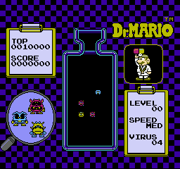
Smooth (FBX):
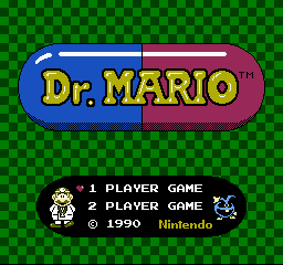
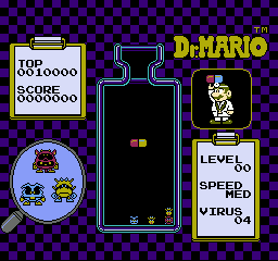
PVM Style D93 (FBX):
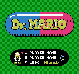
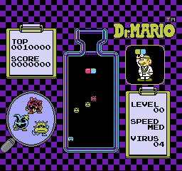
Composite Direct (FBX):

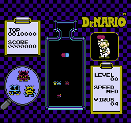
PINBALL:
MednafenX Default:
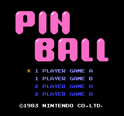
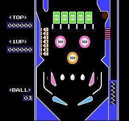
Smooth (FBX):
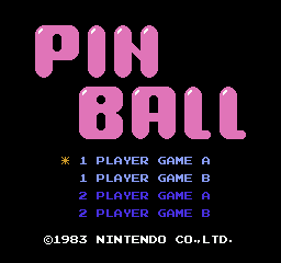

PVM Style D93 (FBX):
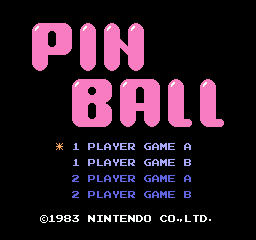
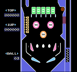
Composite Direct (FBX):

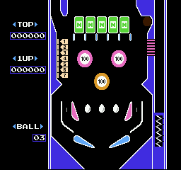
SUPER MARIO BROS.
MednafenX Default:
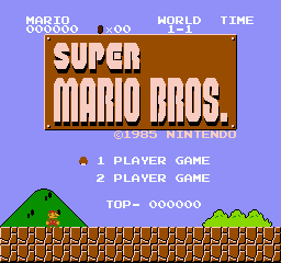
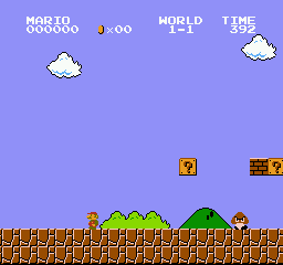
Smooth (FBX):
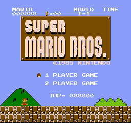
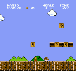
PVM Style D93 (FBX):
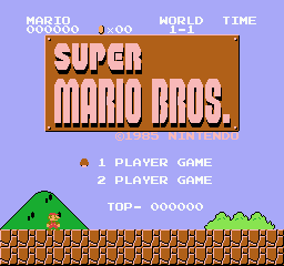
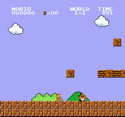
Composite Direct (FBX):
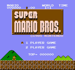

Well... There they are. :)
I think I'm going to start a new thread about NES Color Palettes specifically as well as posting this here so the question gets maximum exposure. I've got a ton of snapshots to take and I can't wait to get started. Been doing nothing but research and tinkering for a full day now and I hate feeling like I'm getting nothing done.
Thanks for looking into this for me bud. :)
-
So I'm going to be re-testing 2,020 games in the latest release of MednafenX on the XBox from back in November, making this the 4th time I've tested them in about 4 months. Yay!
I figure I'll start the emulator completely from scratch and add things as I go along. This will make sure also that I'm adding any game-specific instructions for things like light gun games and other one-offs that have special instructions to get running correctly. I might as well do it this way since I'm going to be re-creating all 4,040 screenshots with the Sony CXA palette that I will be using from now on.
Unfortunately, changing the individual game configurations so that they use this palette would probably be much more work than starting all over since there is no way to change that one thing globally without overwriting a bunch of other stuff that would break the games needing special instructions.
So... once again, what I thought was going to be a quick and easy project turns into a major one.
The Quest for NES Perfection continues. :)
BTW... the rest of our Palette conversation took place in a separate thread I made for it if you care to see how we came to the Sony CSX palette as the one we're using. As of posting this addendum to this post I just noticed that @mediamogul also replied to that thread saying that the Sony CSX palette is the only one he uses as well. :)
Here's the other thread: https://retropie.org.uk/forum/topic/17066/nes-custom-palette-preferences/5
-
Did about 320 of them yesterday, so 640 out of 4,040 screenshots down. These all look much better with the Sony CXA palette, and they're all exactly 256x240.
Two good side effects have happened so far by doing this work. After messing so long with palettes the last few days it was discovered that there was a long-time glitch in the MednafenX code that would auto tint/hue the pallets by specified defaults whenever you changed the default palette by turning the option to autocorrect from "NO" to "YES". The developer has now fixed this so you have to manually turn this on or off and changing the palette won't trigger it.
Also, when I found around 100-120 more obscure clone and pirate type games that had glitches or were entirely unplayable about 6 months ago, he was able to get about 95% of them working. It turns out that while he was fixing them, some minor things got in the way of a few other games so they stopped working. Those two new problem games were fixed last night and he isolated the reason why so the fixes for them will not negatively impact others this time. So I'm very hopeful that as I continue testing if I run into any more it will all be ironed out.
A little more perfect everyday. :)
-
Got over 1,500 of them done now. These look so much better. I think this will be the first thing I test out on github because of the file size being so small. The combined total of around 3,000 Action and Title shots in PNG format at 256x240 pixels is around 18MB.
Compare that to 2,020 PNG Carts at around 1.8GB and 2,020 JPG Box arts at around 2.6GB!
I think I'm also going to re-size them by 200% and 400% using Nearest Neighbor filtering to get images twice and four times as large without quality loss so I can upload 3 separate sets. This will be a good opportunity for me to test out how to get the files to download to the exact correct folder as well as allowing for the end user to choose which version/size they want to download.
-
All of the screenshots are done. Ended up removing two games since one was an untranslated Edutainment title that was unplayable by an English speaking audience and the other was an adult hack of Final Fantasy that had some bugs and I didn't bother looking into it since I already removed all the other adult games that were hacks in the set.
I'm in the process of adding around 50 more translations and hacks at the moment that will put the list up to around 2,070 games. I think this will be my last batch of hack adds from the past and I'll only be monitoring for new ones until the NES/FDS set is complete. I'll make special considerations for anybody who brings any specific hacks to my attention that aren't already accounted for.
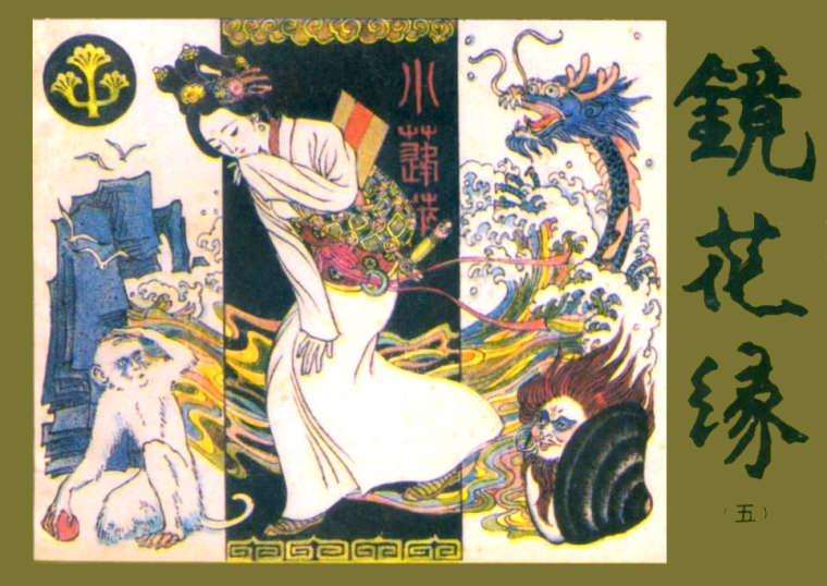
Here's a box I made for a Chinese pirate game that was translated called "Flowers in the Mirror" that was taken from a book called "Jing Hua Yuan". There was no cart or box available online for the game, so I found the most interesting book cover and made a box from that. I will also make a cart image from this when I get a chance.
Original book image:

Edited boxart by me:
-
Check this bad boy out...
There was an Aliens FDS prototype from SquareSoft that was never released, but was unearthed in 2011. It was an MSX port, and it sucks. (I'm not sure if the MSX game was any good, or if the prototype was just bad). Thanks to lancuster late last year, it was heavily hacked to be much more playable.
So, what I like to do with the Prototype games is to provide an image of the actual prototype cart if I can find it. No such luck here. I could barely find anything about it online at all. Then I like using fan art usually used for repro carts if I can find it, otherwise I make my own boxart for the game. That's what I ended up having to do here.
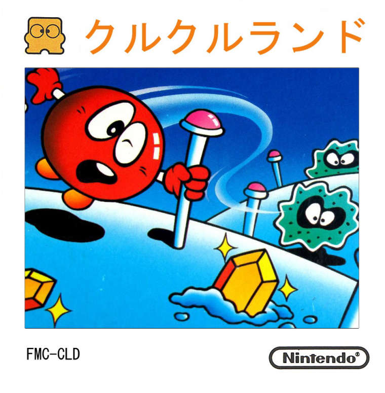
So I took a totally basic FDS image for the game Clu Clu Land that I had:
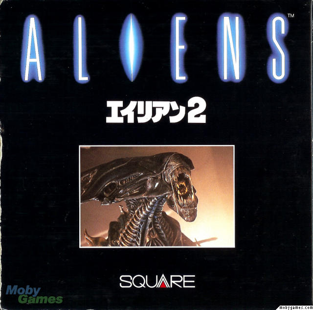
Then I took this image from the MSX Boxart of the game:
And this is what we end up with:
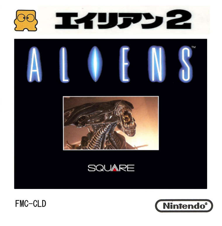
Because FDS disk labels are pretty generic most of the time, it won't look out of place if I take that Japanese text and the "2" and just make a label out of that to put on the FDS cart template I created.
-
Still hard at work here on the project. I added another wave of games to the collection bringing it up to 2,076 games now.
Carts are all done, but I'm working on upgrading some boxart before I start attempting any mass resizes. I'm no graphic artist, but I'm really starting to get the hang of this Paint.NET program, and I'm also learning a lot about sharpening and colorizing images to make them look even better, as well as using layers to remove backgrounds from one image and join them together with another image.
Here's a few that I've done that I'm particularly proud of.
Earthworm Jim II (Pirate):
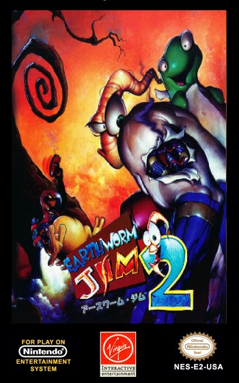
This border is a image from a cart reproduction site that had watermarks all over it. It looks like they used the US Genesis box for the original artwork before ruining the image with the watermarks. I removed that, cleaned up the edges, and I found this cool image which I believe was from the Japanese Megadrive release. It's not Chinese text, but it still looks more like a Pirate cart without the English on there I think. :)
Driar (Homebrew):
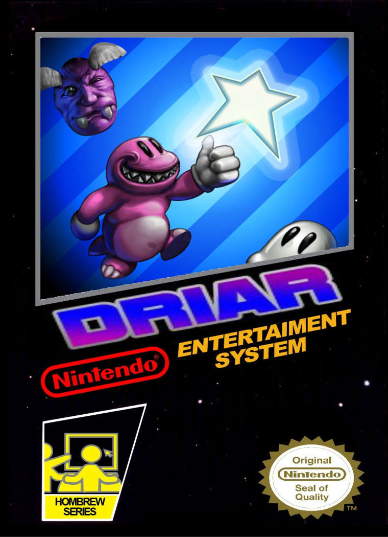
This cool little puzzle game came with a poster image. I coupled that with the template I made from a "Generic Boxart" that @chelochelini2014 made a while back for me. I've actually used this technique a few times already. Unfortunately, I don't know how to make the game text like "DRIAR" on this image. I found yet a 3rd image with that text and I was able to copy it and paste it in a 3rd layer and tilt it.
If I could figure out a good way to make the game titles under that window that would open up a huge opportunity for me to make images for a lot of the Homebrew/Pirate/Unlicensed/Etc. games without any boxes.
Well... that's about it. I figured it was about 3 weeks since I gave any update and didn't want anybody to think I've abandoned the work. :)
-
Haha! Check this one out.
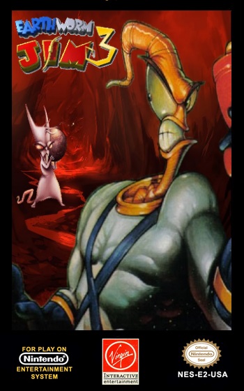
I took a logo of EJ 3D, removed the "D" and the background, found a random cool image and then put them all together and came up with this. :)
These two images are so much better than these crappy pirate games!
-
I'm sure I'm not done adding games yet, but I've finally gotten to the point with the artwork that I'm satisfied that my RAW set is the absolute best Box and Cart art that is available online anywhere. I've personally tweaked over 600 boxes and all 2,116 cart images. Carts and Disks are in PNG format and all have transparent backgrounds that "float" over the skin.
That being said, my first test for mass size conversion seems to be a great success for the Box Art. The images are sized down quite a bit so there won't be any issues displaying them or scrolling through the romlist on a Pi Zero.
There are three different box types that needed to be converted separately to maintain their basic shape. US/Europe style boxes that were typically taller than they were wide. Japan style boxes that were typically wider than they were tall. And finally FDS boxes that were essentially perfect squares. Some boxes of each variety would break the rules, so they were grouped with another type if that was the case.
Sizes are as follows:
US/Europe Style: 372 x 510 pixels.
Japan Style: 510 x 372 pixels.
FDS Style: 435 x 435 pixels.Quality loss is to be expected when many of these raw images were over 1,000 pixels on the large dimension all the way up to around 2,100 pixels. But using the correct sampling while resizing doesn't seem to lead to any outrageous artifacting or other garbage showing up when changing the basic dimensions of these images.
That was something I was originally concerned about, but having learned quite a lot during this process I found out my fears were unfounded. I had originally freaked out a bit when converting some small screenshots in .PNG format when I noticed that changing their size by a single pixel could basically destroy the quality. This was due to the nature of 8-bit pixel screenshots. When working with typically much larger base images that were not pixel artwork, they generally convert in size much, much smoother.
Well... for the first time in months I'm able to scroll through the boxes on my Pi Zero again, and they look great. I can't wait to see what all of this looks like on a Pi 3 when I get one and I can use even higher quality images as well as video previews on it.
-
I finally got around to upgrading to the 4.4 version because I'm going to try to get a semi-put-together Pi Zero build out to my brother that he's been waiting a year for now.
I haven't really explored any of the differences between this and the 4.2 version I had been working with for a long time now, but one thing I did notice that is a huge deal to me is that when you enter a sub-folder the next folder or game inside of it immediately displays the artwork and info now instead of being blank and having to press down and then up to see it. :)
Not sure who puts all of the brains together, but just wanted to give a shoutout to whoever put that fix in. ;)
-
I'm currently batch ripping the manuals I have to PNG with 300DPI.
Sadly, some of these scans are pretty low quality to begin with, so no matter what I do with them they're never going to be perfect. It's kind of ironic that aside from the NES Classic Mini manuals that I got my hands on, the Japanese manuals in the collection are generally in much higher quality than the US manuals. This is due to the fact that the Japanese scans are far more recent and there was much better and cheaper technology to get them done than when these US manuals were scanned. I find it kind of hard to believe that nobody ever really upgraded the US manuals in all of this time. Most of them seem to be the exact same ones that I had a decade ago with a few exceptions.
Even though they're much larger in disk space real estate at 300DPI in PNG format, I feel this is the way to go. Edits can then be made at any time to them without degrading the quality.
Some things I'd love to do at some point with these images are as follows:
- Split the 2-page scans so every image is a single page.
- Make all manual images the exact same size.
- Clean up the images.
Ideally, with a lot of work, a ton of cleaning up could be done to these and many of them have the possibility of one day being as high quality as the NES Classic Mini scans. I don't know if I'd ever do this though, but after splitting the images I would at least like to remove the creases and staples from the bindings, as well as clean up the other three edges of the images.
This doesn't sound too bad when I'm looking at an 8 page manual, but it seems rather daunting when I'm looking at one of the manuals that are over 50 pages.... and then I start thinking about how I have about 1,000 more of these to do. :(
At any rate, it's never going to happen on my end with my current PC. Messing with files like this slows my work down to a crawl and I spend more time waiting on my PC than actually working and it just drives me crazy. At least with the PDF files ripped to the PNG/300DPI format, separated by folder and numbered correctly all of the materials will be there if I ever get a chance to upgrade my rig and decide to tackle this project.
In other news.... I re-ran the gamelist.xml script last night and I'm over 1/3rd of the way toward reversing the process for the 2nd time back to the [synopsis].txt files. So far out of around 700 txt files, 72 of them were different because of the new code changes I made the other day, and none of those differences were undesired or unexpected.
Differences so far on 2nd re-run are as follows:
Removed extra blank spaces at end of lines in Description: 69
Removed 2 extra blank lines at the end of the Description when there was no URL citation: 3Once this is done re-running this time, I'll have 2,118 unique NES/FDS [synopsis].txt files with absolutely no strange characters or formatting errors that will look wonderful on the XBox.
Oh, and anybody that hasn't been following along... These new synopsis files are no longer the novels of information that nobody read that they used to be. Every one of them is 1kb or less in total, and the Game Descriptions now read like the "exciting" text you'd see for the game on the back of the box, or the story in the manual, or on an advertisement for the game.
For example:
The classic tale of horror comes to vivid life in this fast-moving video game! Dr. Jekyll succeeds in separating a man's personality into GOOD and EVIL - but he experiments on himself! Now, without warning, the kind Dr. Jekyll transforms into the monstrous Mr. Hyde. Follow Dr. Jekyll as he fights off enemies in hazardous 19th century London, only to be suddenly plunged into Mr. Hyde's World of Demons! But the excitement doesn't end there - as you do battle in each of the two worlds of this game, the worlds themselves are struggling with each other for control! Which will triumph - GOOD or EVIL? DR. JEKYLL or MR. HYDE?
Sure it's all lies, but it does make it sound like a game you'd want to play. :)
Contributions to the project are always appreciated, so if you would like to support us with a donation you can do so here.
Hosting provided by Mythic-Beasts. See the Hosting Information page for more information.