Pipboy Theme
-
@lipebello obrigado, você me deu inspiração para fazer meu tema, mesmo não tendo a mesma habilidade que você no desenho fiz algo bem bacana
-
@wcarvalho Can you add system "custom-collections" please? ;)
-
-
@wcarvalho Thanks... Installed this and it looks very clean! Thank you ;)
-
Some graphical things
1.1 A small typing error: You named PSP PLASYATION ;)
1.2 The pcengine system won't show in my setup, the folder is named wrong and also the system itself... it'sPCENGINE
1.3 The CPSx systems... are named correct but if you use roman numberic you see just an increasing I. I think arabic characters are better. -
That's one of the themes that may be worth... If the whole system does not have one video. Why not switch off the description and set text of ROMs right in the middle. @mattrixk done this in his IO theme
-
Now my greatest points But this is just my personal opinion.
3.1 In the Main view you have tons of space left and right. Why not view the next and last system?
3.2 If you select the system - why not show the selected system in top view?
I like the color sheme you decided to work with really. This gives a nice RetroFeeling with concentration of the main thing ;) But if you decide to make other system left and right to the middle visible you can "blur" these systems with annother color. So you need just two png. The activated in the middle got this light green, the system left and right are made dark green ;)
But I like this very much and with the right a bit of tuning in letter size and viewing style it's an ideal theme for handhelds ;) I think @Hex will agree....
-
-
Thank you very much for your opinion.
I used the @herb_fargus hint, to take screenshots
1-
1.1 About psp system, I put as playstation portable, and psx only as playstation. Only if it is something of resolution to have deleted the "portable" of the system logo


If you take a look at github, the file is correct there
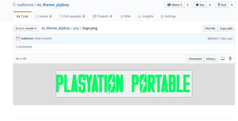
Try to download the image of the psp logo again and put it and see if it corrects. If this is the case I create a new logo with the brief writing and solve the situation, I put "Playstation Portable" because I found it more interesting that way
1.2 In relation to the pc engine. I made the separation of the name of the system with Japanese and Western model name
I will correct the logo written "tg" for "TurboGrafx".
I tried to follow a pattern according to the documentation https://github.com/RetroPie/RetroPie-Setup/wiki/PC-Engine
If so, try to access your es_system system file and change the system theme

1.3 About the CPS system, I put it in Roman numeral because usually in the logo arts it is used that way. I thought a lot to put conventional numbers 1 2 3, but I ended up opting for Roman numeration, I'll test with a new logo to see if it gets better
2 In my case that was the intention, remove information let's say nobody reads. And leave only the name of the game cover and the video preview. Since I also left a lot of empty space on the screen, I honestly did not find a better way to fix it. I will test using the array of games list more in the middle of the screen to see how it is

3
3.1 That part I sincerely thought a lot about it, in showing or not the next logos.
Showing the next logos, it does not mix very much with the theme of pipboy, because it is a command line system.About the "blurred" effect on the game selection screen, I thought I'd implement something like that, but unfortunately I could not do it. I ended up getting only in the list of games, which I particularly enjoyed the effect.
I will try to give a researched and try to update the theme with this, it will be much more attractive with this effectI agree with you, my theme got pretty good for the handhelds, but the way I did, I say resolutions, settings etc etc probably will not work properly, even though I do not have screens of other resolutions to test this theme, unfortunately I only tested on the 32 inch tv I have
-
@wcarvalho Okay then it was your intention to write "Plasyation Portable" instead of"Playstation Portable"?
Moreover... There is nothing wrong with your
tg-cdandtg16... you namedpcenginetopcengenie, that's the mistake here. I renamed it manually and it shows up now... but you named the system itselfPCENGENIE(I linked pictures from your github to here)
I respect your wishes not to show additional systems. But can you tell me were is the switch to show the additional systems?
About the blurring! I created the extra systems for IO theme.... so the activated system shows black/white, the system left and right are grey/white. No literally blur, just with darker or lighter colours
Btw: Later I created a complete new set of all 4 icons ... these are integreated into the IO theme.
-
@cyperghost said in Pipboy Theme:
@wcarvalho Okay then it was your intention to write "Plasyation Portable" instead of"Playstation Portable"?
Yes that was my intention, I ended up letting a writing error happen. Excuse me. I have already edited the publication with the correction
Moreover... There is nothing wrong with your
tg-cdandtg16... you namedpcenginetopcengenie, that's the mistake here. I renamed it manually and it shows up now... but you named the system itselfPCENGENIE(I linked pictures from your github to here)Sorry for not seeing this grotesque typing error. Finishing doing a fix and update on github
I respect your wishes not to show additional systems. But can you tell me were is the switch to show the additional systems?
At first when I developed the theme I did not find it interesting. But I will do some tests to update if I could put the same effect I made in the list of games will be as definitive, as it will be much more attractive
At first when I developed the theme I did not think it was more because I could not apply this effect, and also when I thought of something more in the style of terminal like the piped not very much combined. But I will do some tests to update if I could put the same effect that I made in the list of games will be as definitive as it will be much more attractive. Thanks again
-
I did the tests on the main page. It was a nice effect. But the limit will be 3 logos at a time, if I put more than this it will cut the next logo

About game list alignment. It did not solve so much the issue of empty space
Left alignment
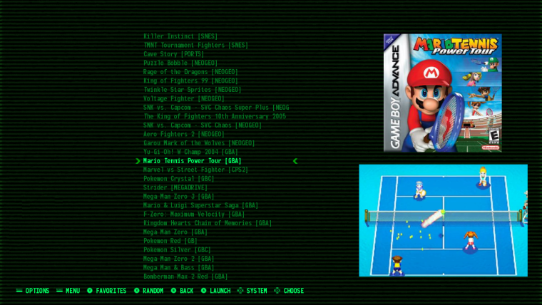
Center alignment

Right Alignment

But in the right alignment, if the name of the game is bigger than the spacing that was defined it will be cut, but on the right side instead of the left that would be ideal
-
@wcarvalho I like the 3 system view and also the alignment settings.
Can you upload to github please or show me how I can enable the settings? -
Is there any chance you could do a version with the game description? I love the cleanliness of this theme but I also love having the descriptions.
-
@simpleethat
Yes, I'll put it in the documentation. How to activateSince I have little time to move, so it's not finished yet
Let's say the theme is still in beta, but usableI had an idea and I am doing the layout of a new version, not so much with terminal face, but maintaining the characteristics. There's still a lot I can test and improve


-
That's pretty badass :D I don't seem to recall the pipboy making the typing noises, though. I have to go back and replay some Fallout 4. That part is a little... meh, but the rest, 100% badass ;D
-
@wcarvalho I found out how to set the 3 systems in main mode ;) I'm using this now. It's just a quick edit to
theme.xml. I think that's the best option (personally) - because I want alway a small overview of next and last system :)Annother idea.... The space in main menu is so empty. Mayb you can set "PiBoy" in one of the corners (right preferred like you did in your Screensavers?) Just to fill some space ;)
As @simpleethat said: I think it's better to keep the theme clean and lightweight
-
This new idea will look like this. I'm still thinking I'll still put the help buttons on the system. And the number of games counter

I can leave this version for those who want with the description of the games.
But anyway. I'm thinking a half of those gamelist buttons, getting bright according to the menu you have.
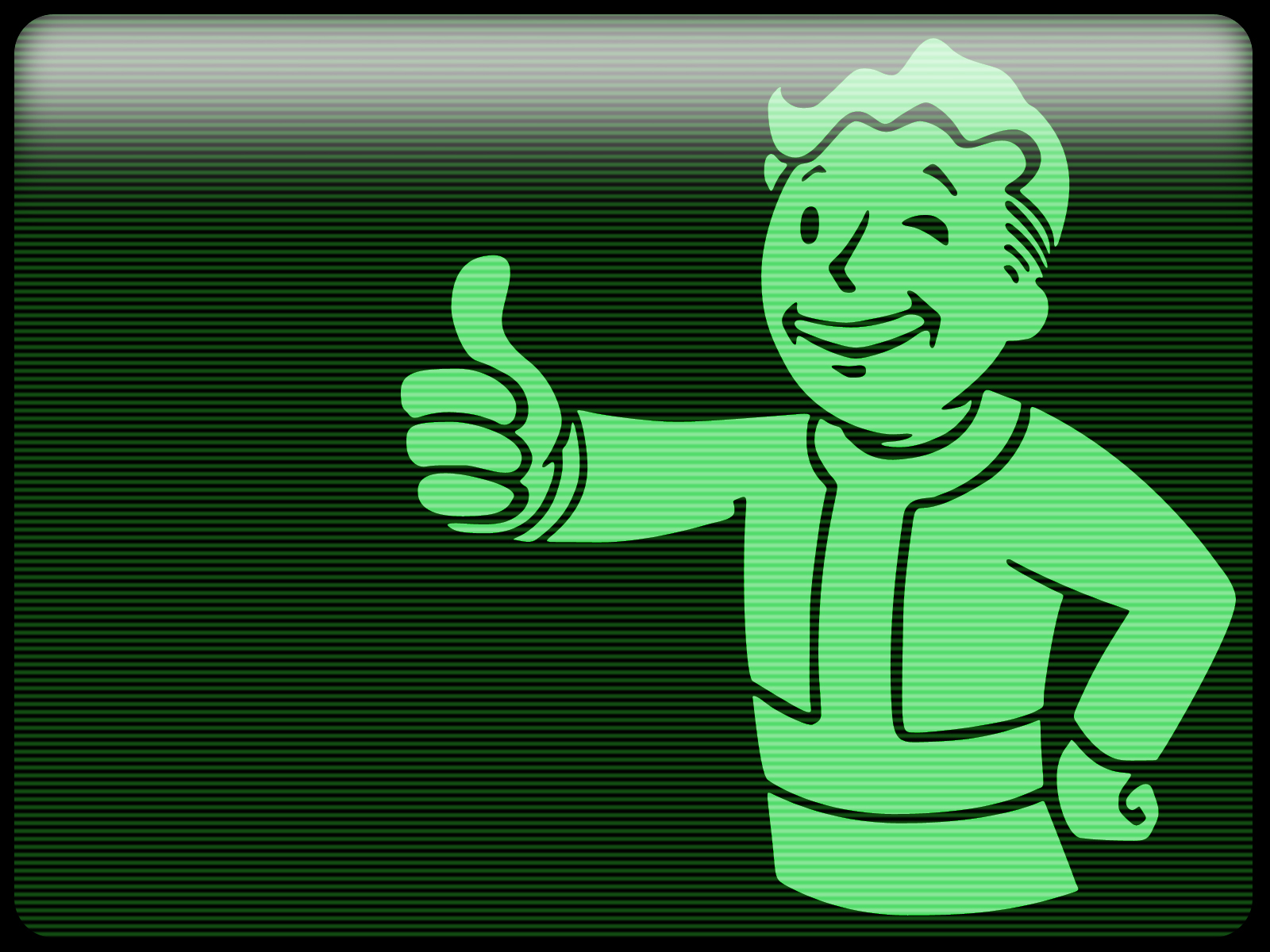
For example, the first for the selection of systems, the middle for the list of games and the last for configuration page of the retropie. I think this is possible. But I need time to complete and testThe image I put of the vault boy, it will not be colored as it was, I will leave it totally green
Every day I like how everything is getting
-
@wcarvalho that's pretty awesome!
-
Contributions to the project are always appreciated, so if you would like to support us with a donation you can do so here.
Hosting provided by Mythic-Beasts. See the Hosting Information page for more information.