[Theme] Angular Theme
-
@lilbud The release year for the nintendo 64 is 1996. Also, could you please add Nintendo next to the 64 since I believe that's the official name of it.
I only noticed it today because I didn't have any n64 games installed and I decided to play Castlevania on the n64 because I saw the df retro video.
-
@SP Thanks, I think it's set to 95 maybe. I'll fix that a little later.
As for the system select logo, I thought it'd be a little redundant to have the company name up top and then repeat it for the system name. That's why some are shorter near the bottom (64 instead of Nintendo 64, Entertainment System instead of Nintendo Entertainment System.)
-
@lilbud What fonts are used in this? I’d love to create some systems I need for my build.
-
@LiveFastCyYoung All of the text is Product Sans Regular (you can find it in the assets folder.)
Here are the illustrator files for the system select logos:
https://send.firefox.com/download/779aa3dd20a966d1/#HflXmAAVXXfl0NqnPX_RQgAnd if you make any new systems, could you submit a PR to my repository?
-
@lilbud will absolutely submit PRs for anything I do.
Thanks!
-
@lilbud How about N64?
-
@SP I updated the logo to say 1996.
Sorry about the wait, had to reinstall illustrator because it wasn't working.
-
@lilbud Thank you. I really do appreciate it.
-
@SP I had the same problem, so I went in and changed the zIndex of the "md_video" element in the "theme.xml" file from "70" to"69" and it resolved it for me.
            <video name="md_video">
                    <origin>0 0</origin>
                    <delay>1</delay>
                    <showSnapshotNoVideo>true</showSnapshotNoVideo>
                    <showSnapshotDelay>true</showSnapshotDelay>
                    <zIndex>69</zIndex>
            </video>
My guess is the zIndex of the video element and the bottom bar are conflicting.
-
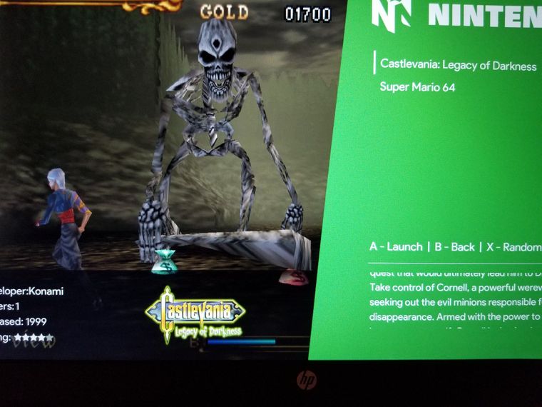
@HeyRay2 Hey, it worked! Thanks a lot.
-
I've finished adding Atari Lynx. The only issue I am having though is, my logos are showing up as black instead of white. I'm digging into why this is happening but haven't had any luck yet.
-
@LiveFastCyYoung Lynx is already in the theme.
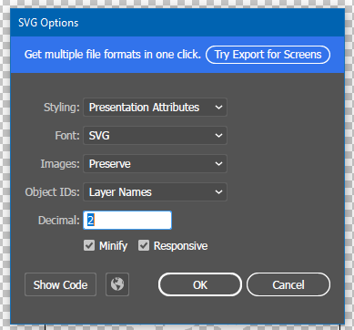
When exporting your svg files, convert everything to an outline. And then select presentation attributes for style.
These settings:
-
@lilbud Long time, no see. Hopefully you still check the forums from time to time.
I hadn't touched my build in quite a while and started to this weekend. I was thinking about modifying your theme to make the angular right sidebar transparent so the system name and help text below overlays the screenshot / image underneath. Is there a way to make that sidebar transparent?
-
@LiveFastCyYoung Actually had the forum open in the background until I forgot about it until hearing the notification sound :)
I'm undertaking the same process of picking up a long dormant build and getting back into messing around with it.
You can just comment out the sidebar in the theme.xml and that will take care of it.
You'd also have to change the code for md_image to fill the screen, as well as use widescreen images to fill the gap.
Do let me know how it turns out, sounds like a cool idea.
-
@lilbud It's my first pass but this is what I have so far...
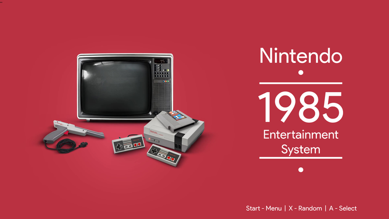
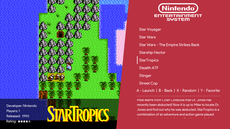
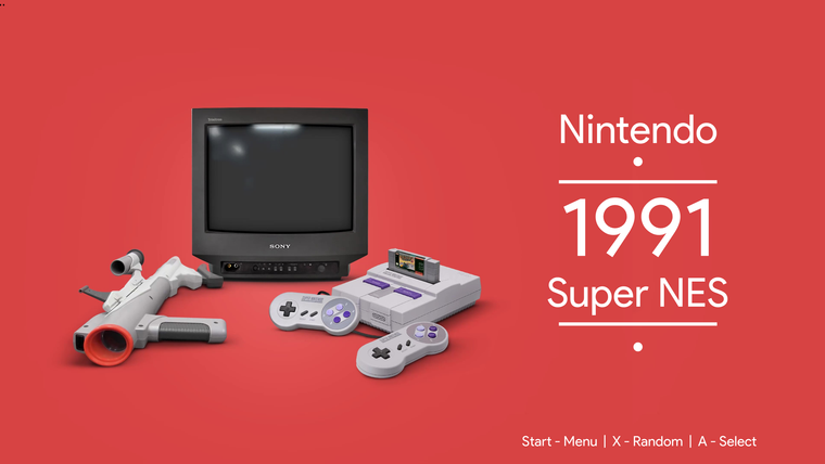
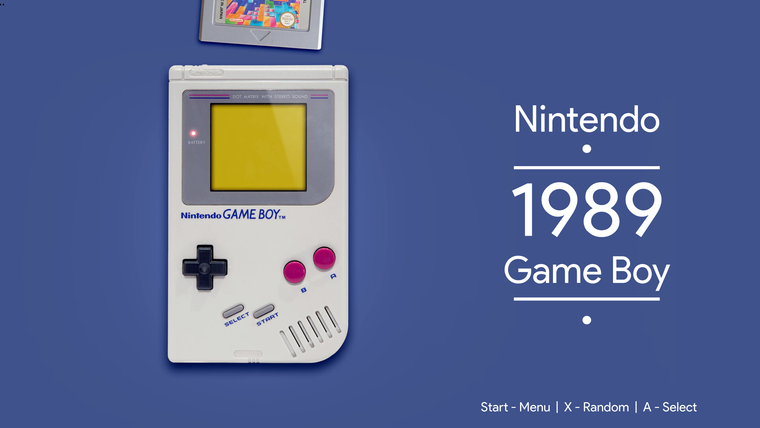
I'm using the videos from the Colorful theme for Launchbox, taking a snapshot of the beginning, re-arranging the photo to align the system to the left, removing the sidebar from the system view and changing the system color for the sidebar for the gamelist view to match the background of the photo.
You can find his videos here...
https://forums.launchbox-app.com/files/file/1958-colorful-platform-video-set/
-
@lilbud Couldn't figure out how to pull request your repo. I created gamelist icons for the Famicom and Super Famicom. They are below if you'd like to include them in your theme.
https://send.firefox.com/download/5a2446af2f479e8f/#8BgZL7DcdxC38-X6yca78A
-
@LiveFastCyYoung You have to clone the repo, add your icons, and submit a PR.
-
Hey man! First sorry for my bad english .
Your theme is become easily one of my fav all the time , i know it talk a lot of work and time and it's really amazing of u .
And because i really love you theme i hope you can make it big and universal theme , and there is some ideas if u can do theme it will be a really awsomMissing system's :
- Atari800
- Bbcmacro
- Pce-cd
- Supergrafx
- Pc-88
- Pc-98
- Fix tg16 , tg-cd
- Sega arcade model 1 , 2 , 3
And i think i miss to mention some , but u can use retropie github setup wiki, and carbon theme as a refernce , and can also also make some themes for collection link nesh "nes hack" , doom , etc
2 - if u can make every company uniqe color by defult , nintendo and atari is red in current theme what if u change atari color to another one , and so ..
3 - u can make make a 3 color profiles , lets call theme slik "your current black one" , "bright and dark" 2 color profiles one usese the dark value of color and another use the bright value of same color, 3 one black Angular like slik -you current dark theme- but with colorfull logos .
4 - change some systems screensshot , like ppssp and satrun etc, ask peoples what of the best memory of every system and pick screenshots with same color templet to be more silk
I know it's a lot of work , and some might be not good ideas, and i wish if i was an artist or know how to work with color, but i really love your theme and i really home it be a huge one.
Thank u for all of your greet work , hope the best for you now and always
-
@lilbud great theme! I'm just having an issue when using it in my Picade cabinet. As you can see in the screenshot attached (sorry for the bad quality, as you can see in a photo taken directly of the screen), in the game list view both the video and screenshot of the game doesn't start from the upper left corner, and also some parts keep the background from the system (arcade in this case). BTW, I'm using EmulationStation 2.9.0RP
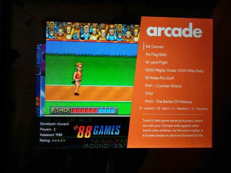
Any clue about what's happening and how can be fixed?
-
@svera switch the theme to 4/3 mode. In the config xml, change 16_9 to 4_3
Contributions to the project are always appreciated, so if you would like to support us with a donation you can do so here.
Hosting provided by Mythic-Beasts. See the Hosting Information page for more information.