NEW! Chicuelo Dark Theme
-
@Weatherby I will not release the artwork, only the main structure of the theme and maybe a psd template. All the backgrounds, characters and controllers will be created by each one, as a collaborative theme so you can get the look of your choice
-
@chicuelo Sorry, I didn't mean the art exactly. You said you might provide a PSD which is more or less what I was trying to get at. For example, say I wanted to do a bit of customizing, have a different game represent a system than what is pre-packaged in the theme. What I would want to do then is replace the character and background they appear on with something I custom made using my own assets or screencap from an emulator, and I was wondering how doable that would be.
-
@Weatherby Yes, my idea is to provide a psd where you can replace the artwork to match with your style, then you export each asset and replace on your theme
-
@chicuelo the old one was also ok, I think. But that Asterix one looks more familiar.
By the way, there was a version of Ristar for the master system but that was pretty late in the life cycle of that system. And in my opinion not that game someone would remember when it comes to the master system.
Gosh... Ristar was even late for the life cycle of the mega drive. -
@xFJSx You are right, I think Asterix is more appropriate for the MS
-
Would there be any way to change the main system text? Is it an image or coded text? I just wondered what it would look like with the systems logos in white rather than text?
-
@chicuelo the .PSD file is a great idea, I did a similar thing when modding your original theme. One thing that really helped me was creating a standard background as a smart object and making all system artwork as artboards. That way you can change the background for all systems with one layer change and quickly export with "export as"
-
@pootis-spencer I thought about a editable text, I've tried the system logo and it does not fit fine. Yes I plan to use the logo in the game list screen
-
@Wildfire Yes! that's the way Im planning to work the PSD, but first I have to define the game list and then work on the structure of the xlm
-
Working on the game list. with some more info and bigger snapshot.
What do you think?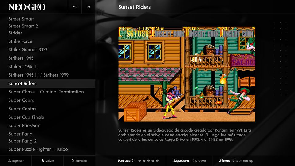
-
@chicuelo how much can you reasonably increase the text size of the text in the games list without it looking ridiculous? I think it would be pretty unique as compared to other themes if the games list font was a good amount bigger.
-
@BJRetro I think one or two points more, but it will reduce the amount of displayed games.
I was also thinking of making a grid view with the game snapshots, but I was wondering if its possible to have the game name below the snap, and wich grid options are there available to work on -
@chicuelo Honestly, that looks frickin awesome. Would definitely use
another batshit crazy idea, custom color themes, like have a blue or red preset in addition to the black theme. The light theme would obviously look good and not inverted colors.
(bad photoshop job is bad, please ignore quality)
Creator of the Radiocade: https://retropie.org.uk/forum/topic/6077/radiocade
Backlog: http://backloggery.com/lilbud
-
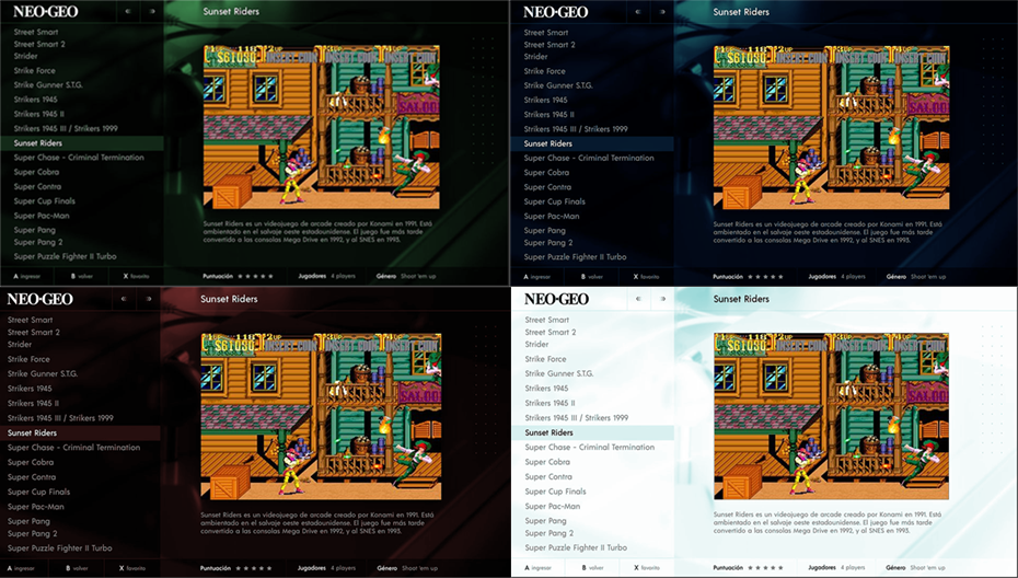
@lilbud Yes, I am working on a purple version as alternative!
-
I really like how that gamelist looks. Only thing with it is I think the game description is a bit squished. An issue I have with the Carbon theme is that a lot of descriptions need to scroll, and they become hard to read in the space they're allotted.
That said, I'm not sure how I would adjust that since the composition of the page is largely based around the size that the game preview displays at.
Love the idea of being able to set custom colors, would be a great feature if it can be done on a console by console basis. Really like how this theme is turning out so far, it looks great.
-
@Weatherby Like you said, each system's preview is going to be a different size (and even sometimes on a game by game basis, which prevents a real one size fits all.)
Maybe a gradient over part of the preview image, like the bottom half fades to black to meet the background. Not sure how much you could shrink the preview image before it might not look all that good.
Creator of the Radiocade: https://retropie.org.uk/forum/topic/6077/radiocade
Backlog: http://backloggery.com/lilbud
-
@lilbud @Weatherby
Maybe creating 2 different setups, one for vertical snaps and another for horizontal snaps, where the text fits the area of the image,
If we reduce the size of the image and place the description aside, I think we will have a lot of empty space arround -
@chicuelo For vertical snaps, you could probably have the description next to the vertical box art or videos.
Creator of the Radiocade: https://retropie.org.uk/forum/topic/6077/radiocade
Backlog: http://backloggery.com/lilbud
-
@lilbud Yes, In my case I have only landscape snaps because I use the game preview on each system, but it could be a possibility for those who use box art or other stuff
-
Maybe one possibility is laying game information out in thirds. This is something I did recently when fiddling around with the Switch theme: https://images-ext-1.discordapp.net/external/AwGi24jCtMPuQKMVefm0NmPfhj0N-qbelLAwe5k9kZA/https/i.imgur.com/zoOHZPR.jpg?width=1202&height=677
Note that I better organized the size and alignment of some of these elements after taking this, but it should give a rough idea. That said, I don't know how compatible organizing information in thirds like this would work for this theme. It seems like you're going for something much more visually dynamic, with large impactful images present on each screen.
It's a toughie since a lot of descriptions that get scraped are overly wordy, and so they seldom fit well into the space allotted in most themes. I really like how it's laid out as is though, the larger images compliment the rest of the visual style of the theme, and reducing it too much would take away from that.
Contributions to the project are always appreciated, so if you would like to support us with a donation you can do so here.
Hosting provided by Mythic-Beasts. See the Hosting Information page for more information.