SNES mini theme
-
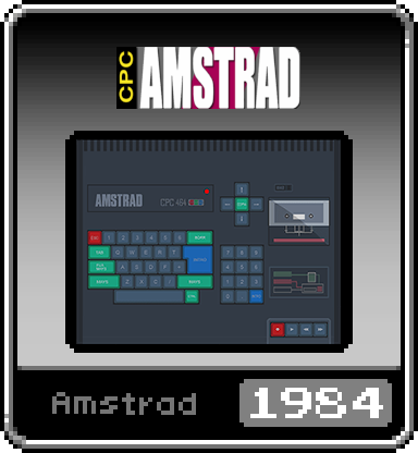
Here is a Amstrad CPC one. Now this is based on the artwork found here:
https://www.reddit.com/r/miniSNESmods/comments/849642/folders_icons_update/Again, I cannot create, only edit so I did my best to scale and edit the artwork so it uses the same size rectangle box in our theme here. It isn't the same style but it is "close enough". The logo above the picture isn't very good at all but, for me at least, this is better than just having a white box with plain text.
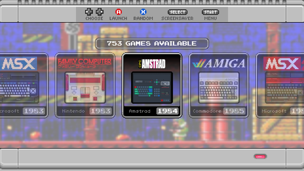
This is how it looks between the other correctly themed systems:
-
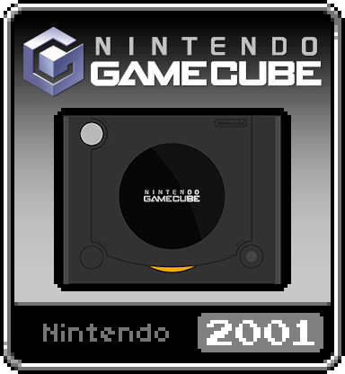
Here is my Nintendo GameCube edit. I have to say, this came out better than expected! I'm pretty happy with this one. Hopefully someone else can use it as well :) Maybe I'll try to re-edit the Amstrad one to get a better logo in... I'll see... still got a few systems left to iconify :)
-
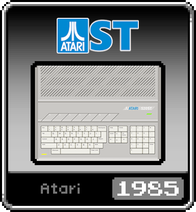
Here is my edit for the AtariST system.
-
@Planetdune These pngs look great. Have you thought about making one for the Solarus engine?
-
@saccublenda said in SNES mini theme:
@Planetdune These pngs look great. Have you thought about making one for the Solarus engine?
I'm focussing on the systems I don't have images for, sharing them as I go :)
-
This is based on the Creativision art that was posted long ago in this thread. It wasn't complete so I finished it up in the traditional style.
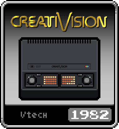
-
Probably my last edit for a while, the jaguar..
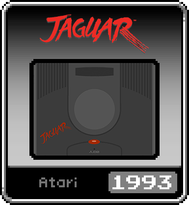
-
Did one more, the Supergrafx
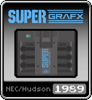
-
@Planetdune These look so good!! Any chance of a TurboGrafx-16 CD? Actually on that note, what consoles are missing at this point, and how can I help lol
-
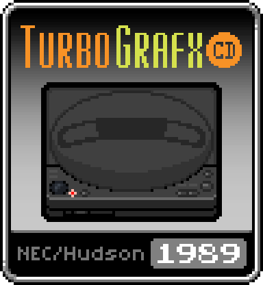


So I decided to try making it myself, I think it turned out ok, its basically just a recolour of the PC Engine CD Icon. I made the Logo's for this and the SuperGrafx as well. Hopefully they fit in style-wise ok!
-
@Brent_Hamel Very nice :) I think the big ones missing are the more modern stuff that do have emulators, the Wii, the PS2 and even the PS3 emu is coming along at rapid pace. Oh and the Saturn I believe, would need to check but have a mental note on that system so I'm guessing it is MIA.
-
is it possible to theme the main menu and options menu in emulation station?
I really want to use the snes mini theme but whenever I press start it completely breaks the look and feel.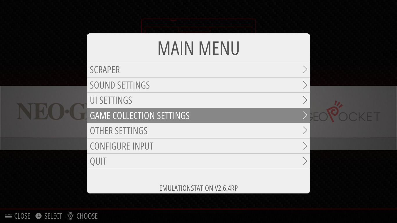
if not can you open a github request to allow main menu and options menu theming?
-
There are a few more issues I have found since posting this.
- The boot screen for this doesn't fit the theme at all something about the retropie project
- There is no Love2d box art
-
@Shadowblitz16 said in SNES mini theme:
is it possible to theme the main menu and options menu in emulation station?
RetroPie's version of EmulationStation doesn't allow themes for the options or menus. The theme also doesn't provide any help message theme info, so you should disable the help system from the options to get a consistent look and feel.
-
@Planetdune and @Brent_Hamel thanks for sharing your icons :)
-
I'm scratching my head trying to figure out how to configure this theme correctly for Retrobat. My TV's resolution is 1024x768. When I set the theme style to snes_usa and the appropriate resolution, it does not yield the layout I selected (a.xml), which is supposed to list the developer, publisher, and game artwork on the left, the genre, description, and ratings on the right, and the gamelist content in the center. Instead, my screen only shows the content that is supposed to appear on the left side, the gamelist content on the right, and omits everything that should appear on the right. Does anyone have a suggestion as to how I can fix this problem? Thank you for any suggestions :-).
-
By the way, I have updated Retrobat to the latest version. If anyone has any input, it is greatly appreciated.
-
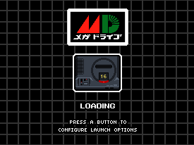
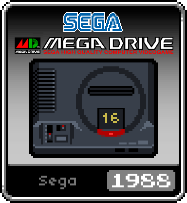
The theme is nice!! I based on the original design of the mega drive system icon and made a Japanese version for my Picade. Please feel free to use them if you are interested.

-
@Striderx99
Hi. Unfortunately the theme only supports layouts in 16x9 resolutions as there isn't enough display space in 4x3 mode to accommodate all of the information. The theme was primarily designed for 1920x1080 displays. -
Thank you Ruckage for the quick reply. I also tested this on my Raspberry Pi 3B build on the same TV. It was able to display these items on the left, center, and the right of the screen as they were originally intended. Correct me if I'm wrong, but I'm guessing that the theme itself may not work with the PC build of Retrobat. I also had an issue with text overlapping the boxes on the Futura-V Dark theme. If you can port SNES Mini over or give Fabrice Caruso permission to make the theme work, that would be excellent.
Contributions to the project are always appreciated, so if you would like to support us with a donation you can do so here.
Hosting provided by Mythic-Beasts. See the Hosting Information page for more information.