SNES mini theme
-
@sleve_mcdichael said in SNES mini theme:
And it's just not an issue in the actual game lists because the art won't be small or transparent, it will either obscure the "missing" image entirely or will in fact be missing.
I guess sometimes they are small and/or transparent (Skyscraper composite image of vertical arcade game):
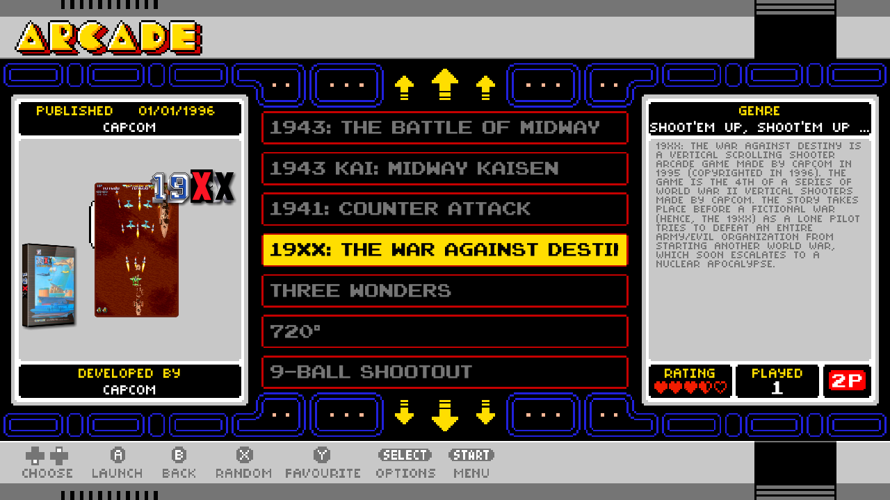
You can just barely see the edge of Toad's speech bubble peeking out behind the screenshot.
This appears on both nes-mini and famicom-mini, in "detailed" view. It is not present in "video" view; if you wish to use detailed view:
The other option would just be to remove or comment the line that defines the image path in
layouts/setup.xml, as in snes-mini (just the<path>line needs to be removed, the rest of the entry and all the references to it can remain without causing any harm, apparently.) -
@sleve_mcdichael said in SNES mini theme:
In "detailed" view it is shown "behind" the image so if the gamelist art is small or transparent, or doesn't exist, it can be seen in the background.
@cdaters I imagine this is what you are seeing on nes-mini, just the "missing" image in the background before your gamelist art loads on top of it. I wasn't seeing it because I was in "video" (actually "automatic") view.
If you're seeing it in snes-mini, I suspect your pirate image has an outdated version of the theme on it.
-
@sleve_mcdichael said in SNES mini theme:
If you're seeing it in snes-mini, I suspect your pirate image has an outdated version of the theme on it.
I agree... Looking at some of the other content on that build, there are emulators and such that are known not to work on Pi4 just yet, so I imagine the developer took an old image and just copied large swaths of content (including configs, etc.) over to their Pi4 build. Additionally, I discovered that he is using the older "stand-alone" version of @ruckage's original
es-theme-nes-miniWhile I am putting together a build from scratch using what is currently available for the Pi4--with the most current themes, programs, emulators, etc. available. So much so that I donated to an emulator developer in an attempt to encourage him to update his (one my of my favorite) emulators that was not yet available on the Pi4.
This theme by Ruckage is definitely one of my favorites, so I would like to work through all the nuances to keep it relevant and able to survive RetroPie updates/upgrades and possibly port it over to batocera's version of ES where the configs, stylings, locale (US vs EU vs JP, etc.) can be incorporated into the UI itself! I wish that RetroPie's ES would pick up some of that same functionality.
In the meantime, it looks like I'll be diging deep to resurrect my pixel art skills (harkening back to my ASCII art days of BBS's) lol to create clean/crisp carousel icons for missing systems in the same style as @ruckage...
-
@sleve_mcdichael how are you doing your screen captures of the various ES screens?
-
@cdaters said in SNES mini theme:
@sleve_mcdichael how are you doing your screen captures of the various ES screens?
-
-
The default
snes-europestyle: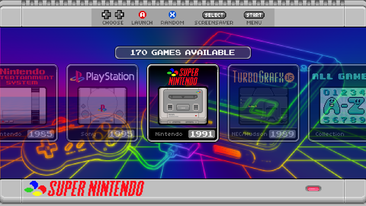
If you change the
<include>tag inconfig.xmlyou can switch thestyletosnes-usa. The borders and icons have changed, but notice that the background image hasn't; it's still showing the European SNES: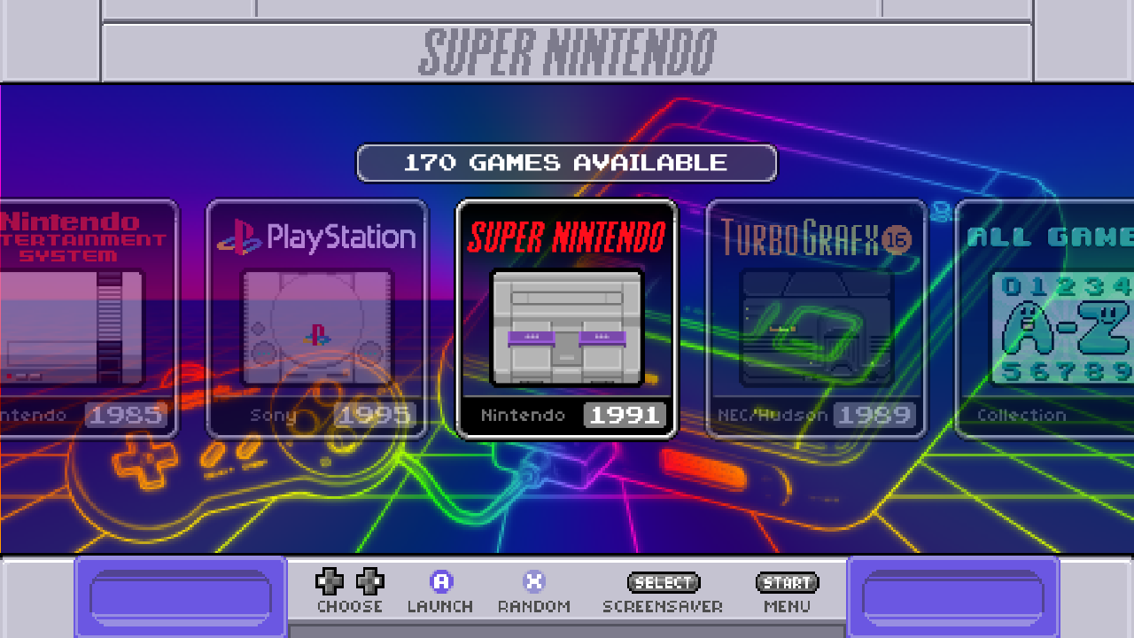
This is explained by a PR shared to the repo:
Fixed include order in config.
The backgrounds sometimes depend on the region setting defined in the style.
https://github.com/ruckage/es-theme-snes-mini/pull/17
This just swaps the order of these two tags in the
config.xml. Now the backgrounds will change with the region setting: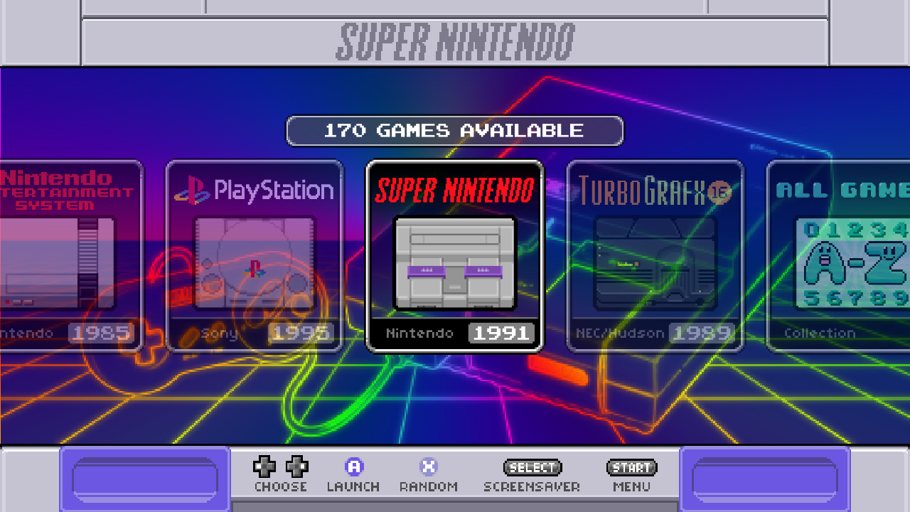
However, this has introduced a new problem. When I change the style to
nes_simple_usa, I noticed the gamelist was sort of low-contrast and hard to read: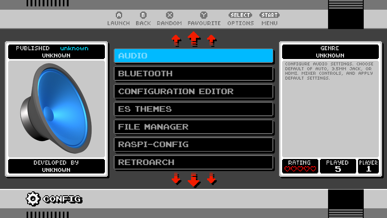
Here's what it looked like before:

What's going on? Clearly it's to do with the order of the
styleandbackgroundtags so I had a look at the files they point to.nes_simple_usaandnes_simple_Europeboth just handle the region-specific differences in borders and icons, then point tones_simple.xmlfor the rest.nes_simple.xmlin the gamelist section, sets the tag<selectedColor>(text color of the selected item) toffffff(white.) The various backgrounds also set this to a custom color.When the
styletag came second (default), then the white color innes_simple.xmlwould overwrite whatever had been set in the background XML. After I switched the order, the custom color set in the background would overwrite the white and actually be used.Sometimes it's even worse. In
neon_purple.xmlfor example, selector and selected are literally the same color!:<selectorColor>00dbff</selectorColor> <selectedColor>00dbff</selectedColor>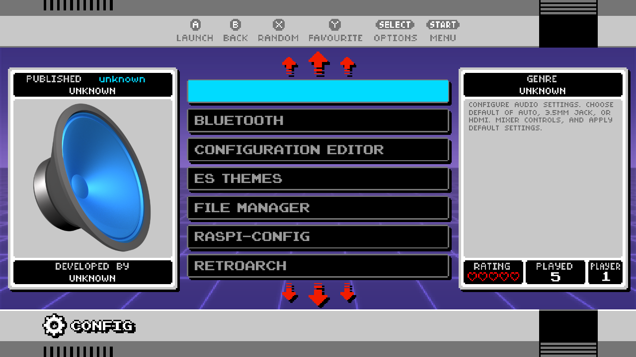
I don't know yet what the "solution" to this problem should be; the other styles still handle this correctly so
nes_simpleshould be able to, too, if we can track down the difference. As a hacky fix for now, you can manually edit the<selectedColor>value in your chosen background XML(s) to white or something else that contrasts with the selector color (background color of the selected item), but this does also change the text color when using the othernes_richandsnesstyles, instead of being dynamic as they are right now. -
@sleve_mcdichael said in SNES mini theme:


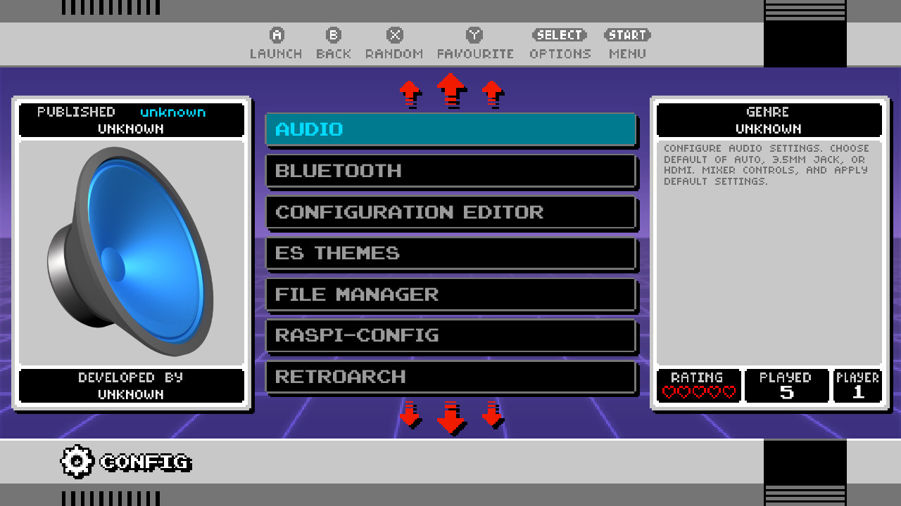
By darkening the image
snes-mini/style/nes_simple/selector_bar${wide}.png(I used a midpoint grey) the contrast is markedly improved: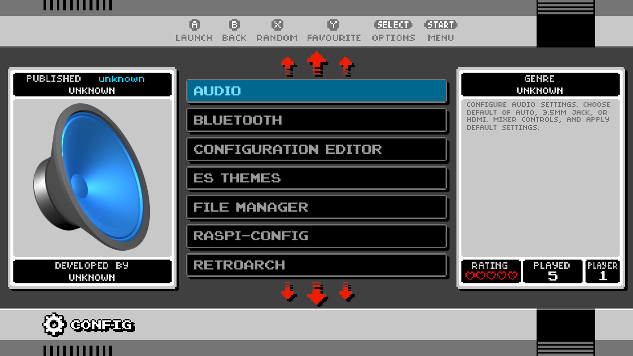
-
@sleve_mcdichael
Has it also been considered to fix all of the "Unknown" text, along with replacing the out-of-place High Quality icons with pixelated ones?Or is it not possible at the moment?
-
@h2805270 the "unknown" text is because this theme uses a single template for every system; you'd have to remove the "published/developed" fields from the template entirely, and then it wouldn't show in the other systems, either.
The icons aren't related to the theme; these are in your
gamelist.xml, just like your box arts. You can either replace the images in$HOME/RetroPie/retropiemenu/iconsor you can edit the gamelist to point at different images; I think both of these are overwritten when you do an update, so keep a backup on hand to easily copy over when that happens. -
@sleve_mcdichael
When I mentioned "Or is it not possible..." I meant as in:
"Can a separate template be made specifically for the Configuration and Settings Menus in this context?"That includes the gamelist.xml icons...
-
@h2805270 not without a major rewrite of the theme, I imagine.
-
its a great theme really like it
-
@Harexam hi really like those icons that you made
btw can you make
PS3
Nintendo Wii U
Nintendo 64DD
Nintendo Switch
Amiga CD32
Capcom Play System I II III
and DOSBOX
thanks -
@mitu slightly off topic but I know of no other way to reach out to you. I meant no offense with my post on Hydro Thunder. But it was the only way I could show you the problem I was having. Such as the gentleman above ( @toaster_strudel ) there is no reason or cause to be overly aggressive. Some of us noobs make honest mistakes. We are not trolling or trying to cause trouble. If posting links to ROM sites are against the rules, how else am I to show you the problems I was having? So you can see for yourself? (BTW I happen to own Hydro Thunder so I am within legal rights to acquire the ROM.) Anyway its done. I offer my apology for accidentally breaking forum rules.
-
@rspeaker said in SNES mini theme:
@mitu slightly off topic but I know of no other way to reach out to you.
Why not create a new topic ?
I meant no offence with my post on Hydro Thunder. But it was the only way I could show you the problem I was having. Such as the gentleman above ( @toaster_strudel ) there is no reason or cause to be overly aggressive. Some of us noobs make honest mistakes. We are not trolling or trying to cause trouble.
I was not being aggressive. In the said topic [1], after 2 users have acknowledged the issue is not with the emulator and being suggested you get a proper game image, you lashed at me and also broke the first 2 rules of the forum - don't ask for ROMs/game and don't post links to ROM sites. I could have also banned your account, but I chose instead to lock the topic, it was clearly not going anywhere.
If posting links to ROM sites are against the rules, how else am I to show you the problems I was having? So you can see for yourself? (BTW I happen to own Hydro Thunder so I am within legal rights to acquire the ROM.)
Posting the checksums of the game files or comparing them to known/validated checksums (for instance redump.org validated lists) .
-
@mitu fair enough. But I wasn’t “lashing” at you. We were simply going in circles and was starting to be very frustrating. Banning my account over a first offense and an honest mistake would have also been excessively harsh. And to be 100% clear, I wasn’t asking for ROM images. Users were reporting they were having success so I was simply trying to get details. As I said I learned from my error and assure you it won’t happen again. We have now thoroughly beat this to death so let’s move on. (I now fear the next time I post my next bonafide inquiry I will be dragged mercilessly due to this lasting impression made here, and not be given legit help.) Life is too short! Let’s all remember that rather than hiding behind keyboards. Instead lets focus on the joys of emulation! ;))
-
@mitu BTW my Intel NUC running Focal Fossa as you suggested is working brilliantly. You never got back to me about comparing the two runcommand.logs and why Retropie is working well on my i5 NUC rather than my SkullCanyon. But oh well. Non-issue now.
-
This post is deleted! -
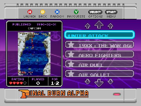
Hey guys, I recently installed this theme and it is absolutely amazing. I'm using it with Emulationstation on Windows, connected to a TV via Crt Emudrivers. The only problem I found is that when I use the favorites star, the text drops down. How could I fix this? Can I change the size of the star or change the sprite?
Thank you!
Contributions to the project are always appreciated, so if you would like to support us with a donation you can do so here.
Hosting provided by Mythic-Beasts. See the Hosting Information page for more information.