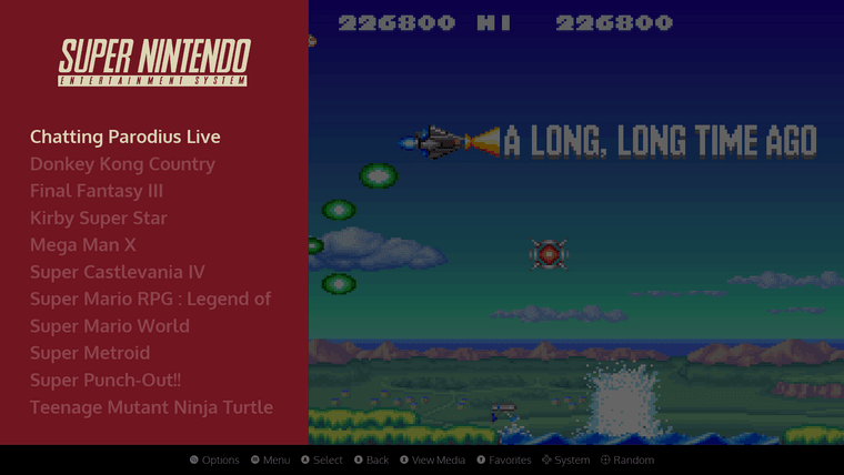
[Theme] Art Book Next
-
WOW! This is the most gorgeous and perfect theme to use with my crt, thanks! Your themes are very cool, Anthony.
Question: I don't know why, but the "Retropie Settings" on this theme doesn't appears to be working for me (it gives me just a black screen with blue letters and ugly font). I'm using the most recent version of Retropie (4.8), with Emustation 2.10.1RP, 4:3 AR, and Steam-OS color scheme. Anyone knows what's the problem? Thanks!
-
@flaviometal hmm i may have the name for that system wrong in the theme itself. i’ll need to look at that.
-
EDIT: I totally messed up and mixed up themes. I went down a rabbit hole lol. I apologize for pinging you!
-
@flaviometal IHI Friend, first of all i want to say that this is the best theme i have ever tried. Im really loving it. Thanks to @alphatoanant for his always awesome themes.
Responding your question, you only have to delete completely the retropie folder that is inside the Art book next theme, and all works like a charm!!!
-
@Gonso , thanks for the aswer. I'll give it a try, man!
EDIT: THANKS, MAN! It worked like a charm! Just renamed Retropie folder, reboot, and voilá!
-
@alphatoanant Hello,
Your theme is magnificent. Congratulations on your talent! 👏👏👏👏👏
I would like to feel that same joy from you, unfortunately I am having difficulty making my theme available.
I'm limited in using Github, not the slightest idea how to create a fork to make my theme available. Would you be able to clarify my ideas?
Sorry for my communication, I'm Brazilian and I don't speak English so well, I needed the help of Google translator.
-
@fpgamesretro, if I can, I am glad to help answer any questions you have. Just let me know.
-
@alphatoanant Your theme was always my favorite when I used to use the old emulationstation years back.
A couple of days ago I decided to try out ES 2.0 on my pc along with your Art Book Next theme and I really love it. I was wondering if you were planning on adding more colors to it. The Famicom color is my favorite, btw.
Keep up the great work.
-
Thank you @SP! I don't have any other colors current planned but I am open to ideas as well.
-
@alphatoanant Is there a way to remove the darkening filter on the screenshot when using the list (no metadata) variant?

-
Nevermind. I figured it out.
-
@alphatoanant Looks amazing! I'm new to retropie and doing some research on images. Does your theme work with all images?
-
@Remote welcome! are you asking about scraped image support for any given game?
-
@alphatoanant Thanks for your quick reply!
Let me clarify a bit…
So I was talking to a friend who recommended to download an image with preconfigured games. He mentioned that doing this would be faster and easier than tinkering yourself.
Therefore, I was looking around for these so called images and found a couple. Here’s one that stood out: “Rick Dangerous’ Final Retropie Image”.
Now these images with preconfigured games sound helpful. But, looking around I still gravitate more to the theme you made. Just something about its simplicity makes it look awesome.
So my question then is, if I were to download and install an image such as “Rick Dangerous’ Final Retropie Image”, will I then still be able to use your theme?
-
This post is deleted! -
@Remote thank you for clarifying =). I haven't worked with preconfigured images so I don't know directly but if the image uses retropie as its base then the theme in this post "should" work with it.
-
@alphatoanant wow. I had seen this theme in some videos but had no idea it was yours, nor that it was a follow up to ArtBook - which is still the theme I use on my RetroPie instances.
This looks gorgeous. I'll have to take a look at it. I remember having a lot of custom systems already created in the main ArtBook theme, I'll see how hard it might be to create those themes.
Congratulations - it's great to see you around and doing great work!
-
@pjft! wow awesome to see and hear from you too =).
If you get to try it out, I am here to talk through things you find or have an interest in seeing being added. I have a template built out for the color theming and a template for the system view artwork so can help there for sure. Rock and roll my friend.
-
@alphatoanant Thanks. I'll see when I have some time and look into it.
-
@alphatoanant I just wanted to say this theme looks amazing. Incredible work and really love the clean and sleek look with the way everything is presented.
I was wondering if I could get some help with regards to the scraping and the way you have the previews presented in the way you do in the preview image with Sonic? When I try scraping - was using the Skraper application - and select the screenshot, marquee and box art 2D options when scraping, as a default all it would show is the screenshot of the game without the logo and box art over the image. Was wondering how and what options you’d choose when scraping, or after the games have been scraped, to get them to present in the same way you have in the preview image? I know there’s the mix v1 and mix v2 options in Skraper too, but they seem to look quite different when compared to your preview image. I hope that makes sense.
Contributions to the project are always appreciated, so if you would like to support us with a donation you can do so here.
Hosting provided by Mythic-Beasts. See the Hosting Information page for more information.