Cardboard Mini NES + Nes mini and Famicom mini themes
-
Hey @ruckage !
I totally get where you're coming from.
I'd say the most universal and used 4:3 resolution used by me and I'd bet many others is 640X480. I'd be willing to guess that if you hit that target you'd be filling the needs/wants of the majority of tube tvs out there.
Thanks for considering this!
Beau
-
@ruckage
Basically the same thoughts as @momaw27.
Just food for thought: the theme I've been using as my main theme is @Rookervik 's workbench (https://retropie.org.uk/forum/topic/5552/release-amiga-workbench-emulationstation-theme). I've been using it for my CRT (which has a 4:3 ratio) and it's able to show all information on screen. I don't know if the theme is even designed for 4:3. Maybe the screen gets squeezed, or maybe the sides are cut off but since the info is centered I don't notice it. I've messed so much with my resolution settings that I don't really know how kosher my setup is, really.I'll try to find time to try your updated version (sorry!) and see if the problem really exists in the first place. I'll try to take pictures.
-
@ruckage a lot of LED 4:3 monitors are either 1600 x 1200 or 1440x1080. There are not I ton of 4:3 LED/LCD monitors out there. Most are either 5:4 or widescreen. I personally run a 21" 4:3 LED in my arcade cabinet and it runs smoothly with retropie at 1600 x 1200.
On top of this, the CRT users are a lower resolution as suggested in the previous post. I would suggest that if you use the higher resolution for design, the crt monitors will be able to display the theme better than designing to a lower resolution and upscaling on LED monitors.
-
@felleg said in Cardboard Mini NES + Nes mini and Famicom mini themes:
@ruckage
Basically the same thoughts as @momaw27.
Just food for thought: the theme I've been using as my main theme is @Rookervik 's workbench (https://retropie.org.uk/forum/topic/5552/release-amiga-workbench-emulationstation-theme). I've been using it for my CRT (which has a 4:3 ratio) and it's able to show all information on screen. I don't know if the theme is even designed for 4:3. Maybe the screen gets squeezed, or maybe the sides are cut off but since the info is centered I don't notice it. I've messed so much with my resolution settings that I don't really know how kosher my setup is, really.I'll try to find time to try your updated version (sorry!) and see if the problem really exists in the first place. I'll try to take pictures.
I can 100% say that my theme will not work on a 4x3 resolution as it was designed as a widescreen theme. Some themes are designed to work in both but that's not the case with mine I'm afraid - and if it did either the sides would be chopped off or it would be horribly squashed, neither of which would be a good solution.
@TMNTturtlguy said in Cardboard Mini NES + Nes mini and Famicom mini themes:
@ruckage
On top of this, the CRT users are a lower resolution as suggested in the previous post. I would suggest that if you use the higher resolution for design, the crt monitors will be able to display the theme better than designing to a lower resolution and upscaling on LED monitors.Resolution isn't an issue as such. My assets are low resolution anyway and technically due to the way theme elements are defined as ratios of the screen dimensions a theme should display exactly the same at any resolution (as long as the aspect ratio is the same). This does work as expected for most elements but for some reason it doesn't work correctly with game lists. This isn't a problem for many themes but as the game list entries on my theme have to line up exactly with boxes in the background it causes problems. I'll show an example below.
First 1080p. Notice the text and blue selector bar lines up perfectly with the boxes in the background.
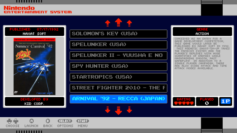
Now 720p. Nothing changed in the theme but notice the text and selector bar no longer line up with the boxes in the background. All other element in the theme however have scaled correctly.
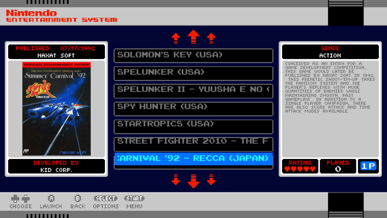
I can correct for this in most cases but if I fix it for 720p then the list is then broken in 1080p. So this is why this particular theme has to be targeted to specific resolutions.
As far a 4x3 versions goes it won't be possible to keep everything on the screen as there simply isn't space. The scaling will also look really bad at 640x480 as all my assets are designed at 270 pixels tall and this will not divide cleanly into 480p - there is no simple solution to this, I can either chop off the entire bottom border which I think will ruin the look of the theme or I can prescale the assets but this will result in a softer look (though may be okay for crt). Basically I'm willing to make the 4x3 at some point but it will not be a simple process and there will need to be some sacrifices to make it possible.
-
@ruckage thanks for even considering this!
For me, the ideal NES-mini 4:3 theme would have everything in the pictures above minus the metadata box. I'd also like to have the rating/played/# of players data above the coverart and the published data below the coverart.
I don't need Developed By or Genre.
Beau
-
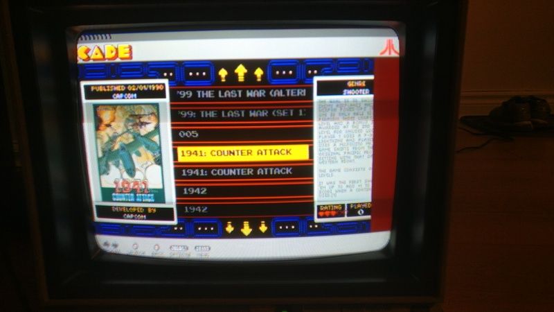
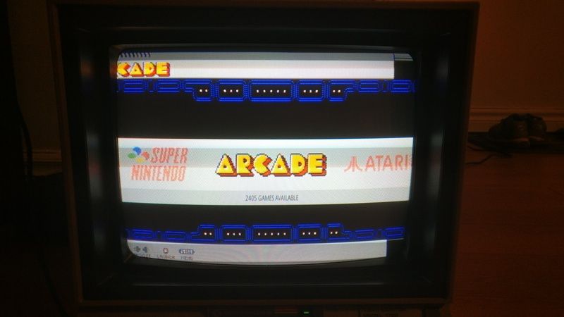
@ruckage Thanks for the response. I totally understand and this is not at all a deal breaker for me. In fact, the theme is not totally broken in 4:3. I did the test and here is what it looked like on my screen. We notice the info box on the right side gets cut by the atari background, and the word arcade is cut on the top left, but these are the only two "bugs" I could find.
-
Yep, this is how it looks on mine as well.
Not horrible, but not entirely show-off-my-cool-system ready either.
Would be totally usable if we could shift the right background and the system logo over an inch and a half.
-
@felleg
Thanks, interesting to see as I don't have access to a 4x3 tv. I can test at those resolutions on pc but the results aren't quite the same, this could be due to slight variations in the way ES works on PC vs Raspberry pi which will make testing more difficult. Here is a picture of how it appears in windows at 4x3: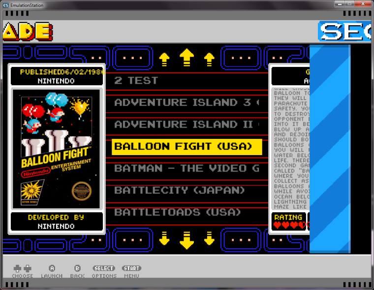
The selector bar matches up fairly well though not perfectly at your TV resolution (640x480) but this is just luck, as you can see at 1024x768 the selector bar doesn't line up at all.
The background displays as I expected, the system backgrounds overlap because the image is wider than the screen but is drawn centrally while keeping it's aspect ratio so it 'overhangs' each side.
The boxes that hold metadata/artwork are squashed horizontally - notice the rating hearts are no longer contained within the black box. This where it differs on pc as the boxes are even more squashed on PC and it's actually closer to how I would expect it - it's a little concerning as it actually looks like the raspberry pi isn't scaling those elements as it should at 4x3 which could be a problem.
The text on your TV doesn't overlap, it does on windows. Windows is actually how it should be displaying I believe so that's another discrepancy.
Another thing that is strange on your photo is it's actually cutting off the bottom of the theme - that shouldn't be happening. My first thoughts were overscan but if that were the case I would expect the top of the theme to be cropped as well but it isn't. Out of curiosity are you from the US and using an NTSC TV? If so that may explain it as NTSC has less vertical lines and I'm hazarding a guess that the RPi is outputting a resolution more suited to PAL TVs. That should be correctable for you by adjusting some settings in the the raspberry pi config.
When I do a 4x3 version I think I will need some testers as by the looks of things for standard TV the raspberry pi doesn't behave exactly as expected - this may or may not be a problem though if I target that resolution directly.
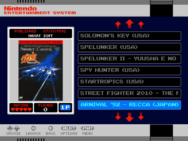
I also think @momaw27 has the the right idea with removing the description box as this would be easier and look better I feel than trying to fit everything onto a 4x3 display. To fit everything on screen would mean having a much narrower gamelist, (it would also mean re-doing all of the backgrounds).
I actually did a quick mockup earlier and this is how it would possibly look.
-
@ruckage that is absolutely amazing! I think that this simple layout makes it look like it was right out of the 1980's.
-
Is this theme available via the ES Theme downloader within RetroPie?
-
No, I don't think so. Hopefully it will though.
-
Hello there @ruckage just registered after months of lurking to thank you for this awesome theme.
I've put it in my pi zero image but i'm missing some systems:
Sega 32X (sega32x)
Atari Lynx (atarilynx)
Megadrive-Japan (megadrive-japan)
Supergrafx (supergrafx)If you could add them that would be absolutely great!
Thanks again for your work!
G. -
YES!!!!! That's it!
WOW... that is a thing of beauty.
When you need testers, count me in!
Beau
-
@astuni said in Cardboard Mini NES + Nes mini and Famicom mini themes:
Hello there @ruckage just registered after months of lurking to thank you for this awesome theme.
I've put it in my pi zero image but i'm missing some systems:
Sega 32X (sega32x)
Atari Lynx (atarilynx)
Megadrive-Japan (megadrive-japan)
Supergrafx (supergrafx)If you could add them that would be absolutely great!
Thanks again for your work!
G.Thanks :) , glad you like the theme.
Sega32x and Atari Lynx are already on the todo list (lynx is actually just finished and will be in the next version), I've added SuperGrafx to the list as that's not been mentioned before. Can't give any guarantees when they will be ready though.
I don't see the need for a specific Megadrive-japan theme unless someone can give me a valid reason why it's a special case. Megadrive is already there and if you started doing a specific theme for every territory for every system things will quickly get out of hand.
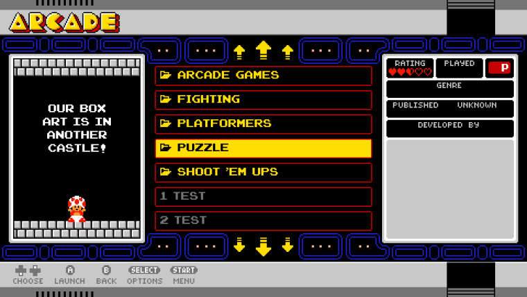
You can always have roms in folders divided by region and if you name the folder with a preceding '#' symbol it will show up with a folder icon. Eg. name the folder '# Japan' and the '#' will be displayed as the folder icon. It will look something like this.
-
@momaw27 said in Cardboard Mini NES + Nes mini and Famicom mini themes:
YES!!!!! That's it!
WOW... that is a thing of beauty.
When you need testers, count me in!
Beau
Thanks. It's getting to the point where a large chunk of systems are now supported. There are 12 systems left on my todo list and once the todo list is worked through I'll see about sorting out a 4x3 version.
There are 40 supported systems now (some of them not released yet but will be in the next version).
Here is a list of all 40 systems already supported
(* = not released yet):Arcade
Atari 2600
Atari 5200
Atari 7800
Atari Lynx*
Colecovision
Commodore 64
Famicom
Family Computer Disk System
Final Burn Alpha
Gameboy
Gameboy Advance
Gameboy Color
Genesis
Intellivision
MAME
Megadrive
NES
Neo Geo
NeoGeo Pocket
NeoGeo Pocket Color
Nintendo 64
Nintendo DS
Odyssey 2
PC Engine
Playstation
Ports*
PSP*
Retropie setup menu
Sega Cd
Sega Game Gear
Sega Master System
Sega SG-1000*
Super Famicom
Super Nintendo
TurboGrafx 16
Vectrex
Virtual Boy*
Wonderswan
Wonderswan Color
ZX SpectrumBelow is the current todo list:
Amiga
Atari ST
DosBox
Dreamcast
Game & watch
Kodi
MSX
pc-engine cd
ScummVM
Sega 32x
Steam
SupergrafxIf anyone has any more requests for systems please let me know.
-
If anyone has any more requests for systems please let me know.
The only one I see that would be missing for me is a "Steam" system.
-
@backstander said in Cardboard Mini NES + Nes mini and Famicom mini themes:
If anyone has any more requests for systems please let me know.
The only one I see that would be missing for me is a "Steam" system.
Why is steam needed? Genuinely curious.
-
@ruckage said in Cardboard Mini NES + Nes mini and Famicom mini themes:
@felleg
Another thing that is strange on your photo is it's actually cutting off the bottom of the theme - that shouldn't be happening. My first thoughts were overscan but if that were the case I would expect the top of the theme to be cropped as well but it isn't. Out of curiosity are you from the US and using an NTSC TV? If so that may explain it as NTSC has less vertical lines and I'm hazarding a guess that the RPi is outputting a resolution more suited to PAL TVs. That should be correctable for you by adjusting some settings in the the raspberry pi config.When I do a 4x3 version I think I will need some testers as by the looks of things for standard TV the raspberry pi doesn't behave exactly as expected - this may or may not be a problem though if I target that resolution directly.
As I've said, I've messed around a lot with the overscan and resolution settings for when I use my Pi with the CRT. Just like momaw27, I'd be happy to test anything you need, just let me know. :)
The screen I am using is an NTSC-U Commodore 1702 monitor.
-
@ruckage
I'd like to see pc-engine cd. -
Why is steam needed? Genuinely curious.
You can stream games from your powerful PC to your Raspberry Pi using Moonlight-embedded. I use it all the time:
Here's Carbon theme's Steam directory:
https://github.com/RetroPie/es-theme-carbon/tree/master/steam
Contributions to the project are always appreciated, so if you would like to support us with a donation you can do so here.
Hosting provided by Mythic-Beasts. See the Hosting Information page for more information.