Pixel 2: A Dump Ground
-
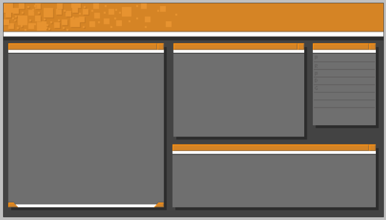
Dump #2 - Some sort of 90's crap.

-
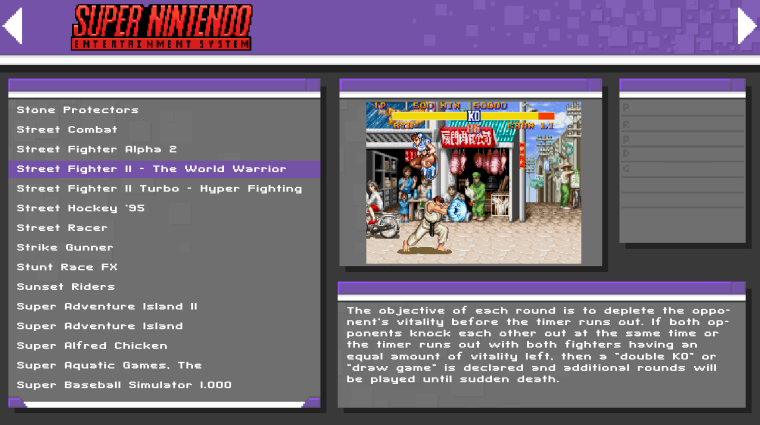
Dump #3 - My old Favorite. Have this running on my pi for the last 6 months.

-
Dump #4 - Some sort of GUI where Crap is cut into it and... yeah.

-
Dump #5 - Wait, this is what I have running on my pi right now. It's ok.

-
Dump #6 - A Book. Yeah >.>

-
Dump #7 - Swagman's Favorite. But it's not "pixel"

-
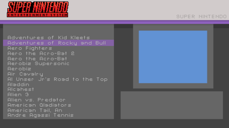
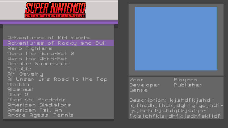
@Syhles I've already changed it to something like this. Hate all the wasted space at the top. Also, hate meta data. It loads slow. Rather it wasn't there at all...

-
@Rookervik
I like that alot more I do miss the scroll bar though... -
@Syhles Scroll bar is a little silly if it has no purpose. And in ES, there's no purpose. LOL
-
@Rookervik
It's purely for aesthetics, it reminds me of a really clean 90's computer OS theme. -
Eh, done messing with this one.

Haha, I was trying to avoid it looking like an OS. I suppose I should get rid of the squares on the right side. If you need an OS theme, check out Workbench. Haha.
I'll try something else later.
-
@Rookervik
It looks nice though, lol.Yeah I know about bench but it's a little too Windows '98 for me.
Yours made me more think of a custom theme on Windows XP.
Maybe you should pick a few of these and have a couple of pixel themes some of them wouldn't be too crazy to maintain like #7 could be only that background with different logos for each System and #5 you could just change the line colors for all the systems.
This is just my opinion lol.
-
How do I get your themes? I want the book one :D
-
@CodeDrawer None of these are available. These are just a bunch of mock-ups for a possible theme, later.
@Syhles Workbench is a theme I made for Buzz that is almost an exact replica of the Amiga desktop OS. :D
-
@Rookervik
Lol, I've never seen an Amiga, also I knew it wasn't Windows '98 I was just meaning old.It's a nice theme aesthetically, though it's just not in my taste.
Looking forward to more mock-ups.
-
Dump #8 - Simple? Yes. Pixel? Nope.

-
@Rookervik Looks like one of the Flat theme rejects
-
@lilbud Yeah. There are a lot of themes similar to flat. I like having the bar go across the top, but it's a waste of space. The right side fills up area that the screenshot could fill. I can cut it up like this, but it looks weird:

-
@Rookervik
Maybe, instead of just cutting the top bar in half you could taper it down to a forth of the height starting at the midpoint and follow that height towards the right hand side? Also following that at the very right hand side taper back up to the original height?Opens space without looking as odd.
-
@Rookervik I liked the system specific one
Contributions to the project are always appreciated, so if you would like to support us with a donation you can do so here.
Hosting provided by Mythic-Beasts. See the Hosting Information page for more information.