RetroPie forum home
    • Recent
    • Tags
    • Popular
    • Home
    • Docs
    • Register
    • Login

    [Theme Changes] Attention Theme Makers: Upcoming Game Collections in ES

    Scheduled Pinned Locked Moved Ideas and Development
    themescollectioncustom system
    224 Posts 21 Posters 126.3k Views
    Loading More Posts
    • Oldest to Newest
    • Newest to Oldest
    • Most Votes
    Reply
    • Reply as topic
    Log in to reply
    This topic has been deleted. Only users with topic management privileges can see it.
    • UDb23U
      UDb23 @pjft
      last edited by

      @pjft "controller" and Text icons for Carbon finalized (download here).

      "Controllers" now all line art as requested (no fills); added one alternative "controller" for "custom collections.
      Added new "custom collection" and "Favorites" texts.
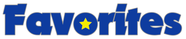
      0_1500216824503_fav txt.PNG

      0_1500216834368_coll txt.JPG
      (size should fit properly when in ES)

      Can you test them and give me your feedback ?
      Thanks.

      mediamogulM pjftP 2 Replies Last reply Reply Quote 1
      • mediamogulM
        mediamogul Global Moderator @UDb23
        last edited by

        @udb23

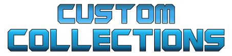
        One thought off hand is that 'Custom Collections' is really close to the AdvanceMAME artwork currently in Carbon as seen below.

        alt text

        What about something that would evoke the notion of custom creation? There are probably more than a few solutions there, but one example would be an architect drafting font like the one below.

        alt text

        RetroPie v4.5 • RPi3 Model B • 5.1V 2.5A PSU • 16GB SanDisk microSD • 512GB External Drive

        UDb23U 1 Reply Last reply Reply Quote 0
        • pjftP
          pjft @UDb23
          last edited by

          @udb23 thanks. I'll test them during the week, as I am unable to do so today. Thank you!

          A thought on the naming of custom collections: that's actually mostly the internal name for it. It can end up being called that in the theme of you'd like it, but I don't object it having a more user-friendly name like "my collections", "game collections" or something.

          Maybe I should stop naming things as that's clearly not my forte :p

          Thank you!

          1 Reply Last reply Reply Quote 0
          • UDb23U
            UDb23 @mediamogul
            last edited by

            @mediamogul @pjft mmm...
            ok let me think how I can get it right for both your comments...

            btw: I referred to "Guardians of the galaxy" for font and colors for "collections".
            Maybe different colors (metal like) could be enough and "My collections" as text ?

            mediamogulM 1 Reply Last reply Reply Quote 0
            • mediamogulM
              mediamogul Global Moderator @UDb23
              last edited by

              @udb23

              Maybe different colors (metal like) could be enough and "My collections" as text ?

              I think a change in colors would help to delineate the two logos nicely and metal seems like a great choice. As for naming conventions, it might be more cohesive to use 'Collections' rather than 'My Collections', due to the convention already existing for 'Favorites' rather than 'My Favorites'.

              RetroPie v4.5 • RPi3 Model B • 5.1V 2.5A PSU • 16GB SanDisk microSD • 512GB External Drive

              pjftP 1 Reply Last reply Reply Quote 0
              • pjftP
                pjft @mediamogul
                last edited by

                @mediamogul said in [Theme Changes] Attention Theme Makers: Upcoming Game Collections in ES:

                @udb23

                Maybe different colors (metal like) could be enough and "My collections" as text ?

                I think a change in colors would help to delineate the two logos nicely and metal seems like a great choice. As for naming conventions, it might be more cohesive to use 'Collections' rather than 'My Collections', due to the convention already existing for 'Favorites' rather than 'My Favorites'.

                Agreed. Ultimately, the naming I provided was more of guidance or direction than any mandatory decision.

                In fact, as there aren't many themes yet with these features, we're kind of setting the standard for the future so make of it what you feel best!

                mediamogulM 1 Reply Last reply Reply Quote 0
                • mediamogulM
                  mediamogul Global Moderator @pjft
                  last edited by

                  @pjft

                  You were right about the logo sizes. The previous images I shared were mock-ups, but once they were actually added to the theme, they needed to be a good bit smaller. Also, I could have sworn that the front-most logo used to enlarge. Either that's been changed recently, or I'm a victim of the Mandella Effect.

                  alt text

                  alt text

                  alt text

                  alt text

                  RetroPie v4.5 • RPi3 Model B • 5.1V 2.5A PSU • 16GB SanDisk microSD • 512GB External Drive

                  TMNTturtlguyT 1 Reply Last reply Reply Quote 1
                  • TMNTturtlguyT
                    TMNTturtlguy @mediamogul
                    last edited by

                    @mediamogul you are correct, the center logo used to get larger.

                    mediamogulM 1 Reply Last reply Reply Quote 0
                    • mediamogulM
                      mediamogul Global Moderator @TMNTturtlguy
                      last edited by

                      @tmntturtlguy

                      Just out of curiosity, why was that changed?

                      RetroPie v4.5 • RPi3 Model B • 5.1V 2.5A PSU • 16GB SanDisk microSD • 512GB External Drive

                      TMNTturtlguyT 1 Reply Last reply Reply Quote 0
                      • TMNTturtlguyT
                        TMNTturtlguy @mediamogul
                        last edited by

                        @mediamogul I have no idea, lots of little things like this started happening with the carousel and and z index changes started rolling out. I don't think it was intentional.

                        mediamogulM 1 Reply Last reply Reply Quote 0
                        • mediamogulM
                          mediamogul Global Moderator @TMNTturtlguy
                          last edited by

                          @tmntturtlguy

                          Can't make an omelette...

                          RetroPie v4.5 • RPi3 Model B • 5.1V 2.5A PSU • 16GB SanDisk microSD • 512GB External Drive

                          1 Reply Last reply Reply Quote 0
                          • J
                            jdrassa
                            last edited by

                            By default, the center logo still gets larger. It is larger in all of the screens above. However, it is themable now as part of the carousel changes. Off hand I know that the nes mini theme doesn't change the size of the selected system.

                            Get latest build of EmulationStation for Windows here

                            mediamogulM 1 Reply Last reply Reply Quote 0
                            • mediamogulM
                              mediamogul Global Moderator @jdrassa
                              last edited by mediamogul

                              @jdrassa

                              However, it is themable now

                              Ah, nice. That's definitely as it should be.

                              It is larger in all of the screens above.

                              They appear larger, but in motion there's no size change in focused logos. Could it be that the increased size was just never added back to the Carbon theme?

                              RetroPie v4.5 • RPi3 Model B • 5.1V 2.5A PSU • 16GB SanDisk microSD • 512GB External Drive

                              J 1 Reply Last reply Reply Quote 0
                              • J
                                jdrassa
                                last edited by

                                The carousel change did result in some tweaks to the default scaling. Previously, the height/width of the logo were scaled at different proportions (1.5x for width and 1.05x for height) . As part of the carousel change, this was changed so that they were scaling at the same rate (1.5x). This lead to complaints that some logos were too big. After discussion, the decision was made to set the default to 1.2x, which may explain why they may not seem quite as large as they did in the past.

                                Details about it can be found here:
                                https://github.com/RetroPie/EmulationStation/issues/126

                                Get latest build of EmulationStation for Windows here

                                lilbudL 1 Reply Last reply Reply Quote 0
                                • J
                                  jdrassa @mediamogul
                                  last edited by

                                  @mediamogul said in [[Theme Changes] Attention Theme Makers:

                                  They appear larger, but in motion there's no size change in focused logos. Could it be that the increased size was just never added back to the Carbon theme?

                                  Hopefully my previous comment should clear things up for you. The logos are larger, but not quite as large as they had been previously.

                                  Additionally you mention "in motion". Currently, the way the logos are handled, ES switches between 2 different logos (normal and large) so the logo just kind of suddenly becomes larger. One change that I have been working on is to actually have this transition animate properly so that the logos will appear to grow and shrink.

                                  Get latest build of EmulationStation for Windows here

                                  mediamogulM 1 Reply Last reply Reply Quote 0
                                  • mediamogulM
                                    mediamogul Global Moderator @jdrassa
                                    last edited by

                                    @jdrassa

                                    the decision was made to set the default to 1.2x
                                    so the logo just kind of suddenly becomes larger.

                                    OK, I see. It's just been made a bit more subtle. looking at it closely now and knowing when the change occurs, I can see a size increase.

                                    RetroPie v4.5 • RPi3 Model B • 5.1V 2.5A PSU • 16GB SanDisk microSD • 512GB External Drive

                                    1 Reply Last reply Reply Quote 0
                                    • lilbudL
                                      lilbud @jdrassa
                                      last edited by

                                      @jdrassa Weren't you the one who brought up the idea of the carousel having an origin function? Like the selected logo standing out much more than the non-selected ones.

                                      Creator of the Radiocade: https://retropie.org.uk/forum/topic/6077/radiocade

                                      Backlog: http://backloggery.com/lilbud

                                      J 1 Reply Last reply Reply Quote 0
                                      • J
                                        jdrassa @lilbud
                                        last edited by

                                        @lilbud There were some requests for something along those lines. What I settled on trying to implement were some alignment options for the logos relative to the carousel.

                                        Get latest build of EmulationStation for Windows here

                                        1 Reply Last reply Reply Quote 0
                                        • cyperghostC
                                          cyperghost @mediamogul
                                          last edited by cyperghost

                                          @mediamogul said in [Theme Changes] Attention Theme Makers: Upcoming Game Collections in ES:

                                          I have the day off and woke up with a little inspiration. I designed these for myself as a stopgap, but in the interest of sharing ideas, I thought I'd also post them here for feedback.

                                          alt text

                                          alt text

                                          alt text

                                          I would exchange the Favorites folder icon with an icon more like that. Or show a cup with a sash (#1) around. This icon was included into the IO theme! . The labeling is really cool.
                                          img.

                                          The COLLECTIONS .... WOW not more to say! Great idea
                                          Also the LAST PLAYED icon and labeling is a good move - Thank you!

                                          Personally I don't like the "A1l Games" labeling ... it looks restless and messed up. But all the other suggestions +1
                                          I think it's a cool theme and it is worth to be the default one :)
                                          Of course that's only my liking! Don't take this personally.

                                          mediamogulM 1 Reply Last reply Reply Quote 1
                                          • mediamogulM
                                            mediamogul Global Moderator @cyperghost
                                            last edited by mediamogul

                                            @cyperghost

                                            All great feedback, thank you. My original idea for 'All Games' was to do a ransom note style as I did, but using the various fonts from the more notable game systems. I lost interest in that direction when I realized the classic Nintendo logo couldn't really be used. Of course these are only meant to be quickly implemented stopgaps for myself until @UDb23 finishes his own stellar work, but you raise some good points and I might continue to develop them further if the mood strikes again.

                                            Of course that's only my liking! Don't take this personally.

                                            Certainly not. I've been in commercial design for too long to take any criticism personally. These days, as an art director, the first bit of advice I give our new designers is to get some thick skin and get it quick. Everyone's work can always be improved and in most cases, no one can see exactly where without the input of a group of like-minded people who share a common interest in the outcome.

                                            RetroPie v4.5 • RPi3 Model B • 5.1V 2.5A PSU • 16GB SanDisk microSD • 512GB External Drive

                                            1 Reply Last reply Reply Quote 0
                                            • First post
                                              Last post

                                            Contributions to the project are always appreciated, so if you would like to support us with a donation you can do so here.

                                            Hosting provided by Mythic-Beasts. See the Hosting Information page for more information.