[Theme Changes] Attention Theme Makers: Upcoming Game Collections in ES
-
@mediamogul you are correct, the center logo used to get larger.
-
Just out of curiosity, why was that changed?
-
@mediamogul I have no idea, lots of little things like this started happening with the carousel and and z index changes started rolling out. I don't think it was intentional.
-
Can't make an omelette...
-
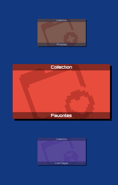
By default, the center logo still gets larger. It is larger in all of the screens above. However, it is themable now as part of the carousel changes. Off hand I know that the nes mini theme doesn't change the size of the selected system.
Get latest build of EmulationStation for Windows here
-
However, it is themable now
Ah, nice. That's definitely as it should be.
It is larger in all of the screens above.
They appear larger, but in motion there's no size change in focused logos. Could it be that the increased size was just never added back to the Carbon theme?
-
The carousel change did result in some tweaks to the default scaling. Previously, the height/width of the logo were scaled at different proportions (1.5x for width and 1.05x for height) . As part of the carousel change, this was changed so that they were scaling at the same rate (1.5x). This lead to complaints that some logos were too big. After discussion, the decision was made to set the default to 1.2x, which may explain why they may not seem quite as large as they did in the past.
Details about it can be found here:
https://github.com/RetroPie/EmulationStation/issues/126 -
@mediamogul said in [[Theme Changes] Attention Theme Makers:
They appear larger, but in motion there's no size change in focused logos. Could it be that the increased size was just never added back to the Carbon theme?
Hopefully my previous comment should clear things up for you. The logos are larger, but not quite as large as they had been previously.
Additionally you mention "in motion". Currently, the way the logos are handled, ES switches between 2 different logos (normal and large) so the logo just kind of suddenly becomes larger. One change that I have been working on is to actually have this transition animate properly so that the logos will appear to grow and shrink.
Get latest build of EmulationStation for Windows here
-
the decision was made to set the default to 1.2x
so the logo just kind of suddenly becomes larger.OK, I see. It's just been made a bit more subtle. looking at it closely now and knowing when the change occurs, I can see a size increase.
-
@jdrassa Weren't you the one who brought up the idea of the carousel having an origin function? Like the selected logo standing out much more than the non-selected ones.
-
@lilbud There were some requests for something along those lines. What I settled on trying to implement were some alignment options for the logos relative to the carousel.
-
@mediamogul said in [Theme Changes] Attention Theme Makers: Upcoming Game Collections in ES:
I have the day off and woke up with a little inspiration. I designed these for myself as a stopgap, but in the interest of sharing ideas, I thought I'd also post them here for feedback.


I would exchange the Favorites folder icon with an icon more like that. Or show a cup with a sash (#1) around. This icon was included into the IO theme! . The labeling is really cool.
 .
.The COLLECTIONS .... WOW not more to say! Great idea
Also the LAST PLAYED icon and labeling is a good move - Thank you!Personally I don't like the "A1l Games" labeling ... it looks restless and messed up. But all the other suggestions +1
I think it's a cool theme and it is worth to be the default one :)
Of course that's only my liking! Don't take this personally. -
All great feedback, thank you. My original idea for 'All Games' was to do a ransom note style as I did, but using the various fonts from the more notable game systems. I lost interest in that direction when I realized the classic Nintendo logo couldn't really be used. Of course these are only meant to be quickly implemented stopgaps for myself until @UDb23 finishes his own stellar work, but you raise some good points and I might continue to develop them further if the mood strikes again.
Of course that's only my liking! Don't take this personally.
Certainly not. I've been in commercial design for too long to take any criticism personally. These days, as an art director, the first bit of advice I give our new designers is to get some thick skin and get it quick. Everyone's work can always be improved and in most cases, no one can see exactly where without the input of a group of like-minded people who share a common interest in the outcome.
-
Seems everyone is getting around to adding these new features, and so i felt like i should too for my upcoming theme.
still need to get around to do the custom collection one but it's a start.
Systems: Raspberry Pi 2
Overclocked: 1050 | 525 | 350 | 425 | 256
My Themes: Metro Theme | Simpler Turtlepi | Future Mini -
Clean enough to eat off and sharp as a razor. Very nice!
-
I agree with many other people. Love the Last Played folder and logo. I love the collections in folders. All Games isn't too hot on the logo. But that's already been mentioned.
As far as keeping things in line with design, all of the "controller" arts look great. And for logos, those change depending on system... there are no design rules for the logos. So they all work.
I have noticed some changes in the carousel since theming was added. There is a gap between the white bar with logos and the grey bar with the number of games. That was never there. And logos do not scale as large as they used to on the selected system. So those changes to ES actually changed how all themes look. I do not mind the gap between carousel and #games, and I can live with the logos not scaling as large as they used to. It's just something I noticed.
As long as these "collections" do not appear as default systems I am happy. I turned off the saving of metadata changes... it speeds up the shut-down time immensely. And I only scrape images, otherwise my boot time would be somewhere around 3 minutes because of the size of the XML files. So I cannot benefit from "recently played" or anything like that. Since changes aren't saved.
Also, if you need to get in touch with me, make sure to highlight me here on the forum since we don't have IM. I don't have enough time to read every topic and see what I should chime in on. But I'm happy to help and love to make graphics. :D
-
Thanks all, and thanks @Rookervik for the reply. Indeed, none of these are default systems, you need to enable them. Even without metadata, though, you'll still be able to benefit from "All Games" if you'd have a use for it. :)
@UDb23 Here's a video with the latest icons:
Overall I like the direction it's taking - great job!
A few thoughts:
- The "Last Played" text feels misaligned, because its baseline is the lower part of the "y".
- The folder icons themselves are "larger" than the other controllers in the theme. It's weird, and I can only assume it's caused because of any blank space around the other controllers.
Both of these are solvable in the actual theme (I actually did so for the folders for the video, otherwise they'd be huge), but I'd probably prefer to have the theme values as standard as possible, but I imagine it's a minor thing.
I wasn't able to test the Custom Collections one yet just because it isn't implemented yet and I'd rather not butcher the theme even more :D
-
All Games isn't too hot on the logo. But that's already been mentioned.
'All Games' definitely presents the biggest challenge to represent visually for a user interface. Do you have any personal thoughts on how it might be best illustrated?
RetroPie v4.5 • RPi3 Model B • 5.1V 2.5A PSU • 16GB SanDisk microSD • 512GB External Drive
-
'All Games' definitely presents the biggest challenge to represent visually for a user interface.
Well this is really a hard nut :)
For IO my idea was ... well... what is all?... RetroPie is a linux system....
Yes ... all means ROOT-dir so the sign I choose was </>
You can take a look hereI'm going to be excited how the Carbon theme will look like. There are tons of good designer work here :)
Maybe </roms> is a good looking one :) -
@mediamogul Yeah I'm not sure. It is a very hard one to include. I was thinking some sort of galaxy font. All-encompassing. Or maybe some ALL ӕ GAMES with that little infinity symbol. Or using a letter from game system logos. Might be best to just go with a single font. As using different logos letters looks a little off:
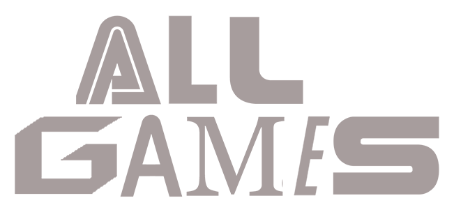
(Can you tell which letters come from which system?)
Or maybe even have a folder in the logo for it.
"Folder Icon" ALL GAMES
"Folder Icon" FAVORITES
"Folder Icon" ETCThose are just some ideas that I might try. I won't be using the folders so I am not too judgmental on how they look :D
Contributions to the project are always appreciated, so if you would like to support us with a donation you can do so here.
Hosting provided by Mythic-Beasts. See the Hosting Information page for more information.