Neo Geo X Build
-
@meleu @FlyingTomahawk i have already included a selection option for @ruckage neogeo capcom theme. Be sure to read the instructions. It works really well. You will need to manually switch your theme after you run the script.
-
Thanks meleu.
That I have installed already. ;-)
I mean choose a profile and it would be setup already with the right theme and all the necessary launch image options.
But the possibility to swap the es_system files is a good step forward. -
@flyingtomahawk do you run your roms off of a USB? One suggestion is to store your roms on a USB, save your images and gamelist in the roms folder. Simply change the USB stick and run the Es_systems script and it will work almost as you wish. The only thing that won't work is the launching screens, however I believe you can set those up on a per rom launch as well.
-
Thanks.
I just tested your script and it works great. Only the theme needs to be switched manually but other then that all works great. Even the preset launch images.
I can live with the theme swapping.Great work!
-
@ruckage can you put the launching images on github so I can make them installable via rpie-art?
-
@ruckage @skj About the gamelist fix....
It's should be okay if you use Notepad++ and scan for
<players>1-and replace with<players>of course a nice script will also do the job :)@FlyingTomahawk Are you going to be kind of Terminator in RL? (red eye on screen?)
Well done Famicom mod - indeed :) Is the joypad also selfmade?@TMNTturtlguy I will use the es_systems script for my next Pi embedded build. But not with the intention to exchange es_systems.cfg rather exchange /boot/config.txt
-
@flyingtomahawk
Thanks for posting that video, shows it off nicely and I'm glad you've got it working properly now. Love the Famicom - great idea putting a power LED under the cartridge flap. b^.^dAnd a big big thanks for the donation you made, that's amazingly generous of you. I really appreciate it :).
-
@meleu said in Neo Geo X Build:
@ruckage can you put the launching images on github so I can make them installable via rpie-art?
Sure, I'll get a github respository setup for them.
-
@ruckage YUP 'Shoot 'em ups' is perfect, i think its this newest generation "Gen Z" that uses Shmups...
-
@ruckage just the labels removed, as the buttons do not have a secondary function just the peimary 1P & 2P start, the ES admin screens i have put under 2 other mapped buttons on a bracket in the coin door... make sense or am i an idiot again ? ;)
-
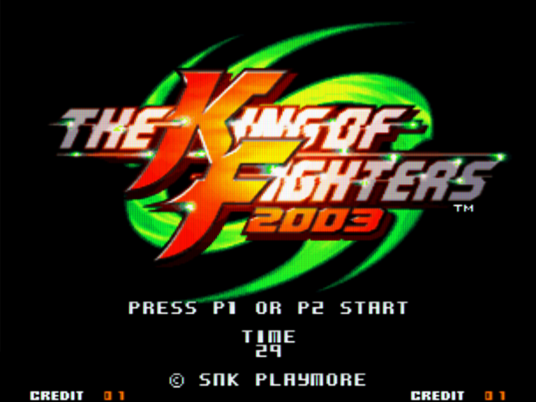
im going to do some hi res in-game screenshots with phosphor scanlines if anyone would like them please let me know (180 games, all US, only 2 boolegs svcsplus and svcplus)
-
@ruckage if you dont want to bother crating TWO overlays for sytems "select a system" and "select a category" maybe just do "select" or "Choose" as an overall one-size-fits-all option...? or just eliminate completely, just thinking... but dealers choice ;)
-
@linuxarcadeguy said in Neo Geo X Build:
im going to do some hi res in-game screenshots with phosphor scanlines if anyone would like them please let me know (180 games, all US, only 2 boolegs svcsplus and svcplus)
An easier way is just to use an overlay as there is no need to create specific images then (I actually already had a scanline overlay in the theme but disabled it for various reasons).
Also remember that the actual size of the screenshot displayed in the theme limits what detail will be visible. To get a true phosphor effect requires very high resolution which just won't be visible here.
Can you post a picture of what you mean by 'screenshot with phosphor scanlines' as I'm still not sure that were talking about the same thing.
-
@ruckage above when i said overlay i just meant image, but as for the screenshots yes will post.
-
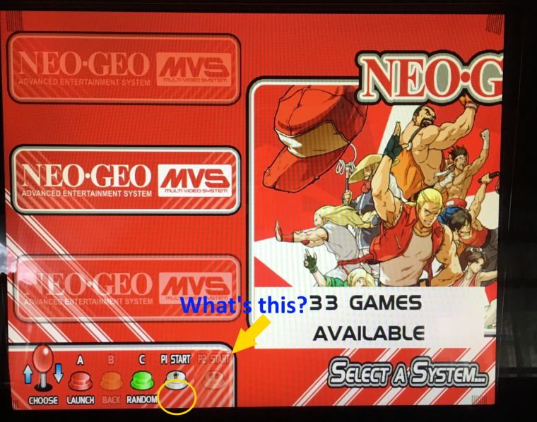
 also circled the "removed words on button" nevermind, i found it its the "controls mask" gone awry because its 16:9 is a 4:3 world!
on the main menu shouldnt both P1 and P2 be faded, it only makes sense...
-

this is an example, i need to redo these, but these are phosphors, REAL arcade monitors have them, i use them on lcd to simulate a true arcade crt experience... -
@linuxarcadeguy said in Neo Geo X Build:
 also circled the "removed words on button"
It's explained on @ruckage 's post where he announced the theme: https://retropie.org.uk/forum/post/94959
-
@meleu what are you talking about? and also shouldnt both P1 and P2 be hidden on the main menu screen?
-
@ruckage yea in my opinion the "controls_mask" should cover Back, P1 & P2 on main screen and instead of "launch" maybe it should say "Select"? because you would be "launching a category or system" so select seems more fitting

-
@linuxarcadeguy said in Neo Geo X Build:
shouldnt both P1 and P2 be hidden on the main menu screen?
No, because you can still access the main options menu from the system select screen.
Regarding the phosphors that was what I was imagining but wanted to make sure we were on the same page. I 'd use less blur though - arcade monitors were pretty sharp.
I think though that they won't look good when displayed as screenshots in the theme as they will be scaled down by ES using nearest neighbour scaling which will result in less tha optimal image quality. You need to pre-downscale them to the correct size using bi-cubic for best results.
Also, could you try to ask several questions in one post instead of posting several one after the other in quick succesion, we all do it from time to time but it seems to be a habit you have and you're flooding my inbox :D.
Contributions to the project are always appreciated, so if you would like to support us with a donation you can do so here.
Hosting provided by Mythic-Beasts. See the Hosting Information page for more information.