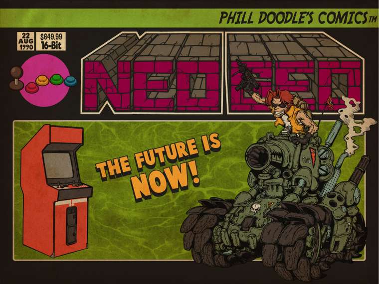
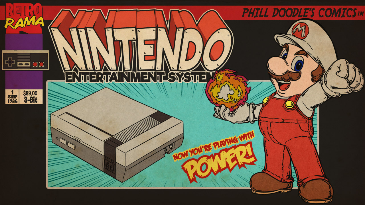
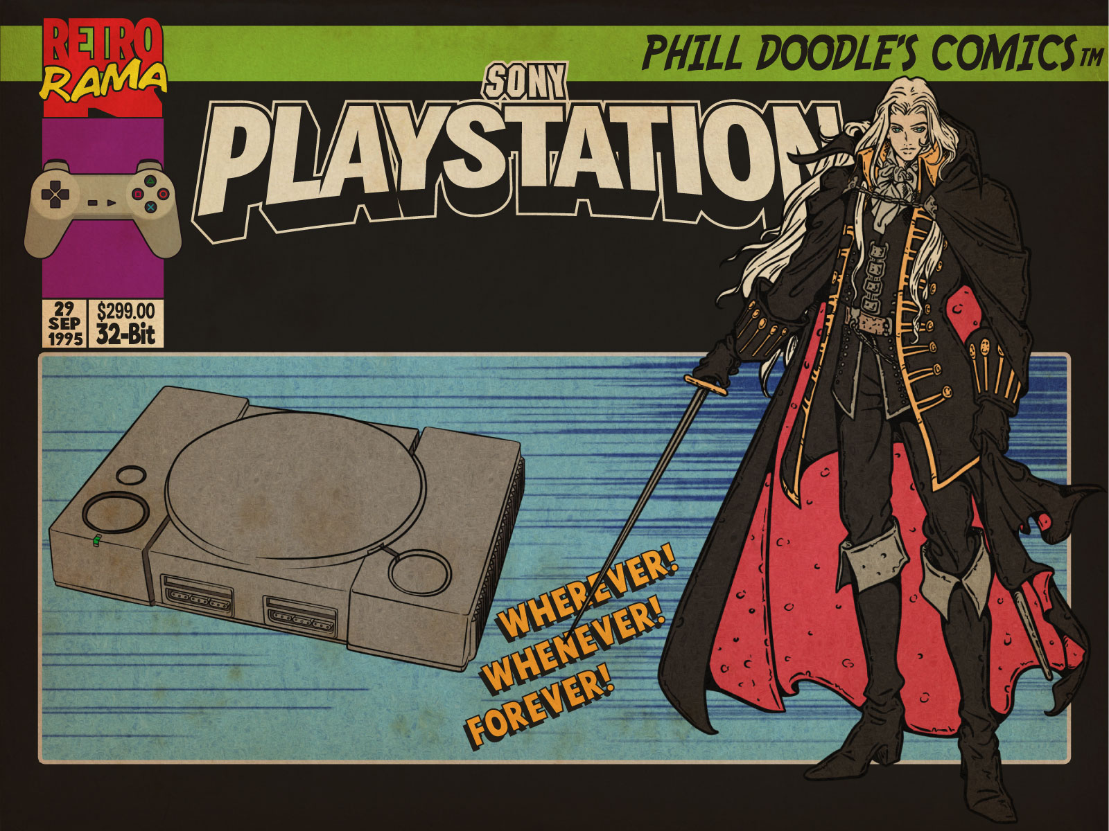
Retrorama Comic Theme
-
@robertvb83 said in Retrorama Comic Theme:
the standard LCD Monitor resolution is 1280x1024! this is actually what most PC monitors are like and mostly this type of monitor is used for RPI cabinet projects.
Well, mine is 1600x1200 which is 4:3.
if you make a true 5:4 resolution it will still look fine on a 4:3 CRT
And vice versa I suppose. I may be a bit biased since my cabinet's monitor is 4:3, but I think that this aspect ratio may actually cover a lot of machines: TFTs with 800x600, 1024x768, 1600x1200, as well as most CRT monitors.
Don't want to start a ratio war here, though. 😇
-
I was looking the wikipedia article about screen sizes and @Clyde is right, 1280 x 1024 is 5:4. I've runned some tests and the images looks good on this resolution too.
https://en.wikipedia.org/wiki/Display_resolution

-
@Clyde @lipebello right now all 4:3 themes are completely fine with my 5:4 monitor! and this will definitely also be true for your theme!
i was just thinking 1280x1024 gives a little bit more resolution which i consider usually better than less resolution with 1280x960 stretched.and although maybe not the case in this forum but most LCD PC monitors above 17" were 1280x1024. this was kind of the industry standard for a long time. but i might also be biased because all my monitors are 5:4 or 16:9 :-)
-
My 19” is also 1280x1024. Its a great resolution for the Pi—plenty of pixels for nice crt shader, yet not so high that runs into performance issues.
@lipebello thanks for the 4:3 support. It’s a great theme and I have been a long time fan of your work!
-
@lipebello It was @robertvb83 who mentioned that 1280x1024 is 5:4, actually. 😌
@robertvb83 You have a point there with the slightly higher resolution, especially since mine is much higher than both 1280-based variants and has to be stretched anyway. One reason for my choice was the idea to still have enough resolution left for the games when using bezels.
At the end of the day, it shouldn't make much difference for either group of users, contrary to bezels where the ratio is important for the screen cutout. I think I'm just a bit more used to 4:3 in the arcade scene because of the original CRT monitors. 😎
edit: Oh, and regarding modern monitors, I'm a 16:10 guy. 😉
-
I love this theme but it is missing the Tandy CoCo and Apple II.
I read a bit about online trolls but I have to say I love this theme
and appreciate the work put into it!
Kudo! -
@lipebello What about a RetroRama-Switch theme?
Use your Artwork from RetroRama and iconize them to the Switch Theme?
https://github.com/lilbud/es-theme-switch
-
@cyperghost You mean with these?
https://drive.google.com/open?id=12kqG7L8_dfrem5If0rI9h3J7FCBiFqF_ -
@lipebello No .... more like a conversion so that the Main System Icons more look like this.
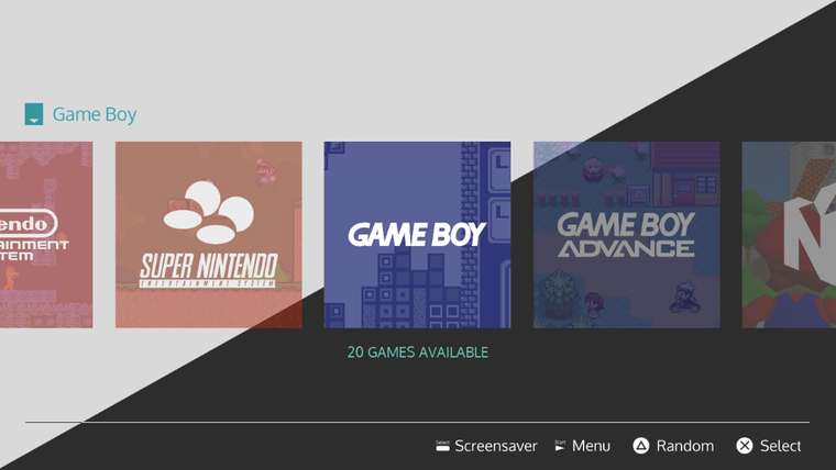
The SWITCH-theme selection icons are square shaped in resolution of 1080x1080 (afaik - but the resolution does not matter). Then the trick is to cut your retrorama systems view also in square shape. like this:I like the clearness of @lilbud's Switch Theme but together with your RetroRama it's a lighweight retro theme ;)
 @lilbud" class=" img-fluid img-markdown" /> -->
  @lipebello " class=" img-fluid img-markdown" />
 -
@cyperghost said in Retrorama Comic Theme:
1080x1080 (afaik - but the resolution does not matter).
I only designed them at that resolution, but I exported them at 600px.
Designing them at 600 made them look terrible.
-
@lilbud Good to know ;) I hope you like the idea
-
@lipebello Love the acknowledgment to the great Stan Lee in your readme files. An inspiration to many! Also, a huge thank you for putting up your original retrorama bezels! Hands down my favorite!
-
@BiZzAr721 said in Retrorama Comic Theme:
@lipebello Love the acknowledgment to the great Stan Lee in your readme files. An inspiration to many!
May he rest in peace. Excelsior!
-
@BiZzAr721 Thank you! Glad you like it. i like the new ones better, because they look more real and old, lol
-
@lipebello I do like the texture & label/button. What I like about the original is the left & right side are differentiated more, but also the new ones have that slight tilt to the artwork so it's not parallel to the bezel.
I'm a finish carpenter by trade, so I can't keep my eye off that - it looks out of plumb haha
Really dig those game specific ones - especially Asteroids & Space Invaders with the back drops!
-
Hi! Has the 4:3 version of this theme come out yet? I LOVE it but my monitor isn't 16x9. Keep up the good work and thanks for any replies!
-
Hi @lipebello,
I really love your Retrorama theme and your themes in general.I'm a Retropie user on Raspberry but I'm also an Attract-Mode user on Raspberry and PC.
I recently forked your public repository on GitHub, to make a 4:3 Attract-Mode version.
In this version there are also some differences from the original and obviously It is not intended as your official version of the Retrorama theme for Attract-Mode... just my version.
I ask you if I can humbly continue my work publicly on GitHub, maybe with some more appropriate description/credit that you can suggest me.
Anyway, if you want I'll delete my fork on GitHub immediately.
Thanks in advance
-
@o0alucard0o hello! thanks a lot for the kind words.
No problem at all, you can use it, as long it's not for sale. -
Hey @lipebello! Spotted your new update on Madlittlepixel's channel and have to say it looks absolutely amazing! I'm desperate to get this on my Pi! Looking forward very much to seeing it when you've done. :-) Happy New Year!
-
Thanks @Ranma! i'm planning to add more systems after the holydays. I'm also making a new version of Retrorama (both 16:9 and 4:3 versions) with new logos and drawings that i've made.
16:9

4:3

Contributions to the project are always appreciated, so if you would like to support us with a donation you can do so here.
Hosting provided by Mythic-Beasts. See the Hosting Information page for more information.