Neo Geo X Build
-
@ruckage said in Neo Geo X Build:
I'm working on a theme for it
Man, please please please release that theme. It'll look just perfect on my arcade:

I use the @Rookervik 's Neo Geo video splash and it looks awesome. With your theme it would be nothing but perfect!
Also, how can we support your work here? Your contributions are really cool.
-
@meleu said in Neo Geo X Build:
Man, please please please release that theme. It'll look just perfect on my arcade:
I use the @Rookervik 's Neo Geo video splash and it looks awesome. With your theme it would be nothing but perfect!Also, how can we support your work here? Your contributions are really cool.
Wow, that cab looks great - really jealous. Did you build it yourself?
I'll be happy to release the theme once done, as I said it will be limited to neogo/capcom but I could probably add a generic arcade system as well. For your cab though I guess the Neogeo system style alone would be ideal. Also the wheel/marquee images are customized to add that border around them. I can probably do a complete arcade wheel set though if needed as I have a photoshop batch setup to do it, it will just take a while to process.
I've worked a bit more on the theme , now added a small amount of metadata (rating, players, release date). To be honest players is a little redundant as virtually all neogeo games are 2 player but it looks cool and will be useful for other arcade systems (notice I've used a little trick to show icons for the players rather than a number).
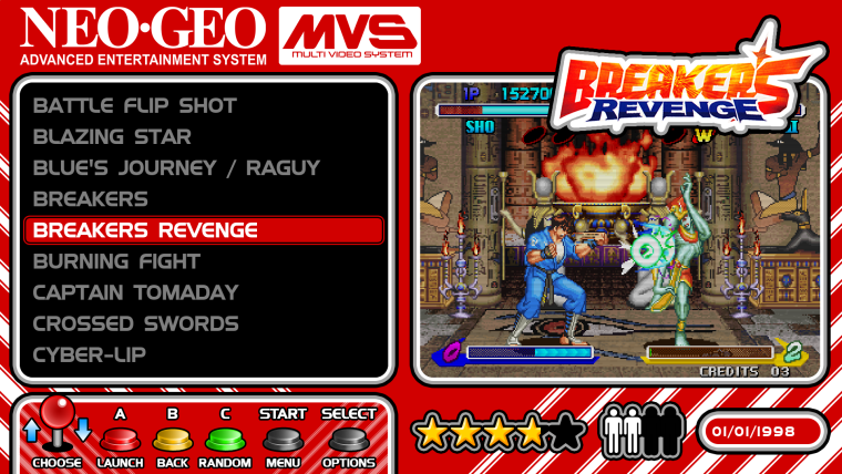
-
Added the Capcom system, I decided to have just a single system that covers CPS 1,2, and 3. I've also updated the selector bar as the latest version of ES has image support for the selector bar.
I removed the release date metadata as it didn't look right, ideally I would just show the year of release and have it centre aligned but unfortunately neither of those things are possible. It leaves a bit of a gap though so I will probably put something else in it's place.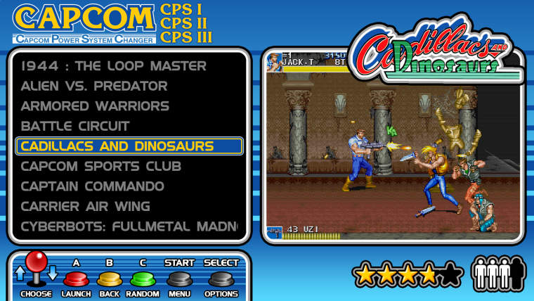
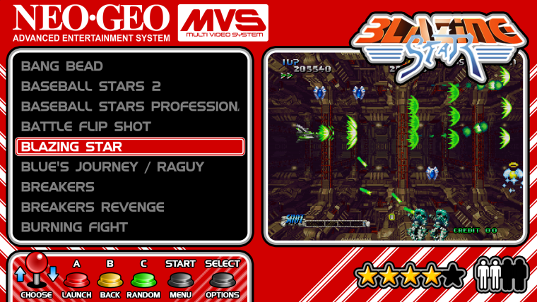
-
Release date looked weird. Good call taking it out.
Theme looks fantastic. 👍
-
Incredible work, you are very talented! Can i but you to share with me how you got the players to act like the stars? I have not looked into it and thought maybe that was hard coded into ES so i just replace the stars graphic with my graphic under the same file name. I might steel your coding if you don't mind?!?
-
@TMNTturtlguy said in Neo Geo X Build:
Incredible work, you are very talented! Can i but you to share with me how you got the players to act like the stars? I have not looked into it and thought maybe that was hard coded into ES so i just replace the stars graphic with my graphic under the same file name. I might steel your coding if you don't mind?!?
You're the first person to ask how I did the players :)
It's actually a special font I made. I figured that players in the xml are always represented by a number so I just made a font where each number shows the relevant number of player icons. This specific font goes up to 4 players but I can add up to 9 (I doubt many games go over 8 players.)
If you had a specific symbol that you'd like to represent the player icons then I'd be happy to make a player font for you. -
@ruckage That is genius! Let me noodle on it a bit and get back to you! I am leaving for a work trip in an hour so I don't have much time until this weekend. Thanks for the offer and I will let you know if i come up with anything.
-
@TMNTturtlguy
No problem. If you do decide you'd like me to make the font you'd just need to find a single colour symbols as obviously the fonts don't support full colour, any format for the image would be fine as I can easily vectorize it. -
@ruckage are you going to release this with all the graphics? Not sure how i would get the title logos. Do they scrape from somewhere or are you creating them?
-
@edmaul69 I can't speak for ruckage but it looks like it was scrapped via UXS and making a mix profile of video and title screen. Just speculating though.
-
@LiveFastCyYoung @edmaul69
No, not a mix profile, I'm using video view so that I can display a marquee and preview image. The title logos are wheel images from hyperspin (I think they can be scraped as well though). However they are modified to give them the border.When I release the theme I'll upload the modified logos as well. The theme will only be for the few systems I've mentioned though as I still have a lot of work to do on the Nes mini theme.
-
@ruckage ok. Thats what i thought because of how they had the glow. There are some pre cps capcom games finalburn runs that would be cool to have included as well. I can give you the list of those games if you wanted to include them. Games like legendary wings and ghosts n goblins really should be on your system.
-
@ruckage
What do you personally use to edit/make fonts? -
@Syhles
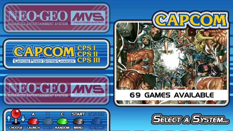
Sorry for the late reply. I use bitfontmaker for the pixel fonts and FontForge to make the player icons.I've made a bit more progress, I've got the system select/carousel done now.
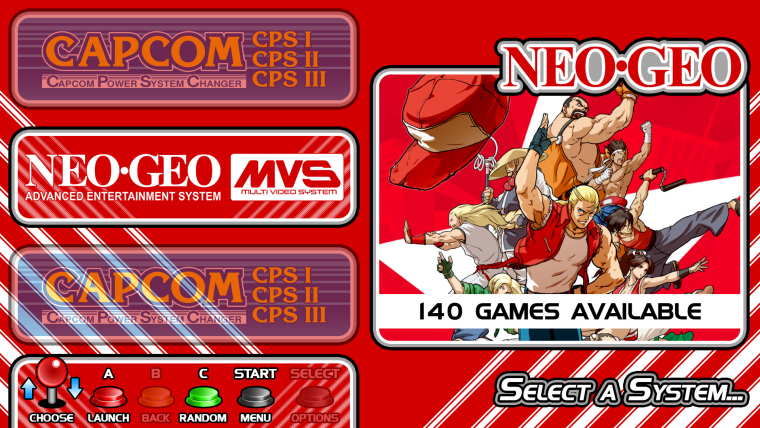
-
@ruckage said in Neo Geo X Build:
Wow, that cab looks great - really jealous. Did you build it yourself?
Sorry for the late reply. :-)
I don't have knowledge/tools for woodwork. I bought that cab. There's a guy here in Brazil who nake it in a way that it can be sent through mail and you just have to connect the parts and screw them.
For your cab though I guess the Neogeo system style alone would be ideal.
You're right! I see you're making them with some differences. I think I can tweak the theme to make every system look like that neogeo style
Also the wheel/marquee images are customized to add that border around them. I can probably do a complete arcade wheel set though if needed as I have a photoshop batch setup to do it, it will just take a while to process.
I think ImageMagick can help with this task too. I'll try something when I have time for it.
Cheers!
-
@ruckage
How are you accomplishing the transparency on the system select screen? -
@Syhles said in Neo Geo X Build:
@ruckage
How are you accomplishing the transparency on the system select screen?Do you mean for the carousel? It does that by default, it's just usually there is a white bar behind them which I've removed by making it entirely transparent.
-
@ruckage
....Apparently I need to pay more attention.
-
Looking forward to this @ruckage keep up the great work!
-
Awesome! Cant wait to see this released... Hitting F5 all day long
Contributions to the project are always appreciated, so if you would like to support us with a donation you can do so here.
Hosting provided by Mythic-Beasts. See the Hosting Information page for more information.