Neo Geo X Build
-
Thanks, I'll take a look and update it - should just need a minor adjustment. Is this at 1080p?
-
This post is deleted! -
@ruckage said in Neo Geo X Build:
Thanks, I'll take a look and update it - should just need a minor adjustment. Is this at 1080p?
thanks, yes its 1080p
-
ive managed to fix this myself,
for anyone else having the same issue edit the neo.xml
and change the last line of md_players to :-<pos>0.8901041666666667 0.8825</pos>
-
@stuart2773
Quick question, are you using this in windows on the Rpi?The reason I ask is because that weird offset was originally needed to make it align correctly on the pi as there was a discrepancy between the way windows and RPI displayed that particular element.
Also if you wan't to be exact (as I always do 😊 ) the correct value to align perfectly is:
<pos>0.8901041666666667 0.8814</pos> -
im using it on the Rpi, the original was <pos>0.8901041666666667 0.8855</pos> but after i updated the Rpi, the alignment was off so i edited the xml on windows to <pos>0.8901041666666667 0.8825</pos> and transfered it to the Rpi.
the 0.8825 was the most accurate i managed to get it on the Rpi after a few attempts.
-
@stuart2773
That's fine, I imagine then the rpi is now matching the behaviour in windows which is good so the values I provided above should be exact (I measure everything very carefully). I'll double check myself on the pi later today. -
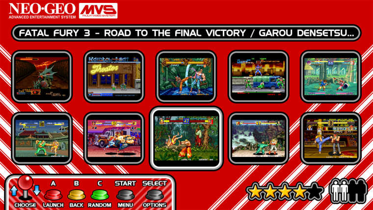
I've been working on adding a grid view option to the theme.
Hopfully in the future gridview may also support displaying the marquee image so when that happens the game title text could be removed and instead I'll have the marquee dispayed in the top right corner of the screen.

-
changed mine to 0.8814 perfect :)
-
Hi LinuxArcadeGuy, do you have a facebook page?, i want to talk with you.
-
I think the grid view is nice if you can display the game case covers or the cartridges. In this case, screenshots, i like the original NeoGeo theme style. Large screenshot with marquee top-right.
-
Fantastic work.
-
I changed the design, but I do love the theme.

-
-
@legacy said in Neo Geo X Build:
@ruckage ,
Please can i sample the grid theme.
Thank you.
Sorry, it's not ready yet but once it is it will be available here.
-
@flyingtomahawk said in Neo Geo X Build:
I think the grid view is nice if you can display the game case covers or the cartridges. In this case, screenshots, i like the original NeoGeo theme style. Large screenshot with marquee top-right.
I agree, the gridview shown would actually work better with title screen images rather than gameplay. I believe @A12C4 is planning to add video support at a later date so a highlighted tile would display a video preview which would be pretty cool I think.
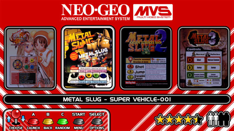
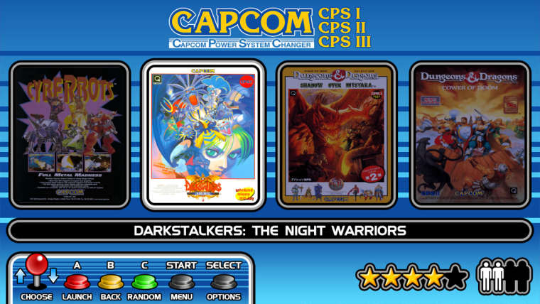
You might like this alternate view I've been working on - I've kind of mimicked the look of the marquees on 4 slot MVS machines for a bit of nostalgia (not an exact visual copy but the same idea). It obviously needs different preview images so I've made a set of marquees for both Neogeo and Capcom that have been modified to display correctly. On my machine I'll have both the screenshots and mini-marquee images in different folders and I can just change the folder name to switch between them.


-
@ruckage ,
Awesome, keep up the great work.
-
That second mock up looks friggin awesome! (4 slot)
-
@ruckage Love your theme. Any insight if you will update it to the current ES themes to include Custom Collections, Last Played, Favorites etc ?
-
love the neo geo 4 slot mock up
Contributions to the project are always appreciated, so if you would like to support us with a donation you can do so here.
Hosting provided by Mythic-Beasts. See the Hosting Information page for more information.