Went to make a backup with Windisk 32 Imager, now my sound doesn't work. Suggestions?
-
@ChristianG Your build looks great! Be sure you always properly shut down and make sure you power is off prior to removing your SD Card.
As for FB Alpha - it depends which version you are using. I am assuming you are once again using lr-fba in which case you need to hit select and X at the same time and edit in the retroarch menu. Select + X at the same time, then quick menu, then controls, make sure to save to core.
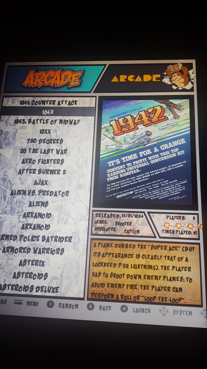
As for the theme. The theme is not made for vertical monitor orientation. You will find that you might have some performance issues with some games in this orientation as ES has issues running when rotated. Some games will work great, others, not so well. You can go in and edit the size of the text on your own build, this is much to custom for me to make changes to the main theme.
use an ftp client like WinSCP and then do the following:
- go to
/ect/emulationstation/themes/ComicBook - find the following file (at the bottom of the folder)
comic_book.xml - Use a text editing program like notepad++
- Change the gamelist text size. go to line 72
<fontsize>and decrease the size, i would try maybe 0.3 to start. Save the .xml file. Restart emulationstation (note, you can leave the .xml file open and restart ES.) Check the text size and then modify the .xml file again, maybe 0.29. Save and restart ES. Repeat until you find the size you like. - Change Meta Data text sizes: Change all these lines to the same text size. Save, restart ES until you get what you want.
- line 129
<fontsize>change to .017 to start, slowly lower the value until you get what you want. - line 140, line 152, line 204, line 211 - change all of these the same as line 129.
- lastly change line 17
<fontsize>to .02, save and restart es - this should make the grey text at the very bottom of the screen that says options, menu, back, fit on the screen.
- go to
-
@TMNTturtlguy Very cool. Ill try it after lunch!
-
@TMNTturtlguy I am in there but it is denying me changes to the file. What am I missing to gain administrator access to change the file?
Thanks!
-
@ChristianG using WinSCP and Notepad++
-
@ChristianG What you can do is copy the entire ComicBook folder from that location onto your desktop. then on the pi using WinSCP browse to
/home/pi/look to see if you can see a folder.emulationstationIf you can see it that is great. If not, follow these instructions link textnow you should go into that folder
/home/pi/.emulationstation/create a new folderthemesupload the
ComicBookfolder that you copied to your desktop. This is now the location that your pi will look to for custom themes. Go back to/ect/emulationstation/themes/and delete theComicBookfolder. If it does not allow you to do so, you can use command line or putty, and this commandcd /ect/emulationstation/themes/ sudo rm -r ComicBookNow in
/home/pi/.emulationstation/themes/follow the directions posted above. This should allow you to make the changes and when you restart the Pi should look to this location for the theme. You may need to press start and go to the UI menu and reselect ComicBook as your theme. -
@TMNTturtlguy Thanks! What was the original value of the help screen on the bottom?
-
@TMNTturtlguy Looks like .018 font size fits portrait mode 4:3 for the gray menu buttons on the bottom. What I don't understand is why the gray menu under Retropie category stays the same and is still large. The gray help menu under everything else (FBA,MAME,ARCADE etc) has resized but not under Retropie.
Is this a different area to adjust? I adjust the value on line 17 mentioned above.
-
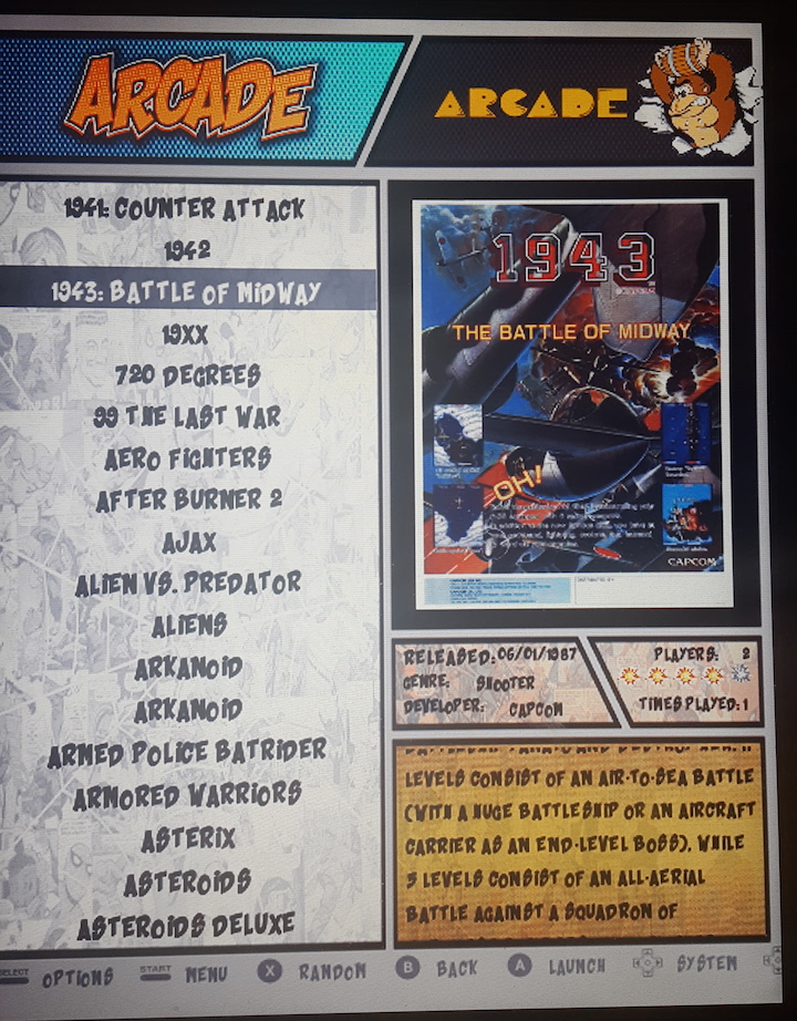
@TMNTturtlguy Thanks for the info. I have changed the values for the game list and for the description to make them smaller and fit.
What coding should I look for to bump over to the right and minimize the Released/Genre/Developer fields. The are large and overlapping right now.
Thanks!!
-
@ChristianG I listed all the lines in the original post
-
@TMNTturtlguy Got it . Thanks. Ill do some trial and error on shifting text over to the right. Thanks again.
-
@ChristianG yup, that is the best way to do it. Another option is to just set all the locations to 1 1 and they will be hidden off screen. That might be best in your case as the space is pretty small.
-
@TMNTturtlguy No I got them to look good. Here is a screen shot. Last thing I have to do is move over the explosion rating system you have to the left a bit. Still trying to figure that one out.

-
@ChristianG looks great! Look for the md_rating that has stars.svg as part of the code, and reduce the size first. Then shift them.
-
@TMNTturtlguy Ill give it a try. Thanks.
-
@ChristianG I just checked the .xml file. Line 192 is the size and line 191 is the position.
-
@TMNTturtlguy Looks perfect! Thanks for such a great theme! Can your video be run as a screen saver?

-
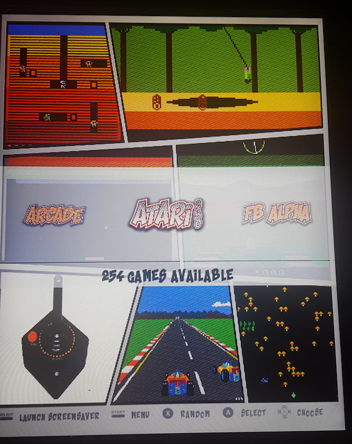
@ChristianG Good work! That looks really nice! How does the system selection screen look? I am guessing that view is all messed up?
Right now the screensaver only uses videos that are on the gamelist as md_video. What you could do is go to the start menu and set the theme to detail view. Then go into your gamelist and add a video tag to just one game. path the video to my intro video. The screensaver should just run that in a loop as the screensaver. The only issue is that the intro video is about 50 seconds long and the screensaver resets every 30 seconds, so you will never see the entire video.
-
@TMNTturtlguy The system selection screens look great. I will try to do what you mentioned. I am onto video preview next and trying to figure out how to do that. Your theme supports this I think I read correct?
Thanks.

-
@ChristianG WOW! That is awesome man, i figured the black boarders wouldn't translate, but they did and it actually doesn't look to bad. I am a little jealous. I tried to set up a vertical monitor, but I kept running into performance issues, how does everything run so far? Also, it would be cool if you were to post a few of these images to my comic book theme thread as well, i think some people who follow that thread might enjoy these images. Your build has really come a long way in the last few days. Great work and keep it coming!
-
@TMNTturtlguy Really everything runs fast. All screens run smoothly and no issues or glitches. Your theme fills out the screen. The black on the sides in the photo is the cabinet but my 4:3 portrait mode monitor has no black edges.
Its really pretty awesome. I will send you more screen prints. Best theme out there really by far...
Contributions to the project are always appreciated, so if you would like to support us with a donation you can do so here.
Hosting provided by Mythic-Beasts. See the Hosting Information page for more information.