[RELEASE] PSX-MINI Theme
-
@itsnitro I agree
-
some changes have taken place recently...
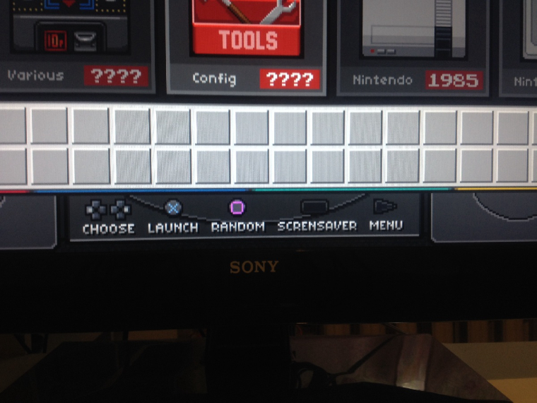
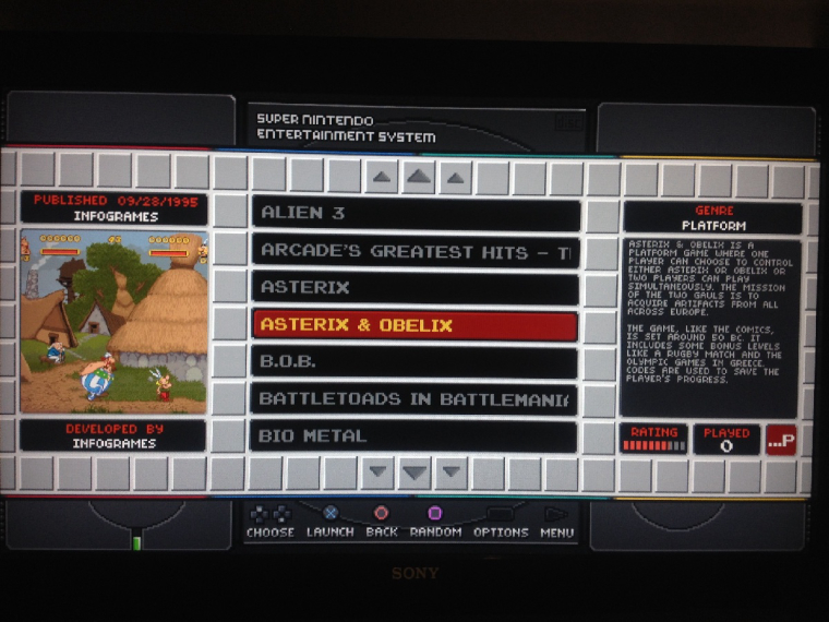
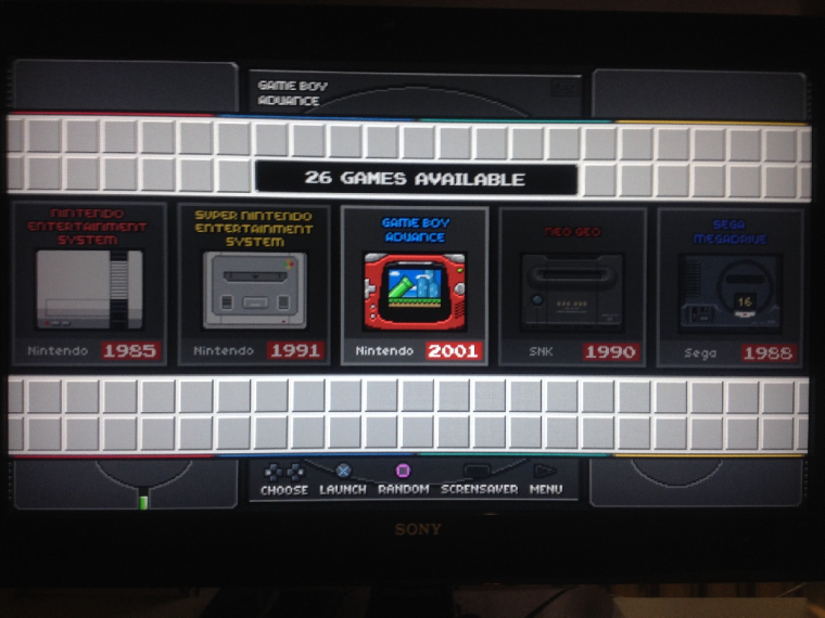
-
very nice. For the new functions in ES would be missing the Favorite Button, if you want to install. Greetings from Germany to Russia.
-
@frgn I would still be very glad if they could contact me by email? Email is above.
-
@frgn I think your PSX mini theme is really great, maybe it would be possible that you send me the theme by e-mail? I will only use it privately. Sergey.kusmin@mail.ru Thank you
-
Awesome Theme. I love the pixel graphics, the playstation background is really successful. You have put emphasis on every detail. Even the Playstation colors, red, blue, green and yellow are above the selection window. Very successful and great work. It is possible to download the theme? in retropie or github?
-
I think nothing will happen here.
-
Why? This would be a pity if you no longer work on this theme. What does @frgn mean?
-
@thunderbolt Hey. thanks for the tip. Work on the theme is still under way, but rather slowly. I decided to redraw all the elements, including the icons of the systems - only in this case the theme will be considered a proprietary design, not a mod. All files with markup will also be re-written, and in the end it will be a full-fledged theme.
I'm not against piracy, but in this case I do not want to share the mod, because the @ruckage did really tetanic work, and I treat it with respect.
I advise everyone to be patient with it - drawing icons of individual systems is much more difficult. Perhaps among the willing there are experienced designers, or just smart guys who know how to draw a pixel art - in this case, I would gladly accept their help in creating icons.
In the near future I will add the latest changes and also the concept of a new carousel. -
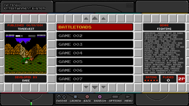
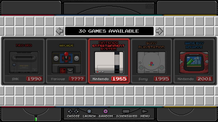
in recent days I just played with the carousel design. added a selector for the system.
-
@thore said in My new theme PSX-MINI (based on Famicom-Mini):
I think nothing will happen here.
@thunderbolt said in My new theme PSX-MINI (based on Famicom-Mini):
Why? This would be a pity if you no longer work on this theme.
It's because it's currently based on my themes and per my license terms sharing of modified versions of my themes is not allowed.
I've spent a huge amount of time creating the graphics, designing the layout, and coding the theme itself.
Links to my theme threads below:
Nes mini and Famicom mini themes
In order to release this @frgn will have to create his own theme from scratch without using my theme as a base or using any of the graphics I created. At the moment it's clear that the layout, code, and many of the graphics are from my theme.
Hopefully @frgn will rise to challenge and create his own theme that is unique and different to my themes. He obviously has some skill when it comes to graphics so I'm sure he can.
-
@ruckage I did not know the theme of the origin of you. But then it is possible. I understand that.
@frgn I'm glad that you want to make your own theme. You'll definitely get that, your current graphics look great. I can imagine that it is a lot of work and not so easy. I am not familiar with the theme, but would still like to offer my help.
-
I would also offer my help
-
-
ahem
@frgn did do a theme previously called PiStation, so maybe he could build upon that?
https://retropie.org.uk/forum/topic/5188/my-theme-pistation -
@allanbuzzy This theme is also just a modification. And besides, I quickly realized that the result does not satisfy me, so I did not work on it anymore.
Hmm. While writing this message, the idea came to mind - to exclude metadata from the theme. Leave only the list of games, cover, and text with a description of the system.
If this is done, the interface will lose most of the content, and it will seem more laconic. But with this option, any list of games will look the same for all systems. as you know, with metadata there are always problems - some games do not contain any data, and this introduces some visual mess.would like to hear people's opinion - do you need metadata? (producer, developer, description of the game, rating, genre)
-
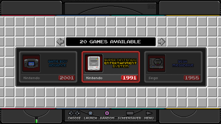
I'm trying to come up with a new carousel. I found in the network quite a few icons of different systems. unfortunately, their dimensions are not very large, so it does not turn out as well as we would like.
Perhaps it makes sense to make a carousel vertical. But in this case there is a lot of empty space.
-
so I find it should have a complete metadata, with (producer, developer, description of the game, rating, genre). I have put a lot of value on it, which is filled with everything and it is also good if you have some information about the game. To the Carousel I find also that it should be vertical, so it makes the most sense, because the background as it is, I find perfect. Because of the icons maybe you could take real graphics? no pixel icons? Maybe like that

-
the carousel should be vertical. And the metadata complete.
-
Contributions to the project are always appreciated, so if you would like to support us with a donation you can do so here.
Hosting provided by Mythic-Beasts. See the Hosting Information page for more information.