RetroPie forum home
    • Recent
    • Tags
    • Popular
    • Home
    • Docs
    • Register
    • Login

    Minimal Theme

    Scheduled Pinned Locked Moved Projects and Themes
    theme
    70 Posts 18 Posters 32.2k Views
    Loading More Posts
    • Oldest to Newest
    • Newest to Oldest
    • Most Votes
    Reply
    • Reply as topic
    Log in to reply
    This topic has been deleted. Only users with topic management privileges can see it.
    • lilbudL
      lilbud @EctoOne
      last edited by lilbud

      @ectoone I know for a fact that marquees work as I tested them last night.

      For the selector I tried an image that was an empty rectangle with an outline, it didn't work, so I just went to a normal one

      I'll add default system later today.

      EDIT:
      @EctoOne said

      I forgot to mention that the marquee is below the gamelist,

      That is how its supposed to be. In detailed view, the gamelist should take up the whole area, in video view, the marquee goes under that and pushes the gamelist up. It was the best way I found to have videos without them being the size of a postage stamp.

      Creator of the Radiocade: https://retropie.org.uk/forum/topic/6077/radiocade

      Backlog: http://backloggery.com/lilbud

      E 1 Reply Last reply Reply Quote 0
      • E
        EctoOne @lilbud
        last edited by EctoOne

        @lilbud Oh I've misread that. Though the marquee was supposed to be overlapping the video, like on one of your mockups. Then the only two issues are, that the cover is behind the video and that the gamelist has the same size on detailed and video view.
        And yeah, an image used as selector almost needs have the exact size because of the stretching behavior. I will take a look at the 9-patch tag later and if it could be used as selector.

        lilbudL 1 Reply Last reply Reply Quote 0
        • lilbudL
          lilbud @EctoOne
          last edited by

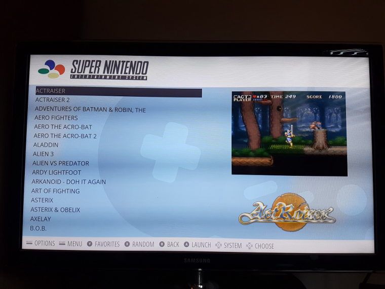
          @ectoone This is what video view looks like for me
          alt text

          I also updated the theme with default system support, as well as stopping the image from showing during video playback.

          Creator of the Radiocade: https://retropie.org.uk/forum/topic/6077/radiocade

          Backlog: http://backloggery.com/lilbud

          1 Reply Last reply Reply Quote 0
          • S
            stephan311280
            last edited by

            0_1504365735559_20170902_172100.jpg

            I like this .....

            lilbudL 1 Reply Last reply Reply Quote 0
            • lilbudL
              lilbud @stephan311280
              last edited by

              @stephan311280
              0_1504365950824_4885d675-7742-4107-9df1-9ceb561d08f7-image.png

              Creator of the Radiocade: https://retropie.org.uk/forum/topic/6077/radiocade

              Backlog: http://backloggery.com/lilbud

              1 Reply Last reply Reply Quote 0
              • E
                EctoOne
                last edited by EctoOne

                video view is still the same for me, with the cover behind the video. you have md_image defined in your theme.xml within the video section as well as in all 4 layouts files.
                I've sent you a PR where i moved them to only appear in detailed view.

                Oh, and the small gamelist on detailed view i mentioned before was on my end. for some reason i had the views set to video only, not automatic. although i can't remember doing that and for what purpose.

                lilbudL 1 Reply Last reply Reply Quote 0
                • lilbudL
                  lilbud @EctoOne
                  last edited by

                  @ectoone I accepted your PR and everything should work now.

                  Creator of the Radiocade: https://retropie.org.uk/forum/topic/6077/radiocade

                  Backlog: http://backloggery.com/lilbud

                  1 Reply Last reply Reply Quote 1
                  • lilbudL
                    lilbud
                    last edited by

                    FFIX was released on ps4 today and to commemorate the release, Square-Enix released a ps4 theme. Here is the background for use as a wallpaper/background for the Minimal theme.

                    0_1505863015498_6cccf2f8-0dd4-4bb6-be1f-dd0d6e916ac8-image.png

                    Creator of the Radiocade: https://retropie.org.uk/forum/topic/6077/radiocade

                    Backlog: http://backloggery.com/lilbud

                    1 Reply Last reply Reply Quote 1
                    • lilbudL
                      lilbud
                      last edited by

                      Thinking of redesigning the theme, thoughts?

                      0_1508277416412_472014c9-51ac-4b8b-9fa1-4f081fb55038-image.png

                      Creator of the Radiocade: https://retropie.org.uk/forum/topic/6077/radiocade

                      Backlog: http://backloggery.com/lilbud

                      E greekmanxG 2 Replies Last reply Reply Quote 0
                      • E
                        EctoOne @lilbud
                        last edited by

                        @lilbud I prefer the old layout. Because with having the cover that big, the new layout will have huge empty spaces when using square boxart and even more when using landscape boxart. Unless you're going to make different layouts for those.

                        lilbudL 1 Reply Last reply Reply Quote 0
                        • lilbudL
                          lilbud @EctoOne
                          last edited by

                          @ectoone Oh yeah, there will be different views for square, landscape and portrait. This is only a mockup

                          Creator of the Radiocade: https://retropie.org.uk/forum/topic/6077/radiocade

                          Backlog: http://backloggery.com/lilbud

                          E 1 Reply Last reply Reply Quote 0
                          • greekmanxG
                            greekmanx @lilbud
                            last edited by

                            @lilbud mockup looks good would love to see what you come up with for a redesign

                            1 Reply Last reply Reply Quote 0
                            • E
                              EctoOne @lilbud
                              last edited by EctoOne

                              @lilbud See, here's where I have the same problem like you mentioned in your other thread about all the different cover variations. I have the same problem with them, that's why I was so happy about the Mix images that Universal XML Scraper can create. I've modified the 3 image mix profile to use only 2D covers and to create a square image.
                              If I would use your theme, I would get unnecessary layout changes while scrolling through the systems.
                              I would love to use normal boxart only but only if it would be possible to also have a screenshot and the marquee as available elements (without having to use videoview). Sadly we don't have that option (yet). That's why I will keep my mix images for now.
                              Well, I might be part of a small group that uses mix images as boxart, so you will probably have not to worry about getting many comments on that. And if I would use your theme, I would at least know how to fix it for myself.

                              I have one question tho. You have to keep the multiple system folders to have different layouts per system right? Or is that possible with variables? I have not worked on themes for quite a while now. Since I am still waiting on some things to be implemented some time ago.

                              Anyway, the new layout doesn't gives me that minimal feeling that the original does.

                              lilbudL 1 Reply Last reply Reply Quote 0
                              • lilbudL
                                lilbud @EctoOne
                                last edited by

                                @ectoone What you'd have to do would be remove the other layout files and only keep the square_layout.xml and replace all instances to horizontal to square.

                                @EctoOne said

                                I have one question tho. You have to keep the multiple system folders to have different layouts per system right? Or is that possible with variables? I have not worked on themes for quite a while now. Since I am still waiting on some things to be implemented some time ago.

                                If you look at my Switch Theme. I updated it to support variables and simplified it. Can't do it with this theme cause it needs multiple layouts.

                                @EctoOne said

                                Anyway, the new layout doesn't gives me that minimal feeling that the original does.

                                Thats why it's a mockup. I'm trying to redesign it so I can use only one layout for all box art.

                                Also, different strokes for different folks.

                                Creator of the Radiocade: https://retropie.org.uk/forum/topic/6077/radiocade

                                Backlog: http://backloggery.com/lilbud

                                E 1 Reply Last reply Reply Quote 0
                                • E
                                  EctoOne @lilbud
                                  last edited by

                                  @lilbud said in Minimal Theme:

                                  Also, different strokes for different folks.

                                  Yeah for sure, what i was trying to say was that you probably should keep the old layout and just make the new layout part of a new theme. Since we can't select different layouts from within ES now, it makes more sense (to me at least) to have more themes available.

                                  lilbudL 1 Reply Last reply Reply Quote 0
                                  • lilbudL
                                    lilbud @EctoOne
                                    last edited by

                                    @ectoone I might make a seperate version of the theme with a new layout

                                    Creator of the Radiocade: https://retropie.org.uk/forum/topic/6077/radiocade

                                    Backlog: http://backloggery.com/lilbud

                                    1 Reply Last reply Reply Quote 0
                                    • lilbudL
                                      lilbud
                                      last edited by

                                      OK, attempt #2. Kinda went for a more Kodi look with this mockup

                                      0_1509810175070_7607db13-ea21-4308-bf1c-776669a626db-image.png

                                      Creator of the Radiocade: https://retropie.org.uk/forum/topic/6077/radiocade

                                      Backlog: http://backloggery.com/lilbud

                                      1 Reply Last reply Reply Quote 0
                                      • N
                                        nj180grados @lilbud
                                        last edited by nj180grados

                                        @lilbud Hello, I just wanted to tell you that I really like the work you have done with this theme
                                        and the minimalist design as well as the possibility of changing the wallpaper
                                        by another of our choice.

                                        I would like to leave you a couple of suggestions for future updates, in my opinion they would improve their design even more.

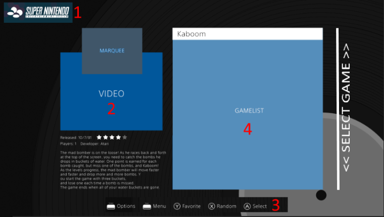
                                        Based on the following image and the following layer design
                                        I leave you listed the changes I would make:

                                        1- I would add the logo of each system as I did in the image, I think it is much more
                                        colorful that the letters, and it would not stop being minimalist.

                                        2- Recently they have seen in new themes for ES the possibility of showing the cover first
                                        of the title or 3dboxart and then the video, all in the same box,

                                        I'll give you as an example:SNES mini theme of Ruckage.

                                        It would be interesting to first show for a few seconds
                                        the cover of the game and then the video. I would like to tell you that the position of the marquee is adequate.

                                        3-We could try to center this text .. I would give a more flamboyant and centered with the text box of the description and the gamelist

                                        4-I have verified that the quantity of titles that shows the gamelist is something excase, I would expand
                                        the number of titles shown here, making the font a bit smaller or adjusting it a bit more.

                                        5-In this last point would put a select game selector... is the complementary touch to the help information below.

                                        These are just my opinion and my suggestions to the already good topic that you have done ...

                                        I do not know if someone else would share my ideas, it would be good to discuss it ...

                                        PS: I'd love to see the icons of capcom play system 1 2 and 3 in your theme!

                                        Thank You! alt text
                                        alt text

                                        https://imgur.com/a/HLg26

                                        0_1509832758441_mockup.png

                                        lilbudL 1 Reply Last reply Reply Quote 0
                                        • lilbudL
                                          lilbud @nj180grados
                                          last edited by

                                          @nj180grados This iteration of the theme is done, not really planning to make any sweeping changes to this version. The mockup above will be a separate layout or even a different theme.

                                          The video should show box art if no video is found.

                                          1- I would add the logo of each system as I did in the image, I think it is much more
                                          colorful that the letters, and it would not stop being minimalist.

                                          Also, the logos are white. So it won't be more colorful.

                                          Creator of the Radiocade: https://retropie.org.uk/forum/topic/6077/radiocade

                                          Backlog: http://backloggery.com/lilbud

                                          1 Reply Last reply Reply Quote 0
                                          • sergioadS
                                            sergioad
                                            last edited by

                                            Actualy, a Kodi theme may not be a bad idea

                                            lilbudL 1 Reply Last reply Reply Quote 0
                                            • First post
                                              Last post

                                            Contributions to the project are always appreciated, so if you would like to support us with a donation you can do so here.

                                            Hosting provided by Mythic-Beasts. See the Hosting Information page for more information.