SNES mini theme
-
yes yes yes !
I'm waiting for the release, really gret job ! -
Looks great! Could you share an ETA? Can be super vague^^
-
I love too <3
Thanks for all your work :) -
Those all look sweet, but the purple and green is especially badass.
-
@ruckage Wow! That looks awesome. Hope there will be Amiga this time ;)
-
@ruckage I have a 4,3" screen
framebuffer_width=480
framebuffer_height=272
But @hex argues that your mini NES/SNES/Famicom aren't suitable for 3,5" screens so I suggest it's 320x240 or 640x480.
I have really no clue why.... so let our developer write a comment about ;)
Thread here! -
@cyperghost
If your framebuffer is 480x272 that's almost identical to the base resolution I'm using for the theme (480x270). The trouble is that 480x270 is 16:9 widescreen ratio whereas you say your display is 4:3 so I'm assuming it has non square pixels. I may be able to do something but without having access to the screen myself it's not going to be easy. -
-
@cyperghost
I think I may be confused - what is the actual aspect ratio of the display - do you have a link to the display you're using? -
@ruckage Sure... https://www.amazon.com/Pyle-Backup-Camera-Monitor-Screen/dp/B00BOPOY70/
Remember: It's not me how said these themes won't fit ;) -
That looks like a widescreen display (4.3 isn't the aspect ratio it's the size - I misunderstood).
If you can set the framebuffer to 480x270 that would be ideal for my theme. I would still need to make a specific option for it though as the description text will probably be unreadable.
Have you tried my NES theme on it? If that works then so will this theme.
-
@ruckage Yes... I used the 320x240 setting for the installed NES theme, but the text boxes are outframed of the rom names. It's just one or two characters. Is this caused by ES 2.6.x and the new theme options?
On those smalls screens there is no no space for video preview.
-
@cyperghost
You shouldn't be using a 4:3 layout on it as it looks to be a widescreen display. Try the theme using the default layout settings (1920x1080) and see how it looks .I did a test in windows and this is how the theme looks at 480x270 with the layout set to 1920x1080 - pretty much perfect (it will be slightly off though for 480x272 so change your framebuffer if you can.)

-
@ruckage Ah I get it why it took so long to clear that out ;)
Green those regions that uses comma as decimal seperator ;)
Blue are the point users ;) and the mix green/blue are undecided ...I should play a bit around... 1920x1080 is to much as there is the preview of video and description available.... I think I will step into this. Thanks for your help
-
It was my fault, I ignored the " symbol otherwise I would have realised you were talking about the screen size.
The 1920x1080 in the layout isn't the actual resolution the theme renders at it just sets everything up so that everything aligns correctly at that resolution. 480x270 divides into 1920x1080 perfectly which is why that layout will work (480 multiplied by 4 = 1920, 270 multiplied by 4 = 1080.)
It will display the description area and preview area but that's just the way the theme is designed and I would have to re-do everything to have just a gamelist on it's own. I could however increase the description font size for these low sizes.
This SNES theme has a slightly different structure to the NES theme so it may be possible for me to add a small screen layout but I can't promise anything yet.
-
Looking good! I think your backgrounds look better than the SNES Classic's backgrounds.
-
Could you add a white variant of your colorfull background
-
@ruckage
I setted framebuffer to 480x270 and used 1920x1080 layout.
That don't look good. All rom texts are outframed. I got more luck with 320x240 the ROM texts are just one or two characters outside the boxes (see from left) -
@mattmanforever said in SNES mini theme:
Looking good! I think your backgrounds look better than the SNES Classic's backgrounds.
Thanks :)
@sergioad said in SNES mini theme:
Could you add a white variant of your colorfull background
Sure, there will be lots of options to choose from.
@cyperghost said in SNES mini theme:
@ruckage
I setted framebuffer to 480x270 and used 1920x1080 layout.
That don't look good. All rom texts are outframed. I got more luck with 320x240 the ROM texts are just one or two characters outside the boxes (see from left)I think you're going to have to show me some photos of the problem, without seeing it it's almost impossible for me to work out what could be wrong. Something can't be right as at that resolution it should display perfectly.
-
I've made a bit more progress. The theme was a bit laggy on the pi due to all the layers so I've optimised it and it's running smoothly again (on a raspberry 3 at least).
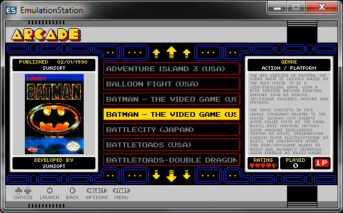
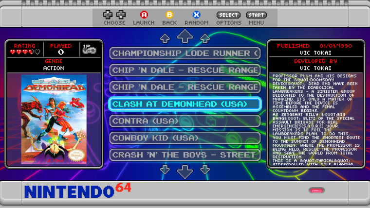
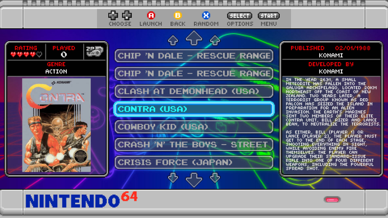
I've also added the controller icons for the number of players on the game select screen - these will actually change to reflect how many players the selected game supports. If you look at the screenshots below you can see a 1 player game and a 2 player game - notice the icon is different for each (lets see if you can figure out how I've done it ;) ).


Contributions to the project are always appreciated, so if you would like to support us with a donation you can do so here.
Hosting provided by Mythic-Beasts. See the Hosting Information page for more information.