SNES mini theme
-
Yes it is.
-
@pokeengineer so the folder i installed manually from the last update will be overwrite by this one? Just wondering cuase i installed it from my computer instead of the pi
-
I don't know, it will probably end up as an error or it will overwrite. If you made any changes, you probably want to back it up for reference.
-
@nestor1924 said in SNES mini theme:
@pokeengineer so the folder i installed manually from the last update will be overwrite by this one? Just wondering cuase i installed it from my computer instead of the pi
You can get it from the ES Themes installer or if you prefer to do it manually there is a link to the theme in the first post.
As @PokeEngineer said if you've customised it then make a backup of your config.xml first.
As I said in my last update I've made some changes so that you can have multiple configs separate to the theme itself but I'll need to do a more in depth post to explain how it works. -
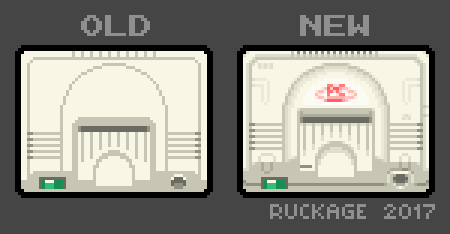
I've modified the PC-engine icon as I wasn't happy with it at all, this new revised version will be in the next update (also in the nes-mini theme as well).

Speaking of PC Engine, anyone know where I can get one cheap (either original of core grafx would be nice)? A non working one would be perfect. I always wanted one as a kid but they're virtually non-existant in the UK so are hard to come by and I'd love to do a raspberry pi build using one.
-
This auction is close to ending...
Would definitely need a lot of TLC though.
-
@ruckage Excellent work with the theme ruckage. Would like to know if it would be possible to get the Classic collections without number of games (21,30) or could you put maybe a SNES one with number 30 like the NES that we could rename if we want to switch icon. Maybe even have 2 or 3 icons with increments of 10 ex. 30,40,50. I know the snes classic only has 21 games but i want my own number of games if possible.
-
I can keep my eyes open for a PCengine.
Do you want one with controllers or just the console?What I can give you for sure is a non working Famicom. A bit yellowish, but a bit of Retrobright should work just fine.
Good for RPi projects.
Let me know.
Can also provide pics if needed. -
Hi! I'm working on my first Arcade Bartop, and get Retropie with Snes Mini theme. It's awesome!!! But I'm using a non wide screen monitor (I think it's 4:3, fits well with 800x600 or similar "squared" resolution for Linux desktop), and the things doesn't looks in place. There is a specific config that fits text, box art and other things? Tomorrow I'll take a picture of the issue, I leave my project at my mother in law's house.
-
This is a sample of my monitor:

-
@danielmewhouse the theme is specifically made for 16:9 only as @ruckage made all the assets in 16:9. There is no config file to fix this in this theme.
-
So I'll try to do some adjustments on the file by myself. If I got any success, I'll post here.
-
@danielmewhouse
@ruckage doesn’t really like mods of his themes posted. But if you want edit it and make it your own, by all means. I’ve turned this theme into a NES/snes hybrid by changing the graphics myself. -
4:3 options have been planned from the start, I just haven't had time to work on it yet (it's not a simple modification). The nes-mini theme already has 4:3 options so you could use that as a test to see if it works on your monitor.
It will however depend on the monitor resolution so you will need to find that out. -
@flyingtomahawk said in SNES mini theme:
I can keep my eyes open for a PCengine.
Do you want one with controllers or just the console?What I can give you for sure is a non working Famicom. A bit yellowish, but a bit of Retrobright should work just fine.
Good for RPi projects.
Let me know.
Can also provide pics if needed.That would great, thank you. A console with controller would be nice but isn't essential, as long as it's in good cosmetic condition. A core grafx would also be perfect and may even be better as the colour won't be susceptible to yellowing (though not sure if they're more expensive).
Regarding the Famicom that sounds really interesting, I've never even seen one in real life. How much would you want for it? I'll send you an email (is the email in your profile correct?).
-
Hi @ruckage , I would like to know if it would be possible to lengthen the visible text of the titles when I enter the game selection screen.
I mean the text path when I position myself in a game, in some cases the text shown is short because the game has a longer title
and the tour is somewhat brief.I give you an example, I have some hacks games with a basic description in the text: Castlevania Vampire Kiss (E) [HACK - Unused Vampire Killer Skin]
It is an example but I have hacks of this type and it does not show all the text when doing the route .. in some cases it is confused when the roms are similar
because I can not read the full text and I have to try it.In short I think I explained it well. I do not know if it would be very laborious I just ask.
In any case if you did, I would appreciate it.
-
@nj180grados said in SNES mini theme:
Hi @ruckage , I would like to know if it would be possible to lengthen the visible text of the titles when I enter the game selection screen.
I mean the text path when I position myself in a game, in some cases the text shown is short because the game has a longer title
and the tour is somewhat brief.
I give you an example, I have some hacks games with a basic description in the text: Castlevania Vampire Kiss (E) [HACK - Unused Vampire Killer Skin]Hello, that is possible but some of the game names will still be cut off as those game names are particularly long.
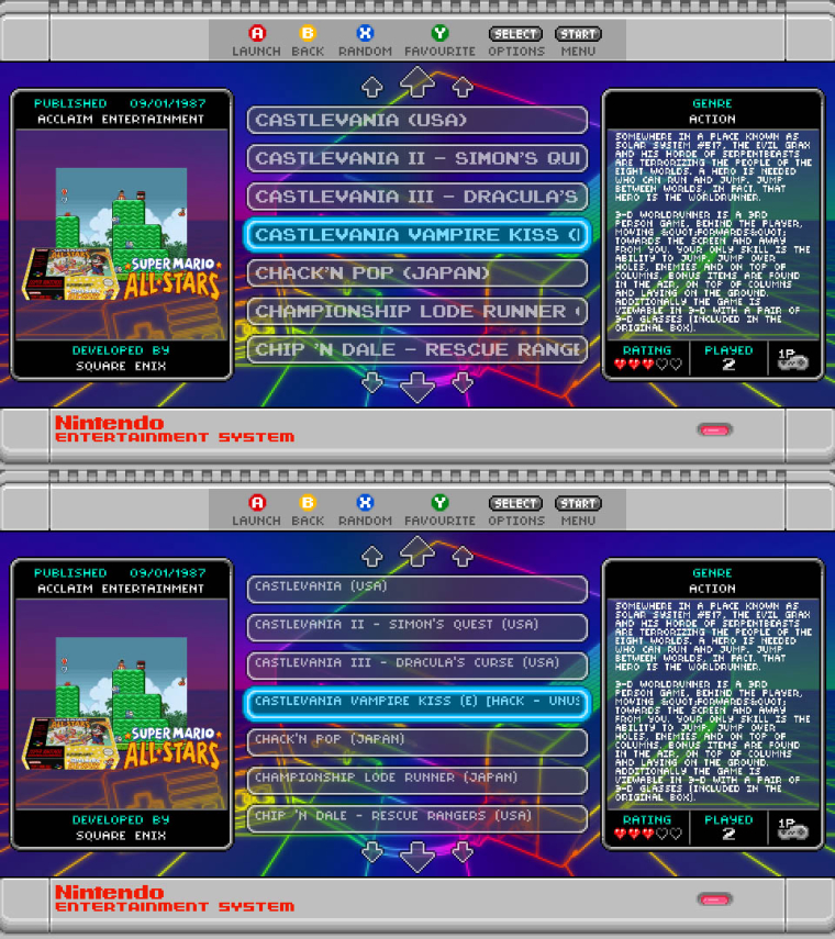
I made a quick test using the name you provided but I will need to adjust the font so that it is centred in the bar. This smaller font allows for around 50% more characters to be displayed.I'll get this added as an option in the config file.
Here is a picture showing a comparison between to large and small font.

-
@ruckage I appreciate it very much, the size of the original source I see it well although something smaller would fit better. The other source you have put, I see something small although it would show the full title.
Would it be possible to add at least 3 font sizes?
I do not want to insist too much but I think that way we would have more options to personalize the content.
Thanks again!
PS: where I see particularly useful also the size of the letter is in the section of retropie config.
Here it is interesting that it looks smaller even showing more options before scrolling down.
-
Yep the e-mail address in my profile is correct.
I have 4 Famicoms laying around. One was my first try to bleach it for edmaul69 and it discolored the front label and rear label. Then 2 are in very shitty condition and are intended to be slaughtered and used as spare parts. And then I have one which is in not so bad condition. It could use a bit of cleaning with alcohol and some scrubbing with a brush but other then that not bad.Today I went to three 2nd hand stores here and they had all kinds of rare stuff. They had a full working and complete PC Engine for 7600 Yen (around 50 GBP). There are core grafx here but they are VERY pricey. They also had one today complete with all what you need and working for 15000 Yen (around 100 GBP)
True, with the core grafx color would be no issue.However they have the so called "Junk corners" where you sometimes can find those consoles without anything and not working for a very good price.
Anyways, sorry for deviating from the topic here...just send me an e-mail whenever you are ready then we can talk further about it.
-
@nj180grados said in SNES mini theme:
@ruckage I appreciate it very much, the size of the original source I see it well although something smaller would fit better. The other source you have put, I see something small although it would show the full title.
Would it be possible to add at least 3 font sizes?
I do not want to insist too much but I think that way we would have more options to personalize the content.
Thanks again!
PS: where I see particularly useful also the size of the letter is in the section of retropie config.
Here it is interesting that it looks smaller even showing more options before scrolling down.
Sorry, no I can't. What I've posted is the best I can do. This works because those two fonts can be interchanged without affecting placement, any other fonts/sizes would require many more changes to the code which would become far too time consuming and complicated when taking into consideration the different resolutions and 4:3 support that is planned.
Contributions to the project are always appreciated, so if you would like to support us with a donation you can do so here.
Hosting provided by Mythic-Beasts. See the Hosting Information page for more information.