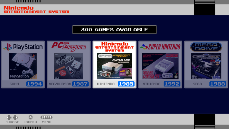
SNES mini theme
-
@jetbootjack said in SNES mini theme:
I absolutely love this theme, I’ve been away from the Pi retro scene for a while, but seeing your work has made me sort out my setup and get back into it!
I run both RetroPie and recalbox setups and I would love to see you support the Atari 800 system in this theme. It’s a system I enjoy using a lot :-)
Anyways - fantastic work, really appreciated!
sTeVE
Hi, I'm a big Atari 8bit fan myself - the Atari XE was my first computer (I like your username by the way: Jet-boot Jack was an amazing game, one of my favourites on the system). I've never actually used the atari800 emulator on retropie as it seemed cumbersome (would be nice if there was a retroarch version). I can certainly add the atari800 to my todo list though.
-
It is now a RetroArch core!
Very easy to use, you can save a per game profile (OS/RAM/PAL/NTSC/IO SPEED etc).
It's not Altirra, but it is great for the Pi!

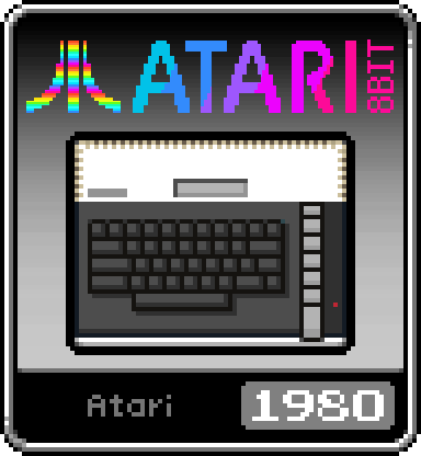
In the mean time - a generic Atari 8bit icon - 800xl with the 800 launch date!
sTeVE
-
Anyways of adding th Sharp x68000 as an icon?
-
@ruckage Wow! Looks really good. I can't wait to use it (sent you 10gbp btw, well worth it)
Are you planning on adding the light blue highlights to the contents of the box as well? Although implementing that properly would probably be more difficult to do I'm sure, since if you're staying close to the official UI you would need to somehow have the highlight appear above the box but below the actual console & information. Probably needing alternate icons for each system.
-
@ruckage I was also thinking of doing an alternate version of the icons that use the original system boxes instead of your admittedly fantastic pixel ones - Just in the interest of getting as close as possible to the official UI (with game console boxart replacing game boxart). Do you have any advice for implementing an alternate system icon for when it is 'selected'? I may make these first as a proof of concept and if you'd like me to I could send you them.
-
@ruckage okay so I made a mockup of the kind of look I am thinking of going for, for both selected and unselected. I have a PSD file if you'd like it, and I would be happy to contribute if you'd like to do an alternate iconset to closer match the box-art style of the SNES classic (as I know that would be no small job at all).
As a note, the little icon actually belongs to this icon pack so it may have to be replaced unless we can get permission (I am not actually sure what the rules are on this).
I'd also really like to stress that your creative vision for this project is already quite refined, and I in no way intend this idea as a critique so much as a potential alternative approach.Anyway, here is the mockup:

-
Hi and thanks for the replies. I actually made a start on a boxart set of icons quite a while back (they were actually the first idea I had for the icons on the NES-mini theme before I made the pixel art icons (Link to original post).
They are essentially the same as the current icons but with the boxart replacing the pixel art. Here's a preview of how they look on the nes-mini theme.

I'd still like to do a finished set of those but I just haven't had the time to hunt down good quality images of all the boxes. I have several scripts and programs I've written so once I have the assets generating the icons is largely automated now.
If yourself or anyone else would like to assist with finding good quality photos of boxes for the various systems that would actually be really helpful and would allow me to finish the set. They could be posted in this thread and I can then clean them up and format them ready to create the icon pack.
Guidelines for the photos are:
At least 640x480 but higher would be better.
Needs to be in focus.
The boxes should preferably have even lighting without reflections etc.
Photos preferably need to be face on (photos taken at a slight angle can be used and corrected if no other images are available though).
Try and find photos of boxes in good condition as that minimises the amount of clean-up needed. -
@kafka_esq said in SNES mini theme:
@ruckage Wow! Looks really good. I can't wait to use it (sent you 10gbp btw, well worth it)
Are you planning on adding the light blue highlights to the contents of the box as well? Although implementing that properly would probably be more difficult to do I'm sure, since if you're staying close to the official UI you would need to somehow have the highlight appear above the box but below the actual console & information. Probably needing alternate icons for each system.
Apologies, I missed this post. Thank you for the donation, that's very kind of you 🍺🍺
Unfortunately there is no way of having a selected and an unselected icon so I'm a bit limited in what I can do. I may add a tinted background image behind the selected icon (I can probably use the carousel bar for that) but I'd need to do some tests to make sure that I don't cause any excessive slowdown.
-
Do you have a list of what system box art scans your missing? i can help you out with that no problem :)
-
@stuart2773 said in SNES mini theme:
Do you have a list of what system box art scans your missing? i can help you out with that no problem :)
Thanks, that would be helpful.
The systems I already have are:
Playstation
PC engine
NES
Famicom
SNES Europe
Mega Drive
Super Famicom
Nes Classic Mini
Famicom classic mini
SNES classic mini USA
Snes classic mini Europe
Super Famicom Classic miniHere is a list of box photos that are still needed for currently supported systems:
Amiga
Atari 2600
Atari 5200
Atari 7800
Atari Lynx
Commodore 64
Colecovision
Dreamcast
Famicom Disk System
Game and Watch
Gamegear
Gameboy
Gameboy Color
Gameboy Advance
Genesis
Intellivision
Master System
MSX
MSX2
N64
Nintendo DS
NeoGeo
NeoGeo Pocket
NeoGeo Pocket Color
Odyssey 2
PC Engine CD
PSP
Sega 32X
Sega CD
SNES USA
Turbografx 16
Vectrex
Virtualboy
Wonderswan
Wonderswan Color
ZX Spectrum* -
Thanks for the list, ive located about 95% of the images, some are a fraction smaller than what you asked for but the quality is amazing at 600x500, and i cant see there being an issue when you make the icons.
i will upload the zip when i get the remaing few :)
-
@ruckage, first of all, thanks for your great work.
Second, I'm currently having an issue with the text boxes of the title not being aligned correctly, it's the same issue as described by @Earendr and his pictures.My setup is a 1920x1200 monitor connected by HDMI cable and I'm using the 1920x1080 resolution in the theme config file. I understand that my monitor resolution is not supported, just wanted to make clear that Earendr issue might have been that from the beginning or maybe his adapter.
By setting the raspi-config video output resolution to 1920x1080, the theme would work correctly, but the picture would be stretched to fill the screen. Is there any workaround for 19:10 displays or do you have plans for adding support to them in the future. Thanks again!
-
@fernandoarafat said in SNES mini theme:
@ruckage, first of all, thanks for your great work.
Second, I'm currently having an issue with the text boxes of the title not being aligned correctly, it's the same issue as described by @Earendr and his pictures.My setup is a 1920x1200 monitor connected by HDMI cable and I'm using the 1920x1080 resolution in the theme config file. I understand that my monitor resolution is not supported, just wanted to make clear that Earendr issue might have been that from the beginning or maybe his adapter.
By setting the raspi-config video output resolution to 1920x1080, the theme would work correctly, but the picture would be stretched to fill the screen. Is there any workaround for 19:10 displays or do you have plans for adding support to them in the future. Thanks again!
Adding support for different aspect ratios isn't a simple task and can be quite time consuming. I've covered 16:9 and 4:3 as I believe the majority of users are using a raspberry pi and will be using it connected to a TV. Currently I don't have any plans to add 16:10 support as I don't think the number of users using that resolution would be high enough to warrant the work needed.
As a work around most if not all monitors should have different ways of scaling different aspect ratios. I would set the pi to output in 1920x1080 and set the monitor so that when it scales it adds black bars top and bottom instead of stretching vertically. Out of interest what make/model of monitor are you using?
-
As promised here are the Box Scans you requested, hope they are of some use :)
https://www116.zippyshare.com/v/jmcyyme8/file.html
Stuart.
-
@ruckage
I understand, thanks for the reply. My monitor is a Dell 2408WFPB. -
@stuart2773 said in SNES mini theme:
As promised here are the Box Scans you requested, hope they are of some use :)
https://www116.zippyshare.com/v/jmcyyme8/file.html
Stuart.
Thanks Stuart. I'll have a look through them later today.
-
@fernandoarafat said in SNES mini theme:
@ruckage
I understand, thanks for the reply. My monitor is a Dell 2408WFPB.I just looked up your monitor and found the manual online :https://downloads.dell.com/manuals/all-products/esuprt_electronics/esuprt_display/dell-2408wfp_user%27s%20guide_en-us.pdf
On page 23 it says if you go to the display settings menu on the monitor you can change wide mode to either "1:1, Aspect, or Fill". If you change that to Aspect then the image should be scaled while maintaining the aspect ratio so you'll get the black bars top and bottom. Hope that helps.
-
Is it possible to include SUPERGRAFX as well?![alt text]
-
@ruckage hey I'm not sure if you're still working on the possibility of a blue overlay for the selected system, but I was checking out the Steam Big Picture Mode Theme and it looks like they have something functional that is visually similar to what I was going for with my mockup earlier.
I'm not sure if this is how that theme does it, but it might also look good to have the blue outline for the selected system have a translucent glow on the inside that gives the illusion of the whole icon being highlighted without actually overlapping any of your system artwork. I will experiment with this tomorrow to see if I can come up with something that looks nice and post it here for your consideration. :)
-
@kafka_esq
I've experimented with an internal glow effect already, ultimately though it will be done how I feel looks best and only if it doesn't affect performance.
Contributions to the project are always appreciated, so if you would like to support us with a donation you can do so here.
Hosting provided by Mythic-Beasts. See the Hosting Information page for more information.