SNES mini theme
-
Just a quick update on the theme. I'm currently in the process of porting over the nes-mini theme to the snes mini theme the aim being that the snes,nes, and famicom mini themes will all be contained within one big customisable theme. It will hopefully be easier maintaining 1 theme rather than 3 separate themes and it will also mean that the Nes-mini theme can benefit from all of the customisation options of the Snes mini theme.
So far I have all the backgrounds ported over, it took a fair amount of work as despite the layouts of the themes being very similar the borders are actually larger on the snes mini theme so I've had to adjust all the backgrounds to take this into account. Likewise the nes borders had to be adjusted to match the taller borders used on the snes theme.
There is still quite a bit to do but its looking good so far and I hope everyone will be happy with this change.
-
Well I've been working on this solidly since my last post and it's been a bit of headache. The first problem I had to overcome was the gamelist art. On the nes-mini theme the gamelist art is different for every system and is part of the background image.
I wanted the gamelist separate to the background so that the snes-mini layout system would work when in nes-mini mode. So I separated out and adjusted all the gamelist art to make it suitable for this theme but then I realised I would actually need 4 copies of each of these as some of the layouts have the gamelist at different widths.
To make life a little easier i made a small program to chop up the gamelist art and create images in the 4 different widths I needed (236 images in total). First major problem solved and the gamelist art is now working perfectly in the theme.Then came my next problem which I'm currently working on. The text, selector bar, and in some cases metadata window colours are also different for every system. My original idea was to use the system.theme variable to call a corresponding xml file describing the colors - but then I remembered variables don't work in the <include> tags. Doh!
So I have three options it seems:
-
I can be lazy and just use the same colours for for all systems: not keen on this as I like the different colours and I don't think nes-mini theme users would like it either.
-
I could probably rework the theme and have a theme folder for every system with all the colour information. This would enable an almost exact reproduction of the nes-mini theme but would be a real pain and would make life very difficult if changes were needed in the future. Not to mention I specifically designed this theme so it wouldn't need individual system folders.
-
I can generate a set of images for each system with all the label text, selector bar, ratings icons, etc. The only elements that would have to remain the same for each system would be the text in the gamelist and the metadata text. This would result in needing to create another huge batch of images however (472 more images with the current system count). On the plus side it would require minimal changes to the theme xml files.
I think I will probably have to go with option 3, it's not ideal and is a messier solution than I'd really like but its the best of the 3 options I have.
I think I need a break and possibly a drink now as I've been working on this since 7.30 this morning (it's now 21:45). I'll provide an update once I've made some more progress.
-
-
@ruckage said in SNES mini theme:
I think I need a break and possibly a drink now as I've been working on this since 7.30 this morning (it's now 21:45). I'll provide an update once I've made some more progress.
Just sent you a donation to get a couple drinks. :)
-
@livefastcyyoung
Thanks very much, that's very kind of you 😀 🍻
I'm going to go and watch a good horror film I think and enjoy a nice tipple. -
After a bit of a break and good nights sleep I came up with an idea. I'm sticking with option 3 as it still seems to currently be the best option but I'm going to automate the process of generating the needed images by encoding the colour information in all my gamemlist art (basically adding a few pixels in the top corner of each image that relate to colours/transparency). I can then adapt the program I made to read this info and generate all the assets in the chosen colours and sorted into folders ready to transfer over to the theme.
-
I've updated the theme to a version that now incorporates the full nes-mini theme. I have noticed a minor bug since uploading which I'll fix in the next few days (the background art always shows the European variant regardless of whether a USA style is used).
Additions:
nes_mini backgrounds: All the backgrounds from the nes-mini theme reworked slightly to fit this theme. Can also be used in snes modes.
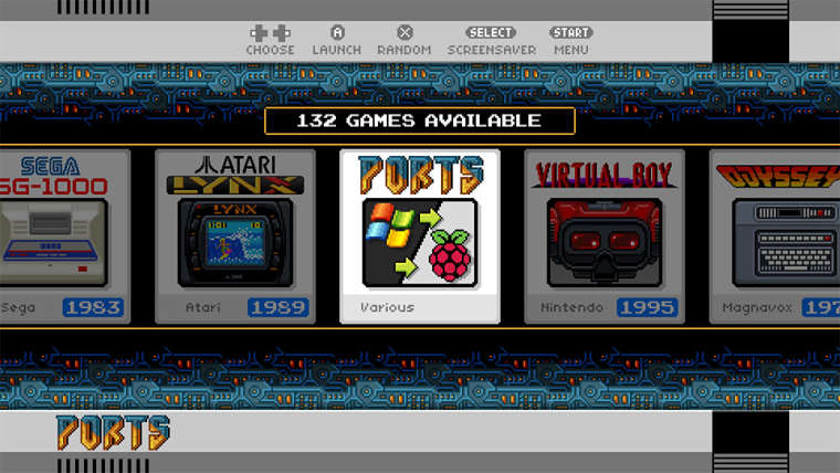
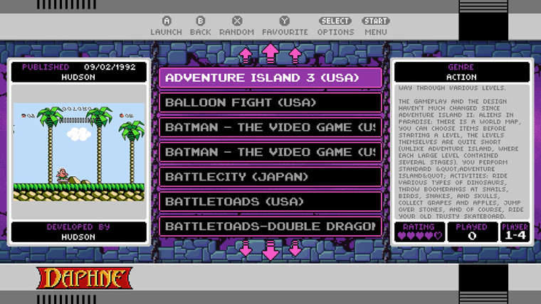
nes_rich_europe and nes_rich_usa: mimics the original nes-mini theme including the system icons, borders, and system specific game lists. Works best with the nes_mini backgrounds
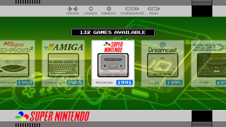
nes_simple_europe and nes_simple_usa: same as above except the gamelist is the same for all systems. Works well with any background.
New no_meta_g layout: New layout that show only the game list and nothing else (as requested by @hhromic )
'nes_rich_europe' using default layout.
'nes_simple_europe' with 'neon_green' background
The nes styles also support all layout options. ('no_meta_c' layout)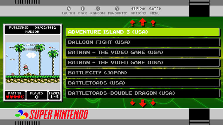
New 'no_meta_g' layout
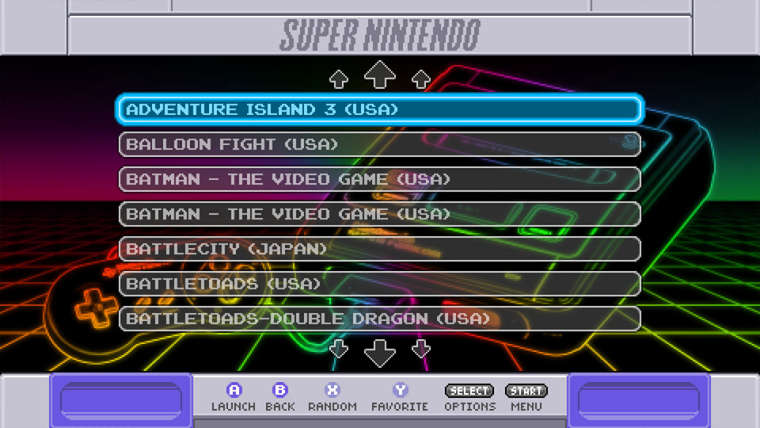
-
I don't know if it something related to the snes mini theme or the system, but I have found 2 problems /suggestions :
If in meta the description is short, I mean, like a phrase, then in the theme the description is cut in one line with a "..." at the end.
If in meta it specified multiple player options, like "1-2 players" then it don't show any icon, when It could show, for example, the 2 players icon
-
@carcayu said in SNES mini theme:
I don't know if it something related to the snes mini theme or the system, but I have found 2 problems /suggestions :
Hi @Cacryu, thanks for the feedback. These aren't actually problems with the theme.
If in meta the description is short, I mean, like a phrase, then in the theme the description is cut in one line with a "..." at the end.
This is just the way EmulationStation deals with long text, if it doesn't fit then it has to be truncated. It's not often a problem though in my experience and not something I can do anything about unfortunately.
If in meta it specified multiple player options, like "1-2 players" then it don't show any icon, when It could show, for example, the 2 players icon
This is explained in the '## CUSTOMISATION GUIDE ##' and is caused by your scraped data and not the theme. The icon system relies on the number of players being defined as single digit eg 1,2,3,4 etc.
However sometimes the scraped data for number of player is in the format '1-2' or '1-3' or '1-4' (this format is redundant in most cases). If you want to use the icons then you will need to edit your 'gamelist.xml' file to replace '1-2' with just '2' and '1-3 'with '3' etc. etc. You can use search and replace to do this.
Alternatively if you don't want to edit your gamelist.xml file you can display text instead of the icons for number of player which is one of the options you can set in the config.xml file -
-
@ruckage Thanks a lot. Anyway, this is not that EmulationStation cuts long words, which is something I understand, but It delete the last words in short description, let say description with 10 words, for example replacing not one long word, but last 5 words with a "...". Anyway, it is clear is something related to the system, not your theme. Thanks a lot!
-
Is this the new gridview Verizon?
-
@carcayu said in SNES mini theme:
@ruckage Thanks a lot. Anyway, this is not that EmulationStation cuts long words, which is something I understand, but It delete the last words in short description, let say description with 10 words, for example replacing not one long word, but last 5 words with a "...". Anyway, it is clear is something related to the system, not your theme. Thanks a lot!
Ah I see. Regardless it would be down to EmulationStation itself though I've never personally witnessed that happen. If it can be replicated you could report it as a bug on the retropie/emulationstation github.
@skj said in SNES mini theme:
Is this the new gridview Verizon?
No not yet, this is just to add nes-mini support.
Once this version is up and running perfectly I want to get it ported over to recalbox, then I can work on grid view and also add the missing systems. -
The last I saw from @A12C4 was that it wasn't expected that grid view was going to be moved to the stable branch any time soon. Not sure if that changes the calculus of porting the theme to grid view.
-
@ruckage Great theme. Is there a way to change the spacing between the main menu items, so it looks like the old nes mini theme?
-
@livefastcyyoung said in SNES mini theme:
The last I saw from @A12C4 was that it wasn't expected that grid view was going to be moved to the stable branch any time soon. Not sure if that changes the calculus of porting the theme to grid view.
That's not too much of a problem, I'd seen the same post from @A12C4 as well but I'm sure it will move to the main branch eventually and in the meantime I can just have the gridview version of the theme as a separate download probably hosted on mega.nz for those who want to try it - kind of like a beta version.
-
@phobos1981 said in SNES mini theme:
@ruckage Great theme. Is there a way to change the spacing between the main menu items, so it looks like the old nes mini theme?
I'm not sure what you mean, could you clarify what you mean by main menu?
-
@ruckage Where you select the system. In the nes mini theme 5 systems fit on the screen. Now the spacing between those is a bit wider, so the left and right system is a bit cut off.
-
@phobos1981 said in SNES mini theme:
@ruckage Where you select the system. In the nes mini theme 5 systems fit on the screen. Now the spacing between those is a bit wider, so the left and right system is a bit cut off.
I see what you mean, that was a deliberate decision to have the icons slightly off screen but if you want to change it you can but you'll need to manually modify the setup.xml file. You can find it in the layouts folder of the theme.
Find this section in the setup.xml file:
		<carousel name="systemcarousel">
			<pos>-0.05 0.3</pos>
			<size>1.1 0.4</size>
			<logoSize>0.2 0.3851851851851852</logoSize>
			<maxLogoCount>5</maxLogoCount>
			<zIndex>101</zIndex>
		</carousel>
And change it to this (the pos and size lines are the modified parts).
<carousel name="systemcarousel"> <pos>0 0.3</pos> <size>1 0.4</size> <logoSize>0.2 0.3851851851851852</logoSize> <maxLogoCount>5</maxLogoCount> <zIndex>101</zIndex> </carousel> -
@ruckage Yes, that's it. Thanks!
-
Is it compatible with Raspberry Pi 3 B +?
Contributions to the project are always appreciated, so if you would like to support us with a donation you can do so here.
Hosting provided by Mythic-Beasts. See the Hosting Information page for more information.