SNES mini theme
-
@mattmanforever said in SNES mini theme:
@ruckage That's gorgeous. I also love the transparency on systems that aren't selected.
Thanks :). @mattrixk is correct, the transparency for unselected systems is default behaviour but it does suit this theme well as semi transparency is used quite a lot.
@hailtostarscream said in SNES mini theme:
@ruckage AMAZING! Cannot wait anymore, could you bless us with an ETA please^^
Not sure, still have a few things to do yet but soon.....
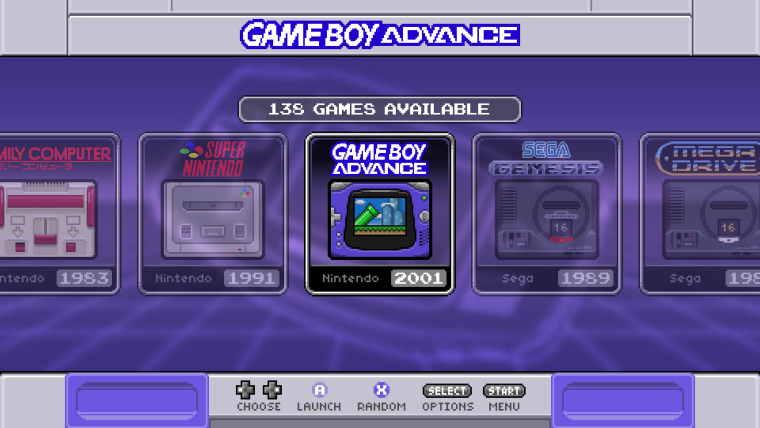
I have the US SNES variant working which you can see below, it also shows the blurred tron style backgrounds with a purple colour scheme.
-
-
@ruckage need the SNES version ! 😁 will make a donation as soon as it is released !
-
Please stop making new themes!
It is so hard to decide which one to use.
Famicom-mini? Neogeo? SNES-mini?
Unless you have multiple devices of course. -
Great job!, the nes/famicom mini themes are my favorites on Retropie, keep the good work!
-
Sorry for the lack of updates, I have been busy working on this though and should be releasing it very soon.
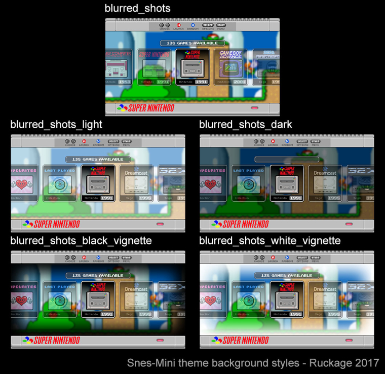
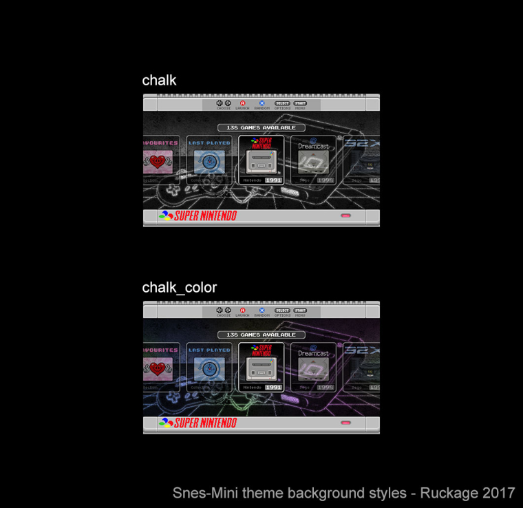
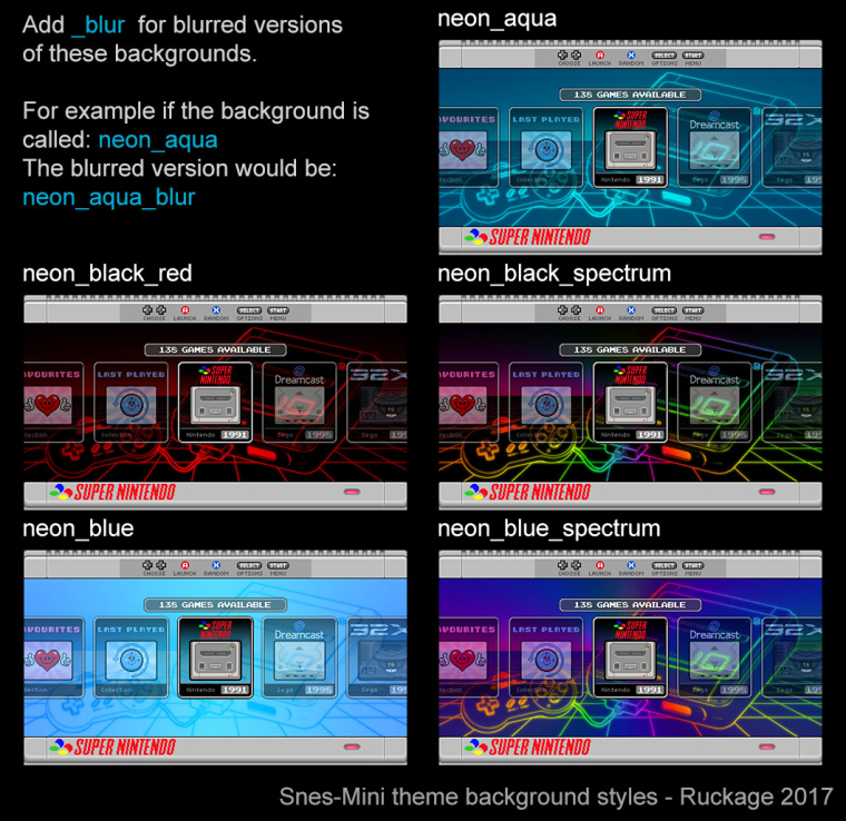
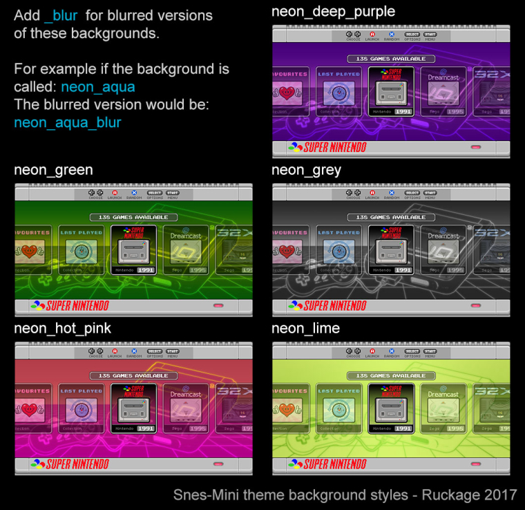
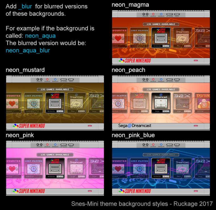
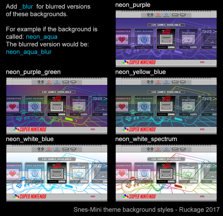
Here is a guide to all the background variation that will be available with the first release (47 in total including the blurred variants).
The theme also supports all the layouts that were in the nes mini theme (24 total), borders for both European/Japanese and the USA style Snes, and 2 different ratings icons (hearts or beads). Hopefully this should give enough customisation options to suit most peoples needs.
-
@ruckage really nice, i have a noob question, how do you change or switch the background styles like lets say i have that super mario world stage blury background and wanted to change it to a neon console background, how do you do that exactly?
-
@nestor1924 said in SNES mini theme:
@ruckage really nice, i have a noob question, how do you change or switch the background styles like lets say i have that super mario world stage blury background and wanted to change it to a neon console background, how do you do that exactly?
You have to edit a config.xml file that is in the theme directory, it currently looks like this:
<!--
theme name:		snes-mini
version:		1.0
author:			ruckage
-->

<theme>
    <formatVersion>3</formatVersion>

<!-- Choose your layout (see ## LAYOUT GUIDE ##.png) -->
	<include>./layouts/a.xml</include>

<!-- Choose your resolution -->
	<include>./layouts/1920x1080.xml</include> <!-- Only 1920x1080 is currently supported-->

<!-- Choose your background (see background_guide.pdf) -->
    <include>./background/neon_aqua.xml</include>

<!-- Choose your style (europe or usa) -->
	<include>./style/europe.xml</include>

<!-- Choose your rating symbol (heart or ball) -->
	<include>./rating/heart.xml</include>

</theme>
To change the background you would replace 'neon_aqua' with the background of your choice.
On my setup I will have several copies of the theme installed with different names and with different backgounds defined in the config.xml so i can just switch between them in ES.
-
I am probably being Captain Obvious over here, but wow, that is a lot of variations!
-
@ruckage Loving that US SNES border! Looking good bro!
-
@ruckage I love the neon white spectrum (the one based on the European SNES / SFC) it is perfect for me :)
-
Those backgrounds are so slick, I'm excited for the release.
-
Nearly ready now, should probably be releasing the theme in the next few days (or perhaps I should wait until 29/9/17).
The initial release will only support 1080p but I will get the other resolutions/aspect ratios added soon.I've made a video splash screen that I'll also be including with the theme, it uses the startup sound from the GBA. Here is a gif of the video.

I'm trying to decide what the default background style should be for the theme, I'm thinking either neon_black_spectrum or neon_blue_spectrum as they are quite eye catching. What does everyone else think? (see here for available styles).
-
@ruckage It's hard to decide, they all look great. You can't go wrong with neon_blue_spectrum.
-
@ruckage hey ruckage tomorrow is my bithday wink wink would be awesome as a bday gift lol
-
Well done on the video. Looks great.
Regarding the background, since we can swap it later anyways it doesn't really matter what WE think, choose what you like the most.
But since you asked, I personally like neon_white_spectrum the most but if I had to choose between neon_black_spectrum and neon_blue_spectrum then blue would be my choice. -
I forgot to mention that the splash screen looks so good.
-
I think the splash screen looks nice, but I think is better having one saying "Retropie" or "Emulation Station" instead of just "Nintendo" since most of us have multiple systems installed on our Raspberries aside from Nintendo, thanks for themes ruckage! the snes one looks great!
-
@ruckage said in SNES mini theme:
here
I prefer Neon deep Purple, as it matches the SNES US much better :D
-
@lord-raziel said in SNES mini theme:
I think the splash screen looks nice, but I think is better having one saying "Retropie" or "Emulation Station" instead of just "Nintendo" since most of us have multiple systems installed on our Raspberries aside from Nintendo, thanks for themes ruckage! the snes one looks great!
I made it specifically for my own personal use to go with my Super Famicom build, I'm just sharing it as others with a Nintendo themed project may also like to use it.
Contributions to the project are always appreciated, so if you would like to support us with a donation you can do so here.
Hosting provided by Mythic-Beasts. See the Hosting Information page for more information.
