Game List and Gif ideas (ES)
-
This mockup is called ES 3.0, or I got no sleep and made this in a half awake fugue state.

-
@lilbud hmm, interesting thought experiment! I am not sure you realize that what you musing about here is more in the realm of UI element behavior, than of layout design. For instance : How do you expect the 'system carousel' to work in this type of UI?
I mean, how to get from the leftmost system to the exit and settings menu?
Maybe the systemslist should be some kind of non-cyclic horizontal list? That would be one way to escape it, and get to the adjacent menu item.Anyways, thanks for sharing this bit of inspiration, as it tickles me to think about improvements we could / should be thinking about in the future!
-
@zigurana Once again, made this half asleep and am typing this also half asleep so let me try here.
I got the ideas from some Smart TV ui's I saw a few days ago. Where there is a lot more customization with menu elements. The carousel will only show a set limit of systems and when you get the the end, there will be a link to an apps drawer (kinda like Android TV) where all systems and programs will live. Moving all the way to the left would enable you to go to the settings menu and have the option to exit as well. All ES and Retroarch settings would live here and could all be changed, even per core settings, from this menu page. Also, the game list would be a separate component and clicking on a game will take you to a separate page with all info about that game.
Don't get me wrong, while I love ES, I feel like it is in dire need of a ui rehaul. There is only so much that can be done with themes and I personally think that the whole thing needs a redo.
-
@lilbud Hello!!! Are you planning to make this carousel design for game list too or just for system list? Looks so great!!!
-
@danielmewhouse I got something else in mind for the gamelist. rubs hands together
-
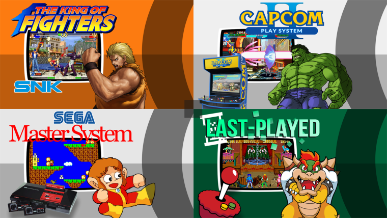
So here is 4 of 54 systems designed to date (ready for a gamelist carousel (marquee) as you can see). Currently I'm displaying a large 3d boxart image where the carousel item fade is currently. Designed these for my kids for a more visual approach rather than text based as they are young.
-
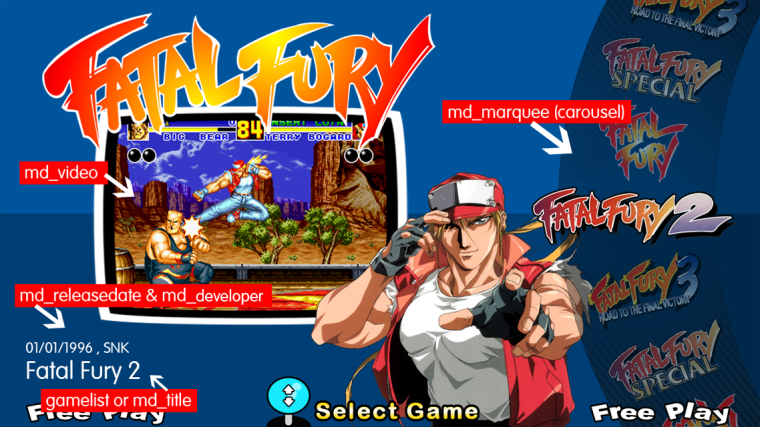
My vision for the md_marquee carousel with a possible md_title addition.
-
Any updates on a marquee carousel ?
-
@Zigurana anything new on the separation of the system carousel style?
-
Hi @Zigurana have you had anymore thoughts on this marquee carousel? or had any time to look further into it? I know the grid view is being developed as we speak but its not the same thing.
-
@paffley said in Game List and Gif ideas (ES):
My thoughts are just to use the md_marquee tag for the carousel, the user can then decide what to put in the marquee folder, wheelart, boxart, screenshot etc. This way it is a separate entity and everything can be kept 'as-is' without jeopardising anybody's current setup.
Hope this helps and makes sense.
Personal build...
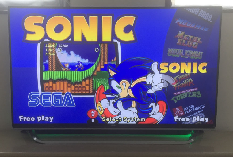
Those are collections on the carousel wheel, I'm thinking maybe the vertical_wheel on the gamelist view could look very similar.
@paffley is this a working ES theme? You have demonstrated exactly what I would love to do - get the gamelist with a carousel and the marquee images. Could you pretty please let me know how you did it ? :)
-
@lilbud said in Game List and Gif ideas (ES):
Here is what I was thinking
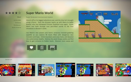
This would be a really nice use of a one line horizontal scrolling grid view :)
-
Hi, Those are collections on the carousel wheel that are on the system view currently on my personal build. Currently you cannot set the marquee's to work the same way in the gamelist view.
-
@a12c4 said in Game List and Gif ideas (ES):
@lilbud said in Game List and Gif ideas (ES):
Here is what I was thinking

This would be a really nice use of a one line horizontal scrolling grid view :)
I agree completely, that's the kind of thing I was asking you about in the other post regarding the grid view.
Where the current screenshot is on the image above, have the video tag there also.
-
@paffley that actually is a video, can't show it through an image though
-
@lilbud Damn I thought it was just an ingame screenshot.
-
-
@lilbud thats brill thanks! The vertical wheel with the video and box art beside it is exactly what I was talking about to be compatible with the grid view :)
-
There is one thing I like on the wheel over the single line grid, it's that the selected game is always in the same place. With grid view, you move the selector.
-
Contributions to the project are always appreciated, so if you would like to support us with a donation you can do so here.
Hosting provided by Mythic-Beasts. See the Hosting Information page for more information.