Switch Theme 3.0 (UPDATED 08/12/18)
-
Since we're at the task of making icons, any chance for a TurboGrafx-CD and/or PC Engine CD icon into the mix?
-
@garisaan Funny you mention that, I just submitted a PR for both of those icons.
Click here for the PC-Engine CD-ROM2 , and here for the TurboGrafx-CD. -
@supercatfooz Nice set. But that's the reason I like this theme - you can create new systems at ease. So why not consider to use "Switch" as default theme with the possibility to add new icons via a dedicated dialog-bash script?
-
Update on updated version :D
Everything working now. No lag or artifacts even with vram default.
It missing only one system which i forgot to mention, sorry :/
SG-1000Great theme and great work however!
-
@darishzone SG-1000 is already in the theme.
-
@darishzone SG-1000's in the theme, it's just named differently from what you might expect: the theme name is
sg_1000rather thansg-1000. -
@supercatfooz Yeah, I'm on it.
Update: SG-1000 name is fixed. I had it with an underscore instead of a hyphen.
-
Finally, I was able to test the theme. Now, I know how to add a theme easily. I downloaded it an hour or two ago or so. Something is not right, it just don't scale correctly on my system. I feel I miss something or did it wrong. I also have suggestions, if it is possible.
My monitor is 4:3, RetroPie setup to 640*480 pixel mode.
EmulationStation settings are in UI SETTINGS:
UI Mode=Full
Quick System Select=Off
Carousel Transitions=On
Transition Stle=Instant
Theme Set=Switch (this one)
Gamelist View Style=Automatic
The game info part at right top of content has overlapping text.
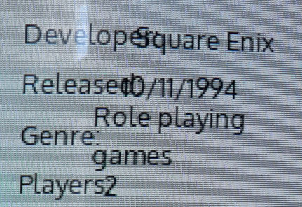
Button information on right bottom are cut out.

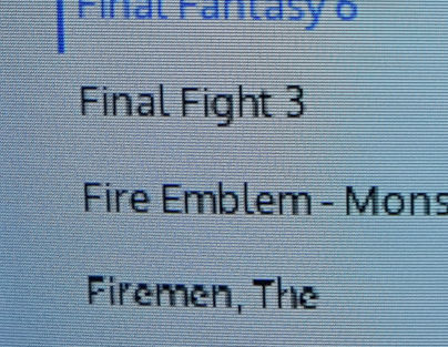
There is a small visual error in the text at same position on each systems game list. It looks like this (screenshot) at Firemen, The. It is around where the third portion from top of the screen begins.
I don't get the "half white, half black" background image.
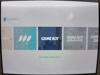
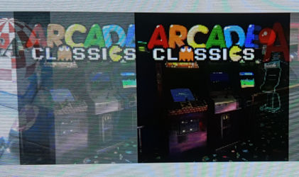
I can create new custom themes, which are specifically supported by the theme itself. There is an special entry for it, which the new theme don't have. In example, on the old theme I created a collection by this option (shown below) to create "arcade". This one will be shown in systems main menu with all the other system. The second images shows it how it looks like (unfortunately it have same icon like the normal Arcade folder, but that does not bother me).
In the new theme (this theme) this special custom collection is not showing up in main menu. Instead, it shows it normally just like an ordinary collection in custom collection menu. Could this get such custom collections from theme support?

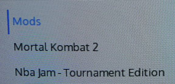
A suggestion here, if it is possible. I use subfolders in systems for specific reason, like Mods. I wish these folders could get same information on the right like custom collections have. In example the description of them are "This collection contains 51 games, includiding...". Would it be possible to add these information to subfolders itself?
-
@thelostsoul Okay, one at a time
Did you switch to the 4_3.xml in the theme.xml? That should solve all of your issues.
The half white, half black background doesn't exist. I only made that in photoshop to show off both colors without needing two screenshots in the post.
You have to disable this setting to get custom collections on the main menu, instead of folders in the custom collections system.
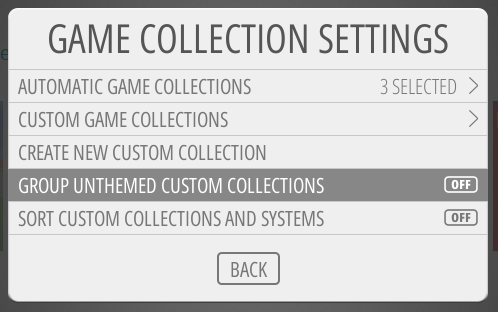
Fair warning about custom collections. I don't plan to support all kinds of custom collections (Ninja Turtles, Megaman, Mario, etc.) Now that doesn't stop people from sending in custom icons for those, But I myself won't be making them. Mainly because I'll never stop getting requests and we will have 500 systems added to this theme.
Now about the folders. I can't add a description or modifier to folders. The most I can do is change the color of the text when unselected, but it will go back to the primary color when highlighted.
You can create a folder icon following these instructions: https://retropie.org.uk/forum/topic/9461/sub-folder-icons/5
-
- How do I switch it to 4_3.xml?
- About the half white and black, I just thought I am missing something. It is fine like it is now.
- The Group Unthemed Custom Collections=Off is not what I want, as it will show up ALL my 26 custom collections in the main menu (without icons btw). Thats where the theme supported custom collections are coming in. It only shows up arcade then. It is not just creating an icon for it, every such a folder needs a support for from the theme. In the old theme (one of my screenshots shows it) uses the same arcade icon like the other one. So, there is no need in creating a new icon (but I would do it probably).
- That folder description thing... yeaah, I expected that. Nothing wrong with it, just asked if it is possible.
- Folder metadata. Are folders handeled just like other entries in the xml file? But all the other stuff like icons and images for folders aren't what I want to have. Anyway, thank you for the idea. I didn't think of it.
-
- In the theme.xml in the es-theme-switch folder. There is an include tag at the top.
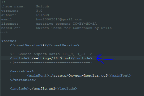
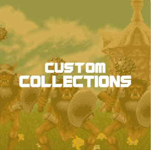
change the '16_9' to '4_3' - There is an arcade icon in the theme, as well as a mame icon (If I understand what you mean.) If you leave on the setting to group unthemed custom collections. You will have a single entry for custom collections and they will show up as folders. This is the icon
- I'm not entirely sure if folders can use all the same metadata. You can give it a shot, but no promises.
- In the theme.xml in the es-theme-switch folder. There is an include tag at the top.
-
@lilbud Thank you for your patience.
- I finally found the setting for 4_3. I somehow missed it, because of a specific behavior my editor. It solved all problems related to it and shows up correctly. I like this much, its clean and simple. My favorite theme.
- The "small visual error in the text at same position on each systems game list" still remains (in my above example with Firemen, The). This is no deal breaker to me, I just don't understand it.
- About the custom collections thing, I think you don't understand my request. If the grouping is on, then all custom collections without icons will be grouped together, like you show. Now there is another feature some themes support, it is not available here. The "custom collection from theme" differs in the way, that it will show up in front page, while all others still remain in the grouped custom collections folder.
I would do something, if I could understand the coding behind it. Just to need dig in someday.
-
About the text issue, I have no clue. That could maybe be something with your TV (looks like a CRT.)
The custom collection from folder won't work because there are none. I wonder if you make a folder and drop the icon in if it would work. I'm not home right now so I can't really fix anything.
-
@thelostsoul said in Switch Theme 3.0 (UPDATED 08/12/18):
A suggestion here, if it is possible. I use subfolders in systems for specific reason, like Mods. I wish these folders could get same information on the right like custom collections have. In example the description of them are "This collection contains 51 games, includiding...". Would it be possible to add these information to subfolders itself?
Are you talking about subfolders in your rom folders or custom collections?
If it's for the rom folders you can add this in your gamelist.xml:<folder> <path>./subfolderpath</path> <name>Sub Folder Name</name> <desc>A Folder With More Games</desc> </folder>You need to add this for every folder you have, then the description will show up at the same location as a game description does (when a theme supports it).
-
@lilbud I don't believe the text issue have something to do with my CRT (still probably could), because on the old theme there is no such text error. The text is a bit thicker, so maybe it just overlaps the error? I don't know too.
The image entry for a game will not show up, before the video playback starts. In the older theme the image was showing up right away, when i scroll down through the list. If i wait a second, the video starts playing. The entry for it is in this format: "<image>/home/pi/.emulationstation/downloaded_images/nes/Alter Ego-image.jpg</image>"
@EctoOne Ah yes, I was talking about subfolders in rom folder. My suggestion was adding the same dynamic description like it is available in custom collections. It will create a list of some examples in the description, plus the count of how many games are there, plus playing a video from a game in this collection. I was just hoping the same could be done for subfolders in rom folder.
-
@thelostsoul I'll look in to it when I get home
-
@thelostsoul said in Switch Theme 3.0 (UPDATED 08/12/18):
@EctoOne Ah yes, I was talking about subfolders in rom folder. My suggestion was adding the same dynamic description like it is available in custom collections. It will create a list of some examples in the description, plus the count of how many games are there, plus playing a video from a game in this collection. I was just hoping the same could be done for subfolders in rom folder.
Well dynamic content is definitely not a thing. You can add an image to a folder (same way as it is done to a game entry. I did that for my scummvm subfolders where i used company logos). Maybe you can add videos as well, never tested it though and if it works it would be always be the same.
-
@thelostsoul said in Switch Theme 3.0 (UPDATED 08/12/18):
The image entry for a game will not show up, before the video playback starts. In the older theme the image was showing up right away, when i scroll down through the list. If i wait a second, the video starts playing. The entry for it is in this format: "<image>/home/pi/.emulationstation/downloaded_images/nes/Alter Ego-image.jpg</image>"
I updated the theme to have a 1.5 second delay before the video starts playing. It'll show the image while scrolling and if you stay on the game for a sec, the video will play.
I also enabled the ability to show the image if there is no video.
-
-
@lilbud Now 2 days after usage, everything works fine. I have just changed the 1.5s delay to 1.0s. It is just very small effect, but I feel like 1.5s takes an eternity until video starts. Its just my personal preference. Another note, I also tried different (free) fonts from my Ubuntu installation. I found the "Ubuntu-R.ttf" (from usr/share/fonts/truetype/Ubuntu/ from desktop Ubuntu) is much better readable on my 640*480p screen, more clear. It could be just on my specific setup, but why not telling it here?!
A lot of game descriptions at the right side have characters like """, which aren't transformed into the characters they represent. Is this theme dependent or should I look elsewhere?
Contributions to the project are always appreciated, so if you would like to support us with a donation you can do so here.
Hosting provided by Mythic-Beasts. See the Hosting Information page for more information.