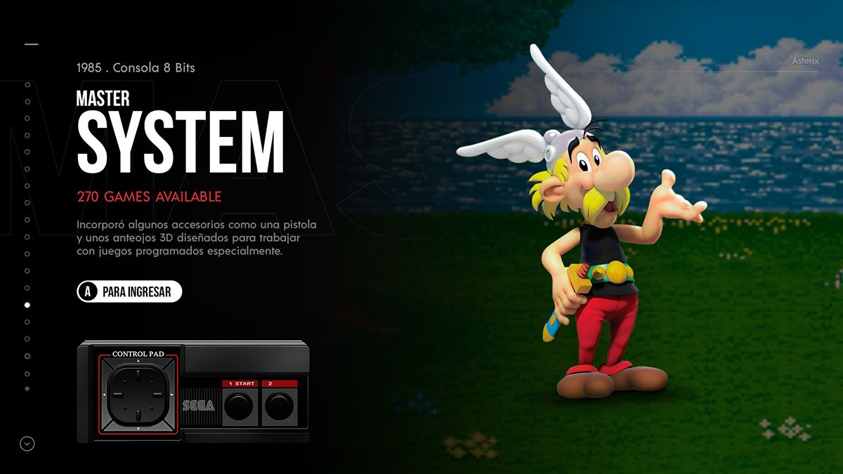
NEW! Chicuelo Dark Theme
-
@BJRetro
Yes, the idea is to keep the images as big as the hardware handle them fine! -
@chicuelo
Your design is awesome, great job.
Your old design is still number one with me. -
Updated to the final design
-
Just a thought, maybe change the controllers to the outlines from the carbon theme. That might look a little nicer
-
-
This looks awesome!
-
That's a thing of beauty. Stunning design, mate.
-
@lilbud Thanks, I thought about it. But that will make a big black area on that bottom corner. I think the realistic version matches with the character too
-
@IanDaemon Agree, also the red text above the white button looks odd, because you have 2 call to actions very near, so I decided to leave in that position and make an information split, on the top the system name and on the bottom the specifications
-
@chicuelo this looks awesome. But I suggest to change the screen for Sega master system from ristar to Alex kidd. Which was more common for that system.
-
@xFJSx I was using Alex Kidd before, but there where not enough images in a good quality so I decided to use Ristar.
I also thought about Asterix
-
Love the look of this, but I'm curious if there will be an option to customize the background images used when released? Not that I dislike them by any means, but my preference would be to use screenshots directly from the games.
-
@Weatherby I will not release the artwork, only the main structure of the theme and maybe a psd template. All the backgrounds, characters and controllers will be created by each one, as a collaborative theme so you can get the look of your choice
-
@chicuelo Sorry, I didn't mean the art exactly. You said you might provide a PSD which is more or less what I was trying to get at. For example, say I wanted to do a bit of customizing, have a different game represent a system than what is pre-packaged in the theme. What I would want to do then is replace the character and background they appear on with something I custom made using my own assets or screencap from an emulator, and I was wondering how doable that would be.
-
@Weatherby Yes, my idea is to provide a psd where you can replace the artwork to match with your style, then you export each asset and replace on your theme
-
@chicuelo the old one was also ok, I think. But that Asterix one looks more familiar.
By the way, there was a version of Ristar for the master system but that was pretty late in the life cycle of that system. And in my opinion not that game someone would remember when it comes to the master system.
Gosh... Ristar was even late for the life cycle of the mega drive. -
@xFJSx You are right, I think Asterix is more appropriate for the MS
-
Would there be any way to change the main system text? Is it an image or coded text? I just wondered what it would look like with the systems logos in white rather than text?
-
@chicuelo the .PSD file is a great idea, I did a similar thing when modding your original theme. One thing that really helped me was creating a standard background as a smart object and making all system artwork as artboards. That way you can change the background for all systems with one layer change and quickly export with "export as"
-
@pootis-spencer I thought about a editable text, I've tried the system logo and it does not fit fine. Yes I plan to use the logo in the game list screen
Contributions to the project are always appreciated, so if you would like to support us with a donation you can do so here.
Hosting provided by Mythic-Beasts. See the Hosting Information page for more information.