RetroPie forum home
    • Recent
    • Tags
    • Popular
    • Home
    • Docs
    • Register
    • Login

    NEW! Chicuelo Dark Theme

    Scheduled Pinned Locked Moved Projects and Themes
    chicuelochicuelo themeinterfacedesigndesign layout
    72 Posts 23 Posters 15.1k Views
    Loading More Posts
    • Oldest to Newest
    • Newest to Oldest
    • Most Votes
    Reply
    • Reply as topic
    Log in to reply
    This topic has been deleted. Only users with topic management privileges can see it.
    • chicueloC
      chicuelo
      last edited by chicuelo

      This is the final version of Chicuelo Dark theme. On my first version Some people was selling their cabs with my artwork and claiming as themselves. What I am going to do with this theme is this: I will make a template and leave some editable files so everyone could make its own version of the theme, using a base structure and replacing the artwork on every system, as a collab theme so no artist will be discredited.
      Hope you enjoy it.
      Any help with the arquitecture of the theme will be appreciated!
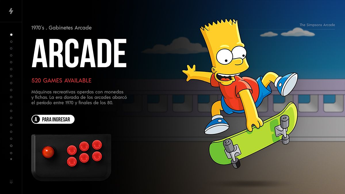
      1.jpg

      gamelist1.jpg

      2.jpg

      3.jpg

      4.jpg

      5.jpg

      6.jpg

      7.jpg

      8.jpg

      9.jpg

      10.jpg

      11.jpg

      12.jpg

      13.jpg

      14.jpg

      15.jpg

      16.jpg

      17.jpg

      18.jpg

      19.jpg

      gamelist2.jpg

      gamelist3.jpg

      rand0mR B X JimigaJ 4 Replies Last reply Reply Quote 14
      • sergioadS
        sergioad
        last edited by

        Looks really nice

        1 Reply Last reply Reply Quote 1
        • mituM
          mitu Global Moderator
          last edited by

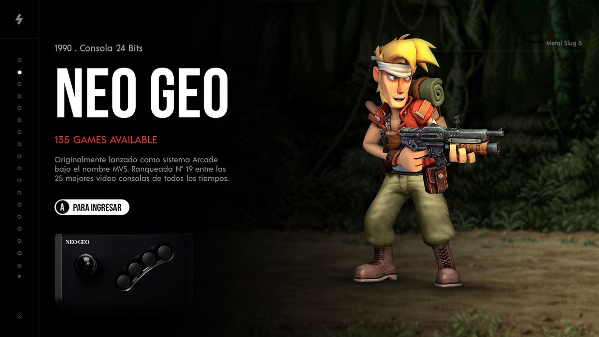
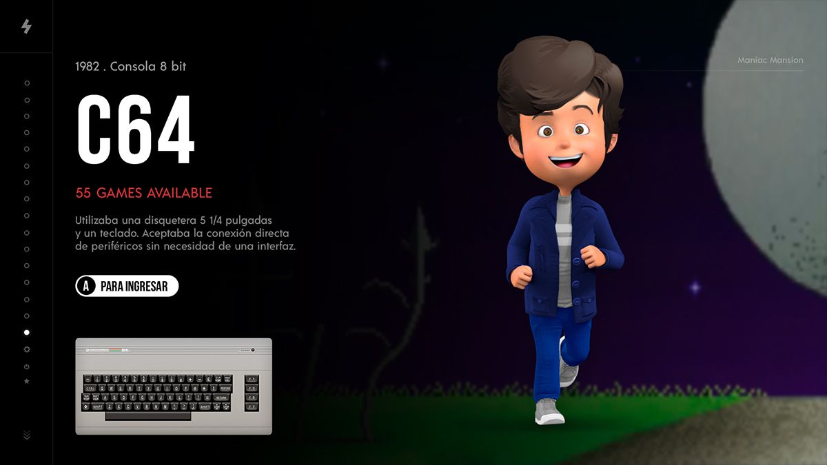
          Looks like an improved dark theme of the original theme - I like it. I would probably switch the game count and the console summary just to have all white text flow one after the other.
          As for performance, we'll have to try it and see, will probably be a good theme for the Pi4, where GPU VRAM is not such an issue.

          chicueloC IanDaemonI 2 Replies Last reply Reply Quote 2
          • chicueloC
            chicuelo @mitu
            last edited by

            @mitu
            Thinking the same. Pi4 should handle it fine and hoping future RetroPie releases include some UI animations or transitions to make themes more dynamic

            1 Reply Last reply Reply Quote 1
            • T
              thedeadfish7
              last edited by

              @chicuelo looks great. When do you think it'll be available?

              1 Reply Last reply Reply Quote 1
              • rand0mR
                rand0m @chicuelo
                last edited by

                @chicuelo Welcome back Chicuelo, the theme is looking amazing! great job! But the name can get confusing with the original.

                1 Reply Last reply Reply Quote 1
                • WildfireW
                  Wildfire
                  last edited by Wildfire

                  Welcome back @chicuelo, glad to hear your working on a new theme! looks awesome already :)

                  I prefer the full-color versions rather than the ones that fade to black and @mitu's makes a good point about switching game count and console summary.

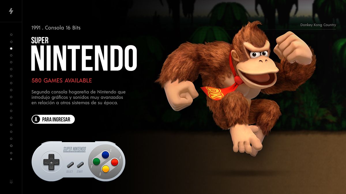
                  I think the theme would look better without the consoles in the background of the black section. On darker consoles like the Genesis, you can't really see it anyway and I think a more simple approach with just the picture and controller would work better.

                  Do you have any mockups of the gamelist view? I'd highly recommend looking into @alphatoanant's work on the Art Book theme. He had a set of custom templates that manipulated the gamelist view based on the orientation of the boxart (i.e. vertical, horizontal, square)

                  A very effective option that I've only seen in his theme and you can set up as many custom themes as you want. I've implemented it in modded themes before and had custom templates for "system options", "power", "arcade" and "loose" versions of the original templates so Artwork wouldnt get stretched.

                  https://retropie.org.uk/forum/topic/11728/theme-art-book

                  chicueloC 1 Reply Last reply Reply Quote 1
                  • S
                    svera
                    last edited by

                    @chicuelo great to have you on board again! Looks great so far, looking forward to test it. But please, don't forget about us owners of 4:3 displays :)

                    1 Reply Last reply Reply Quote 1
                    • chicueloC
                      chicuelo @Wildfire
                      last edited by chicuelo

                      @Wildfire Thanks for the advice! I will think about this when I go over the game list view!
                      I want a modern look on this approach, and asking people they say they prefer the colorful version too

                      B 1 Reply Last reply Reply Quote 1
                      • B
                        BJRetro @chicuelo
                        last edited by

                        @chicuelo I hope you keep the big videos/images in the gamelist view unless you are going to do a Grid View with this! That really made your original theme unique!

                        chicueloC 1 Reply Last reply Reply Quote 1
                        • chicueloC
                          chicuelo @BJRetro
                          last edited by

                          @BJRetro
                          Yes, the idea is to keep the images as big as the hardware handle them fine!

                          1 Reply Last reply Reply Quote 0
                          • B
                            brigada @chicuelo
                            last edited by

                            @chicuelo
                            Your design is awesome, great job.
                            Your old design is still number one with me.

                            1 Reply Last reply Reply Quote 1
                            • chicueloC
                              chicuelo
                              last edited by

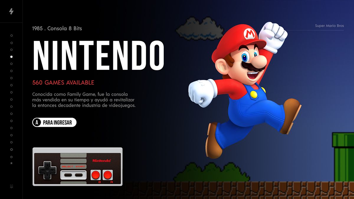
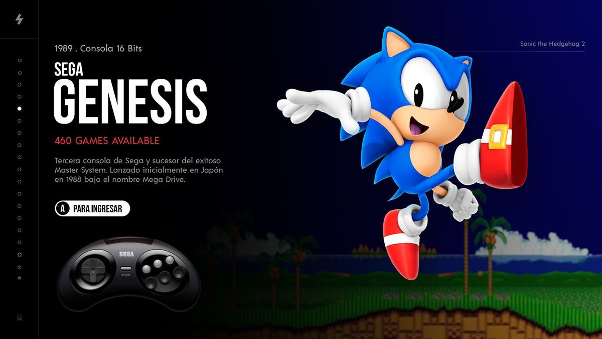
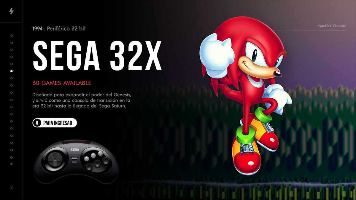
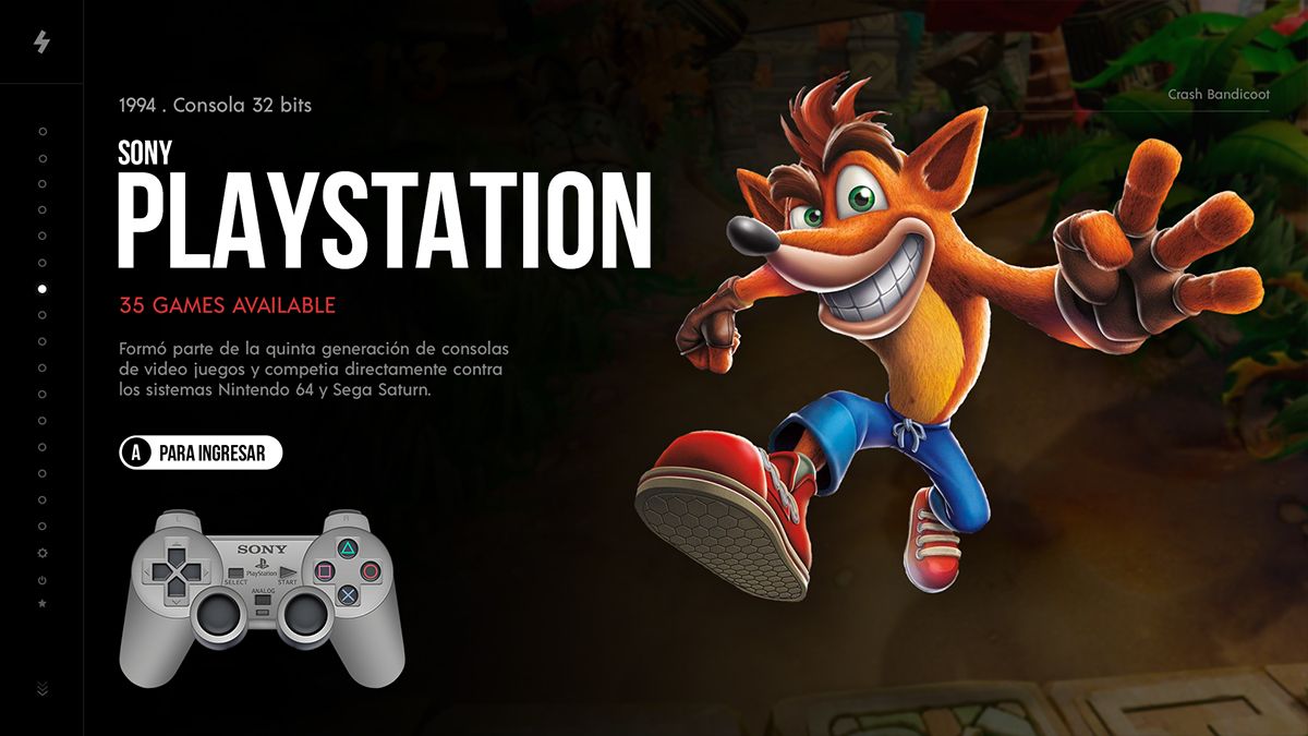
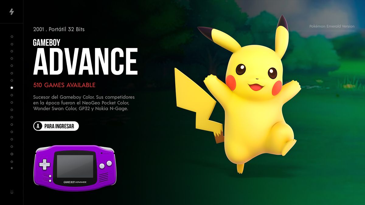
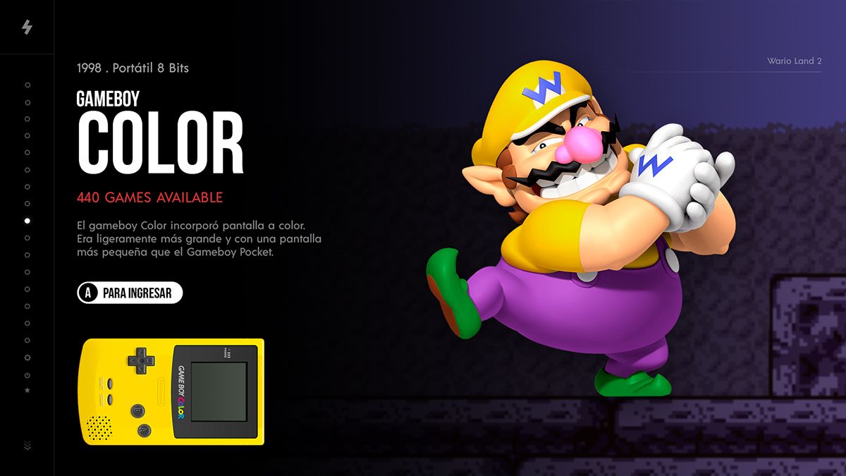
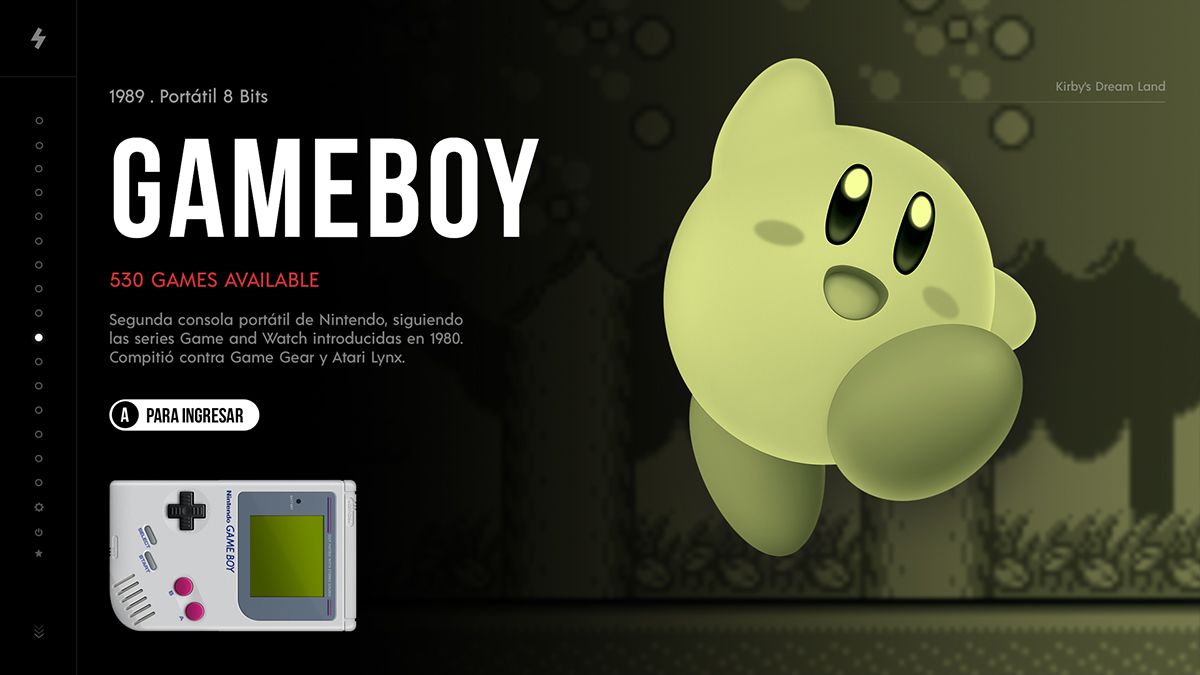
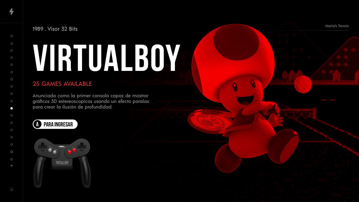
                              Updated to the final design

                              1 Reply Last reply Reply Quote 0
                              • lilbudL
                                lilbud
                                last edited by

                                Just a thought, maybe change the controllers to the outlines from the carbon theme. That might look a little nicer

                                Creator of the Radiocade: https://retropie.org.uk/forum/topic/6077/radiocade

                                Backlog: http://backloggery.com/lilbud

                                chicueloC 1 Reply Last reply Reply Quote 1
                                • IanDaemonI
                                  IanDaemon @mitu
                                  last edited by IanDaemon

                                  @mitu @chicuelo I think having the red text in the middle of the white text makes it "pop" and draws attention to the number of games on the system. I also see it as adding to the "topography" of that portion of the screen.

                                  • 5 Favorite Arcade Games in MAME
                                  • Cocktail Cabinet Games
                                  • Check out the MAME RoW
                                  chicueloC 1 Reply Last reply Reply Quote 1
                                  • A Bored NinjaA
                                    A Bored Ninja
                                    last edited by

                                    This looks awesome!

                                    1 Reply Last reply Reply Quote 1
                                    • chizzerC
                                      chizzer
                                      last edited by

                                      That's a thing of beauty. Stunning design, mate.

                                      1 Reply Last reply Reply Quote 1
                                      • chicueloC
                                        chicuelo @lilbud
                                        last edited by

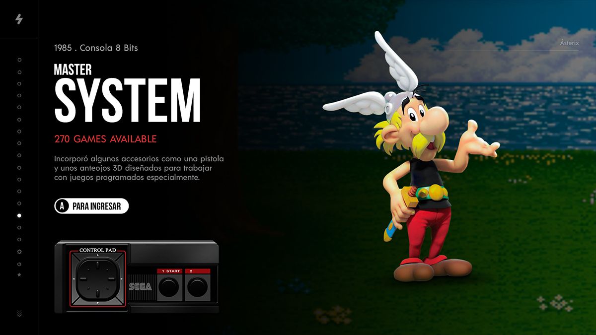
                                        @lilbud Thanks, I thought about it. But that will make a big black area on that bottom corner. I think the realistic version matches with the character too

                                        1 Reply Last reply Reply Quote 1
                                        • chicueloC
                                          chicuelo @IanDaemon
                                          last edited by

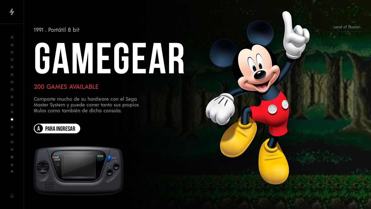
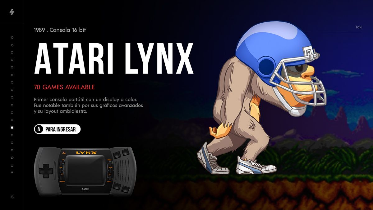
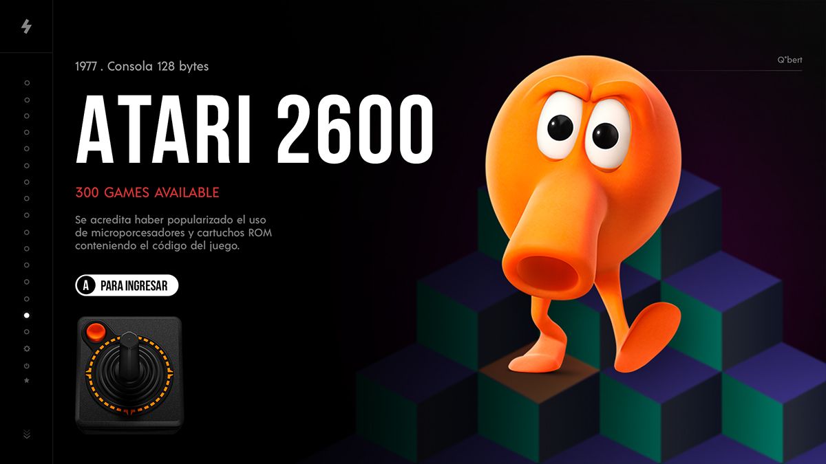
                                          @IanDaemon Agree, also the red text above the white button looks odd, because you have 2 call to actions very near, so I decided to leave in that position and make an information split, on the top the system name and on the bottom the specifications

                                          1 Reply Last reply Reply Quote 0
                                          • X
                                            xFJSx @chicuelo
                                            last edited by

                                            @chicuelo this looks awesome. But I suggest to change the screen for Sega master system from ristar to Alex kidd. Which was more common for that system.

                                            chicueloC 1 Reply Last reply Reply Quote 1
                                            • First post
                                              Last post

                                            Contributions to the project are always appreciated, so if you would like to support us with a donation you can do so here.

                                            Hosting provided by Mythic-Beasts. See the Hosting Information page for more information.