Carbon Theme Suggestions
-
I can answer a few concerns, while others I'll have to check in to.
I actually went to college for graphic design. And there, they teach you many tricks that most people wouldn't necessarily even notice. One such trick is you never create a design that is truly centered. Adding weight to elements on the top give the appearance of a "centered" visual. To an untrained viewer, a truly centered piece will actually look heavy below. So Carbon even has this design rule in play. I didn't want everything perfectly aligned top and bottom. I wanted a little more space on the bottom than there was at the top. :D
The RetroPie menu is actually full of icons I created in Blender. Not bad eh? I'm flattered you thought they were from a pack. That means I'm getting better at 3d :D And they are intentionally "generic" since they are the icons all themes have to use. Not just Carbon. I do agree that I could tweak the RetroPie section to make the icons smaller. I'll check that out.
As for the other measurements you took, they are probably related to how the SVGs are saved. Some have padding in them, some do not. Same with the controllers. Those I will have to look at, individually.
Also, margins on the left and right will be a little different because the game list screen is seen as 2 halves. On the left, you have the game list, on the right, you have the boxart/screenshot and meta data. These elements do not cross over each other. They are their own section, on their own side of the screen. So those are centered in their half of the screen. Hope that helps you understand the design choices made.
I'll still check the SVGs for errors (guuurrrr there are so many of them....)
As far as green, if you read the Readme it will tell you how to choose green. :P
-
@Rookervik Thanks for the great reply! I get your point, and am indeed aware of this visual 'bias' (I studied too, but long, long, so long ago). Fair enough, and it's difficult to see just by looking - my first visual reaction was there should be a little more space below the header. Didn't take any measurements or anything...just me probably...
Icons - I'm very sorry - glad you took it in good humour - I'd be proud to do as well, and I didn't think (stupidly) of course they'd have to be shared between themes.
"I want green" - a joke for a designer :)
I will leave you to it! Cheers
-
@chavatar said in Carbon Theme Suggestions:
- RetroPie menu: icons kinda disproportionately large. Here the description is more important than the icons I think.
- metadata, the right amount for me, it's possible that it's self-explanatory without the labels to save space, (but I think I would keep them) and to have it on 2 not 3 lines (Genre + Players / Developer + Released, makes a little more sense to me). Surely only needs year (not day/month) for Released if possible.
I agree that the icons are too large and the description is very much important. I believe I actually screwed up this section when I mass-copied the theme.xmls to the folders. Metadata needs to be removed and allow the description to take over. And make the icons smaller. I agree 100% and will do.
Metadata... you can't change what is displayed in the metadata pulls. If you want only the year, you need to manually edit your gamelist.xml to only contain the year. ES shows you the metadata provided by that gamelist.xml.
You also have some blank area in metadata due to kid-friendly icons. So, like me with no meta data and gobs of wasted space, now some users have a little blank area to make room for kid friendly icons. But since everyone complained about me compartmentalizing the theme, I can't make boxes for the kid friendly icons to let users know there is room for something even tho there is no icon. :P
Rest assured I plan to fix the retropie menu. Thank you for bringing that up.
-
@Rookervik Thanks again. There are a lot of considerations I'm not even aware of (which no doubt are a right pain in the proverbial)
ES isn't optimal (sure that isn't too controversial) but I can see why it's there. Interested to see how things progress on the interface side of things down the line.
-
Things I like about carbon... the dark menus (I hate the bright backgrounds) and overall it looks clean.
Things I dislike are the menu sizing, full game names not showing, and I like the game backgrounds for each system on the "simple" theme. But I can't use that theme because I have some custom logos for carbon, so overall carbon wins. Ideally for me it would be like it is now, sized a little better (if possible?) with the option for the backgrounds. I think the simple theme also uses the bright background colours for each system menu which I don't like
-
The main thing that bothers me about Carbon is the fact that all of the metadata text is in all caps. Surely I can't be the only person who thinks this looks ugly.
I use Eudora instead, mainly for this one reason.
-
@ScOULaris said in Carbon Theme Suggestions:
The main thing that bothers me about Carbon is the fact that all of the metadata text is in all caps. Surely I can't be the only person who thinks this looks ugly.
I use Eudora instead, mainly for this one reason.
the forced upper case can be edited in the main xml file, to lower case
-
@Rookervik When you were in college, you probably thought that you would be doing something profound and well known. Probably did not foresee making boot screens for a retro gaming project.
Creator of the Radiocade: https://retropie.org.uk/forum/topic/6077/radiocade
Backlog: http://backloggery.com/lilbud
-
Well, RetroPie isn't a job. No one gets paid for working on the project. I do this art because I enjoy it. =^_^=
-
And yeah, everyone has personal taste that conflicts with everyone else. All I can hope to do is make myself, and as many others happy as I can. There's a thread over in the help section of people really really upset that the sound effect was removed. There was a thread on the old forum about how everyone wanted the sound removed. Haha. Just can't win. But we try <3
@ScOULaris I've actually never even noticed caps Metadata (Probably because I don't have metadata.) That's an interesting point. Changing the <forceUppercase> tag is easy, might think about doing this in the future. :D
@sc0tt88 I'm not sure how to go about getting all the game name to show. There's a trade-off with font-size and viewing area. You don't want the font to be so small that you can't read it from the couch. The Readme.txt has information on changing font size on the gamelist. The game names will scroll if you highlight them. Some game names are ridiculously long, like the arcade games. I actually went in my gamelist and renamed them all to something that made sense.
And for background images, Carbon is designed for the RaspberryPi. "Simple" theme was not. It was designed for PCs with graphics cards and over a gigabyte of RAM. If you have custom wallpapers for every system, after 10 systems ES crashes with white screen. Trust me, I made wallpapers for most of the systems... then ran into the memory issue: http://ryokai.deviantart.com/gallery/55770575/Console-Wallpapers
-
So. How do you scroll through the game description...? lol
-
Game description has always scrolled for me. Does it not anymore? If not, that poses a problem. I don't have metadata to test. Just the retropie menu, and it looks ok. Please let me know.
-
Yeah its fine. I had a moment and forgot it auto scrolls. I thought there was a way to scroll manually.
-
@Rookervik said in Carbon Theme Suggestions:
And for background images, Carbon is designed for the RaspberryPi. "Simple" theme was not. It was designed for PCs with graphics cards and over a gigabyte of RAM. If you have custom wallpapers for every system, after 10 systems ES crashes with white screen. Trust me, I made wallpapers for most of the systems... then ran into the memory issue: http://ryokai.deviantart.com/gallery/55770575/Console-Wallpapers
I have 40 systems displayed with your carbon theme. I have 11 custom themes with several using a different logo inside and out. One of the themes has the background to retro city rampage and it logo used in it i have managed to push the theme to the limits. I am almost tempted to remove the controllers so i can push the limits on themes customized on the inside
-
If you remove the controllers and use images around 320x200, you can actually have a wallpaper for each system! A screenshot of a game for each system is definitely do-able.
It's when you get to 720p wallpapers that the system takes a hit. "Simple" theme uses 720p wallpapers, and at about system 10, you get white screen because ES is out of VRAM. White Screen was a major, major problem for RetroPie a couple years ago. Herbfargus and I worked on Carbon just for that reason.
-
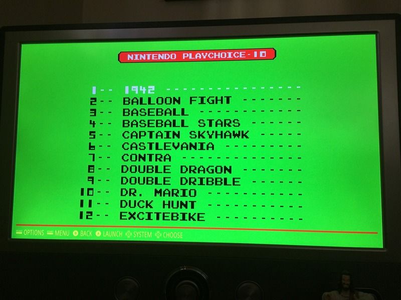
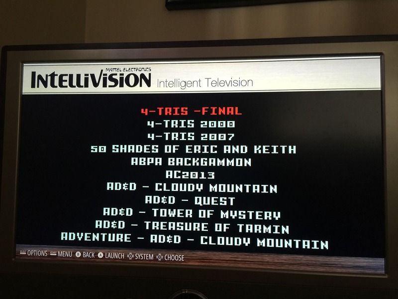
@Rookervik so most of my pics are small 8x8 or 1x112 and a few as big as the header and footer used in the simple theme. here are a few examples of how i am doing them
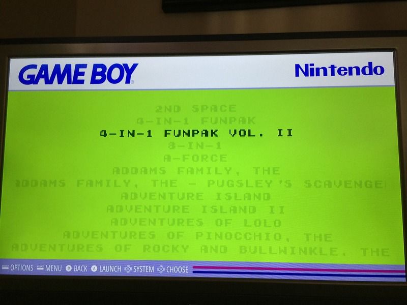
this one took renaming the playchoice 10 nes roms as well
-
@edmaul69 They look good, but I am still quite skeptical that your bottom bar images are as small as you say. They look like they are at least 76x512, then stretched to span the screen. And you have quite a few of them. The wood grains. Even if your image is 1x112, when the texture is read into Video RAM, it takes a "canvas" the size of 128x128 (the closest power of 2 from 112). And bottom images as large as they look, would expand to 512x512. So I can see where your memory issues come in. And a custom font for each system. Each weighing in probably over 1 megabyte.
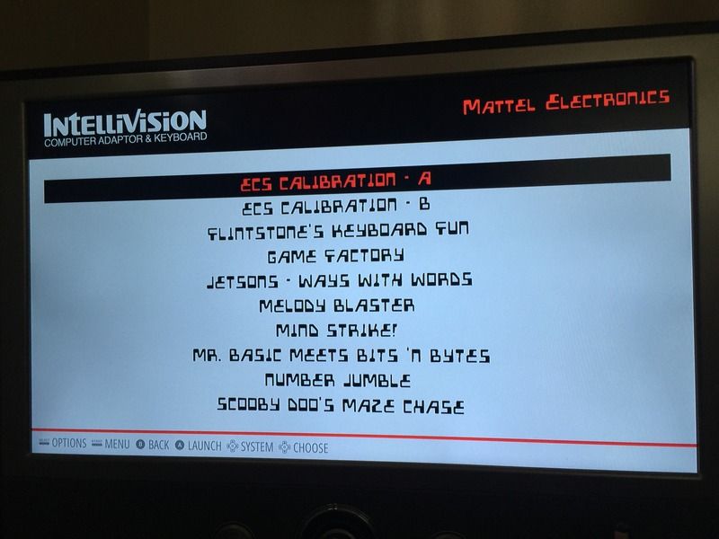
Your logos at the top are very very large as well. If that's a 1080p screen, your intellivision logo (even as an svg) is taking the VRAM of a 1024x1024 image. That's massive for the Raspberry Pi's limited RAM.
I found out the hard way that even a 1kb svg, stretched to fullscreen, will white-screen a 128 MB RAM split Pi. (>_<)
So shrinking your logos down some will help with RAM, as would smaller bottom bars. Try to stay below 128x128 and find something that will tile smoothly.
And sweet jesus, turn down the green on the gameboy! It wasn't hypercolor! Hahahah!
-
I only have 3 others that have a brushed or woodgrain. The playchoice 10 one i already have a cutdown bottom that brings that is 1x whatever that brings the bar completely across the bottom to save space. All the rest only use a 1x224 and 8x8. Super nintendo only use 1 8x8. Whats crazy though is i had 29 of them like this with a 640x 300 picture on the outside as well running on my pi 2. I think if i get rid of the controllers i can get get a lot more than 11 of my custom ones. I am going to convert over to your new theme though. I really like that one. And the green from the gameboy is from a screenshot i took from the gameboy emulator. It used to be the b&w gameboy pocket version but i decided recently i wanted the green version the original gb used since the rest of the theme was from an original. With the fonts and all i want to see how far i can go without controllers anywhere.
-
So i deleted the controllers and i am at 19 modded themes. I have 20 more that i have to redo for carbon so i will see how it goes. All the ones i have left only have 8x8 and possibly 1x334
-
@nemo93 said in Carbon Theme Suggestions:
As I don't want to be too much party breaker, is there any chance to separate out the "new" Carbon with the previous "old" Carbon version at least?
I too am disappointed with the new Carbon. I really like the old Carbon with gamelist on the right, and tons of metadata. An option to install old Carbon would be highly appreciated.
Contributions to the project are always appreciated, so if you would like to support us with a donation you can do so here.
Hosting provided by Mythic-Beasts. See the Hosting Information page for more information.