Request for artists working on themes - needs for (lr-mess/MAME) additions
-
Thanks !
Works far better and faster now with my new method described in the earlier post.
The logo is an svg with a black doubled shadow created with inkscape.
-
@folly said in Request for artists working on themes - needs for (lr-mess/MAME) additions:
@dteam
Thanks !
Works far better and faster now with my new method described in the earlier post.I'll try that for Dragon 64 system.png and other images with white contours.
For svg, sometime it works sometime not, depending the number of colors and details
-
Slowly, I'll rework imperfect images from the theme.
-
Yes SVG's are a pain in the butt sometimes, I agree.
We have to make miles for that in order to know how it works ;-) -
-
@folly
Ideas for new systems. see:https://thegamesdb.net/list_platforms.php
and
https://gamesdb.launchbox-app.com/ -
clear background if you need them


-
-
@folly
Better presentation. Nice work I’ll accept your request -
@folly said in Request for artists working on themes - needs for (lr-mess/MAME) additions:
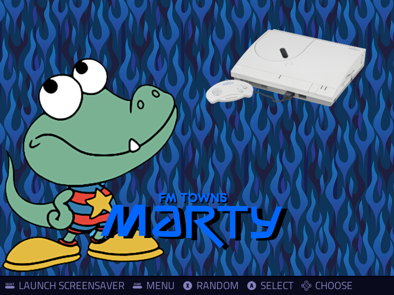
I have re-done fmtmarty , if you like it I will do a pull request.
(PR is done)I forgot to say that your mascot / system files must be less than 280 KB. If they are bigger than that, you will have a white screen problem. Retropie does not seem to tolerate big size image files if you manage many systems (80 systems and more).
-
Ok, so the mascot of fmtmarty has to be reduced a bit.
Will do that asap.PR is done reduced to 250kb
-
 F Folly referenced this topic on
-
reworked Game Gear for use... the colors of Green and Blue were off in many of the .svg files
Also made it grey and black for light and dark without outlines.


-
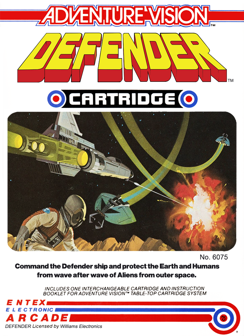
created a "new" Defender box for AdventureVision if anyone needs it. I didn't like the one that was out there and I used the other boxes as the baseline to create an improved version. I think this was a pack-in game so it didn't have an actual box.
The scene is taken from Extex's hand-held version, as was the original. I just didn't like how many times it said Defender on it and kept it cleaner looking.
Use for whatever you need it.

-
A corrected TRS-80 badge for the CoCo2. Taken from other parts and reworked into this horizontal style badge. This is for US/North America market released units, so it's spelled "Color" rather than "Colour".

-
Thanks !!! Nice logo I uploaded it for cygnus blue flames theme
-
@jamrom2 said in Request for artists working on themes - needs for (lr-mess/MAME) additions:
reworked Game Gear for use... the colors of Green and Blue were off in many of the .svg files
Also made it grey and black for light and dark without outlines.


Same thing for Game Gear, I used your second logo for my theme. Thanks a lot!!
-
We should add the ti99_4a too.
I could have changed the script so
ti99_4awas installing underti99but I think that will be somewhat confusing as ti99sim uses other rom formats.The ti99 is already in the theme, we can use that.
Perhaps we can add a minor change so we know thatti99_4ais for mame/lr-mess.What do you think, good idea ?
-
@folly I agree. I modified the already existing Ti99/4a logo and added in the Texas Instruments logo as well. I felt it better suited the look. So now I have a separate ti99/4a theme in my build so that it's not the same as the Ti99Sim emulator. It's white lettering on a transparent background, so it's a little hard to see here... also, same with a black background


-
-
@folly
I'll do monday
Contributions to the project are always appreciated, so if you would like to support us with a donation you can do so here.
Hosting provided by Mythic-Beasts. See the Hosting Information page for more information.
