Pixel Art Themed Bartop Arcade
-
@tpardue023 Love it! Great work! It’s cool to see what characters other people include when making similar artwork to mine, it’s like a look into somebody else’s childhood, haha!
-
@Capeman great job, congratulations. it is possible to have the file in high resolution, I would like to make my bartop with this wonderful graphic
-
This probably took a lot of hours since just collecting all the sprites took ages but again looks really good really neat idea
-
@patricktee really nice design you did there ;)
-
Friend has original pixel art bartop arcade photoshop file of this artwork you can edit everything and there is like huge number of sprites if anyone is interested and would like to buy just send him mail bartoparcade@protonmail.com
-
@kitarist He absolutely does NOT have the original artwork. I have never released my photoshop files.
I've seen a bunch of people incorporate the basic idea behind my design since I first posted it here. Imitation is the sincerest form of flattery, and some of the users on this thread have created their own version of this design themselves, and that is AWESOME... but it's honestly frustrating and disappointing to see people claim original creation and sell variants of my design.
I guess this is how Nintendo must feel about the 8bitDo controllers and retroflag cases, haha. Oh well.
-
@patricktee Hey any way you can share a high res of this? i would love to use this on my cab
-
@capeman hey would you be so kind to share the files so i can print them out for my cab?
-
@capeman Long time again!
How have you been?
It's been a very slow process trying to build my cabinet and COVID definitely hasn't helped any.
Turns out the international shipping fees are exorbitant and thus I've had to start looking at making my cabinet here in Australia as opposed to buying it overseas. It made me realise though that there aren't really any great bartop arcade DIY kits in Australia that are to the same quality as Arcade Forge (Germany) and Game Room Solutions (America).
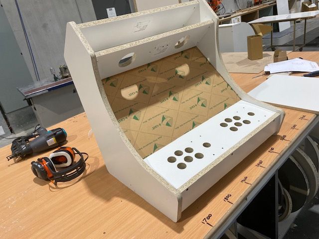
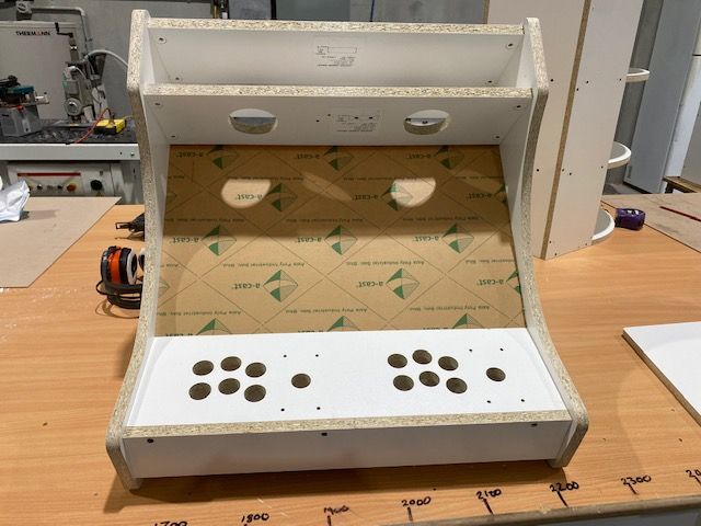
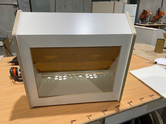
So I've been working hard with a CNC routing company to start my own DIY cabinet business. This is the progress I've made so far on the cabinet itself:
I'm now working through sourcing the marquee l-plate holders. I have some brushed metal ones but noticed yours are black. Did you paint them yourself, or did they come black? Also, were they pre-drilled for the screws to affix them to the marquee or did you have to do that yourself?
Also, for your joysticks, I've noticed that mine currently feeds a bolt through the top of the control panel for the nut to be tightened on the bottom. But this leaves ugly bolts sticking out the top of the control panel. I've noticed yours doesn't seem to have that. How did you get around it?
I reckon with the progess I'm making, I should have the first "final cut" of the bartop arcade done by end of the year to start selling in Australia. It's been a fun and frustrating process, but enjoying the creative challenge :)
-
@patricktee This already looks awesome. Are you a lefty, or is the control panel upside down?
My cab has the sticks screwed into the bottom of the cp, without anything protruding topside, but I honestly don't know if any stick will just go in like that.
-
@weirdh thanks for the feedback!
Haha, nah not a lefty. The cabinetry company accidentally flipped the cuts into the panel. This is being rectified on the final version.
Interesting about the joystick. I don't see why I couldn't just screw it in from the bottom and use the wood to secure it vice a nut and bolt solution. Will look into that!
Cabinets will be available in 16mm MDF coated in the below options:
- White
- Black
- Natural Walnut
- Two tone (white side panels, all other panels grey)
-
Love the design, this is what I am looking to do as well. Does anyone have a location where I can download the pixel art/sprites that I can make my own.
Thanks,
-
@capeman Hi Capeman, inspired by your creation I'm trying to create my own
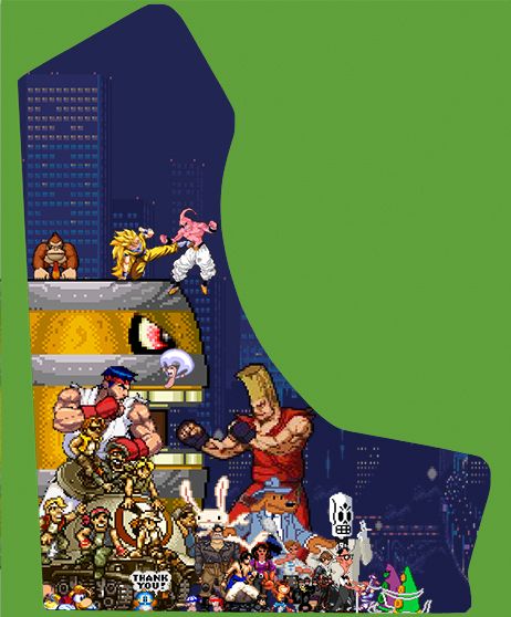
is it possible to contact you via email?I need to know if the final print will result ok or too much pixelated, if you mind to help me I can send you my wip psd file to compare to yours.
Let me know, thank you!
-
@Capeman Any help? A reply would be much appreciated :)
-
@orsoh the way I designed mine was to collage the pics at actual pixel size, literally my whole design was only like 800 pixels high since pixel characters are that small when grabbed from sprite sheets. That way none of the pixels overlapped and all of the pixels were a consistent size. When it came time to print, I upscaled the image to a solid percentage (somewhere around 1000% or so) using the nearest neighbor resampling in photoshop (not bubic or bilinear), that way the chunky pixels were maintained at high resolution without the usual blurriness of upscaling. It made for perfect pixel upscaling.
Love the artwork btw! loving all the scummvm games on there!
-
@capeman So you worked on small file and you've upscaled only the final results?
I'm asking this because I've upscaled every single sprites to 5/600% working on a large template.
I think the final results will be the same but just to be sure let me know if I'm right or no :) -
@orsoh If you upscale the sprites before you setup your character collage, you end up not being able to line up the sprite pixels corner to corner (it may be possible, but it's way harder). You end up with funny overlaps like shown below.
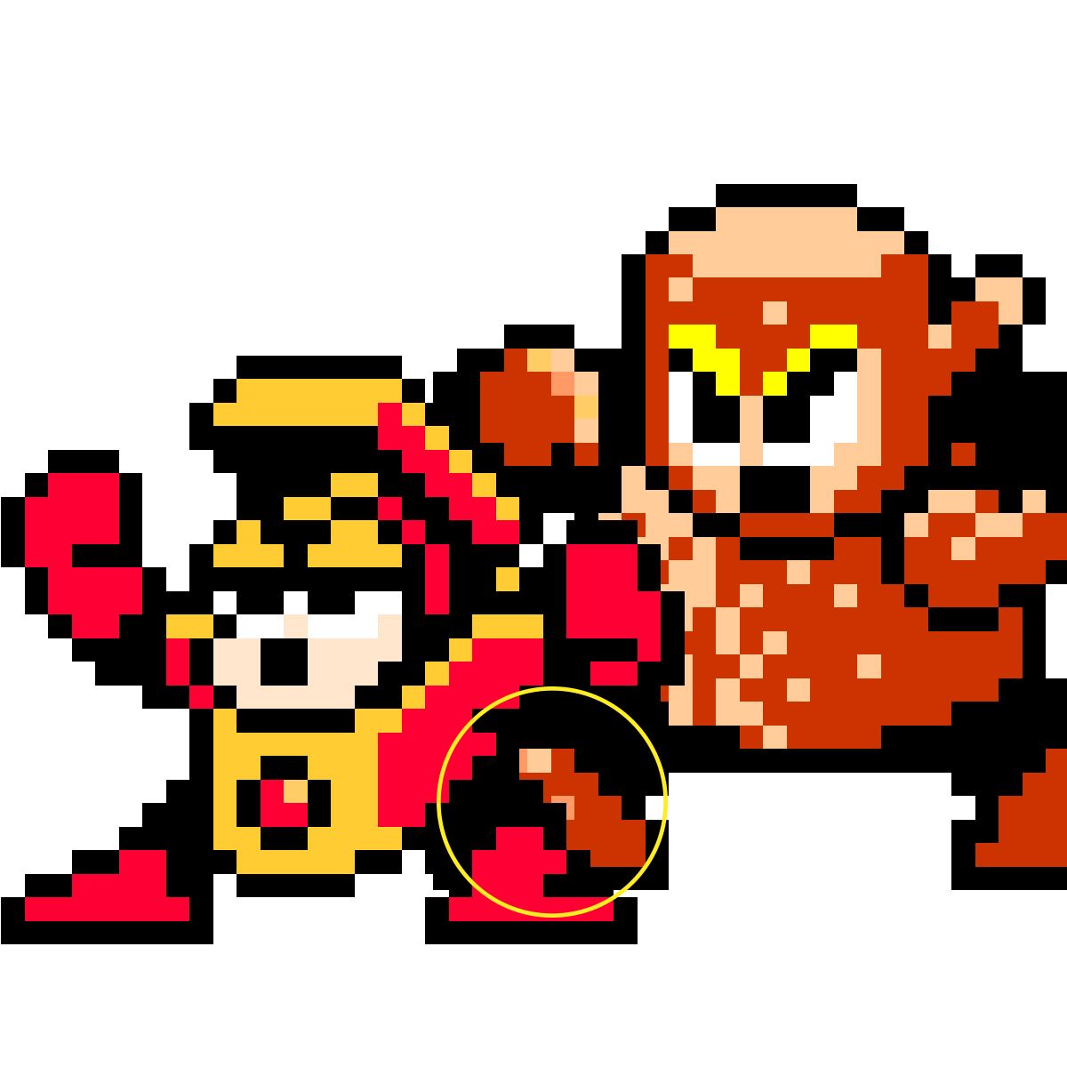
When you work at native resolution, where every pixels is exactly one pixel on the image, then there is no way to get odd overlaps. Every time you nudge the sprites, the pixels will line up perfectly.
If you look up at my originals, you'll notice every pixel on every character is exactly the same size and in a perfect grid with no pixel overlap. This is a zoom of my original working file, showing the photoshop pixel grid.
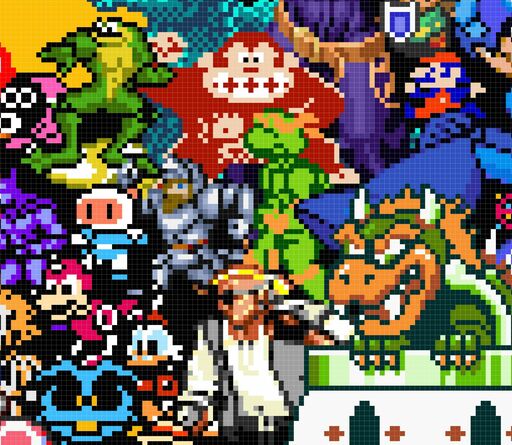
So to answer your question, yes, I design at 1 to 1 pixel scale, then upscale the final result using nearest neighbor rendering to keep the sharp edges and even upscale factors (usually 1000%).
-
@capeman It's a little bit hard to understand.
Let me do an example:-
I've downloaded this sprite: https://www.spriters-resource.com/fullview/38894/
-
Importing the full sprites png on Ps.
-
I've cropped the full sprites to the character pose that I want to use:
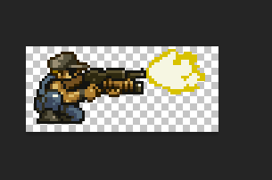
-
At the moment the single sprite is 72x32pixel and my template is 5862x7087
-
I increase my sprite to 1600%, and it became 1152x512:
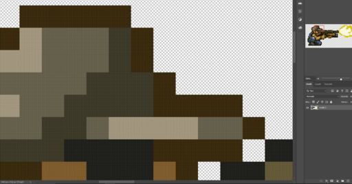
I'm not seeing any error on pixel, but maybe I cannot understand what are you telling to me.
However the final results isn't bad at all, when I move my increased sprite to my template:
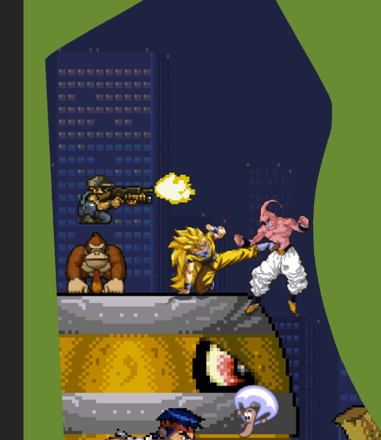
Am I wrong?
I'm sorry if I didn't understand what you want to tell me, but it's a little bit complicated :D -
-
@orsoh Seeing your art close up, it looks like you're not going for the consistently sized pixel look anyway, so what you're doing looks fine for the type of design your making. If you look at mine, every pixel is exactly the same size (because I'm neurotic about that), yours has pixels that vary in size. As long a you scale everything with nearest neighbor, you should be fine.
-
I've finished it!

Contributions to the project are always appreciated, so if you would like to support us with a donation you can do so here.
Hosting provided by Mythic-Beasts. See the Hosting Information page for more information.