Material Theme
-
Working on an update for the Material Theme. Is there anything you would like to see added?

-
@lilbud When I tried it, I noticed that the gamelist artwork (for me, that's primarily arcade game snaps) doesn't always have the correct aspect ratio. A vertical game is stretched to fill the same dimensions as a horizontal game. It would be an improvement if the AR of the image was preserved, and it stretched to fit (not to fill) the available space for that element, centered.
It's a small thing, but since you are asking. . .
By the way, I really like Material Theme for it's simplicity and completeness.
-
@caver01 It should be fixed now.
-
@lilbud Cool! I was just playing with some of the files and noticed <size> vs. <maxSize>. I did a little test with Arcade by changing the size tag to maxSize and that seemed to do the trick. It felt like I was specifying the constrained maximums rather than the dimensions of the image outright. Was I on the right track? I haven't done any theme editing. . . yet!
-
That is what I just did to the repository.
-
Theme has been updated, Dark background, and gamelist selector matches header and footer
-
Any chance of adding virtualboy to your theme?
-
@pompitousofseth I'll try
-
@lilbud thanks! I tried editing the .svg files myself but I don't know what I'm doing when it comes to advanced imaging software. Take your time. No rush.
-
@pompitousofseth Done and Done, update from setup script
-
@lilbud Thanks again!
-
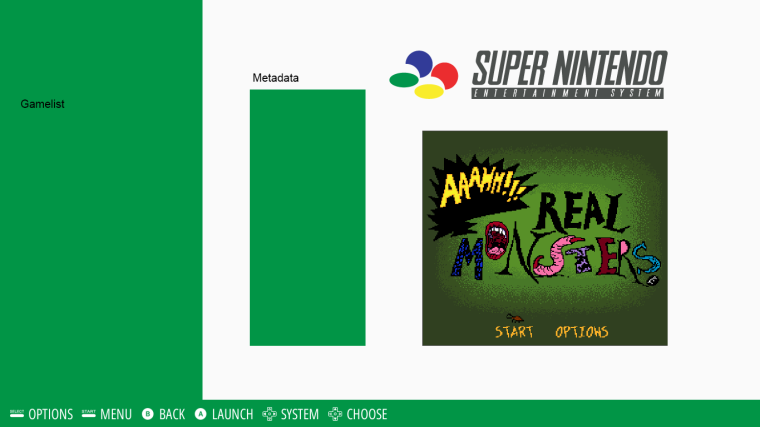
Thinking of a redesign of the material theme, got this so far.

If anyone has ideas, let them be heard.
-
@lilbud maybe add extra rectangles to the boxes for shadows?
https://material.google.com/material-design/elevation-shadows.html#elevation-shadows-shadows
-
@pompitousofseth it's a tightrope to walk with the VRAM on the pi
-
@herb_fargus @lilbud if it's too much strain on the vram the shadows could be incorporated into the white background and they would be one static image.
-
@herb_fargus VRAM won't be an issue on the shadows. If he's using a 1 pixel PNG for the colored boxes, he'd just put another instance of the image, tint it black, and set the opacity to 50% or lower. Actually won't take any additional VRAM. You could also create this whole theme with a single 320x196 (or something) PNG image with transparency. Runs incredibly fast, takes little VRAM, stretches sharp, and no need to fiddle with placement of elements. That's what I use on the Modern theme and the Luminous theme to an extent.
-
Try this image as the background, lilbud: BG Image
And tint it: 019546 with the <color> tag.
The shadows should stay black and transparent, while the white part will take on the tint you apply to it. Be sure to stretch the image to full screen. The image is less than 1kb, and smaller than what I use in Pixel. And pixel is faaaast.
-
@Rookervik from the ES theme master himself!
-
@Rookervik Is there a way to call the individual system logo from the main theme.xml?
Like this...
<image name="logo"> <pos>0.600 0.057</pos> <maxSize>0.26 0.1</maxSize> <path>./system.svg</path> </image> -
@lilbud Nope, but you can define everything for that logo, then call for the path of the logo in the theme.xml.
Pixel and Modern do this:
In the main xml, you set positions for EVERYTHING. Font for everything, colors... set up the entire theme here in the main xml. So calling for your image would be
main.xml:
        <image name="logo">
		<pos>0.600 0.057</pos>
		<maxSize>0.26 0.1</maxSize>
		<color>ffffffff</color>
	</image>
And then the individual theme.xmls would pretty much ONLY have links to images...
theme.xml:
        <image name="logo">
                <path>./system.svg</path>
	</image>
Since the theme.xml calls for the use of main.xml (up at the top) both xmls are basically combined. Favoring the theme.xml over the main.xml in disputes.
Contributions to the project are always appreciated, so if you would like to support us with a donation you can do so here.
Hosting provided by Mythic-Beasts. See the Hosting Information page for more information.